JustDogbert
Two Pair
Put me down for a barrel of these

Good Job.
Good Job.
Thx. Once I got off custom clays and committed to ceramics, I tried to take advantage of their flexibility. I want it to seem like a traditional chip, but do some subtle things that aren't possible on traditional chips. I'm glad that's noticeable. I'm hopeful that these will be simple and clean, and just plain look good at first glance, but have enough going on that you can spend some time looking at all the detail (all the while also being a playable chip).The evolution of these has been awesome! I love the faded transition with the edge-spots, I feel like you are taking advantage of the things you can only do with ceramic chips with both the face art and edges. You may want to further differentiate the blue/red($5) and darkblue/green($100) edges though, might still be some dirty stack issues.
I personally don't like how the images cover the text but that's just my preference. Do you know if you can have different printing on each side of the chip? If you want to take full advantage I feel like you should have something different printed on the opposite side. Maybe use numbers instead of text?I've made some changes since then, so here's where I am now.
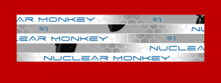
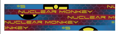
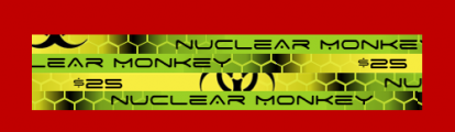
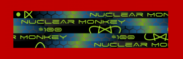
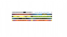
Here are the edges
very ambitious and creative use of the rolling edge. so basically you need to order 5 different versions of each chipIf you line up the edges, here's what you get:
Yep, 5 versions of each chip (4 for the greens).I personally don't like how the images cover the text but that's just my preference. Do you know if you can have different printing on each side of the chip? If you want to take full advantage I feel like you should have something different printed on the opposite side. Maybe use numbers instead of text?
very ambitious and creative use of the rolling edge. so basically you need to order 5 different versions of each chip
Do you have a preference for the words over the numerals?I'm still working out some details on these, but I have new design for the back. It moves the denomination off the front altogether, which makes the front cleaner. What do you think?
View attachment 752812View attachment 752811View attachment 752810View attachment 752809View attachment 752808View attachment 752807View attachment 752806View attachment 752805View attachment 752813View attachment 752803
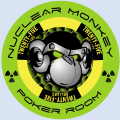
Two versions. One monkey on each side. One for dealer, one for bomb pots.Are you planning to make all four versions of dealer buttons?
Yes, for the face on these. I'll have the numeral on the rolling edge. I've tried the numerals, and I can't get them to look right. The 1 is sooo skinny and I feel the space needs more substance. So the words provide that. Maybe I'm not designing the numerals right.Do you have a preference for the words over the numerals?
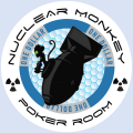
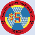
One other thing to note, in my game, all of the players will know the value by the outer ring color. In the last 25 of our regular games, no one has ever asked what a chip is worth, and we use Claysmith Mint chips now (which are not easily readable either).These look good.
I think you may want to consider different colors for the denom side for better contrast. Be able to identify the value of a chip from across the poker table.
With regard to the outer ring contrast issue,, do you mean the sample chip BroPro sent me? If so, I've already lightened the NMPR text on the black chip and I'm getting samples of different shades of red to improve the red chip.Looks great! My 2¢- boost the contrast on the Nuclear Monkey Room along the outer ring. Based on your samples, the 5 and 100 need the most attention. Yellow on the red and lime green on the black- both those colors are in the radiation symbol design. Not sure about the 500 as that radiation symbol is lavender and lime green- which would be great on the black.
I already sent you a PM, but there will be a lot of interest in these if you don't mind ordering a bunch.Two versions. One monkey on each side. One for dealer, one for bomb pots.
I don't mind doing something. How does that work? Does everyone place orders through BrPro? or do I take orders from y'all and then place an order with BrPro and you pay me back?I already sent you a PM, but there will be a lot of interest in these if you don't mind ordering a bunch.


I will just run this in this thread (already cleared with @nuclearmonkey ). There are two dealer buttons, each with a different image on each side.Himewad is going to run a group buy on the dealer buttons.