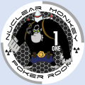
Nuclear Monkey Ceramics (1 Viewer)

nuclearmonkey

Sitting Out
Joined
Feb 3, 2018
Messages
49
Reaction score
186
Location
dallas
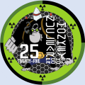
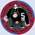
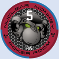
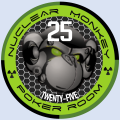
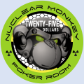
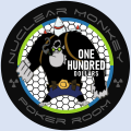
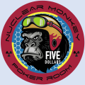
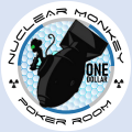
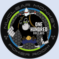
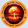
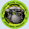
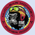
Hey Guys - Been lurking on this forum for a few years, but haven't posted much. Y'all have got me thinking I need a new custom set of chips, so here's my first shot at it. Nuclear Monkey is a gamertag I've used for years.

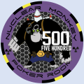
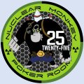
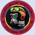
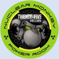
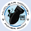
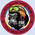
I play in a $1/$2 game with $300 buy-ins. We seem to like big stacks of reds, so that's mostly what is on the table, but we use the greens and blacks too.

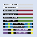
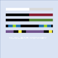
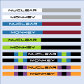
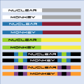
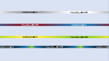
I'd love to get some CPCs, but $1000+ is too much for me right now, so I'm thinking custom ceramics from BR Pro. For 500 chips, I can keep it under$500. I couldn't decide whether the text on the edge was too much.

I was hoping to get some opinions and feedback on this design. What do y'all think?
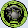
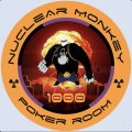
 

Attachments

  • Button.PNG
    Button.PNG
    166.7 KB · Views: 252
  • NM 500.PNG
    NM 500.PNG
    207.4 KB · Views: 252
  • NM 100.PNG
    NM 100.PNG
    206.5 KB · Views: 261
  • NM 25.PNG
    NM 25.PNG
    211 KB · Views: 254
  • NM 5.PNG
    NM 5.PNG
    227.5 KB · Views: 243
  • NM 1.PNG
    NM 1.PNG
    212 KB · Views: 257
  • Edges Writing.png
    Edges Writing.png
    12.7 KB · Views: 240
  • Edges Plain.PNG
    Edges Plain.PNG
    4 KB · Views: 246
I love the design. Is the front and back the same? The only thing I would be concerned about is if the denomination is large enough? From the picture I think it is but does it get lost in the image? Also I guess it depends on who your players are? If they are regular poker players and not newbies then I see no problems. As a seasoned poker player I absolutely love them!
 
I love it, congrats on the design. One thing though the nuclear monkey is hard to read, also a little busy imo with the card room on the bottom of the nuclear monkey text. Maybe changing the font or/and placement of either the nuclear monkey or card room text. Maybe leave the card room completely and only go for nuclear monkey. Either way, looking forward to see the final product!
 
Looks like there will be alot of black on the rolling edge for many chips.

Not sure if this will present dirty stack issues. I'd suggest changing up the $5 and $25 chips. Try out other colors than black to create more contrast between chips.
 
My $0.02s. The logo is too busy. I'd make the "head" on the shirt as the logo and put the lettering around it in a circular fashion. You can make the dealer button the actual logo with the figure wearing the shirt.

But, I've always leaned towards a simple clean design.

Good luck with design. Great name and logo.
 
Did you happen to be a Machinist's Mate in the Navy?
Nope, not me.

Thank you all for your feedback and help. Your comments were very helpful and I incorporated a lot of them. Here's what I've got now. I'm debating whether to have a different back to each and whether to use this design or design new back with a monkey on a rocket ala Dr. Strangelove.

I've spent way too much time on this for now, so I'll probably stew on it for a while. In the meantime, lemme know what you think.

I love the design. Is the front and back the same? The only thing I would be concerned about is if the denomination is large enough? From the picture I think it is but does it get lost in the image? Also I guess it depends on who your players are? If they are regular poker players and not newbies then I see no problems. As a seasoned poker player I absolutely love them!
My game is full of poker degenerates, so they'll have no trouble remembering what color is what value, especially with the standard colors for each value.
 

Attachments

  • Slide1.PNG
    Slide1.PNG
    211.3 KB · Views: 120
  • Slide2.PNG
    Slide2.PNG
    216.8 KB · Views: 119
  • Slide9.PNG
    Slide9.PNG
    246.9 KB · Views: 122
  • Slide10.PNG
    Slide10.PNG
    250.6 KB · Views: 120
  • Slide11.PNG
    Slide11.PNG
    248.2 KB · Views: 126
  • Slide12.PNG
    Slide12.PNG
    242.3 KB · Views: 125
  • Slide8.PNG
    Slide8.PNG
    12.8 KB · Views: 110
  • Slide7.PNG
    Slide7.PNG
    191.8 KB · Views: 109
  • Slide6.PNG
    Slide6.PNG
    166 KB · Views: 108
  • Slide5.PNG
    Slide5.PNG
    212 KB · Views: 96
  • Slide4.PNG
    Slide4.PNG
    211 KB · Views: 95
  • Slide3.PNG
    Slide3.PNG
    219 KB · Views: 102
  • Slide13.PNG
    Slide13.PNG
    239.7 KB · Views: 117
Nope, not me.

Thank you all for your feedback and help. Your comments were very helpful and I incorporated a lot of them. Here's what I've got now. I'm debating whether to have a different back to each and whether to use this design or design new back with a monkey on a rocket ala Dr. Strangelove.

I've spent way too much time on this for now, so I'll probably stew on it for a while. In the meantime, lemme know what you think.


My game is full of poker degenerates, so they'll have no trouble remembering what color is what value, especially with the standard colors for each value.
Awesome work! Nuclear monkey text easier to read now, i like it!
 
Really dig the theme and graphics, especially now that it’s less cluttered.

I still see a dirty stack issue between the 25 and 100. Imagine looking at a stack on 100’s with one 25 in the middle—or vice versa. Are you sure you would see the odd chips? I’m not sure. Maybe do green and orange on the 25 rolling edge? And possibly white instead of black on the 500?
 
Yeah, I think you're right. Next iteration I'm going to look at yellow or pink on the edge of the green (call me weird, but I'm not a fan of green and orange together), and I like your idea of white instead of black on the edge of the purple, although it might muddle with the yellow. I might have to make the yellow dirtier or put white and green spots on the purple chip and blue and yellow spots on the black.
 
I like the head logo better! Always good to have at least 4 different mock ups with different graphic elements in various compositions/layouts.
From a designer’s perspective, I’m cringing at the large value overlapping the monkey’s forehead at an odd angle. It doesn’t look right to me. And I don’t think you need to write out the value either - i’m sure people can make that determination by the number itself. Here’s my suggestions for some tweaks:
1) Remove the value text at the bottom. It’s redundant.

2) If you scale the head graphic slightly smaller you could move the chip value below the head. (You’d have to play with both graphic and text scale for the perfect balance). Make it radially aligned (or horizontally of you prefer).

3) Rotate the radiation symbols so they are also radially aligned with the center of the chip like the text, not horizontally across. Center it by checking the spacing between the end characters to the left and right.

4) Edit the font! I’ve used that font before and didn’t care for the points/dots it puts under the capital M, inside the A, and with other characters. You can edit the type in Illustrator to remove them for a cleaner look.

5) Another option for the chip value would be to rotate the head counter-clockwise a bit, then scale the number a bit smaller to fit in the monkey’s forehead.

6) Darken the background a bit more to have more contrast so your monkey graphic pops. Maybe do an alternating/reflective linear gradient or a radial gradient overlay with gray and dark gray values.

If I had the graphics I could do a quick mock-up.
Maybe I should make this my second job!
HAHAHAHA

Hope these suggestions help!
Some excellent thoughts. Thank you. I see what you're saying and I'll play with these some more. Only one I'll quibble with: I chose this font specifically for the dot under the A and M, so I'm keeping those! (You can also just use lower case to remove them).
 
Alright, here's where I am. Thank you all for your advice and comments so far. Y'all have really helped clarify my thoughts and made these better. I'd love to hear any other feedback you have.

Is it weird that the animation style on the $100 monkey is a little different than the other 3? I was contemplating getting a different graphic altogether on some of them.

I'm getting close to pulling the trigger on these. Thank you again for your feedback.
 

Attachments

  • Slide2.PNG
    Slide2.PNG
    174.5 KB · Views: 121
  • Slide3.PNG
    Slide3.PNG
    224.3 KB · Views: 123
  • Slide4.PNG
    Slide4.PNG
    179.6 KB · Views: 132
  • NMPR Chipset Version 4.2.png
    NMPR Chipset Version 4.2.png
    276.1 KB · Views: 139
  • edges.png
    edges.png
    12.2 KB · Views: 132
  • Slide6.PNG
    Slide6.PNG
    158.2 KB · Views: 122
  • Slide7.PNG
    Slide7.PNG
    197.7 KB · Views: 113
  • NMPR Chipset Version 4.2.png
    NMPR Chipset Version 4.2.png
    260.4 KB · Views: 124
This has been an amazing chip design journey. Congrats. I freaking love that $1 chip

I don't think the style difference in the $100 is a problem. My only thought is with the $5, $25, and $100 is that the monkey might blur in with the background, making one big black indistinguishable blob. The thin white/grey outlines you have will probably not show up when printed, or will be extremely faint. I'm also wondering how well the grey text around the border of the $100 chip will show up. Are you going to have samples made before doing a full order?

I'd play around with a lighter color background. I mean, just look how awesome that $1 chip looks :love:
 
Alright, here's where I am. Thank you all for your advice and comments so far. Y'all have really helped clarify my thoughts and made these better. I'd love to hear any other feedback you have.

Is it weird that the animation style on the $100 monkey is a little different than the other 3? I was contemplating getting a different graphic altogether on some of them.

I'm getting close to pulling the trigger on these. Thank you again for your feedback.
These could become one of my favorite ceramics! Love it!!
The only thing i could think of, I am kind of missing the monkey on the one dollar chip.
 
Those look fantastic!

Only potential adjustment would be changing the rolling edge colors of the 25 chip. The black may cause dirty stack issues with the 100 chip. The yellow from the 25 face art may be an option.
 
I'd play around with a lighter color background. I mean, just look how awesome that $1 chip looks :love:

^^^^ this, very much this. Really cool design, but a lighter colored background would really help to distinguish the main graphics on the $5 thru $100.

Is it weird that the animation style on the $100 monkey is a little different than the other 3? I was contemplating getting a different graphic altogether on some of them.
This jumped out a bit at me too - the main graphic on the $100 overlaps / jumps across the inner circle, but the rest of the chips are all contained within that inner circle. I think I like the style of the $100 better, IMHO it meshes really well with the overall style and feel of the set. I would try to use the same approach across all the chips and see how that looks (if appears that you could accomplish that by making the graphic a hair larger). If it doesn't look right, then I'd shrink the graphic on the hundo to match the rest of the lineup.
 
Last edited:
This has been an amazing chip design journey. Congrats. I freaking love that $1 chip

I don't think the style difference in the $100 is a problem. My only thought is with the $5, $25, and $100 is that the monkey might blur in with the background, making one big black indistinguishable blob. The thin white/grey outlines you have will probably not show up when printed, or will be extremely faint. I'm also wondering how well the grey text around the border of the $100 chip will show up. Are you going to have samples made before doing a full order?

I'd play around with a lighter color background. I mean, just look how awesome that $1 chip looks :love:
Thanks. Yes, I'm going to have samples made, so if the hex background or the grey writing on the black chip doesn't show up, I'll modify the colors to improve the contrast. I've printed 39mm "samples" on paper and it all shows out just fine.

I've played with the hex background a bit. I might try again with a lighter background to see how it looks.
 
^^^^ this, very much this. Really cool design, but a lighter colored background would really help to distinguish the main graphics on the $5 thru $100.


This jumped out a bit at me too - the main graphic on the $100 overlaps / jumps across the inner circle, but the rest of the chips are all contained within that inner circle. I think I like the style of the $100 better, IMHO it meshes really well with the overall style and feel of the set. I would try to use the same approach across all the chips and see how that looks (if appears that you could accomplish that by making the graphic a hair larger). If it doesn't look right, then I'd shrink the graphic on the hundo to match the rest of the lineup
Here is a quick and dirty mock up with a lighter background. I probably need a background specific to each chip like the white.
 

Attachments

  • Slide1.PNG
    Slide1.PNG
    250.1 KB · Views: 84
  • Slide2.PNG
    Slide2.PNG
    175 KB · Views: 89
  • Slide3.PNG
    Slide3.PNG
    240.8 KB · Views: 89
  • Slide4.PNG
    Slide4.PNG
    173 KB · Views: 88
  • Slide8.PNG
    Slide8.PNG
    12.2 KB · Views: 90
  • Slide7.PNG
    Slide7.PNG
    196 KB · Views: 98
  • Slide6.PNG
    Slide6.PNG
    152.7 KB · Views: 89
  • Slide5.PNG
    Slide5.PNG
    276.1 KB · Views: 87
Those look fantastic!

Only potential adjustment would be changing the rolling edge colors of the 25 chip. The black may cause dirty stack issues with the 100 chip. The yellow from the 25 face art may be an option.
I've toyed with yellow around the edge of the $25 instead of black. I put the writing in black on the green part to distinguish it from the white writing on black on the $100.

Thank you all for the help. More to think about it. I'm getting close!
 
Here is a quick and dirty mock up with a lighter background. I probably need a background specific to each chip like the white.
Perhaps try a background color that is a lighter gradient of the base color? Or the complementary face color? Like you did with your $1 chip? That chip looks great with the blue background.
 
I absolutely love the Strangelove $1. The whole set is looking good (and I like the improvements in the most recent version) but that's the winner in my book!

I see you say you have printed 1:1 size versions. My only worry is many aren't 100% sharp, like they have been created at a smaller size and up-scaled. Hopefully your samples look OK, but that's really the only thing that concerns me.


Also, where is the sample set order thread? ;)
 
Did some extremely quick mock-ups of some ideas. I know it’s late, but it illustrates the backgrounds I was talking about earlier.
The 1000 chip is just a combo I thought of now.
 

Attachments

  • E0D3BD4B-48F8-42D8-B269-D8BD5838B986.png
    E0D3BD4B-48F8-42D8-B269-D8BD5838B986.png
    381.3 KB · Views: 101
  • C815A276-C148-4641-AB42-DCD4A8E0229B.png
    C815A276-C148-4641-AB42-DCD4A8E0229B.png
    378.9 KB · Views: 77
  • 94BEC026-040E-4AA2-B2B6-7C5AEB29FA66.png
    94BEC026-040E-4AA2-B2B6-7C5AEB29FA66.png
    917.7 KB · Views: 76
Perhaps try a background color that is a lighter gradient of the base color? Or the complementary face color? Like you did with your $1 chip? That chip looks great with the blue background.
Messed with lighter backgrounds. Here's what I got, I like 'em better.
 

Attachments

  • Slide2.PNG
    Slide2.PNG
    194.6 KB · Views: 80
  • Slide1.PNG
    Slide1.PNG
    248.6 KB · Views: 70
  • Slide3.PNG
    Slide3.PNG
    242.6 KB · Views: 95
  • Slide4.PNG
    Slide4.PNG
    164 KB · Views: 75
  • Slide5.PNG
    Slide5.PNG
    276.1 KB · Views: 74
  • Slide6.PNG
    Slide6.PNG
    144.5 KB · Views: 78
  • Slide7.PNG
    Slide7.PNG
    188.9 KB · Views: 75
  • Slide8.PNG
    Slide8.PNG
    12.2 KB · Views: 74
I absolutely love the Strangelove $1. The whole set is looking good (and I like the improvements in the most recent version) but that's the winner in my book!

I see you say you have printed 1:1 size versions. My only worry is many aren't 100% sharp, like they have been created at a smaller size and up-scaled. Hopefully your samples look OK, but that's really the only thing that concerns me.


Also, where is the sample set order thread? ;)
I was going for Strangelove, so glad that came through!

I've been very worried about the fuzziness of a few (white and green mostly). I don't have high res originals of these. I may have to go get them. Having said that, they look fine on my print-outs, they aren't as sharp as the black and especially the red, but its close. I assume that when they get printed on the chip, they lose some sharpness anyway. The NJs I have aren't super sharp either. If that's the case, then I think it will be fine, but that's also why I'll get samples first.

I'll do some samples if there's interest. I've already received a message about the Dealer buttons too.

Did some extremely quick mock-ups of some ideas. I know it’s late, but it illustrates the backgrounds I was talking about earlier.
The 1000 chip is just a combo I thought of now.
Thanks! I've messed with those a bit. I added the green hex. If you look super close, the orange already has all the monkeys on it, very tiny though! I may not even mess with the orange. It's kind of an afterthought at this point. I don't think I need them, just thought it was a cool idea for a no-value chip.
 
Spent way too much time on this, but this is the best yet. Thank you all for your feedback. You've been instrumental in making these better.

Any comments are always appreciated.
 

Attachments

  • Slide5.PNG
    Slide5.PNG
    169.2 KB · Views: 82
  • Slide4.PNG
    Slide4.PNG
    240.3 KB · Views: 78
  • Slide3.PNG
    Slide3.PNG
    178.8 KB · Views: 76
  • Slide1.PNG
    Slide1.PNG
    248.6 KB · Views: 92
  • edges.png
    edges.png
    37.8 KB · Views: 98
  • Slide7.PNG
    Slide7.PNG
    151.1 KB · Views: 93
  • Slide8.PNG
    Slide8.PNG
    189.2 KB · Views: 77
The evolution of these has been awesome! I love the faded transition with the edge-spots, I feel like you are taking advantage of the things you can only do with ceramic chips with both the face art and edges. You may want to further differentiate the blue/red($5) and darkblue/green($100) edges though, might still be some dirty stack issues.
 

Create an account or login to comment

You must be a member in order to leave a comment

Create account

Create an account and join our community. It's easy!

Log in

Already have an account? Log in here.

Back
Top Bottom