New Dealer Button Design, looking for feedback please (2 Viewers)

Pony

Two Pair
Supporter
Joined
May 19, 2022
Messages
397
Reaction score
686
Location
Orygun
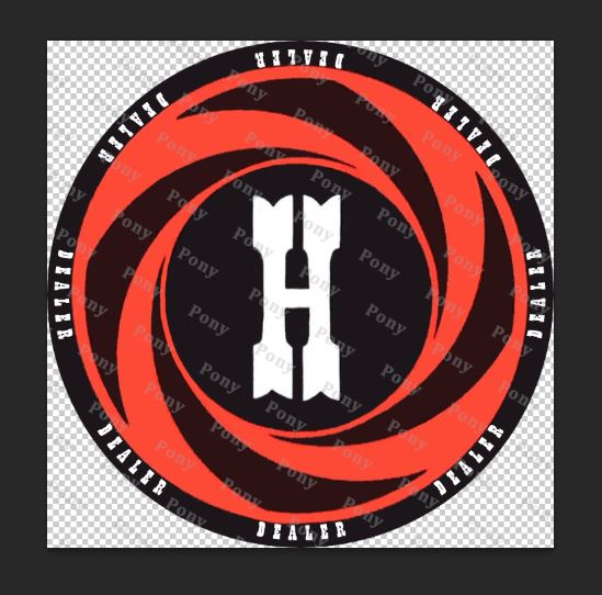
Looking for some honest feedback on this dealer button design. Hadn't seen any Harold's Club buttons, so I found some old print stuff, and came up with this as a potential dealer button design (like I did with the Mapes design from early this spring).

Harold's Club had a crap-ton of different promotional designs, but this "H" seemed to be the most consistent.

This design I'm thinking about for the current acrylic group buy, which is why the 'dealer' text is on the face of the button (and not around the edge).

Thanks!

harolds.JPG
 
I like the look.
I would be careful to not put anything so close to the edge like the dealer text, because there is the potential that if it prints slightly off-center, the text may be cut off. Even if it’s not text, if it’s too close, the off-center printing is much more evident. I recommend an 1/8” or more between the design and the edge, or make the design go all the way past the edge.
 
Appreciate the feedback, here's one after doing some tweaking based on suggestions;

harolds 2.JPG
 
IMO if you want "dealer" to be visible it should be at least 10-12pt. I like the swirl pattern... not sure where to place the dealer text in the design.
 
If you are set on having Dealer on there, I like the Dealer in the swirls, but I agree it might need to be a bigger font.

I also like the suggestion of just removing Dealer altogether
 
Lots of good thoughts/ideas, many which I agree with. My initial thought was just the logo - but I was thinking about doing a button in acrylic, hence trying to get 'dealer' on the face.

I think the way this design goes, it would be best suited for a ceramic button, with 'dealer' on the edge of the button and not on the face. I also kind of like it without the circular border.

harolds 5.JPG
harolds 6.JPG
 
IMO it looks better without the border.

I think you can get away with no "DEALER" text on the button if it's the only button you're using.
 
Definitely looks better without the border. And IMO I like it better without the Dealer as well.
 
I agree, it doesnt need to have "dealer" on it for everyone to immediately recognise who's the dealer.
Especially if it's a large acrylic button.
 
I like no border and no dealer. Everyone will know it's a dealer button. And they can't wait to "have" it. lol
 

Create an account or login to comment

You must be a member in order to leave a comment

Create account

Create an account and join our community. It's easy!

Log in

Already have an account? Log in here.

Back
Top Bottom