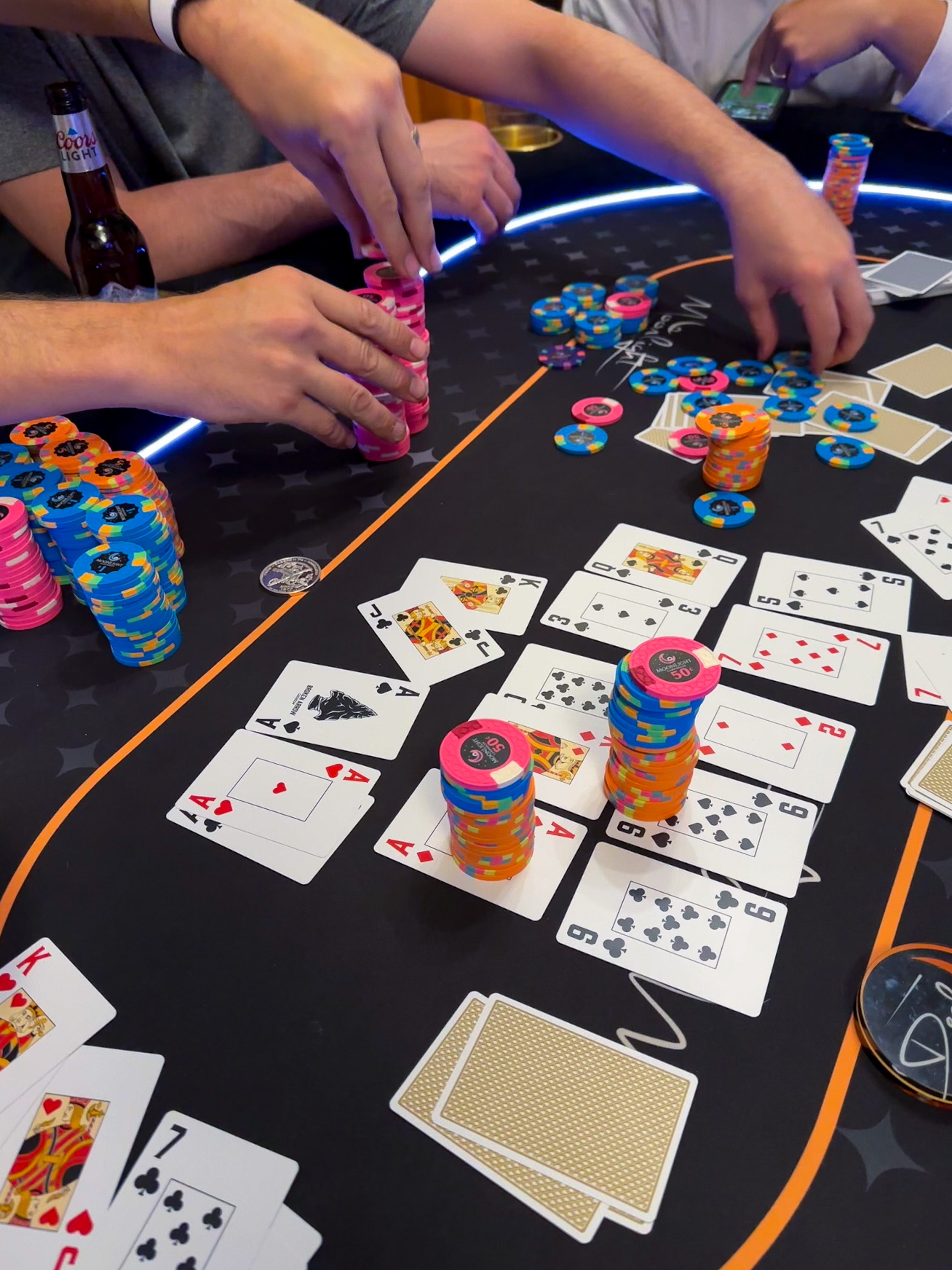
There's been a lot of hoopla over these BROKEN ARROW card setups.
Meanwhile, John Travolta is over here saying....
Meanwhile, John Travolta is over here saying....

 and purposefully pressed and rubbed the two cards together pretty hard (harder than would happen during a shuffle or having the card in the deck) right where the drawn club was, and there was no transfer to the back of the joker that I can tell. I tested this on both the black back and the yellow back and I couldn't see anything on the backs of the joker cards.
{ Doing way more scientific research than necessary to find out if a sharpie will work on a single card, but ultimately it will probably only help like two people in the world. }
To dig it in, tell them you’re buying all this new gear with their money.Just got my setup. These will be used in my next game. Many thanks. I may have to buy more for my friends. My non-chipper friends are noticing the quality in my gear and starting to ask questions.
 If more than a couple people want this, I might ask for a $1 donation to help cover the envelope, stamp, and card stock.
I’ll take one and am happy to donateI'm refining the design of the stencil a bit. When creating it originally I used the 58mm x 88mm measurement on Justin's proof sheet. Turns out that was a little larger than the cards in reality, which I had measured with calipers and they came out as 57.6mm x 87.6mm. So I'm making the stencil cards a little smaller (maybe split the difference in case the calipers aren't totally accurate, and doing 57.8mm x 87.7mm).
I am also making the stem of the club a little larger so it's easier to fill out. I may also make a version with just the three circles of the club without the stem.
If @Carnth is right and only 1-2 people are interested in this "fix", I can make a couple of cards to send out. YMMV and I will not be responsible for messing up these cards.
What about the typeface of the 5 made it confusing? Was it too close in appearance to another number?Used these last night. Shuffling was very nice. Pitch was great, seemed like slightly less glide than the faded spade and desjgn cards I usually use. The edges were catching a lot more on each other than I'm used to, might just be the first time out, but it made gathering and flipping cards over less smooth. I loved the faces in the pictures, but in play the font caused some confusion, especially the 5.
Overall good value in these cards. I think a font tweak would push them up to great. Hoping the edges wear in a bit and become less grabby, and that durability is good. I'll be putting these to use in the bar poker rotation which has been rough on cards. We get about 9-12 months out of Desjgn setups, so even the 4-6 month range will be great there.
My guess is that it somewhat resembles a "2" .What about the typeface of the 5 made it confusing? Was it too close in appearance to another number?
Yeah I kept thinking it was an 8, same with other players. I noticed people were peeking cards longer than usual and double checking more oftenWhat about the typeface of the 5 made it confusing? Was it too close in appearance to another number?

That is 100% appropriate for my circle. I lost $10 to my brother in law last night. He went out to reup on some brew, and when he got back he said "thanks for the game. You bought the beers". Haha!!!To dig it in, tell them you’re buying all this new gear with their money.
this is always my quote lolTo dig it in, tell them you’re buying all this new gear with their money.
where we at with the re-prints etc?
Yes.do I need to read the whole thread? DAMNIT !!
Same. I've been trying to convince myself to pull the trigger. I REALLY want to get some if these. But I know with some older eyes, the 5 would be mistaken for a 6 or 8.The 5 may be the reason I don't become a buyer for these. I understand why it's style the way that is based on the rest of the font, but ultimately it's just too confusing of a number in real print. It probably would still fit and be less confusing if the top crossbar didn't have a descender.
Card are in production. Should be 30-40 dayswhere we at with the re-prints etc?
do I need to read the whole thread? DAMNIT !!
Exactly what I was thinking - I'm in for multiple setups, and likely repeatedly. Can't wait for these to land!@Venturalvn @natumes @bigdonkey
If you all look at little closer at the proof I think you will see we updated the 5
View attachment 1165779