My Project: "Sitting Plush with a Royal Flush..." (2 Viewers)

CRAW

Two Pair
Joined
Feb 18, 2020
Messages
477
Reaction score
765
Location
Des Moines, Iowa, USA
"...Aces Back to Back." :ah::as:

Any Grateful Dead fans here? :cool A little back story on my label design... I've always been into the Grateful Dead even though they were a little before my time (born in '76), and I've always loved how Robert Hunter and Jerry Garcia have used poker references in their lyrics. One of my favorites being from the song Ramble on Rose: "...sitting plush with a royal flush, aces back to back." Now some might say "WTF does that even mean?" In short, I don't know :ROFL: :ROFLMAO:, but do I know I like the lyric/saying, and the song is one of my favorites. One explanation for the lyric I found is here, and it makes more sense after reading it.

So that lead me to teach myself Adobe Illustrator during these past few weeks (my wife is a teacher of this and other programs so that and the provided text book helped tremendously!), and although I'm now still just a novice, I've come up with a design. I'm a bit hesitant to showcase it, as you all have such beautiful labels and chips, but I need the feedback because 1) I've never done anything like this, and 2) you all have.

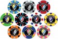
Also, what are your thoughts on my (basic at best) design? Is it too much? Too little? The chip colors and denoms on these aren't 100 accurate as I only have 500 pieces of the 43mm Royals (200 whites, 150 dark blues, 100 reds, 50 green, and 25 yellows), but I couldn't find any better blank Royal picture to use for my design. If you have better pictures, please share them with me. The denoms on those Royals that I do have are correct, however. And... another hurdle I'm sure I'll have is: What are my odds of finding someone to print labels for me w/ the Grateful Dead's Steal Your Face logo on them? It is undoubtedly is copyrighted. I do however see tons of reproduction labels that people have had @Gear & @Wifey and others print, so I'm thinking (hoping) it shouldn't be a problem - IDK. Thoughts?

Please be honest, but also kind. :bag:

TYIA, and "I know this song ain't never going to end..." ;)


EDIT 3-1-21: Latest update is on
this post - LMK what you think - thanks!

EDIT 6-14-21: Final set found here https://www.pokerchipforum.com/thre...g-plush-with-a-royal-flush.56041/post-1532232 ) - LMK what you think & thanks!!!
 

Attachments

  • Mock Up 1.jpg
    Mock Up 1.jpg
    163.3 KB · Views: 863
Last edited:
I actually really like it. I’m not a Grateful Dead fan, but I like the concept. Well done.

Edit to add that you aren’t consistent with the colors you used in your design. Most of them use the middle part of the design as the chip color. But not all.

Also, do you realize you have two $1000 chips?
 
I actually really like it. I’m not a Grateful Dead fan, but I like the concept. Well done.

Edit to add that you aren’t consistent with the colors you used in your design. Most of them use the middle part of the design as the chip color. But not all.

Also, do you realize you have two $1000 chips?
Yeah, and I’ve been fooling around with different color schemes, as some of them didn’t quite look as good as others. I will take it into consideration, and maybe even post pictures with everything matching.

In regards to the two the $1k chips, yeah I was more or less just fooling around with all the denominations other than the colorsi currently own (white, royal blue, red,green and yellow).

Thanks!
 
I also want to say I’ve thought about making two cash sets using pink, yellow, green, and light blue for the Grateful Dead set, and another design for the other colors. Who knows... I do have time on my hands. LOL!
 
Guys... I’m really at a standstill here. I’ve come up with a few designs based off of the one above and although I like this one the best, it seems the demons just screw everything up.

Should I leave this on the one side and the denom on the other? Or what is the basis for others doing this (demons on one side)?

Any thoughts, suggestions, kicks in the ass are much appreciated.
 

Attachments

  • 62460D5F-6377-4D12-BDF6-190F98A4E005.jpeg
    62460D5F-6377-4D12-BDF6-190F98A4E005.jpeg
    160 KB · Views: 330
Yeah, I’ve thought about that, much like similar layouts I’ve see where there’s a design at the top center of the label (be it a pic, logo, stamp, swiggly-whatchamacallit) and the text and demons at the bottom. Maybe I’ll mess around a bit with that idea. IDK...
 
I think you're right, you should try a two-sided design. You're doubling your canvas that way, so you can include all the elements you want without trying to squish them all into one label.
 
I like the idea for the labels. My only word of caution is to watch out for all these matching color elements. Unless you are able to snag a print profile and use a calibrated monitor, you'll likely be disappointed by the printed colors on the labels. They will be close, but not quite accurate.
 
Loving your mockups! Those look really nicely done. Hunter is one of my favorite lyricists... there is always so much going on with his words. He used a lot of card playing references, too.

I grew up in Menlo and P.A. near where they did, but am closer to your age so I missed them by about a generation. Was able to see some shows at Shoreline and Oakland in the(ir) last few years, and tried to catch JGB at the Warfield when I could.

I really like your original design with the denominations, and I agree with the feedback about not strictly needing the writing on top. A bonus to removing it would be that you could make the stealies bigger and the graphic would look less constrained. Just my $0.02. Or maybe $3.50.
 
I’m still fiddling around with this Grateful Dead design, and when reading the previous posts and advice, I forgot to take one bit of advice to heart. Color matching. Doh! How hard is this going to be for these Royal CC’s?

Anyway... here is my latest design (albeit on only one color of chip) based on suggestions above saying that the Gratefull Dead logo is enough for one side of the chip, and my card club (and casino?) name and denomination on the other. Feedback and constructive criticism is welcomed and appreciated.

Side A:
29984507-AA23-4E4A-A451-A43A4ADAEF85.jpeg

Side B:
31F0DF02-527A-4C3A-8521-DC2DE3C83864.jpeg

My thoughts:

Are the different fonts distracting? I want the text “The Rambling Rose” to stand out, but should the other text in the different font match each other (in both size, and style)?

How hard is it to match colors?

Is this by far too complex of a design? I see some chip labels are very simple with only two or three colors.

TYIA
 
Last edited:
I'm not sure side B (with the name and denomination) needs the text in the white space.

Also, maybe it's just an optical illusion, but the white space looks thicker on side A.
 
I'm not sure side B (with the name and denomination) needs the text in the white space.

Also, maybe it's just an optical illusion, but the white space looks thicker on side A.
Ok - thanks! I’ll mess around with this.

And yes, it is wider and something I should have noticed - thanks! Just the kind of thing I’m looking for!
 
Missed this... very cool!

you’ll have to get these too! Lol. GD marketing over the years keeps that big machine rolling!

F37C39E6-0636-4CBF-B588-5153658873A4.jpeg
 
Had a Hawaiian Rosebud sticker on my convertible. Dancing Terrapins on the Caddy and Bertha on the big Lincoln Town Car. Went to many dead shows in those 3 cars, but was never goin down the road feelin bad.
 
Are the different fonts distracting? I want the text “The Rambling Rose” to stand out, but should the other text in the different font match each other (in both size, and style)?

How hard is it to match colors?

Is this by far too complex of a design? I see some chip labels are very simple with only two or three colors.

TYIA

I find the differing fonts make the design more appealing. Maybe experiment with the kerning, to my eyes some of the letters are a bit too close together.

Color matching isn't the easiest thing to do, but getting a good approximation isn't too hard. If you can upload an image with on-screen color that matches that of the chip as it's in your hand, the eyedropper tool will hit it close enough (and if you incorporate a gradient effect to the color you are putting on the label you can get away with being off a bit on the match). Ask Gear to print you a prototype to ensure it meets your expectation before going full production.

The cent sign is a bit thin, both compared to the thickness of the numerals and with regard to it printing well enough for the color to show.

Not too complex at all. The The faded logo under "The Rambling Rose" is an amazing effect.

Solid design :tup:
 
I prefer the Ramble On Rose To The Rambling Rose and just got a little chill up the spine remembering the roar of the crowd after Jerry sung the “Just like New York City “ lyric.
 
I prefer the Ramble On Rose To The Rambling Rose and just got a little chill up the spine remembering the roar of the crowd after Jerry sung the “Just like New York City “ lyric.

I thought about this long and hard (yeah, I know - “thatswhatshesaid”) but a card club (and or casino - still stuck on this too - ?) called “ *The* Ramble On Rose” didn’t quite have the same panache in my opinion as the play-on-words title “The Rambling Rose.” Think I should reconsider? Believe me, ROR is one of my favs and I want to do its due diligence.
 
Just my opinion, but "The Ramble On Rose" sounds like an event (like a meetup tagline), whereas "The Rambling Rose" sounds like a place. I agree with your reasoning @CRAW . I'm not a dead head, though. Maybe you die-hard fans know what kind of outrage this could cause.
 
While I think Rambling Rose does sound better in this application, and is a play on words....the possibility of someone thinking that you simply got it wrong would likely make me want to go with Ramble On Rose instead.
 
I find the differing fonts make the design more appealing. Maybe experiment with the kerning, to my eyes some of the letters are a bit too close together.

Thanks!!!

Color matching isn't the easiest thing to do, but getting a good approximation isn't too hard. If you can upload an image with on-screen color that matches that of the chip as it's in your hand, the eyedropper tool will hit it close enough (and if you incorporate a gradient effect to the color you are putting on the label you can get away with being off a bit on the match). Ask Gear to print you a prototype to ensure it meets your expectation before going full production.

Yeah, I should really get in contact with one of the label printers, and I’m not chipset as I’ve heard good things about them all. Whoever can get my job finished the quickest is who’ll will more than likely get my business.

And this color matching will have to take top priority for me and my OCD.

The cent sign is a bit thin, both compared to the thickness of the numerals and with regard to it printing well enough for the color to show.

Not too complex at all. The The faded logo under "The Rambling Rose" is an amazing effect.

Solid design :tup:

The cent sign is too thin and a piece I struggled with. I’ll have to find a better font for that.

Thanks again - truly! I greatly appreciate the feed back on my maiden Illustrator voyage.
 

Create an account or login to comment

You must be a member in order to leave a comment

Create account

Create an account and join our community. It's easy!

Log in

Already have an account? Log in here.

Back
Top Bottom