My Project: "Sitting Plush with a Royal Flush..." (3 Viewers)

Just my opinion, but "The Ramble On Rose" sounds like an event (like a meetup tagline), whereas "The Rambling Rose" sounds like a place. I agree with your reasoning @CRAW .

My thoughts exactly. It’s driving me batty.

While I thing Rambling Rose does sound better in this application, and is a play on words....the possibility of someone thinking that you simply got it wrong would likely make me want to go with Ramble On Rose instead.

Again, this is my struggle. LOL! I’m just going to have to make a decision.
 
Did you say your name was ramblin’ Rose?...

...is the lyric, I think.

The chorus ending with the line “Ramble on, Rose,” is why I thought the song is named as it is.
 
Did you say your name was ramblin’ Rose?...

...is the lyric, I think.

The chorus ending with the line “Ramble on, Rose,” is why I thought the song is named as it is.

True! Very true.

I like “The Rambling Rose” the more I think about it. I mean why wouldn’t there be something out there called that to pay homage to The Dead and RoR? You know?
 
A lot of great art on their albums. Stanley Mouse was a talented artist who created a lot of the old artwork associated with the GD

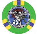
I was just going through my photos and I forgot I did a quick mock-up of the Bertha... It’s a quick and rough idea, but IDK....

89ED7F5E-809C-4CC5-B692-9E33024E6ED6.jpeg
 
I’m still fiddling around with this Grateful Dead design, and when reading the previous posts and advice, I forgot to take one bit of advice to heart. Color matching. Doh! How hard is this going to be for these Royal CC’s?

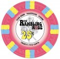
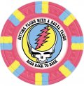
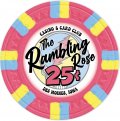
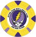
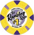
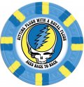
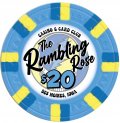
Anyway... here is my latest design (albeit on only one color of chip) based on suggestions above saying that the Gratefull Dead logo is enough for one side of the chip, and my card club (and casino?) name and denomination on the other. Feedback and constructive criticism is welcomed and appreciated.

Side A:
View attachment 638770

Side B:
View attachment 638771

My thoughts:

Are the different fonts distracting? I want the text “The Rambling Rose” to stand out, but should the other text in the different font match each other (in both size, and style)?

How hard is it to match colors?

Is this by far too complex of a design? I see some chip labels are very simple with only two or three colors.

TYIA
I like this design, but want to caution you on the outer ring. You're going to want to design these labels with the main text inside a safe zone reasonably far away from the edge of the label. It's very difficult to print them perfectly aligned with the pre-cut label sheet, so you have to expect some small variance from sheet to sheet. So for example, the thin black ring on the outer edge is going to be a problem, as that's likely within the margin of error, size wise. So you'd end up with one side with a thick black ring (for bleed purposes) and the opposite site with a thinner to nonexistent black ring. If you want to stick with this black ring on the outside (along with all that text up close to the label edge) I'd size everything down 5-10% and make the outside black ring larger.
 
Not to beat a dead hoss, but I kind of thought that rambling was more of a negative type term.. like some scudder who won’t stop talking .
Led Zeppelin song Ramble On always gave me a more positive feeling. Ramble On Rose was Jerry’s go to song if he was trying to pick the band up, or even pick the crowd too. Or if he was in a really good mood and playing well. Huge first set fan favorite as well.
 
Nice work! I caught the bug hard in college, 55 shows during the late 80s and early 90s :cool
Late 80’s early nineties shows in the hockey arenas were the best concerts I ever attended. Spring and fall tours were incredible. I wonder if the label guy is able to use the steal your face logo ? The 13 point bolt a
so has crazy copyright stuff involved too.
 
Late 80’s early nineties shows in the hockey arenas were the best concerts I ever attended. Spring and fall tours were incredible. I wonder if the label guy is able to use the steal your face logo ? The 13 point bolt a
so has crazy copyright stuff involved too.
I have often wondered this as well, and I suppose that better be my very next immediate step. Does anybody know who are all of the label vendors we have on site? I know Gear typically is very busy so I would hate to bother him with a little question like this.

Who else is there? TYIA
 
Here's a $5 chip I picked up from the Hard Rock, Las Vegas back in the 90's sometime.

Hard Rock.png


Btw, I like all of your chips except the $500 black/white/gray. The rest of them have fabulous, vibrant colors, then the $500 is just... blah. (Just my opinion)
 
Here's a $5 chip I picked up from the Hard Rock, Las Vegas back in the 90's sometime.

View attachment 639828

Btw, I like all of your chips except the $500 black/white/gray. The rest of them have fabulous, vibrant colors, then the $500 is just... blah. (Just my opinion)

Cool chip! Thanks for sharing.

Yeah, the chip demons are just for fun and don’t represent my colors at all. In fact I’m still not sure what four colors I currently own I’ll choose to go with.

Thanks for the input!
 
Like I previously mentioned, I should ask if this logo is even printable due to copyright issues before going any further...

So label printers (@Gear, @ABC Gifts and Awards, @BR Pro Poker, anyone else...?), what are your guys' thoughts on printing labels for me with the use of the Grateful Dead "Steal Your Face" logo? Thank you in advance. You all do outstanding work, and come with high praises.

Example:
Dead.jpg

Please let me know, and send me a private message too if you'd rather. Thanks again!
 
I saw this on the Grateful Dead website and it got me thinking:
C53967AF-9384-440E-929B-32DC4A46857D.jpeg

Could you use the skull and put a rose in the middle, maybe fade from blue to red? Would that help satisfy enough of a change? Maybe not...but worth a try.
 
Yeah, @Colquhoun I thought about changing the inside of the Stealie, but I'm pretty much a traditionalist when it comes to things like this logo. BUT if it would get me by as far as copyright infringement, I'd most certainly do something like that, and that's probably what you meant.
 
Always liked space your face, but there have been hundreds of different _____ your face variations
 
Like I previously mentioned, I should ask if this logo is even printable due to copyright issues before going any further...

So label printers (@Gear, @ABC Gifts and Awards, @BR Pro Poker, anyone else...?), what are your guys' thoughts on printing labels for me with the use of the Grateful Dead "Steal Your Face" logo? Thank you in advance. You all do outstanding work, and come with high praises.

Example:
View attachment 640450

Please let me know, and send me a private message too if you'd rather. Thanks again!

Does anyone know where/how I can get a definitive answer on printing copyrighted logos on labels for private use chips?

I haven’t heard from anyone. Is there a better way to reach our label vendors?
 
Very cool idea. I'm not a dead-head but a friend of mine is. When i think of GD, I always think of his crazy cassette tape collection of live concerts and rainbow bears? I think it had a sticker on his car.

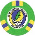
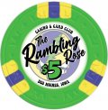
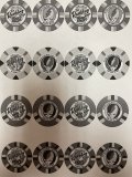
As far as the chips, love the color matching on the skulls. can you re-order the chips by denom? Kind of hard to tell the progression.
 
Like I previously mentioned, I should ask if this logo is even printable due to copyright issues before going any further...

So label printers (@Gear, @ABC Gifts and Awards, @BR Pro Poker, anyone else...?), what are your guys' thoughts on printing labels for me with the use of the Grateful Dead "Steal Your Face" logo? Thank you in advance. You all do outstanding work, and come with high praises.

Example:
View attachment 640450

Please let me know, and send me a private message too if you'd rather. Thanks again!

Unfortunately we cannot print copyrighted images, I'm sorry :(
 
Love it...two sides definitely a good move IMO. Look forward to seeing pics and hearing your thoughts on the color matching (though I dare say it’s going to look really nice regardless). Good luck!
 
Love it...two sides definitely a good move IMO. Look forward to seeing pics and hearing your thoughts on the color matching (though I dare say it’s going to look really nice regardless). Good luck!

Thanks! Now that I’m nearly all squared away on the design, it’s the color matching that has me the most worried now. But others have said the label vendors get it pretty spot-on, or at least that’s all I have ever read.

The color matching and what it will look like printed. I’m going to do that today (print it out and hold it an arms length away) and adjust from there.

Still, if anyone else has any thoughts, suggestions or advice for this Illustrator novice, PLEASE lay it on me.
 
Are you doing labels on Majestic blanks? That must be getting expensive... like into realm of getting custom ceramics.
 
Are you doing labels on Majestic blanks? That must be getting expensive... like into realm of getting custom ceramics.

I don’t know much about ceramics, but they sound fragile, and I’m a newb chipper.

I’m doing blank CC Royals. It’s been over a year-long project so... I’ve spaced it out money wise.
 
These are great!
Thanks!

Right now I’m debating on a $100 chip to “future proof” my set in case my son or daughter use them when they’re my age and everyone is a baller by then. If we’re all still around then... LOL

Typically we just play short handed small stake games (.25/.50) and don’t buy in for much over $50 (if even that).
 

Create an account or login to comment

You must be a member in order to leave a comment

Create account

Create an account and join our community. It's easy!

Log in

Already have an account? Log in here.

Back
Top Bottom