-
PCF is an eBay Partner. If you make a purchase through one of our links, we may earn a commission at no extra cost to you. Thank you for your support!
You are using an out of date browser. It may not display this or other websites correctly.
You should upgrade or use an alternative browser.
You should upgrade or use an alternative browser.
Might do a 43mm IHC 8v Cash Set - Check out this lineup! (2 Viewers)
- Thread starter sheikh617
- Start date
OP
OP
sheikh617
4 of a Kind
Well.... Due to a awesome chipper, I was able to get more SB T1ks! I'll be able to go in my original direction and use one of the most killer yellow chips I've ever seen, as the fiver!
WhiteMamba1646
4 of a Kind
Well.... Due to a awesome chipper, I was able to get more SB T1ks! I'll be able to go in my original direction and use one of the most killer yellow chips I've ever seen, as the fiver!
you will have alot of fun playing with that set. No regrets on my end at all. Hands down my only keeper set is my 43mm set. Glad your going down this path too! Need pics in the future once completed!
OP
OP
sheikh617
4 of a Kind
When I have the 43mm AS chips on the table and i get to shuffle them, the feeling is unreal. Heavy, stack like bricks and the shuffle/sounds is heavenly. I cant wait to get the design finished. This will likely be a once a month set!you will have alot of fun playing with that set. No regrets on my end at all. Hands down my only keeper set is my 43mm set. Glad your going down this path too! Need pics in the future once completed!
Don Clay
Full House
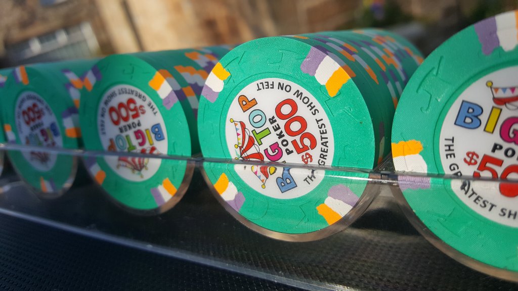
Which orange is that?Alternative: Find BTP $500s and make those your frac
Arc yellow?
OP
OP
sheikh617
4 of a Kind
Black label or white label..... decisions decisions....


Black labels for sure.
OP
OP
sheikh617
4 of a Kind
Really? I'm digging how the white contrasts against the chips. This womt be the actual design on the chips as I'm having a v2 design done especially for this set but I'm so torn on label color.... I was thinking maybe white with a gradient.Black labels for sure.
White label looks ok on the blue chip. I don’t like it on the rest.Really? I'm digging how the white contrasts against the chips. This womt be the actual design on the chips as I'm having a v2 design done especially for this set but I'm so torn on label color.... I was thinking maybe white with a gradient.
OP
OP
sheikh617
4 of a Kind
Yeah I guess the design is really going to influence the label. I sort of like what mamba did with his 43mm chips with have a gradient pattern background type effect. Plain black seems not cool enough for such awesome chips, idk...Really dislike the white. Sorry. It might be the rainbow look to the image, but it makes it look cheap.
Black all the way.
Last edited:
realcdn
Flush
Black labels for me as well. I just think it makes the chip colours really pop.
Also, I know you are planning a new label but my preference would be a standard denomination colour across the lineup as well.
Going to be an epic cash set no matter what!
Also, I know you are planning a new label but my preference would be a standard denomination colour across the lineup as well.
Going to be an epic cash set no matter what!
realcdn
Flush
White label looks ok on the blue chip. I don’t like it on the rest.
Was going to say the exact same!
RocAFella1
Royal Flush
What’s the saying?

(Something like that...)
(Something like that...)
OP
OP
sheikh617
4 of a Kind
Man I'm surprised to see so many folks on team black label. I figured most people would side with a white label, above designs aside since these wont be what's on the chips. Prettt much all the NAGB chops have white labels minus the AS chips and as nice as those chips are the labels are pretty average.
Bright chips—->black label
Darker chips—->white label
That’s my preference.
Darker chips—->white label
That’s my preference.
RocAFella1
Royal Flush
Without ending up in the out of context thread, I almost always prefer the older style labels but in this case, it’s not close.Man I'm surprised to see so many folks on team black label. I figured most people would side with a white label, above designs aside since these wont be what's on the chips. Prettt much all the NAGB chops have white labels minus the AS chips and as nice as those chips are the labels are pretty average.
OP
OP
sheikh617
4 of a Kind
Interesting.... awesome feedback guys will help very much.
Perthmike
Straight Flush
Credit to @WhiteMamba1646 for the idea lol.Yeah I guess the design is really going to influence the label. I sort of like what you did with your 43mm chips with have a gradient pattern background type effect. Plain black seems not cool enough for such awesome chips, idk...
Go back to the drawing board if you aren't feeling it. Try some different designs and see how you feel. Maybe even mock a colour match style too. You can never do too many mocks when doing a new label for an entire set.
hdgeno
Full House
Black labels for me as well. I just think it makes the chip colours really pop.
Also, I know you are planning a new label but my preference would be a standard denomination colour across the lineup as well.
Going to be an epic cash set no matter what!
Yeah black labels/inlays always make the chip colours really shine, black all the way
OP
OP
sheikh617
4 of a Kind
Yeah for sure. I'm not a good designer so the person helping me will probably end up hating meCredit to @WhiteMamba1646 for the idea lol.
Go back to the drawing board if you aren't feeling it. Try some different designs and see how you feel. Maybe even mock a colour match style too. You can never do too many mocks when doing a new label for an entire set.
 . Cant wait for this set to come to fruition. Every time I see the chips I get hyyyyyype.
I think part of it is the black shadow look on the white inlay multicolor city silhouette. Without it it’d look crisper/cleaned I think

Marius L
4 of a Kind
I'm usually a fan of white labels, but here I much prefer the black labels!
WhiteMamba1646
4 of a Kind
im team black for sure, but why not try the same background design at @Perthmike or myself? It works really well
PlayerADK
Flush
I think the main issue with the white label is the Bean Town lettering.
Black Label looks great with white lettering
White Label would look much better with black lettering.
The shadow is apparent on the white label (purposefully) but the shadow disappears on the black label.
Might sound good in theory but may not be super easy to execute - all depends on your design options
OP
OP
sheikh617
4 of a Kind
I didn't wanna be a copy catim team black for sure, but why not try the same background design at @Perthmike or myself? It works really well

WhiteMamba1646
4 of a Kind
I didn't wanna be a copy cat
i get it, you wanna do your own thing. Respect

markleteenie
4 of a Kind
This exactly.I'm usually a fan of white labels, but here I much prefer the black labels!
- Joined
- Nov 22, 2018
- Messages
- 16,602
- Reaction score
- 35,492
- Rewards
- 623
- Location
- 129 West 81st Street, Apartment 5B
Where’s that why not both meme?
Double up on chips, break out the white background labels in June/July and maybe winter holidays, run the black background the rest of the year. When you host your meetup, throw em all in together
Double up on chips, break out the white background labels in June/July and maybe winter holidays, run the black background the rest of the year. When you host your meetup, throw em all in together
Similar threads
- Replies
- 87
- Views
- 2K
- Replies
- 20
- Views
- 416
- Replies
- 9
- Views
- 571
- Replies
- 9
- Views
- 915