Poker Zombie
Royal Flush
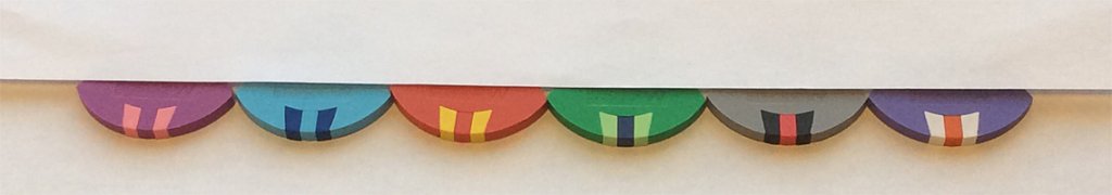
The socks problem is a little less obvious on the Siam, because there is so much pink. No issue with the blue or green, because I've never seen blue or green bleed onto white.
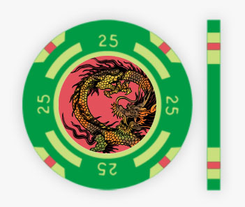
I had no issues with set 2, though Set 1 and 3's (in that order) 25s were better.
I had no issues with set 2, though Set 1 and 3's (in that order) 25s were better.
")


 :
: