jdub
Pair
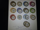
You've seen my first attempt at a die-sub printed ceramic. I've done additional work filling out the range of denominations and picking out a color scheme.
Observe that I use the 554 denomination progression to eliminate 2X steps in chip denomination. This deletes the 2X step from 500 to 1000 and elsewhere.
Today I am actually requesting feedback, specifically on color selection. I've tried to avoid non-contrasting colors within a four denomination spread. I'm concerned about the purples being to close to the blacks. You'll see that I re-use colors, but they are far apart and so should not be on the table at the same time.
I try to use bog standard "Vegas" colors in the $1,5,25,100,500 range to avoid confusion for what most people are accustomed to. The only variation being that Navy Blue replaces black.
I plan to have progressive artwork for each denomination. For now, the submarine warfare insignia will serve as a placeholder for art. The hope is to use war time propaganda posters.
Some thoughts I have:
Based on input here, I am going to do a test run with the die-sub and my new heatpress. I don't have the poker chip attachment yet. Coming soon. I can do the faces though.
@grebe @Thomacetti @Seeking Alpha Social Club
Observe that I use the 554 denomination progression to eliminate 2X steps in chip denomination. This deletes the 2X step from 500 to 1000 and elsewhere.
Today I am actually requesting feedback, specifically on color selection. I've tried to avoid non-contrasting colors within a four denomination spread. I'm concerned about the purples being to close to the blacks. You'll see that I re-use colors, but they are far apart and so should not be on the table at the same time.
I try to use bog standard "Vegas" colors in the $1,5,25,100,500 range to avoid confusion for what most people are accustomed to. The only variation being that Navy Blue replaces black.
I plan to have progressive artwork for each denomination. For now, the submarine warfare insignia will serve as a placeholder for art. The hope is to use war time propaganda posters.
Some thoughts I have:
- The yellow $2500 chip should have a contrasting color rope, perhaps white.
- The $100 and $1M chip should have contrasting edges on the rope, perhaps grey rather than black.
- That green $25 chip is ugly in print.
- Gotta have a pink.
- I might need an orange.
- I like lime, but lime doesn't fit well with the darker colors I'm using here.
Based on input here, I am going to do a test run with the die-sub and my new heatpress. I don't have the poker chip attachment yet. Coming soon. I can do the faces though.
@grebe @Thomacetti @Seeking Alpha Social Club
Attachments
Last edited:
")