Greek Mould Custom Feedback (1 Viewer)

OzzieJim

High Hand
Joined
Dec 9, 2023
Messages
91
Reaction score
107
Location
Brisbane, Australia
Hi team,

Have had these designed for me, will keep the artist anonymous for unbiased feedback.

Would be keen to hear your thoughts!
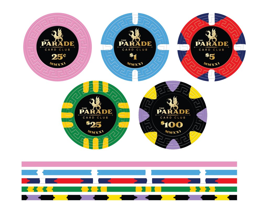
Parade Card Club.jpg


Reference points were:

.25 - Solid Pink
$1 - Paris $1
$5 - Australian Flag
$25 - Australian Sporting Colours
$100 - Jacaranda Tree and Golden Wattle for edge spots.
 
Hi team,

Have had these designed for me, will keep the artist anonymous for unbiased feedback.

Would be keen to hear your thoughts!

View attachment 1268666


Reference points were:

.25 - Solid Pink
$1 - Paris $1
$5 - Australian Flag
$25 - Australian Sporting Colours
$100 - Jacaranda Tree and Golden Wattle for edge spots.
Looks like a homerun!
 
Id make the the $1 dollar the aussie flag but with a blue base instead.

Go with a two tone gold on the 25 or make a yellow base chip with two tone green.

you can make a red 5 with colours from the outback. you know red dirt.

on the hundos you could have the colour of the qld state flower instead of wattle. or a maroon spot somewhere if you follow nrl.

if you dont use yellow as a $20. you could have a solid yellow frac to represent wattle.


Edit. colour pallete is limited by the tool but did my best to try and illustrate the above.

1707283897886.png


1707283970452.png

inspo for the $5
 
Last edited:
Id make the the $1 dollar the aussie flag but with a blue base instead.

Go with a two tone gold on the 25 or make a yellow base chip with two tone green.

you can make a red 5 with colours from the outback. you know red dirt.

on the hundos you could have the colour of the qld state flower instead of wattle. or a maroon spot somewhere if you follow nrl.

if you dont use yellow as a $20. you could have a solid yellow frac to represent wattle.
It's funny because pretty much everything mentioned did go through my original thought process.

I love the Paris $1 chip. I think it is the best in class so I wanted to stick with it. I did have the $100 mocked up with a navy blue base but I didn't feel it was dark enough.

For the $5 I did originally think maroon for Broncos with gold/yellow spots but I find the more vibrant red appealing and felt the gold spots were already somewhat overused across the 25/100.

If I went $20 over $25 I would 100% invert it to yellow with green. Might end up adding a yellow $20 if I want a low stakes limit expansion - but will need a new edge spot colour to avoid clashing, not that the 20 and 25 would ever be in play together.

Unfortunately the Queensland state flower, the Cooktown Orchid, is basically the same colour as a jacaranda tree's flowers haha. I have a jacaranda tree in my front yard so it's pretty applicable as a reference. I do like the two tone purple though.

I like the outback red dirt themed chip. Might keep it in the back pocket for a tournament chip or a weird additional denom, but I personally think the darker colour isn't suited to the workhorse. I like the mountains of $5's to pop.
 
I like the mountains of $5's to pop.
if thats your aim then you should be focusing on the edges more than the face because thats what you see in stacks.

love the Paris $1 chip. I think it is the best in class so I wanted to stick with it.

my issue is you have 418 spots in white on adjoining chips. its feels repetitive
 
Last edited:
You asked for feedback, so I think it is only fair to give you honest feedback.

First, a little factoid- Tina doesn't charge extra for cool spot patterns and extra colors. Might just be me personally, but I don't understand why anyone gets Tina chips made with solid colors and super simple spot patterns.

Quarter & dollar - sorry, but boring... Do something fun with these chips. If you play micro stakes games, then these two denoms might make up 75% or more of all the chips on the table. Splash those pots with some splashy color! Nothing inherently wrong with the base colors, but add some larger spots and more/better colors.

$5 - Great looking chip!

$25 - Great spot pattern, but you ruined it with only one color. Just like above, why not spiff it up a bit with a three color bear claw?

$100 - Another good one as it. I love 8Vs.

Label isn't bad, but it gives off strong vibes to one of the Apache china clay chips. Majestics maybe?
 
Not a fan of white spots next to white spots, or yellow spots next to yellow spots.
 

Create an account or login to comment

You must be a member in order to leave a comment

Create account

Create an account and join our community. It's easy!

Log in

Already have an account? Log in here.

Back
Top Bottom