sat guru
Two Pair
I've had this set since 2016 and been meaning to post it. Only getting around to it now. I have enjoyed reading and learning from other people's creative processes so I am adding mine in case it is helpful.
Concept: A long time ago, far, far away, I was thinking about having a custom Chipco set made. I had an idea that I had started working on and was poking around on the Big Blue Board I came across these:

It wasm't exactly my concept but was close enough that I didn't feel I could have my design made without people thinking I had copied WijWij (more pics in the "Gone But Not Forgotten Thread."
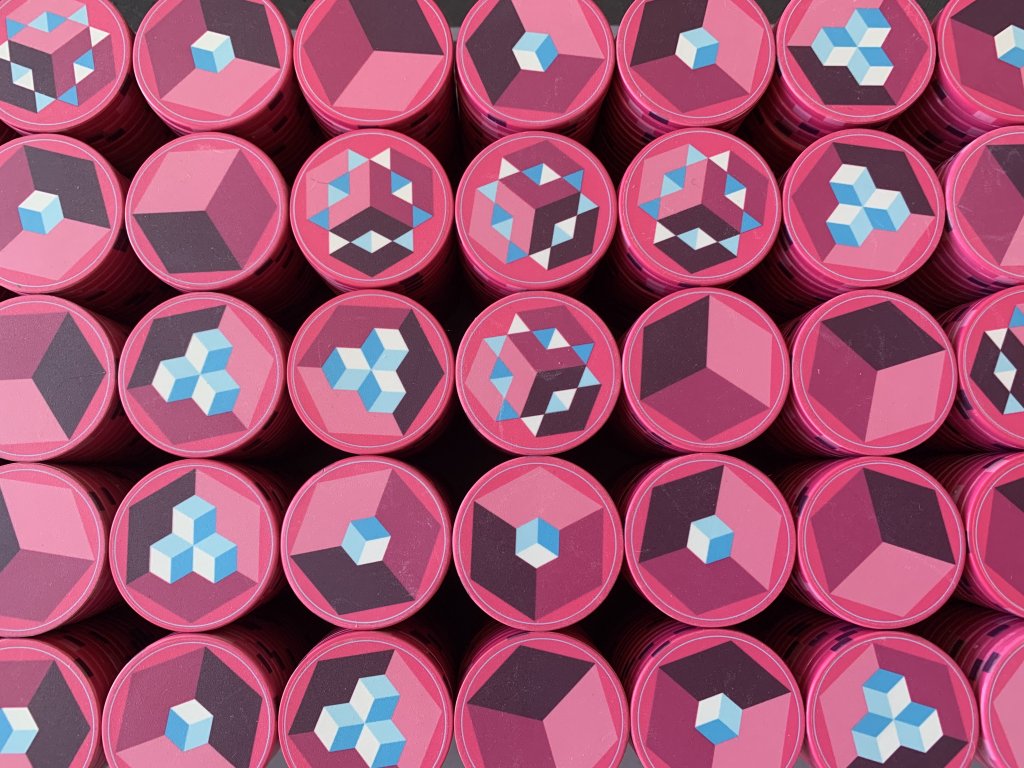
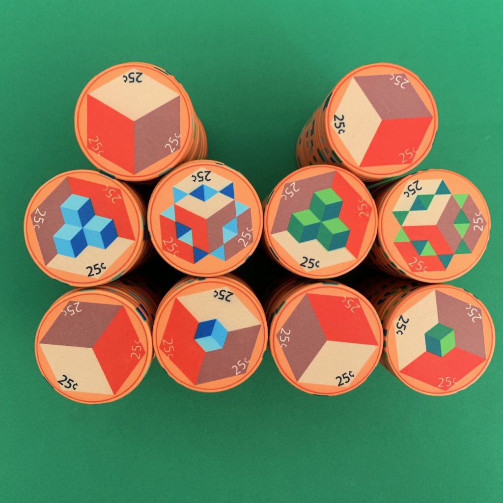
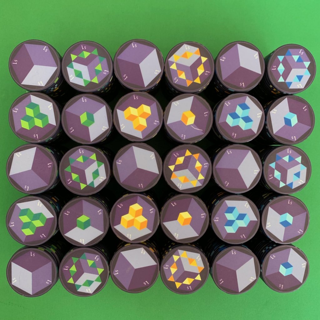
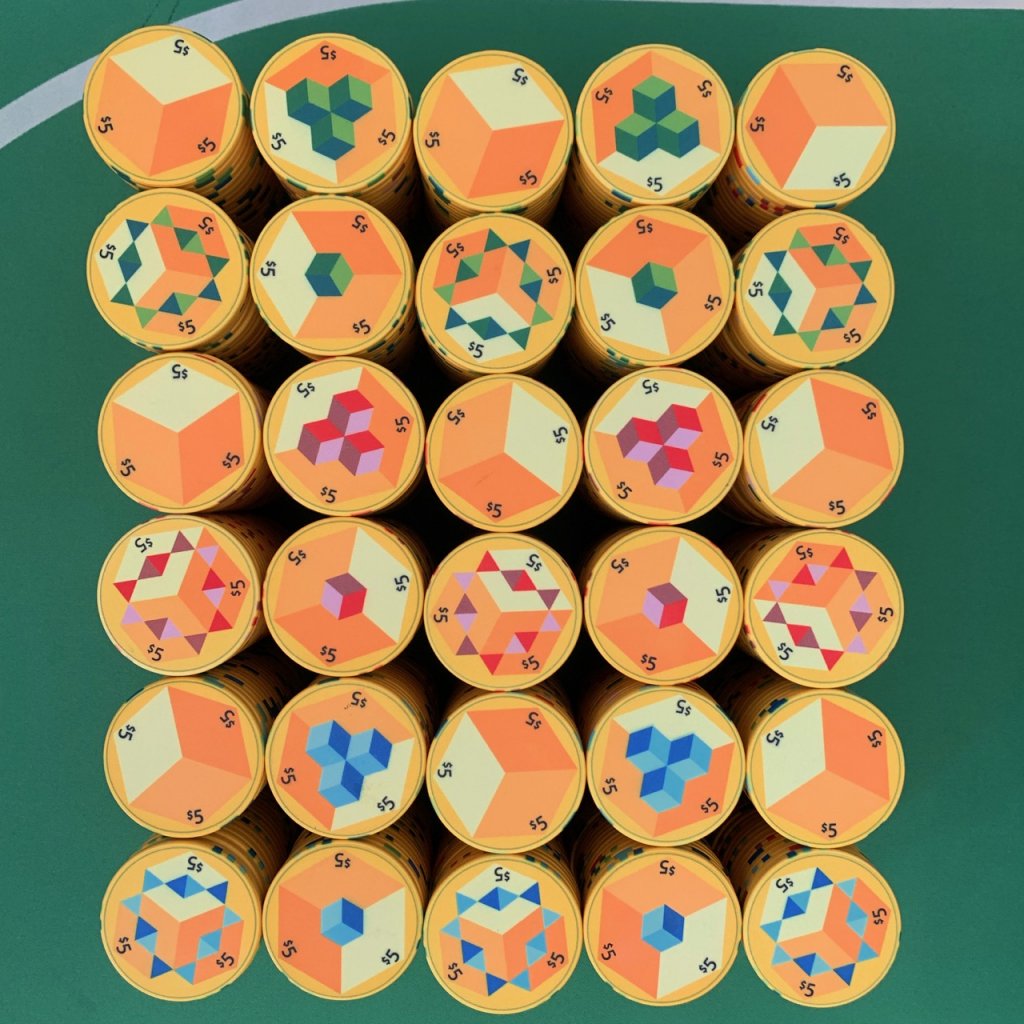
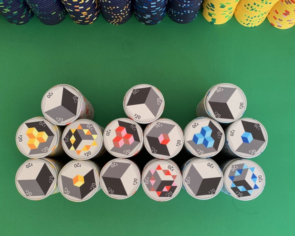
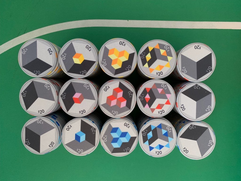
I put the design on hold and came back to it in 2014 or so. I noodled around with a few concepts and came up with a conceptually design but I call it the exploding cubes. The faces progress through four designs from a flat cube to an exploding cube. (The third face has similar elements to Wijwij's chips.)
A friend had introduced me to Adobe Illustrator and given me access to it. (I'm not a designer by any means, and have never had any "art" training but I'm a scientist.) And dammit, scientists are creative plus there is a symmetry to these that was easily solved with some quick arithmetic and help from my friend how to actually use illustrator. (There are lots of online tutorials which are helpful.) . So the design is by me and given my limited abilities I am pretty chuffed with how these turned out.
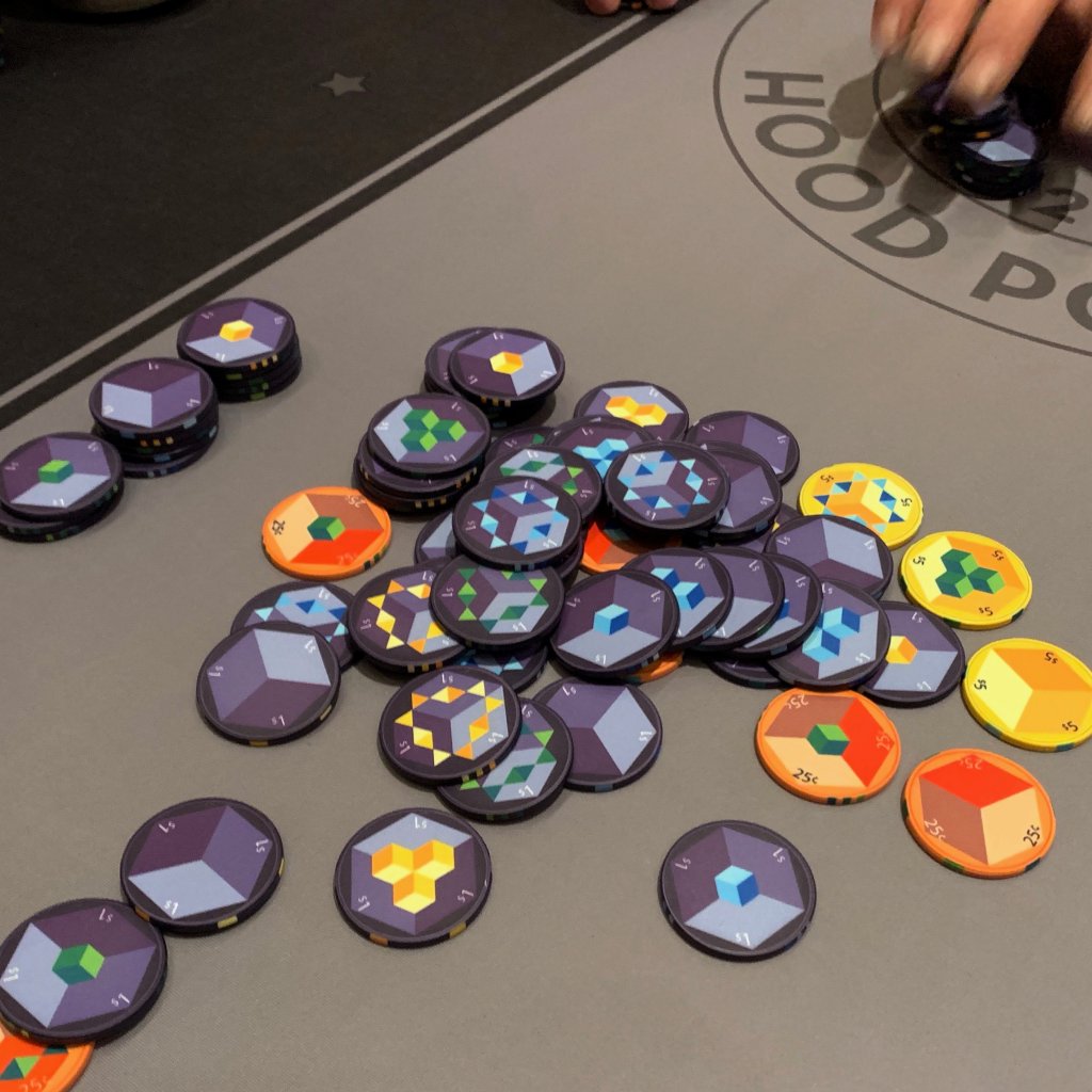
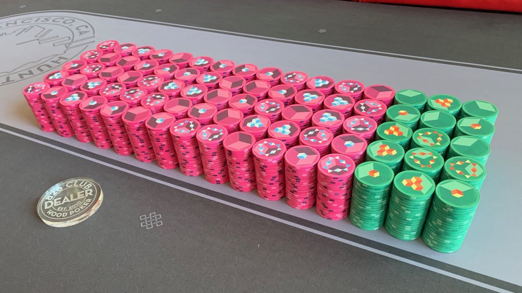
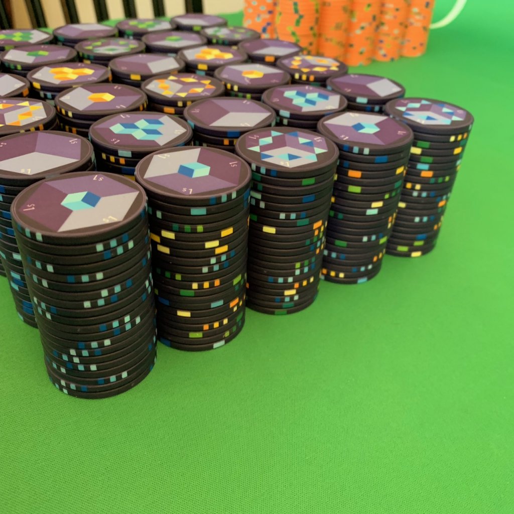
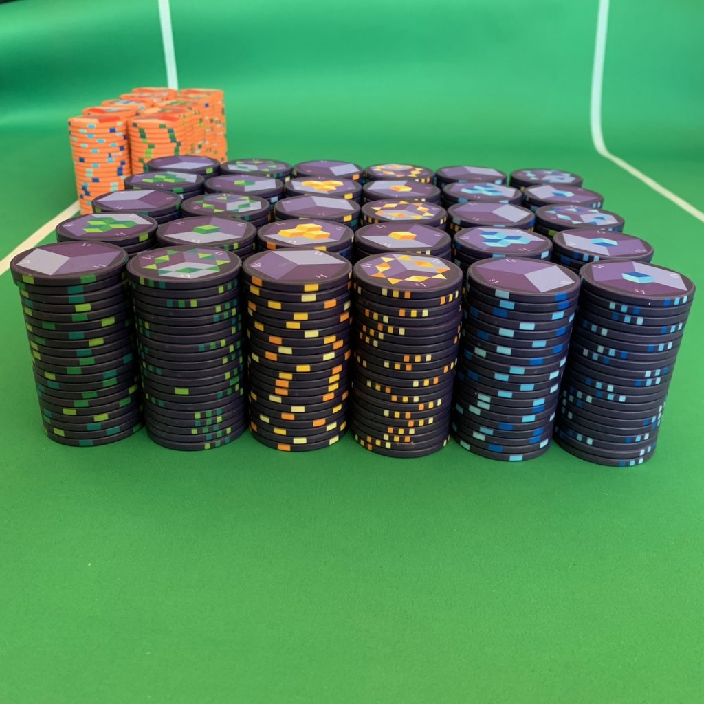
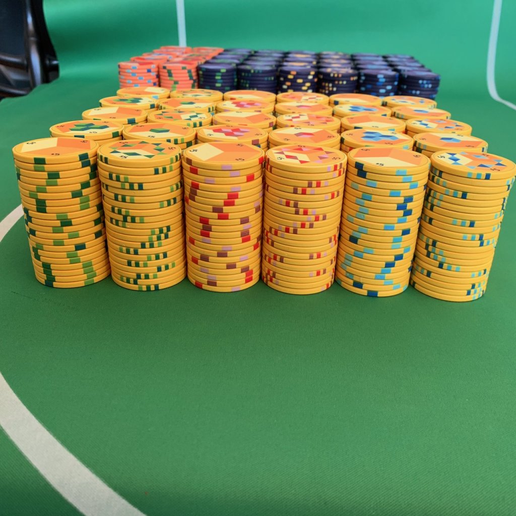
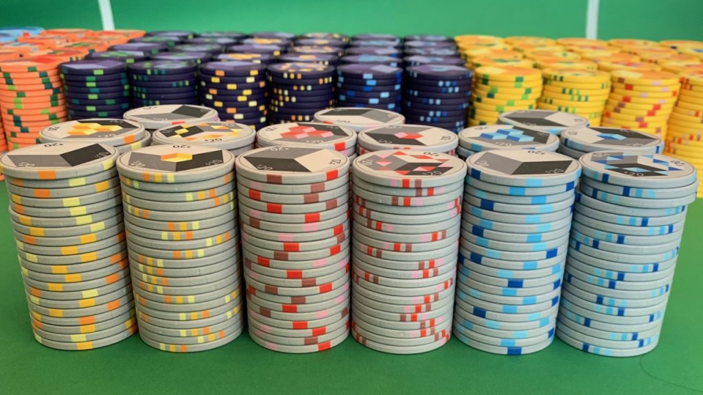
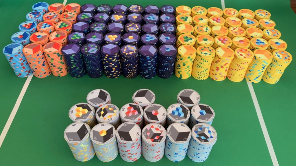
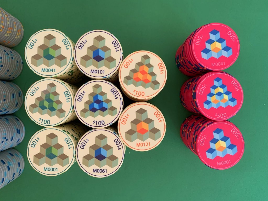
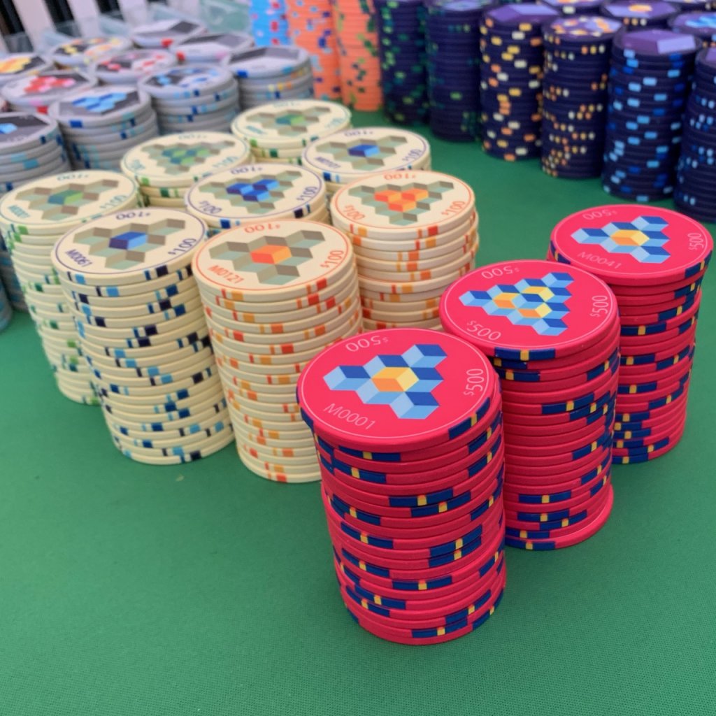
I like big sets and ceramics are much cheaper than clay so I decided to get a large set (2,000 total) and have a bank that my great-grandkids can still use. When I started I didn't have major wants other than the design elements, a purple $1, Calif. colors, sequentially numbered 44mm $100 and $500, and I wanted the chips to be bright and visually interesting. Hence I decided to use four different shades of the base color and three different shades of contrasting colors (sometimes multiple contrasting colors in one denomination). Other than the $1 I picked pretty standard Calif. colors, but went with grey for the $20 because the $1 is so dark.
I also wanted a bank to be able to spread from small to large games (should that ever occur).
I think the different shades add to the chip and the contrasting colors give the chips some interesting colors. The actual colors are exceptionally vivid and the printing quality is fantastic. The only thing I didn't realize was that I was limited to the Chipco palate and the off-white that I chose for the $100 became a sandy color. If I had known this I would have left them white.
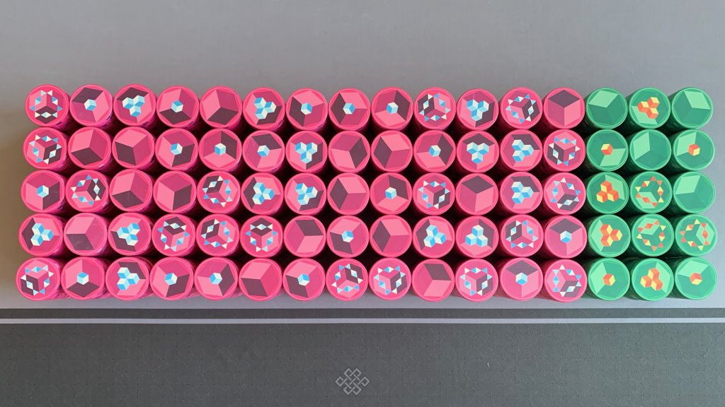
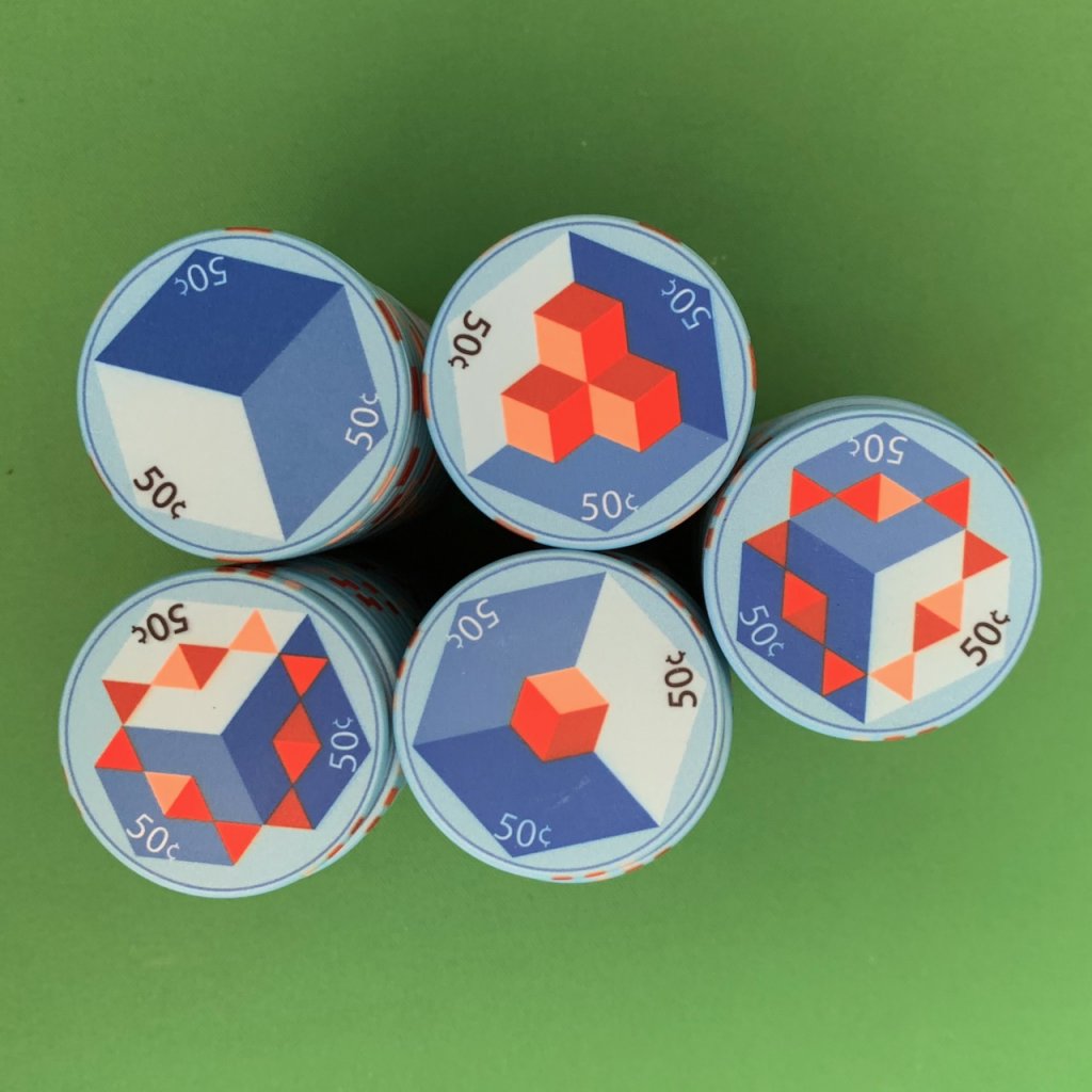
To give you a sense of how the colors work within a denomination, here are the 50¢:
So for each design there are four faces so each chip of similar color and denomination has a different face on each side.
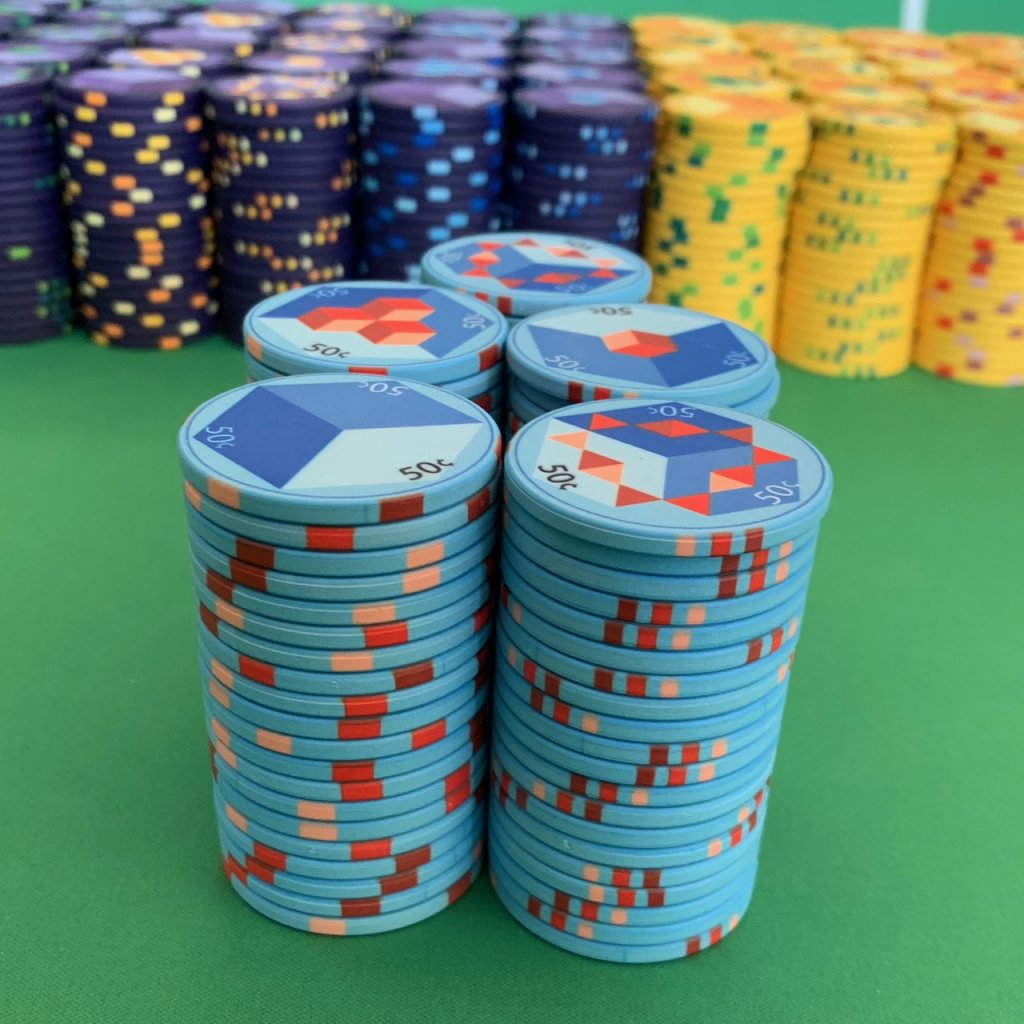
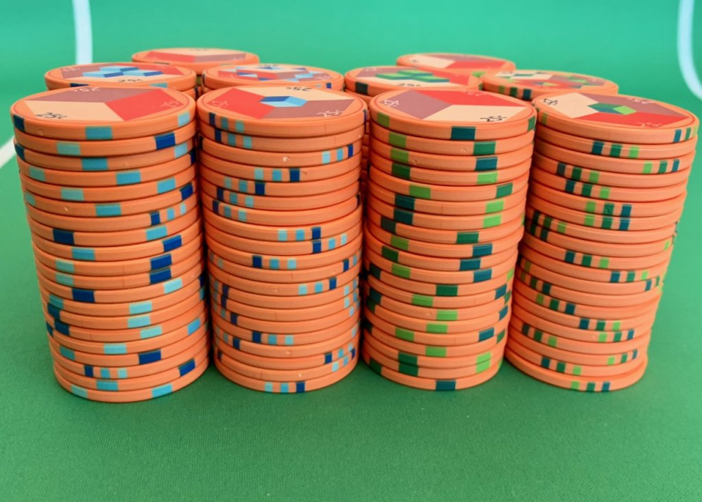
I also changed the edgespot pattern depending on the faces which used the three contrasting colors on the edge. (In retrospect I would have gone with 6TA14 for all of the chips). Here is what mixed stacks for the $1s:
Overall I'm really pleased with how these turn out and how they play.
Concept: A long time ago, far, far away, I was thinking about having a custom Chipco set made. I had an idea that I had started working on and was poking around on the Big Blue Board I came across these:
It wasm't exactly my concept but was close enough that I didn't feel I could have my design made without people thinking I had copied WijWij (more pics in the "Gone But Not Forgotten Thread."
I put the design on hold and came back to it in 2014 or so. I noodled around with a few concepts and came up with a conceptually design but I call it the exploding cubes. The faces progress through four designs from a flat cube to an exploding cube. (The third face has similar elements to Wijwij's chips.)
A friend had introduced me to Adobe Illustrator and given me access to it. (I'm not a designer by any means, and have never had any "art" training but I'm a scientist.) And dammit, scientists are creative plus there is a symmetry to these that was easily solved with some quick arithmetic and help from my friend how to actually use illustrator. (There are lots of online tutorials which are helpful.) . So the design is by me and given my limited abilities I am pretty chuffed with how these turned out.
I like big sets and ceramics are much cheaper than clay so I decided to get a large set (2,000 total) and have a bank that my great-grandkids can still use. When I started I didn't have major wants other than the design elements, a purple $1, Calif. colors, sequentially numbered 44mm $100 and $500, and I wanted the chips to be bright and visually interesting. Hence I decided to use four different shades of the base color and three different shades of contrasting colors (sometimes multiple contrasting colors in one denomination). Other than the $1 I picked pretty standard Calif. colors, but went with grey for the $20 because the $1 is so dark.
I also wanted a bank to be able to spread from small to large games (should that ever occur).
| Color | Denom | Amount | Bank |
| Salmon | $0.25 | 200 | $50.00 |
| Blue | $0.50 | 100 | $50.00 |
| Purple | $1 | 600 | $600.00 |
| Yellow | $5 | 600 | $3,000.00 |
| Charcoal | $20 | 300 | $6,000.00 |
| Sandy White | $100 | 140 | $14,000.00 |
| Hot Pink | $500 | 60 | $30,000.00 |
| Totals | 2000 | $53,700.00 |
I think the different shades add to the chip and the contrasting colors give the chips some interesting colors. The actual colors are exceptionally vivid and the printing quality is fantastic. The only thing I didn't realize was that I was limited to the Chipco palate and the off-white that I chose for the $100 became a sandy color. If I had known this I would have left them white.
To give you a sense of how the colors work within a denomination, here are the 50¢:
So for each design there are four faces so each chip of similar color and denomination has a different face on each side.
I also changed the edgespot pattern depending on the faces which used the three contrasting colors on the edge. (In retrospect I would have gone with 6TA14 for all of the chips). Here is what mixed stacks for the $1s:
Overall I'm really pleased with how these turn out and how they play.
Last edited: