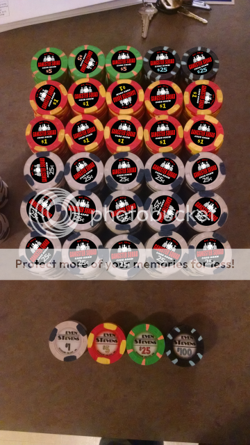
I like this rendition, re denomination colors/font/no-border and gangster configuration.
Overall, the images look 'high' to me -- text a little too close to the edge at the top, and too much unused space at the bottom (especially the green chip). A little tweaking should fix it.
Have you considered a more traditional color line-up? I'd be very tempted to go with 25c white, $1 black, $5 red, and $25 green, or 25c black, $1 white, $5 red, $25 green.... which would probably be less confusing for your players. Also gets those awesome black chips immediately into play.
I'll make a light grey one and see how that looks. Thanks for the suggestions everyone. I'm by no means a great designer so I appreciate the tips and suggestions.
Spike, I'll be using the single pip boy gangster in my next set which will feature a whole slew of pipboy characters from Fallout
Here's the sample with a light grey 25 cent and no white borders on any of the denominations. I think this is my favorite so far. Thoughts and suggestions?
View attachment 3763