Feedback on label design (1 Viewer)

Design-wise, I think it's getting a lot better.

Regarding the denomination font, I think the problem lies in the white outline -- it needs to be thicker/bolder. They all look pretty crappy to me (sorta like a bad photocopy; very grainy).

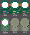
Hate the nipples on the titties.

No offense, but if you get this close-to-final condition, I'd strongly advise turning it over to a design pro for the final polishing effort. Well worth the money imo....
 
A few denom font options:
font9.giffont8.giffont7.giffont6.giffont5.giffont4.giffont3.giffont2.giffont1.gif
 
A couple of things to try, Outlining the dancers maybe with same color as the denom or a lighter gray. Also give the dancers a gradient to give them more dimension. Not sure about the font, when picking a font try all the different denominations to see what they all will look like. Assuming you are going with standard denomination 0,1,2,5 are the numbers you want to see when testing fonts. Just looking quick, out of your options I like row 2 far right but without the lines. Also use search google images to look for 'elegant number fonts' or something like that to get an idea of what you like.
 
I think this is getting the right vibe, how do you feel about it?


attachment.php


↑▲↑▲↑ ▲↑This side is good to go, IMHO. Use this font for the denom. ▲↑▲↑▲↑▲↑
Unless you want to make very minor tweaks, (Text outline, kerning bottom text ect.)


attachment.php


↑▲↑▲↑ ▲↑ This side is almost ready. ▲↑▲↑▲↑▲↑

Have you tried using the number word (ONE HUNDRED) for the denom across the moon to distinguish the reverse a bit more from obverse. Also try making the moon the same color as the dancers to see how that might look.

As always, it all comes down to your personal preference
.
 
Also use search google images to look for 'elegant number fonts' or something like that to get an idea of what you like.

Just to understand better, when you say elegant fonts, are you talking about script? I've shied away from them just from worrying that it might not be bold enough.
 
Just to understand better, when you say elegant fonts, are you talking about script? I've shied away from them just from worrying that it might not be bold enough.
'elegant number fonts' was just a sample of what you would type in the search to see what it brings back. You could use any adjective for the style you are looking for.

Are you using a vector based tool like illustrator? If you like a font but want it bolder, you can do it in a couple of steps in illustrator, not sure about other tools. Here is an example where i made snell roundhand black script a little bolder. I liked the style but needed it bolder.
test numbers.jpg
 
I am using Illustrator. Here's a couple other tries. the one on the left has a font from above, but in different numbers now. the middle one is a new font. added an outline to the dancers.
font11.giffont10.giffont12.gif
 
Last edited:
I don't think there's anything wrong with using a fancier font on this one. I'd really like to see more of what you want the chips to look like as well!

These suggestions have been helpful, and allow me to try different ideas to see what I like. I've liked a lot of the suggestions and the design has come a long way in a short period of time.
 
Overall I think you are looking pretty good. The biggest issue to me is the resolution seems like it just isn't very good.

Resolution? I think that's just a function of the Poker Factory tool shrinking the gif file in that program. Here's the normal resolution of the gif for the 500:
500a.gif
 
Resolution? I think that's just a function of the Poker Factory tool shrinking the gif file in that program. Here's the normal resolution of the gif for the 500:
View attachment 6291

Maybe, I'm not an expert on the subject. Your edge spot progression looks good to me. I think you're on the right track.
 
best advice i was ever given was to pay for the CPC color samples. the colors on teh chipfactory arent even close to what they look like in person
 
The denomination font seems too dark to me. And, of course, both the colors from the 25 are on the 500, which doesn't allow for much variety.
 
I have some concern about the graphics file and how it will show when they print to the insert - especially the white border around the dancers. Might be safer to go without the white border. Perhaps those more experienced with going from different file types to print can chime in.

I'm not the best to comment on color and spots - but I like them.
 
something like this
squareoneonchip.jpg
 

Attachments

  • Screen Shot 2015-02-04 at 1.50.57 PM.png
    Screen Shot 2015-02-04 at 1.50.57 PM.png
    128.2 KB · Views: 171
Last edited:
Nice. I really like the top one with the gradient effect. But the denom needs to have a black outline, not a white one.

You could do a 2 sided design with one black inlay and one white inlay. But both are nice by themselves also.

Like the simple spot/colour combo you've used also. But the 25 bugs me using the same colors as the 500 (just personal preference) I've attached a couple other colour combos to consider. If you're sold on a green and purple maybe try different shades.
 

Attachments

  • image.jpg
    image.jpg
    55.6 KB · Views: 157
thanks for the feedback. I've tweaked a little more, trying a different color gradient and trying to make the fonts a little bolder, easier to read. also leaning more toward a CSQ mold now. For whatever reason, just makes more sense in my head than the FDL, which has nothing to do with Argentina or tango or anything. CSQ feels reminiscent of the brick/cobblestone streets of Buenos Aires. (or at least I'm telling myself)

Screen Shot 2015-02-05 at 6.28.50 AM.png
 
  • Like
Reactions: 72o
Holy smokes. This is fantastic.
Agreed, this is the best inlay yet, esp if outline of the font were in black. I like the gray gradient, not sure other colors would have the classic look desired.

CSQ mold is awesome for these. You could go with 1" inlays.
 

Create an account or login to comment

You must be a member in order to leave a comment

Create account

Create an account and join our community. It's easy!

Log in

Already have an account? Log in here.

Back
Top Bottom