Feedback on Ceramic Customs (1 Viewer)

Old State

Full House
Joined
Jul 20, 2016
Messages
3,011
Reaction score
4,816
Location
Directly above the center of the Earth
For the first time in 18 years I’m buying new custom chips!! I originally joined the forum to research options but never got around to it. I’ve been using my ASM set for the all this time and I think it needs a break. This will be a cash only set ordered in quantities to cover from .50/.50 to $2/5

I decided to go ceramic this time for the artwork potential and will be using BR PRO. I loved the sample set I got and have decided on 43mm with a front and back design. My Father is a retired art director and has been working on the design for the last few weeks. He is slow but what can I expect for free labor ;)

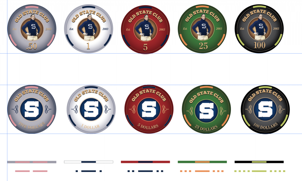
Here is what we have come up with so far. I’m interested in general thoughts but also input on the edge spot design. I was trying to pull the top edge spots in from edge to avoid having to align but will do that if you all feel it to be critical. I could also make the edge spots a different design. Do you think I need some progression?

As for the .50 and $1 Chip I’m worried the text looks washed out and just asked my Dad to try it in navy blue …but he is favoring the way it looks.
Also may change the denomination text on the back to “One” “Five”, “Twenty-five” etc

Thanks so much!
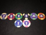
PS: Im including a pic of my old ASM chips so you can see the general theme that I’m trying to stay a little connected to. I’m moving to Old State Club vs Old State Card Club because my basement has a bar….so the “club” is more than poker ;)
74481D33-4B89-4CE9-9061-FF425A103F94.png
10B01D99-E2FA-4DC1-B624-81FBB0A5C914.jpeg
 
Last edited:
For the 50c and $1 chip, I think the "Old State Club" text will be fine in that color, but the "Est. 2003" and denomination might be washed out.

Also, on your 50c chip the written denomination says "Five Dollars".

The inconsistency in the text and squiggly design colors would bother me. On some chips they're all the same color, some alternate. I think the squiggly pattern on one side, and the Est 2003 on the other side should be the same color (not the case in your 50c chip).

I don't understand the edge artwork, what's happening with the art that's below the edge artwork (the ones with the dots)?

A couple of tweaks and I think you have an awesome set.
Thanks for the feedback.

My Dad just made a typo on the .50.

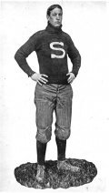
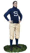
I was also wondering about the text. I think he was trying to the original font from the ASM chips. These are Penn State theme (my alma mater) so the top font is a collegiate block font. The guy in the front is “Mother” Dunn their first all American line backer. He colorized it from black and white. I was going to use the girl in my avatar but my dad and some friends thought she was creepy looking (pics s from a 1905 game day program) That’s the logo I used for my bar menus ;)

As for the edge spots he was just showing options. I was thinking originally of just soldi colored spots with a progression but may just used solid spots in the same number.

You may be right with the “est 2003” comment…he probably overlooked that. He is re-tweaking it today to see some other slight variations and I’ll post those when I get them.

My Dad isn’t a chip guy so I sent him dozens of pics to take inspiration from and point out features I like. I wanted an antique feel. The inspiration for these was these chips
4E44F921-6C58-46C5-90B6-F914CA36EFB6.jpeg
 
Last edited:
I agree with your friends, the Mother Dunn is the better choice for the chips.

For the edgespots, personally I like the progression idea.

A couple of other random thoughts

- The edgespot color for the 1 and the 5 are the same, maybe try something different for the 5? yellow?

- For the 50c and 1 chip, I would keep the color of "Old State Club", but make the the denomination, squiggly, and Est 2003 all in navy.

- Get samples made before you do full production. For the 5, 25 and 100 I would get two different samples made, one as is, and one where the squiggly and Est 2003 are a little more bold. In my experience, printing something that small in a light color on a dark background can give you weird results. It might end up being almost invisible, especially on the 100.


Last thought: Is there a better word that "squiggly" ? :LOL: :laugh: :LOL: :laugh: I'm sure that thing has a real name, I just don't know it!
Good idea on two sample runs. I was just playing on one
 
I agree with your friends, the Mother Dunn is the better choice for the chips.

For the edgespots, personally I like the progression idea.

A couple of other random thoughts

- The edgespot color for the 1 and the 5 are the same, maybe try something different for the 5? yellow?

- For the 50c and 1 chip, I would keep the color of "Old State Club", but make the the denomination, squiggly, and Est 2003 all in navy.

- Get samples made before you do full production. For the 5, 25 and 100 I would get two different samples made, one as is, and one where the squiggly and Est 2003 are a little more bold. In my experience, printing something that small in a light color on a dark background can give you weird results. It might end up being almost invisible, especially on the 100.


Last thought: Is there a better word that "squiggly" ? :LOL: :laugh: :LOL: :laugh: I'm sure that thing has a real name, I just don't know it!
Agree with all of this.

I believe the term for the "squiggly" lines is "flourish". If you search for "Flourish clip art" using Google, you will find numerous examples.
 
Another thing I just noticed. The edge artwork looks like it color matches to the lighter color that's near the center of the chip, not the darker color of the gradient that's close to the edge on the face of the chip. It's most noticeable on the 50c and 1. I think you would want to color match the edge artwork to the color that is closest to the edge.
 
For the first time in 18 years I’m buying new custom chips!! I originally joined the forum to research options but never got around to it. I’ve been using my ASM set for the all this time and I think it needs a break. This will be a cash only set ordered in quantities to cover from .50/.50 to $2/5

I decided to go ceramic this time for the artwork potential and will be using BR PRO. I loved the sample set I got and have decided on 43mm with a front and back design. My Father is a retired art director and has been working on the design for the last few weeks. He is slow but what can I expect for free labor ;)

Here is what we have come up with so far. I’m interested in general thoughts but also input on the edge spot design. I was trying to pull the top edge spots in from edge to avoid having to align but will do that if you all feel it to be critical. I could also make the edge spots a different design. Do you think I need some progression?

As for the .50 and $1 Chip I’m worried the text looks washed out and just asked my Dad to try it in navy blue …but he is favoring the way it looks.
Also may change the denomination text on the back to “One” “Five”, “Twenty-five” etc

Thanks so much!
PS: Im including a pic of my old ASM chips so you can see the general theme that I’m trying to stay a little connected to. I’m moving to Old State Club vs Old State Card Club because my basement has a bar….so the “club” is more than poker ;)View attachment 763035View attachment 763036
Top Row:
  • I might tighten up the gradient on the 50c, so it prints a bit darker blue overall
  • I want to say try the "Old State Club" a bit bigger
  • Definitely bigger with the Est. 2003
  • I do also find the bottom half to be unbalanced, you could try adding the location on either side of the denom, the "Est." & "2003" there as well
Bottom Row:
  • These have some alignment issues that needs to be adjusted across the board in both the top and bottom text.
General
  • That green colour on the 100, I don't think you'll be happy with it. It will print out a muddy kind of green.
  • Ensure you're using a rich black (CMYK values all 100%) so that hundo doesnt come out on the grey/charcoal side.
My Dad is currently revising several things on these so this isn’t a final proof to this is just a late stage concept post. On the bottom text I think I’m going with just “one”, “five” etc. to better align it visually
I’ll tell my Dad about the colors and make sure he feels they will print. I’ll also ask BR Pro their thought when I send the final versions in plus get proof batch printed.

What color green are you thinking? Lighter?
 
BR Pro will also tell you if the .50 and the 1 are too close together to be recognizable. From the mockups they look like they'll be totally indeterminable together.
 
Thanks for all the responses so far. I have my Dad working in the gradients to deepen them up on the green and black and lighten them on the white and frac. I had my dad send the chips flat without gradient and they looks bad and cheap.
In the meantime here are some corrections he made as of this morning and two color options for the .50.

What color do you prefer on the frac?

@allforcharity , I get what you are saying in the photorealistic pic and I would agree in most cases. It was a thought but I felt between the colorization and age and lack of clarity of the pic that it didn’t look bad. What do others think?

Also changed the denomination on the white to navy for better clarity. Does the inconsistency bother anyone?


CCE20178-5491-4E8F-8A92-E42A621FB4E8.png
0479E869-844C-4277-A211-17FD0B174689.png
 
New colors are MUCH better. I would go with blue instead of purple myself.

I don't see the issue with the realistic pic? Working with BR Pro is a dream and they will work with you to do prototypes and even hone colors on their side to get the right print on these.
 
Actually, now that I can see it clearer when blown up, the player image looks okay. The tinting on his face matching the shorts, and the relatively monocolour of the shirt and S logo make it appear sufficiently flat.

I agree that blue wins slightly over purple in this case for your frac, though you can always make the purple a dime!
This is the original and what my Dad colorized if you were interested to see. 43AE32E7-B95C-4A99-8699-5FD4D42A0C57.jpegE39F4FA0-FBD4-4869-AF28-27D7E83B6583.png
 
Last edited:
I was going to mention before that that ring might not show up well in print either. Scale has everything do with detail being visible or not.
 
I like the ring
After a few hours of messing around we put them back. Here is the latest with side edge spots. The gradient looks much nicer but we took it out because it would make the edges too dark and muddy. My Dad has to straighten a fix a few details. Interested in everyone’s thoughts…
BD644818-7536-432C-8B02-32B8AA29A7C9.png
B0883FE8-DAF7-48FA-B817-434BA992A9A1.png
 
Hate to say it but I loved the gradient.
Maybe try an alternative...instead of the base color fading to a darker color on the edges, have the base color be on the edges and fade to a lighter tone as it goes toward the center?

I just think a gradient adds so much more dimension to these chips. They’re really beautiful.
I tried to ask my dad to do this but he kept saying it wouldn’t work because gradient adds black. I think it will need to be done a different way….and I think he was getting tired as we were at it for a few hours. I agree they look much more interesting with the gradient.

The other issue is how to gradient the white chip as the edges would look grey in a stack. Maybe very light grey would be ok…not sure. Maybe the white is the only chip that doesn’t get gradient?

I would like to have a gradient version and a flat version printed off as proofs to see how they work
 
I tried to ask my dad to do this but he kept saying it wouldn’t work because gradient adds black. I think it will need to be done a different way….and I think he was getting tired as we were at it for a few hours. I agree they look much more interesting with the gradient.
Here's an example, you dont have to have the gradient go out to black. Have it go in to a lighter shade:
gradient chip.jpg
 
Here's an example, you dont have to have the gradient go out to black. Have it go in to a lighter shade:
View attachment 765044
Thanks! I’m going to send him this because I don’t think he understood what I meant . This was what I was thinking and I’m 100% sure he knows how to do this.

it doesn’t solve the white chip problem though. Do I not use gradient on only that chip or make it a very light grey?
 
A very light gray will still be perceived as white, in my opinion. With the Horseshoe southern Indiana secondary $1 chips, they’re an off-white... but unless you put a TRULY white chip next to them to compare, the off-white appears white.

The other option, is to fade the chip to a light gray, but still use a bright white on the rolling edge.
 
The other option, is to fade the chip to a light gray, but still use a bright white on the rolling edge.
This was the debate last night. I don’t think a different shade in the edge will look good. Even thought these are printed items I think the illusion should be that they are solid. Not sure but I’ll talk to him

EDIT- My Dad saw the pic and said he can do that and will try it later. For the white, I told him a very light grey on the edge would be ok. After all, my old ASM $1s are more a light beige but I think look better than pure white IMO.

Some behind the scenes action of my Dad at work ;) . This was my view for way too long last night ….
6B7AFB99-A221-4094-9974-72D486A6AD5F.jpeg
 
Last edited:

Create an account or login to comment

You must be a member in order to leave a comment

Create account

Create an account and join our community. It's easy!

Log in

Already have an account? Log in here.

Back
Top Bottom