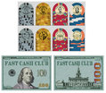
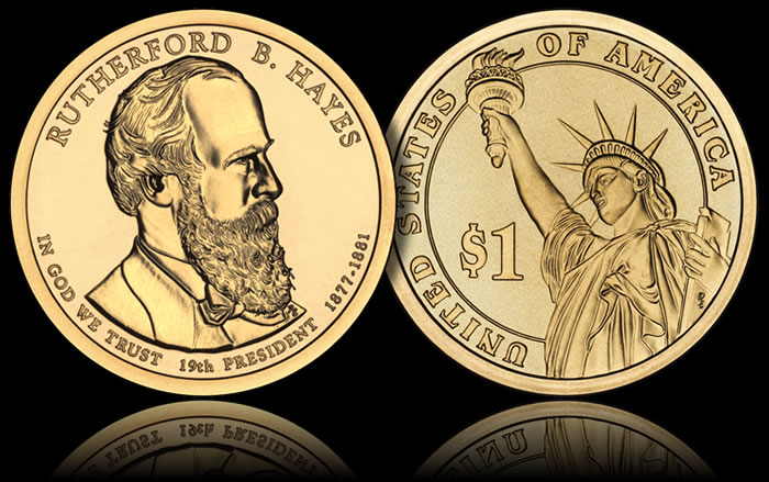
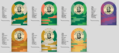
What I wanted with the cash set is to fit the "cash" in every literal sense of the word. The quarter looks like a quarter and the dollar looks like the dollar coin.
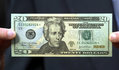
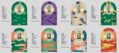
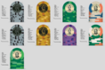
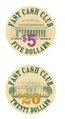
And for those very reasons, I don't like the the $5 and $20 chips -- because they look absolutely nothing like US currency. The impact of the chosen colors as combined make for a very disjointed set when matched up with the 'coin' chips (which are very good, imo).
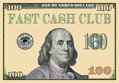
Some combination of off-white, light purple/gray/green/yellow should be used for the $5 chip (but definitely not a red base). Colors that would make for an 'authentic' $20 bill would be some combination of off-white and blue/peach/green/yellow (but not a blue base). In both cases, the use of additional colors should be subtle, not smack-in-your-face. For the $20, I'd probably actually go with a close-replica ceramic plaque to really top off this set (but if a $100 denomination is needed, I'd go with a plaque for the hundo and keep the $20 as a chip). As shown in the OP, I don't like the currency chip colors/spots at all. Great choices in another set perhaps, but not this one.
I'd remove the denom on the "face" side so it's not overlapping the picture
I agree with ^^ this. Placing the denomination to the right of the portrait will look much better (clear and readable) than overlapping the president's neck on the 'bill' chips.
Regarding the 'coin' hot-stamped chips.... I am assuming that you plan to stamp these in black, with the base chip color showing through as text and artwork. I have a couple of sample chips with this design, and I think the effect is very cool -- but I can't recall any aftermarket hot-stampers who have publicly offered this service. Have you contacted anyone about stamping these yet to see if it is possible in today's market?
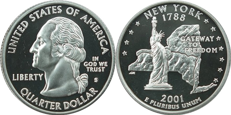
QUARTER DOLLAR: Eliminate the denomination references (both numeric and written) on the reverse, since real quarters do not have them -- which leaves more space for your New York State art and
Fast Cash Club text (which should be at the top, keeping in style with the real coins). The obverse looks great as-is.
ONE DOLLAR: I'm a bit surprised at your choice of James Monroe (VA) on the obverse, given the NY references elsewhere (there are several NY-based presidents to choose from). Again, to match the layout of the actual coins, I'd eliminate the written denomination on the obverse, and display
only the numeric $1 denomination on the reverse.
Circle-square is a great mold choice for the currency chips, as it somewhat resembles the intricate border on US bills (the scroll mold would also work well here). But I'd go with the no-mold for the coin chips - which will really set them off as 'coins'. I usually don't advocate mixing molds, but I think it works perfectly in this case. Coins =/ bills, and the corresponding chips shouldn't look the same, either.
Great artwork by p5woody.
.png")
")