So I'm in the process of designing new cards. Feedback is greatly appreciated. I like the pattern but I'm thinking that we need to make the middle less crowded and the boarder maybe solid gold ?


-
PCF is an eBay Partner. If you make a purchase through one of our links, we may earn a commission at no extra cost to you. Thank you for your support!
You are using an out of date browser. It may not display this or other websites correctly.
You should upgrade or use an alternative browser.
You should upgrade or use an alternative browser.
Designing new cards (1 Viewer)
- Thread starter Gunnar
- Start date
For sure solid borders, else they are susceptible to possible edge sorting errors. Personally, I don't buy or use any cards with advertising on them (i.e., Poker Store). As a giveaway, text on the front would be fine.
Poker Zombie
Royal Flush
Inca beat me to it - solid borders FTW.
I'd print them out at actual size, just to see if the logo looks too small.
I'd print them out at actual size, just to see if the logo looks too small.
Poker Zombie
Royal Flush
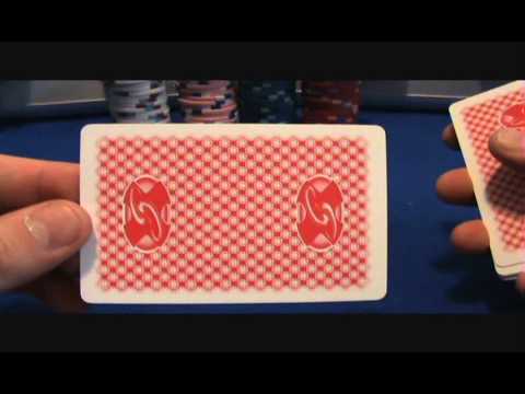
And the logo doesn't have to appear on the card backs twice. Once is plenty, and looks classier imo.
But only 1 logo makes for an upside right / upside down ability for a skilled dealer to set the deck.
Pierna
Pair
For sure solid borders, else they are susceptible to possible edge sorting errors. Personally, I don't buy or use any cards with advertising on them (i.e., Poker Store). As a giveaway, text on the front would be fine.
Edge sorting errors?

Poker Zombie
Royal Flush
Google "Phil Ivey" and "Borgata".Edge sorting errors?
OP
OP
So Solid border is the way to go.
The logo on front was a thought for TV advertisement. But then maybe if I will sell alot more cards without logo then that is something I might have to think about ?
Are many players that are that strong minded about logos on front ?
The logo on front was a thought for TV advertisement. But then maybe if I will sell alot more cards without logo then that is something I might have to think about ?
Are many players that are that strong minded about logos on front ?
Not intentionally, but it's hard for some to not to notice any potential defect in a deck of cards. Card border press/cutting discrepancies happen, and a solid border eliminates that as a possibility. Win win.
Then use this orientation rather than side-by-side.....But only 1 logo makes for an upside right / upside down ability for a skilled dealer to set the deck.
dimperdoo
Pair
i wouldn't be seriously concerned about someone edge-sorting so much as just recognize the consideration & know that w/ steps taken to eliminate that concern it will never become an issue even in conversation.
Then use this orientation rather than side-by-side.....
Called "end on end" by card manufacturers.
It's certainly better but due to the horizontal nature of the logo both logos are quite small.
I agree end on end logos may work better. I'd try a draft and print out both versions full scale. The advantage for end to end is you have the option to size the logo to whatever size you want.
I agree end on end logos may work better. I'd try a draft and print out both versions full scale. The advantage for end to end is you have the option to size the logo to whatever size you want.
Poker Zombie
Royal Flush
Is that golden edge not uniform on purpose, or is that to simulate some sort of gold foil look?
OP
OP
Yeah it is idea to look like a foil.Is that golden edge not uniform on purpose, or is that to simulate some sort of gold foil look?
Lemonzest
4 of a Kind
So Solid border is the way to go.
The logo on front was a thought for TV advertisement. But then maybe if I will sell alot more cards without logo then that is something I might have to think about ?
Are many players that are that strong minded about logos on front ?
I really dislike having a logo on the cards....it just looks cheap imo. Unless it says WSOP or WPT...and even then I think the plain cards with no logo just look way classier (ie Kem four arrow design)
When you add the logo then it just looks like a piece of promotional material like when companies give away free pens at a trade show.
OP
OP
We have decided to have no logo on front. We are working on design as we speak and maybe I will be able to let PCF buy some cards at a better price if someone wants. If there is a good interest then maybe I will have to find someone to re-ship in the US. That highly motivated re-shipping person can throw me a line if someone is interested
Poker Zombie
Royal Flush
Will they be 100% plastic cards?
OP
OP
OfcourseWill they be 100% plastic cards?
") jumbo index
jumbo indexPierna
Pair
I like the latest backs better, nice job!
crussader
Flush
Love the new design. Makes me want a set-up, or two, or three...
chipjoker
Flush
Poker size or Bridge?
OP
OP
First batch will be poker. If the PCF goes crazy and wants Bridge size I will maybe to a group buy for that sizePoker size or Bridge?
Kyle
Full House
Sweet cards. (y) :thumbsup: I would like to see jumbo index bridge cards. Any Red and Blue backs possible also?
Kyle
Full House
Any pictures of the cards with just 2 numbers instead of 4?
Similar threads
- Replies
- 39
- Views
- 1K
- Replies
- 5
- Views
- 234
- Replies
- 17
- Views
- 533