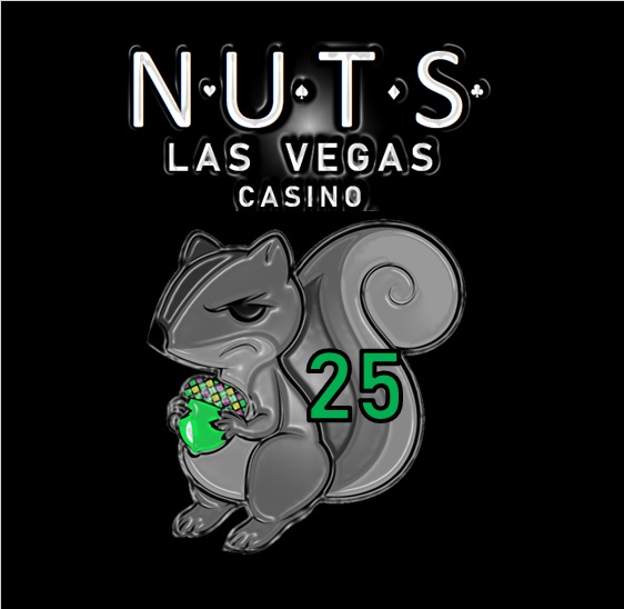
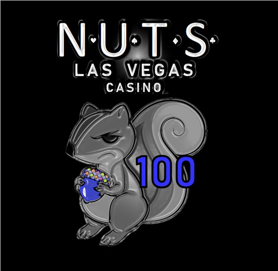
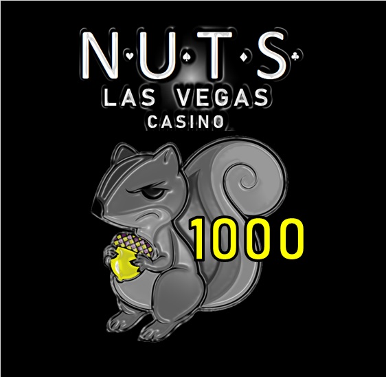
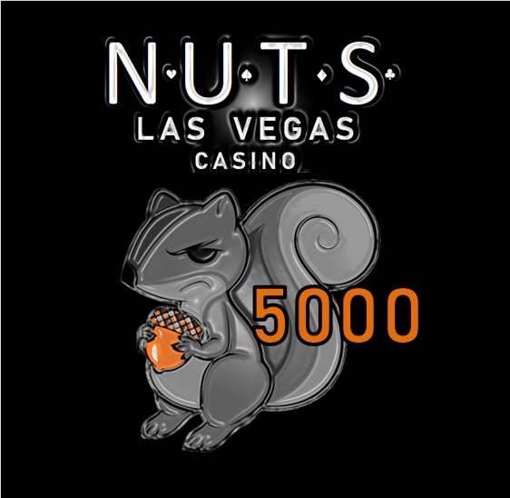
Just messing around a bit today. I'm no graphic artist, but I'm kind of digging what I came up with for the Royal lineup. Thoughts?
-
PCF is an Amazon Associate and an eBay Partner. If you make a purchase through one of our links, we may earn a commission at no extra cost to you. Thank you for your support!
You are using an out of date browser. It may not display this or other websites correctly.
You should upgrade or use an alternative browser.
You should upgrade or use an alternative browser.
Custom label ideas (1 Viewer)
- Thread starter Himewad
- Start date
Too much fine detail. I always recommend the "arm's length test" -- print out your design life-size (i.e. about 1 inch) and look at it from 3 or 4 feet away. I think you'll find that a lot of the detail will just disappear into smudges and blurs.
For example pretty much all of the metallic effects will just look like crappy print quality.
My 2¢
For example pretty much all of the metallic effects will just look like crappy print quality.
My 2¢
That's too bad. Like I said, I was just messing around, and like the NUTS theme. Especially with the nut being the chip color.
sheikh617
4 of a Kind
Purely from a looks cool aspect, I think this is pretty dope. From a print onto inlay aspect, always listen to Gear lol.
Dodger
Flush
Design idea is the nuts (every pun fully intended).
Wonder if there is a way to take Gear’s recommendations and still execute this well for print.
Stay with it.
Wonder if there is a way to take Gear’s recommendations and still execute this well for print.
Stay with it.
Eloe2000
Straight Flush
Design idea is the nuts (every pun fully intended).
Wonder if there is a way to take Gear’s recommendations and still execute this well for print.
Stay with it.
I would just remove the debossing/embossing effect. I don't think that there is too much detail in the line drawing of the squirrel itself. The suits between the NUTS lettering will definitely be unidentifiable though. So will the detail in the top of the acorn. Not that that is a big deal.
Larger suits in the NUTS lettering. No crazy artistic effects going on. Denominations white. Removed "CASINO" and added "the" in the title.
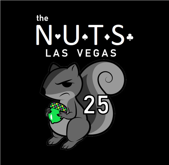
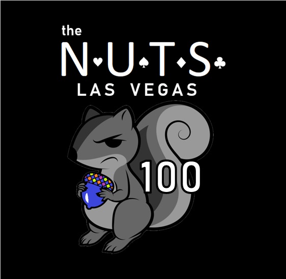
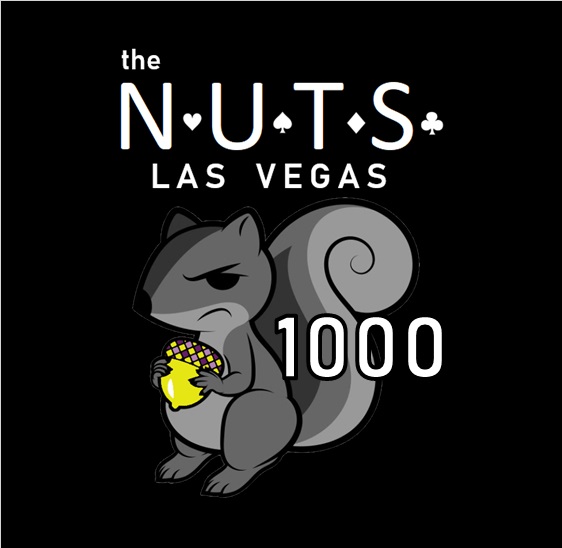
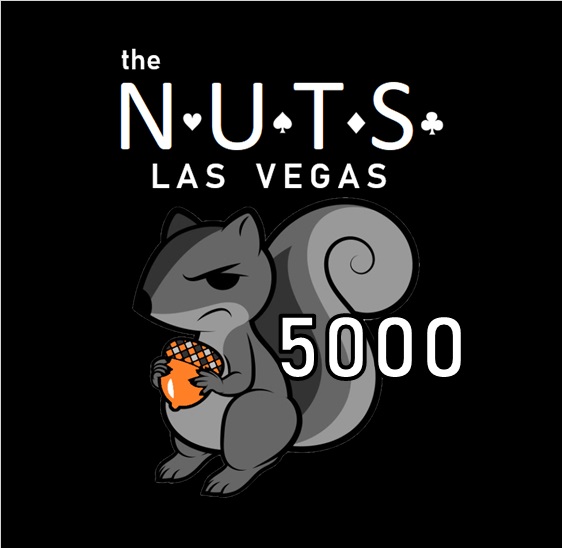
Really digging this!Larger suits in the NUTS lettering. No crazy artistic effects going on. Denominations white. Removed "CASINO" and added "the" in the title.
View attachment 363070View attachment 363071View attachment 363072View attachment 363073
Did you decide against the color matched denominations?
Yes, I think the nut itself is sufficientDid you decide against the color matched denominations?
Last edited:
Just for the hell of it …
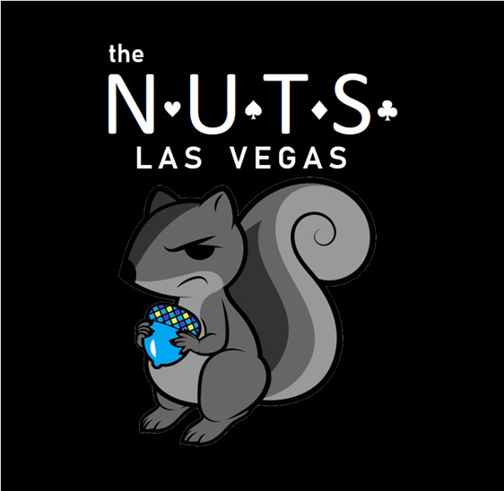
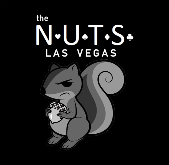
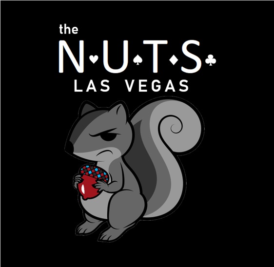
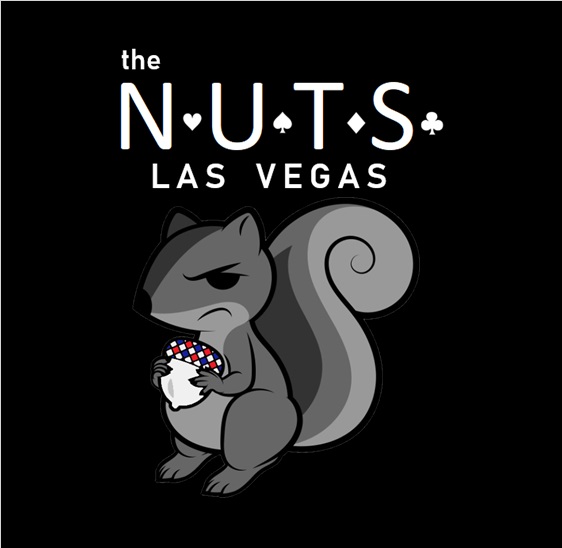
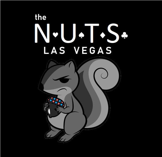
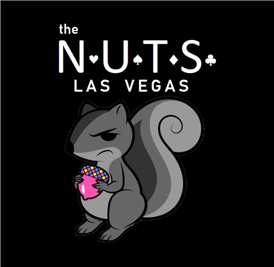
Thanks, so am I. I think the top of the acorn needs to be tweaked (maybe I will remove the base color and just put the edge spot colors in the top section), and the spacing inside of a circle needs to be tweaked, as well. But the general idea, I really like.Really digging this!
Dodger
Flush
Wow, quick update! Looking good.
Don’t know if it would throw it off or even be worth it, but what about color matching the squirrel’s eye too? Just spitballing...
Don’t know if it would throw it off or even be worth it, but what about color matching the squirrel’s eye too? Just spitballing...
Davism72
Flush
These are cool af. Could you share a bit about your process? I've been dipping a toe in Inkscape recently.
Brace yourself. Seriously.These are cool af. Could you share a bit about your process? I've been dipping a toe in Inkscape recently.
I did this in Excel and MS Paint. I wasn’t kidding when I said I’m not a graphic artist.
If I were to get this print-ready I would have it done by someone with a good software program so that the resolution is as good as it needs to be.
Really like these. Think they could make a cool hot stamp too
Davism72
Flush
You can't just say something like that without details.Brace yourself. Seriously.
I did this in Excel and MS Paint. I wasn’t kidding when I said I’m not a graphic artist.
Ok, I found the squirrel on google. I’m sure I violated some copyright but whatever. Opened it in MS Paint 3D and used the paint bucket option to fill in the acorn with the colors I wanted. Then did some sort of special selection (forget what it’s called exactly) so that I could copy just the outline of the squirrel (not any background) and then pasted it in Excel. Did that for all 10 Royal chip colors. I’m sure the colors aren’t exact ... I just eyeballed it ... but it’s good enough for government work.You can't just say something like that without details.
Then it’s a little bit of experimenting with fonts to get it how I want. I used MS Paint to cut and paste the poker suits, which I also lifted from a google search.
When everything is how I want it, I just copy the whole thing in Excel and paste it in MS Paint, then save it as a jpg file. Easy peasy.
Davism72
Flush
Huh. I'm impressed.Ok, I found the squirrel on google. I’m sure I violated some copyright but whatever. Opened it in MS Paint 3D and used the paint bucket option to fill in the acorn with the colors I wanted. Then did some sort of special selection (forget what it’s called exactly) so that I could copy just the outline of the squirrel (not any background) and then pasted it in Excel. Did that for all 10 Royal chip colors. I’m sure the colors aren’t exact ... I just eyeballed it ... but it’s good enough for government work.
Then it’s a little bit of experimenting with fonts to get it how I want. I used MS Paint to cut and paste the poker suits, which I also lifted from a google search.
When everything is how I want it, I just copy the whole thing in Excel and paste it in MS Paint, then save it as a jpg file. Easy peasy.
I do like that idea. Think I need to save space vertically, so might remove the “Las Vegas” from under “nuts” and try to curve it under the squirrel from just right of his feet around the bushy part of the tail. Will remove the “the” as well.Wow, quick update! Looking good.
Don’t know if it would throw it off or even be worth it, but what about color matching the squirrel’s eye too? Just spitballing...
Got a busy night tonight, so prob won’t get a chance to do anything until tomorrow.
Last edited:
Davism72
Flush
Definitely need to save some space if these are going to be labels. Maybe squirrel + denom on one side then text + denom on the reverse side?I do like that idea. Think I need to save space vertically, so might remove the “Las Vegas” from under “nuts” and try to curve it under the squirrel from just right of his feet around the bushy part of the tail. Will remove the “the” as well.
Got a busy night tonight, so prob won’t get a chance to do anything until tomorrow.
I do like two sided chips. Good idea.Definitely need to save some space if these are going to be labels. Maybe squirrel + denom on one side then text + denom on the reverse side?
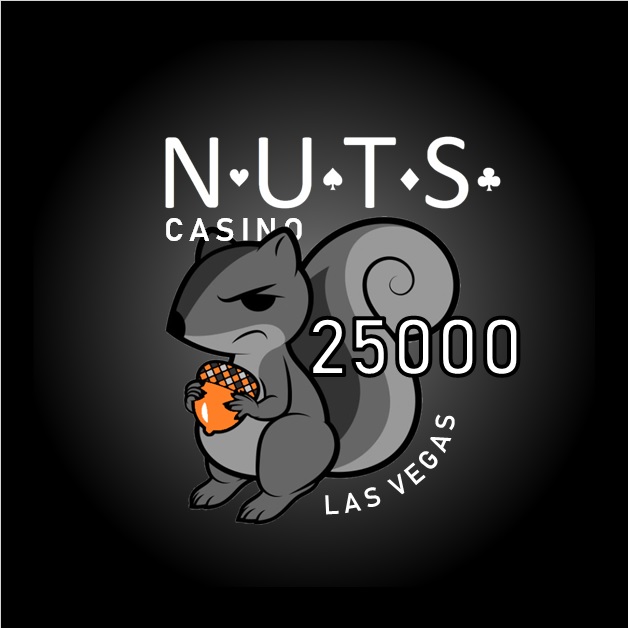
Updated. Needs to be shrunk just a touch, but everything fits this way. I liked the challenge of tucking the left (as you look at it) squirrel ear behind "CASINO" but the right ear is in front of it. Gives it a little 3D effect. Put the denomination as 25000 just to make sure a large number would fit OK.
Messing with the eye color just looked weird. The way I was doing it, anyway.
Messing with the eye color just looked weird. The way I was doing it, anyway.
madforpancakes
Straight
I like it, the only thing that tilts me is when I see suits that are not ordered! Spades Hearts Diamonds Clubs!
WedgeRock
Royal Flush
If you ever make this set, I have custom card covers for sale...
madforpancakes
Straight
Oh I have plenty of Jack's and those tilt me a little too!
Dodger
Flush
The latest iteration is looking good. Scrap the eye color idea. Keeping it to just the nut is so subtle and so clean. It doesn’t distract from the rest of the design.
Similar threads
- Replies
- 7
- Views
- 302
- Replies
- 18
- Views
- 896
- Replies
- 18
- Views
- 2K

