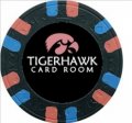
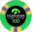
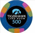
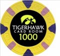
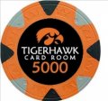
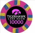
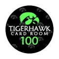
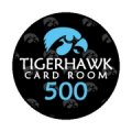
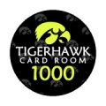
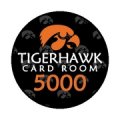
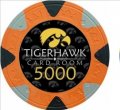
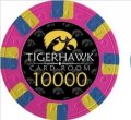
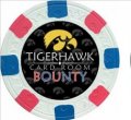
I agree. Even if I don't get a near perfect color match, the black labels just look so much better than the other options. But it's got to be legible.The black labels are so good. Maybe just suck it up and accept that the blurple is what it is...or lighten it just a bit.
-
PCF is an Amazon Associate and an eBay Partner. If you make a purchase through one of our links, we may earn a commission at no extra cost to you. Thank you for your support!
You are using an out of date browser. It may not display this or other websites correctly.
You should upgrade or use an alternative browser.
You should upgrade or use an alternative browser.
Custom label ideas (1 Viewer)
- Thread starter Himewad
- Start date
bigdonkey
Straight
Everything you said here is spot on. I'd don't think I've ever preferred black labels to white, but on these I do. Definitely not the gray.Think I like the black background the best, but the blue kind of gets lost. The white background looks fine, but it's so bright, which is why I went with a gray middle option. But I'm not crazy about it.
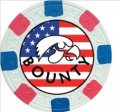
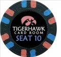
I like the bounty chip and the seating chip labels.
I'd probably just lighten up the blue enough to make it pop, and call it a day.
Dodger
Flush
The black labels are so good. Maybe just suck it up and accept that the blurple is what it is...or lighten it just a bit.
I agree. Even if I don't get a near perfect color match, the black labels just look so much better than the other options. But it's got to be legible.
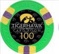
I know you are going for a color match of the base chip color. But...what if for the blurple you use one of the edge spot colors? Just to bring out the color more next to the black.
Just a thought.
I considered that, but the edge spots are green, pink and orange, which are used on other chips.I know you are going for a color match of the base chip color. But...what if for the blurple you use one of the edge spot colors? Just to bring out the color more next to the black.
Just a thought.
Dodger
Flush
I considered that, but the edge spots are green, pink and orange, which are used on other chips.
Hmmm...I get where you are coming from - no repeats!
What about this...since “Tigerhawk Card Room” is in white, what if you gave the Hawkeye logo a white border, just to separate it from the black? On your white mockups, you can see the logo has a black border, and you lose that with the black background - effectively shrinking your logo a little.
Don’t know if adding the white will help, but it could be worth a try.
SixSpeedFury
Full House
So just a big nut should do the trick.
That's what she said...
Now … to continue working on my casa Rivera ceramic design
doughboy63
Flush
These are nice but really liked the squirrel inlay a lot.
I do too, but I need professional design helpThese are nice but really liked the squirrel inlay a lot.
Prototypes (not just computer images). Definitely going this route.
SMinla
High Hand
Very cool! Like the design AND the color combos you have. Legibility aside, having a color that doesn't match the chip would drive my OCD CRAZY!!!!!!!!
I think you'd be fine. But Look forward to seeing them finished.
Who are you getting to make the inlays!?? Or are you going the DIY route?
I think you'd be fine. But Look forward to seeing them finished.
Who are you getting to make the inlays!?? Or are you going the DIY route?
Going with ABC to finalize the design and printing. They’ve been very good to me. Thought about doing it myself but I know I wouldn’t have been completely happy with it.
ABC has been great to work with so far. They've been very helpful in making small tweaks to the design, and they even wanted samples of the Royal chips so that they could get as close of a color match as possible. And they offered to send me printed samples to make sure I like how they would look. Such a great vendor.
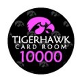
Slight tweak to the design here. More dark gray tigerhawks in the background, more of the "look" of the Royal Card Room label, and black outlines around the letters and numbers.
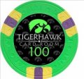
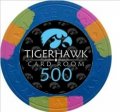

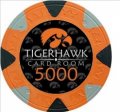

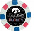
Slight tweak to the design here. More dark gray tigerhawks in the background, more of the "look" of the Royal Card Room label, and black outlines around the letters and numbers.


Last edited:
sheikh617
4 of a Kind
If post 76 can do a good color match I would prefer that. Otherwise post 77.
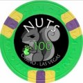
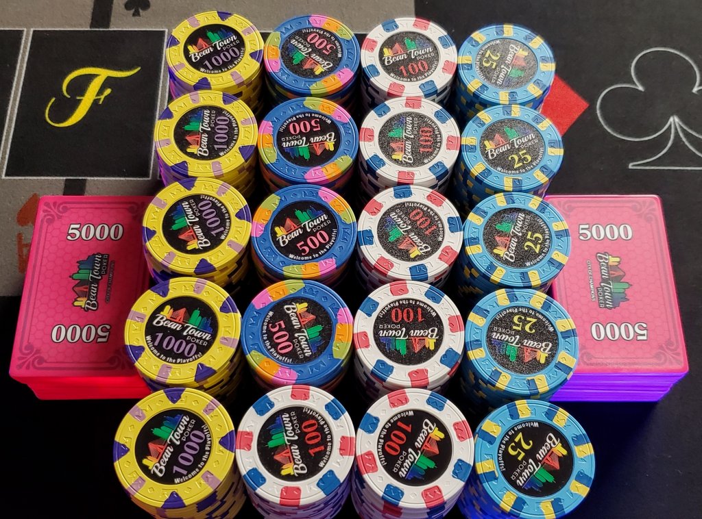
Already thinking ahead to custom ceramics. Maybe by the end of this year. And going back to the NUTS theme. The squirrel is about as big as I want to get it - probably need to push it a touch to the right - but otherwise I like it. This is obviously a prototype on a Royal chip, so if I'm going full ceramic the design could be larger, perhaps showing more detail of that nut.

TeamNapoli
Straight
totally love it and i think it would make an awesome center art work for a poker table felt and all in general a theme for a poker room, especially the first group of images
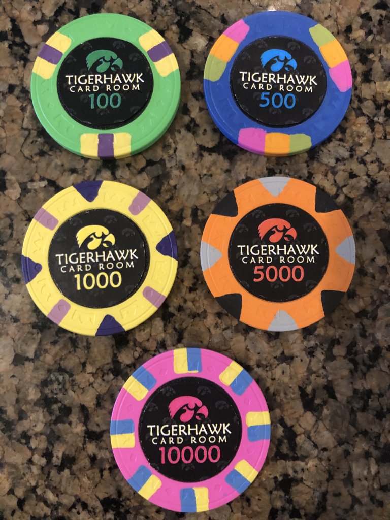
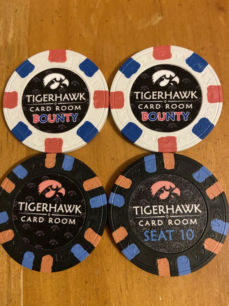
Got my sample labels back from @ABC Gifts and Awards
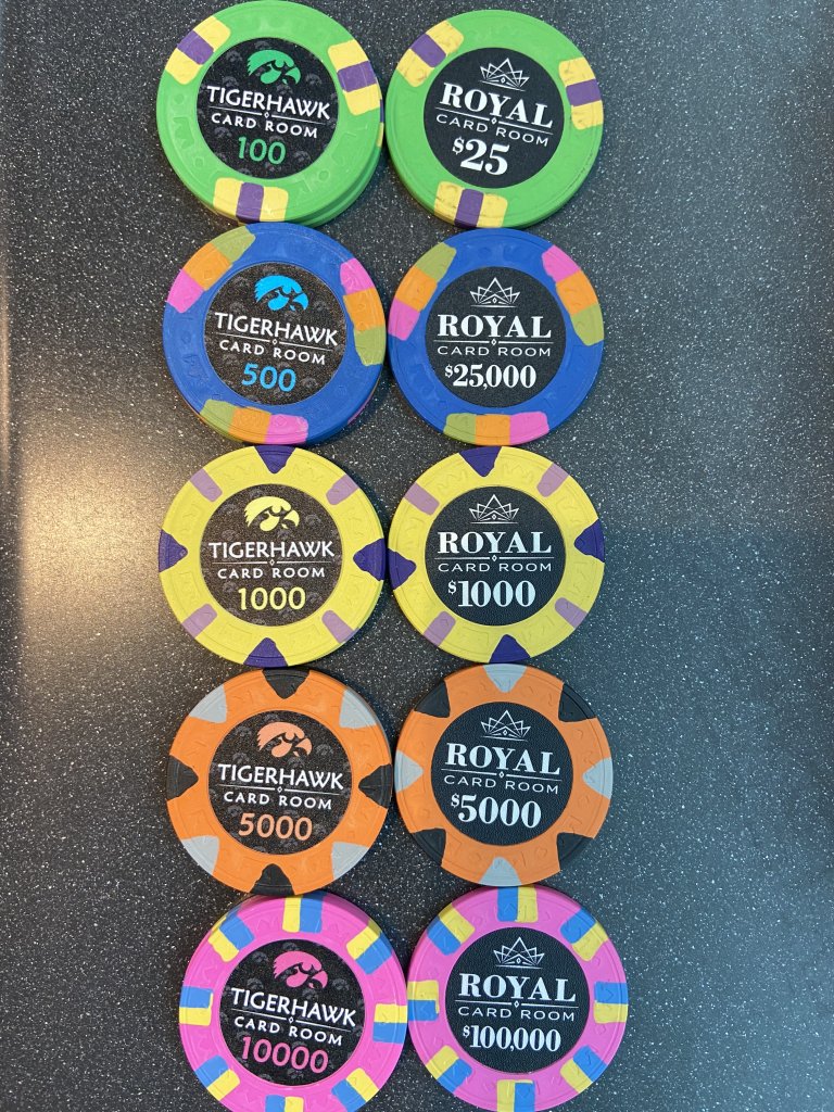
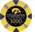
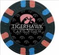
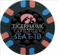
Also have samples for the bounty (white 500 chip) and a seating chip (black 100 chip). I like the labels so much that I think I will get labels for an All In (light blue 25 cent chip) and Show ‘Em (red 5). Can’t decide what the gray chip would be used for. Ideas?
Also have samples for the bounty (white 500 chip) and a seating chip (black 100 chip). I like the labels so much that I think I will get labels for an All In (light blue 25 cent chip) and Show ‘Em (red 5). Can’t decide what the gray chip would be used for. Ideas?
Last edited:
sheikh617
4 of a Kind
Labels are awesome. Any chance you can darken the T500 color match text to match better?
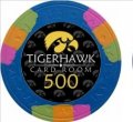
Actually they sent me a sample of a darker blue that matches the chip very well. Here are the two options.Labels are awesome. Any chance you can darken the T500 color match text to match better?
Here are the bounty and seating chips.
sheikh617
4 of a Kind
I also did a custom with this chip and my fear was the dark blue against the black. The light blue tilts me and the dark blue is harder to see but a much better match. I'd go either dark blue or use an edgespot.
sheikh617
4 of a Kind
That bounty is DOPE!
Yes, the light blue is maybe too light, I agree. And the dark blue (that matches perfectly) might be too dark. But I’m leaning toward the dark right now. I can’t use an edge spot color because all three colors are used on other chips in my set (green, orange, pink).I also did a custom with this chip and my fear was the dark blue against the black. The light blue tilts me and the dark blue is harder to see but a much better match. I'd go either dark blue or use an edgespot.
View attachment 394097
Thanks, I like it tooThat bounty is DOPE!
Maybe I’ll do a gray Reload chip in addition to the red Show ‘Em and the light blue All In “bonus” chips.
Kind of like this.Maybe I’ll do a gray Reload chip in addition to the red Show ‘Em and the light blue All In “bonus” chips.
Similar threads
- Replies
- 7
- Views
- 302
- Replies
- 18
- Views
- 896
- Replies
- 18
- Views
- 2K


