Custom felt (feedback/ideas) welcomed! (2 Viewers)

Cwaters425

3 of a Kind
Supporter
Joined
Mar 17, 2018
Messages
680
Reaction score
845
Location
Ohio
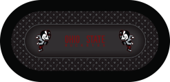
I am in the process of having a custom felt made and wanted to get opinions (good or bad), other than my own from the first draft. Any ideas/feedback are welcome!

My thoughts:

1) I think the Ohio State Buckeyes text needs to be a little bigger to fill more of the space and also maybe outlined in white so that the text stands out a little more. It kind of gets lost when the image is small, but when view full size it is a lot better. I imagine when its printed it will be even bigger so this may be a non-issue

2) I think maybe lowering the contrast on the white of the "Brutus" mascot logo (inside the betting line) so its not so bright

3) I also had input from my friend Craig (@doublebooyah85) about getting rid of the Brutus logo that is mixed in with the suits pattern on the outer portion and just have it as suits & the buckeyes leaf

Looking forward to hearing anyone's thoughts/ideas

thanks,
Chris
 

Attachments

  • Chris Waters Ohio v1.png
    Chris Waters Ohio v1.png
    183 KB · Views: 112
:ROFL: :ROFLMAO: looks horrible, maybe go Purdue or Ivy Tech, just about anything is better, but really it should be Roll Tide!

I think it looks fine! You could make the outside a little lighter for contrast
Bahahahaha

@Machine I'm going to have him make a few different versions with the feedback I get/changes I want and see what he can come up with. Thanks for the input!
 
lighter Grey in center? Both the red text and buckeye thing are a bit lost.
@trever - light grey as the background color in the middle (betting area) or light grey text color? I agree the red text in the middle is a little lost in thumb nail, but gets better when image is maximized. I think it will get even better when its printed as my playing surface insert in 78x32
 
I meant lighter Grey as the background. I'll defer to others on how things come out when printed, but I'd always lean towards maximizing contrast.
 
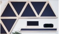
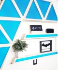
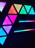
Also for what its worth, I will have a chemcast (black plexi material) diffuser on the outer edge of the playing surface with LED's behind for my raised rail. The chemcast is matte black, but whatever light color you put on, it will show that color, its really awesome stuff. Here is some examples:
 

Attachments

  • black-led-acrylic-dark-1200x705.jpg
    black-led-acrylic-dark-1200x705.jpg
    65 KB · Views: 44
  • black-led-acrylic-blue550.jpg
    black-led-acrylic-blue550.jpg
    36.3 KB · Views: 44
  • black-led-acrylic-multi550.jpg
    black-led-acrylic-multi550.jpg
    25.5 KB · Views: 46
Maybe outline the letters on Ohio State Buckeyes to make it pop a bit more. Agree it’s a little hard to see.
 
A drop shadow on the lettering on the middle can add a nice touch.
 
A drop shadow on the lettering on the middle can add a nice touch.
@T_Chan I'm not sure what you mean by that, can you post an example pic? I did also email Ray back with some ideas for when he gets back in a few days
 
First of @T_Chan’s three looks great.
 

Create an account or login to comment

You must be a member in order to leave a comment

Create account

Create an account and join our community. It's easy!

Log in

Already have an account? Log in here.

Back
Top Bottom