Thanks AP!Your cards are awesome.
The solution to the offcentered cut might be to avoid the white border around the design. But on a design point of view, it's very very nice !
-
PCF is an Amazon Associate and an eBay Partner. If you make a purchase through one of our links, we may earn a commission at no extra cost to you. Thank you for your support!
You are using an out of date browser. It may not display this or other websites correctly.
You should upgrade or use an alternative browser.
You should upgrade or use an alternative browser.
Custom cards design: Le Gold (1 Viewer)
- Thread starter LeGold
- Start date
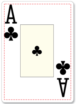
Speaking of non-precise cutting... has anyone of you who used MPC (@StevieG, @Nuhockey, @sheikh617) tried having graphics outside of the safe area? My pips (well, clubs only) stick out on the sides a bit and I'd rather not make them smaller :/
StevieG
Pair
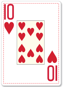
Thanks... seems that I should be safe:
Also, two versions of , still not sure whether I should go monochromatic or colored:
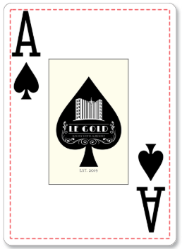
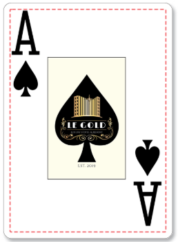
I have to check why the graphic seems to be shrunk a bit and moved to the top left corner... might be that just the big preview is not centered, as I think I've done all the calculations right and the image IS symmetrical.
Also, two versions of
 , still not sure whether I should go monochromatic or colored:
I have to check why the graphic seems to be shrunk a bit and moved to the top left corner... might be that just the big preview is not centered, as I think I've done all the calculations right and the image IS symmetrical.
StevieG
Pair
@LeGold -
First off, love the ace of spades. I think the color makes it really pop and I encourage you to go with the full color ace of spades.
As for the image I agree something is off, and though the source image may be symmetric perhaps the image size is not what MPC expects?
I recall having trouble with that and finally working out from the MPC specs that for bridge size my upload images needed to all be 747 x 1122, and then I was fine.
StevieG
Pair
One other thing you should note @LeGold -
If you are a stickler for tradition, you should know that the order of printing is the same as the order of the proofs on the page.
By default the MPC layout order looks like this:
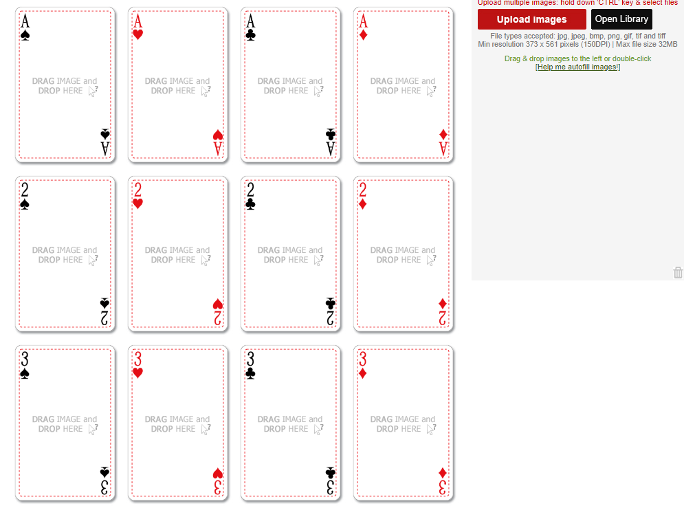
That means when printed and stacked all the aces will be together, etc.
If you want to get a deck printed and shipped that will be in the classic new deck order that you expect from USPC Bicycle and others, you will want to change that so that upper left to lower right goes as follows:
1) Hearts Ace -> King
2) Clubs Ace -> King
3) Diamonds King -> Ace
4) Spades King -> Ace
5) black joker or guarantee card
6) red joker
This way you get the kissing kings in the middle.
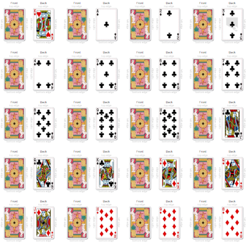
A partial shot of my finished proof (step 5 at MPC) looks like so:
If you are a stickler for tradition, you should know that the order of printing is the same as the order of the proofs on the page.
By default the MPC layout order looks like this:
That means when printed and stacked all the aces will be together, etc.
If you want to get a deck printed and shipped that will be in the classic new deck order that you expect from USPC Bicycle and others, you will want to change that so that upper left to lower right goes as follows:
1) Hearts Ace -> King
2) Clubs Ace -> King
3) Diamonds King -> Ace
4) Spades King -> Ace
5) black joker or guarantee card
6) red joker
This way you get the kissing kings in the middle.
A partial shot of my finished proof (step 5 at MPC) looks like so:
Last edited:
StevieG
Pair
I highly recommend doing a guarantee card for your black joker, that was a lot of fun for us.
Yeah, I was wondering what I should do with the remaining 3 cards. Any suggestions are welcome!
Thanks for the heads-up wrt. the order, I'll give it a thought (haven't uploaded anything yet beyond those few test cards to see how it looks).
Thanks for the heads-up wrt. the order, I'll give it a thought (haven't uploaded anything yet beyond those few test cards to see how it looks).
StevieG
Pair
Thanks for the heads-up wrt. the order, I'll give it a thought (haven't uploaded anything yet beyond those few test cards to see how it looks).
If you want to be able to unwrap and then fan across the table and see suits in order, you will definitely want to re-order.
sheikh617
4 of a Kind
I haven't sorry.Speaking of non-precise cutting... has anyone of you who used MPC (@StevieG, @Nuhockey, @sheikh617) tried having graphics outside of the safe area? My pips (well, clubs only) stick out on the sides a bit and I'd rather not make them smaller :/
What I tried to say is that there is no order or no-order yet, I'll start from scratch and fill the list (in order) when I am readyIf you want to be able to unwrap and then fan across the table and see suits in order, you will definitely want to re-order.
@LeGold
As for the image I agree something is off, and though the source image may be symmetric perhaps the image size is not what MPC expects?
I recall having trouble with that and finally working out from the MPC specs that for bridge size my upload images needed to all be 747 x 1122, and then I was fine.
Just got a reply from MPC to my question about the online preview being off:
The preview is not accurate.
You just need to design your cards according to attached card template.
The final cards would be looks well.
After checking the second attachment,it is good to go ahead ,thanks.
Sorry, missed this one completely, got distracted by the huge Manny just above!Casino cards were all full bleed but I think they are increasingly introducing white borders to avoid edge sorting advantage plays in table games, so either choice is good.
It's your casino brand, but for my 2c this gold color comes across as more yellow. At least compared to other "gold" casino cards I've seen it's very bright and saturated.
View attachment 479569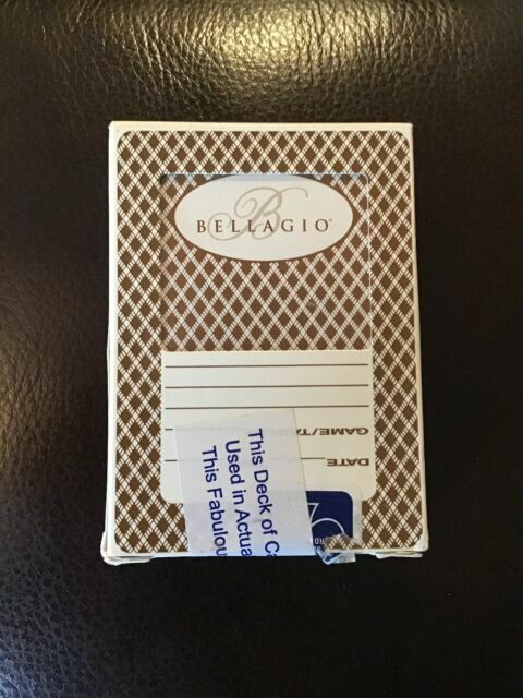
Indeed, I'm unsure about the color, it is very hard to know what will work well in print by only seeing it on screen (albeit calibrated). Maybe @Gear knows what CMYK value could work "best" for a gold-ish diamond pattern for the backs?
Jake14mw
Flush
Looks great. So, which cards are you having the custom faces for, just the Ace of Spades? I like the colored version.
Cheers. It looks like I'll just go for custom Ace of Spades and Jokers right now. It would be too much to do all the court cards as well, maybe another time.
The last (55th) one I might just add hand rankings, much like Copag has... unless someone gives me a better idea.
The last (55th) one I might just add hand rankings, much like Copag has... unless someone gives me a better idea.
Jake14mw
Flush
How's this going? Did you finalize things?
Just got a package from MPC! My babies have arrived! Sorry for the bad lighting.
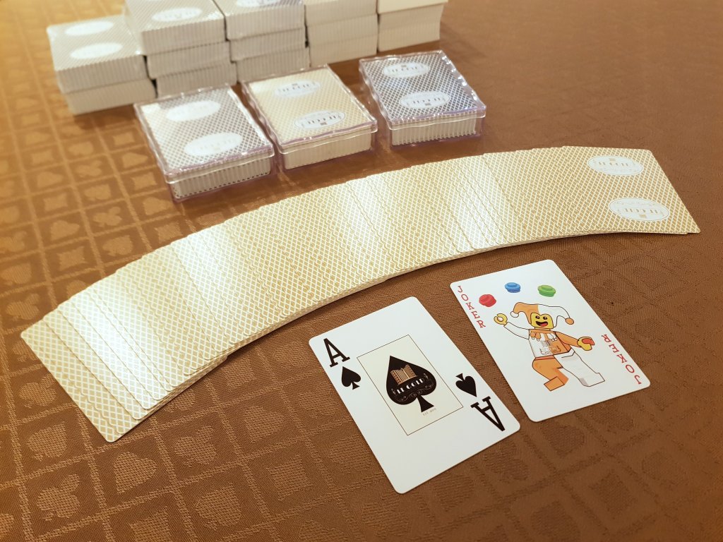
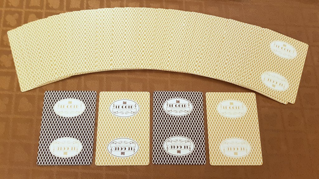
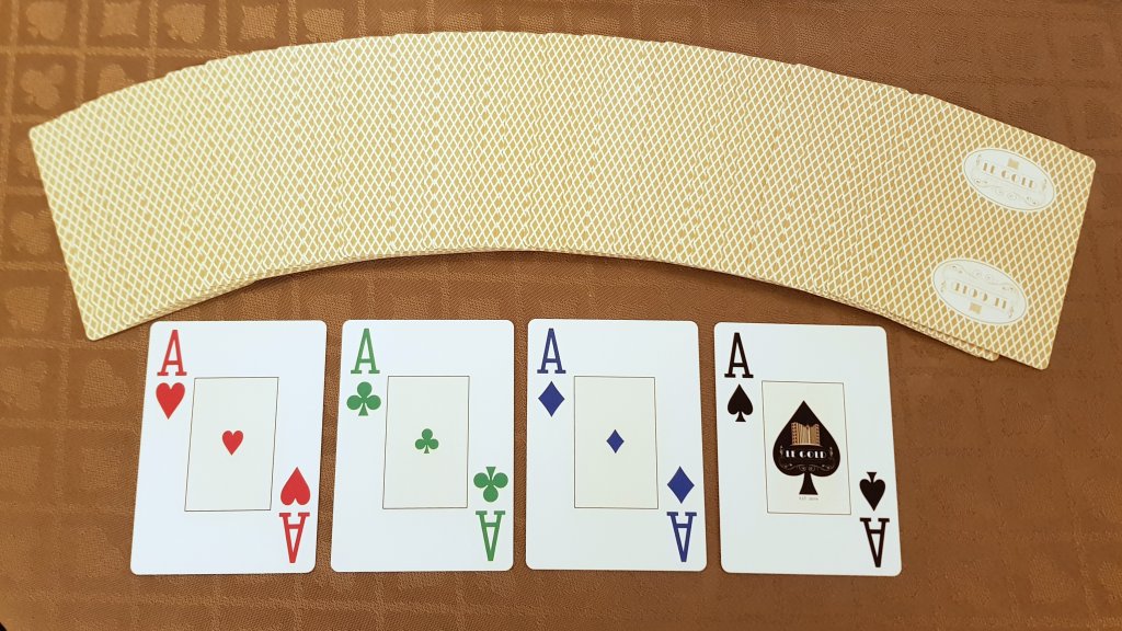
Obviously, I love them! Now to the objective first impressions:

Obviously, I love them! Now to the objective first impressions:
- They are indeed slightly on the thicker side (52 cards come to 16.8 mm, vs. 15.5 mm for the Copags).
- They are not as smooth, so they do not fan as well. Maybe after they break in, we'll see.
- The golden backs work perfectly. Could have been a tad darker, but I'm not even sure it would be necessary.
- Cuts: acceptable! Not perfect, and I'm sure an edge sorter would know how to exploit them, but it is very subtle and I'm happy with the result.
- Backs: I did all 4 combinations gold, black, gold + black, black + gold; still not sure which ones I like best!
- Pips: The double-colored backs are also the ones with 4 colored pips; again, still not sure which ones I like best.
- Backs: the golden print is not as sharp as the black one, so some details are a bit blurry on the logo; if I ever do a re-run, I know what to change.
- Faces: sharp and nice, the details on the
 were a bit too small though, the thin lines didn't make it as well... could have anticipated that bleeding would be a challenge.
 - Faces: Yellow centers: not as prominent as on some other cards I've seen, but I like them and how subtle they turned out to be
- Jokers: love them! They fit perfectly into the theme, I would like to thank my friend and artist Megan Rothrock who did an amazing job on these! (she's also an author, so if you have kids make sure you check her books series The LEGO Adventure Book! and if you read Vol. 3, you might even stumble upon some models of someone you know
 ) Oh, and yes, she'll get compensated for the job with more than just exposure.
 - Court cards and pips kindly provided by Daniel Schneider of Black Roses Cards.
FordPickup92
Royal Flush
Very cool! Love the little Lego joker!
Jake14mw
Flush
They look great! Congrats!
StevieG
Pair
Chipenhagen
Pair
They turned out great. Perfect juggling LEGO joker (love LEGO). Well done to make it appear to be alive even if based on a LEGO minifig. And nice detail with the balls being LEGO bricks.
Similar threads
- Replies
- 18
- Views
- 2K
- Replies
- 34
- Views
- 2K
