You are using an out of date browser. It may not display this or other websites correctly.
You should upgrade or use an alternative browser.
You should upgrade or use an alternative browser.
Critique my set - open discussion and feedback (1 Viewer)
- Thread starter Perthmike
- Start date
F@ck me dead, can you imagine if this set was done on custom THC a la Bergs set. Lordy.Lol I was literally gonna say that they aren’t leaded THC.
All I’ve got...
What about growth??1 table so I'm all good, I have 600
All of them.What is the optimum number?
Perthmike
Straight Flush
You've got me thereWhat about growth??
Honestly - this set is amazing. All the way around. The only negative is I don't have a sample set - and you didn't order 5k of them!You've got me there
Another secondary $5...i love this spot. Too bad there's not a 4 version of this edgespot
.

.
Perthmike
Straight Flush
I feel the same. It was a conpromise that I possibly regret now.The elephant's getting a lot of shit, but I prefer it over the zebra. The problem is that I totally understand why you designed it how you did. It's just the least exciting chip in the lineup for me.
Johnblue
Flush
The elephant's getting a lot of shit, but I prefer it over the zebra. The problem is that I totally understand why you designed it how you did. It's just the least exciting chip in the lineup for me.
The zebra chip... the chip that left its dice spots at home?
Remember that guy that suggested that we make a dice chip commemorative CPC set? That happened
okay I am having too much fun.
the giraffe chip is my favorite, wish the brown spots contrasted a bit more, but classy. Reminds me of a giraffe.
and all my comments are in jest,
When I look at your chips, and I think about the animals they represent, it all makes sense. It’s a gutsy move and if you really wanted the chips to represent the animals, nailed it.
super jealous because all I can afford are roulette mold solids that one day I hope to put my own little stickers on. Child’s play compared to your chip game.
Last edited:
Mike mac
4 of a Kind
should take the labels to the next level and put them on THC chips. i feel that you owe it to them... they are representing a whole continent on PCF great labels tho.
BonScot
Straight Flush
The 25c is shite
The $1 is shite
The $5 is shite
The $20 is shite
Seriously what the fuck is that $100 meant to be?!?!
I’m embarrassed for you...
How’s that?
The $1 is shite
The $5 is shite
The $20 is shite
Seriously what the fuck is that $100 meant to be?!?!
I’m embarrassed for you...
How’s that?
Last edited:
I really like the inlay, with the different animals. The scale of the lizard and toucan seem a bit off to me though. Straight out of Toho Studios!
Also the edgespots across the 5/20/100 are a bit dark/heavy. I like a big more variety and contrast. Generally I think black is too much as a spot color.
I really like the frac and 1 color choices. Those are solid! I'd maybe have gone with a lighter spot than the dark green on the frac. I like spot color combos that are equally weighted, avoiding any one overpowering the others.
Agree with @superchromix that the hundo spot pattern is too much.
$1 easy personal fave!
detroitdad
Royal Flush
Ok guys I think I fixed it
View attachment 365369
Nope
superchromix
Full House
how about 7/8” inlays?
superchromix
Full House
ps. I love the concept of this critique thread 
BonScot
Straight Flush
Even worseOk guys I think I fixed it
View attachment 365369
superchromix
Full House
Ok guys I think I fixed it
View attachment 365369
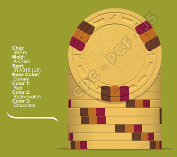
Actually I like these spots & colours, but I’m not a fan of 1” inlays, nor of the A-mold. CSQ could work here
Johnblue
Flush
Maybe the zebra should be 8v instead?
I still don’t see any penis’.
I still don’t see any penis’.
Steamtrain
3 of a Kind
Just fix the Quarter.Ok guys I think I fixed it
View attachment 365369
as mentioned before off balance compared to the rest of the set.
I really like the quarter. What do you think is off balance?Just fix the Quarter.
as mentioned before off balance compared to the rest of the set.
slisk250
Straight Flush
How many tables? I like 4 racks per.
12 racks of Rosie 5s got you covered...
Damn. That’s a nice set.12 racks of Rosie 5s got you covered...
Steamtrain
3 of a Kind
Would really need to see a sample to actually critique the set.
DeeVee8
Straight
Negative only? Not easy to do. The 100 makes me go...

DeeVee8
Straight
E&C would look soooooo cool.I know, I’m trying!
This thread sucks!!
Okay, okay, that was weak.
In all seriousness, if I had to be nit picky, the E&C or one of the neutral molds(CSQ, DSQ, etc) would have been my choice.
Similar threads
- Replies
- 18
- Views
- 582
- Replies
- 4
- Views
- 293
