CPC Mockup - First timer (1 Viewer)

EvelcyclopS

High Hand
Joined
Dec 10, 2020
Messages
88
Reaction score
182
Location
Virginia, USA
Hello all, I'm new here, I've been lurking for some weeks as I've ramped up some efforts to fulfill a more than decade long ambition of having a genuine custom set of chips.

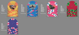
Theme follows an idea of sunsets - i'm into a tonne of things, but nothing that would make sense to build a set of chips off, apart from a love of a good sunset. So I matched this up with my love for travel, and built an idea to base my chips on sunsets I've seen in my travels and squeezing in some of my hobbies (e.g. the paraglider in the yellow chip). I'm still working on the inlays, but with the travel inspiration, i'm trying to style the inlays off art deco style travel posters. Current name is 'Sunset Club', however i'm not 100% sold on that. Was thinking 'sunset stakes', or 'the sunset' etc, but you guys might have some nice ideas.

The Denoms i was thinking are as follows, planning to play between 10c/10c and up to 10c/25c:
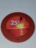
100: 10c (Yellow)
200: 25c (Blue)
200: $1 (Pink)
80: $5 (Red)
20: $25 (Purple)

Since my name begins with A i was thinking of going A-mold, but quite like the H-Mold and heard that circle-square has a great feel. I was hoping to get a sample set at least for colours, but not planning on buying barrels to test for feel. Anyway, nice to meet y'all and let me know what you think
 

Attachments

  • Chipset draft.png
    Chipset draft.png
    284.7 KB · Views: 329
These are beautiful! I love the overall theme and how the inlay complements the base.

Curious: Why no edge spots on them?
 
I love the theme and think you’re in the right way here. But I would twist a few things here and there:

- I don’t think a 10c / 25c distribution makes sense. I would either go with 5c / 25c (you would need a lot more fracs) or 10c / 50c (less fracs required).
- Personally, I don’t like your spot progression, with 2 chips using 3V12. To me, either all the chips in the set use the same edgespot or none of them repeat it. But that’s my personal taste.
 
Last edited:
I love the theme and think you’re in the right way here. But I would twist a few things here and there:

- I don’t think a 10c / 25c distribution makes sense. I would either go with 5c / 25c (you would need a lot more fracs) or 10c / 50c (less fracs required).
- Personally, I don’t like your spot progression, with 2 chips using 3V12. To me, either all the chips in the set use the same edgespot or none of them repeat it. But that’s my personal taste.
Yeah I think you’re right - the red chip is the weakest one. Any suggestions for a good spot progression for that?

I was thinking about 5c chips vs. 10c, i haven’t settled on a decision yet, but for me it makes less sense than 10/50c as then the step to $1 is a bit moot. Unless considering ditching the $1 altogether but then I think that reduces the table value of the chipset.
 
Try to avoid reusing the same colors. Also try to avoid reusing the same spot patterns (that or make them all the same). Your edge spots should either progress across the set or all be the same across the set.
 
I agree with @RainmanTrail that you should avoid trying to use the same colours if possible, or at least not for chips within 2 denoms of each other. I am less a stickler for "spot progression", as it is not necessarily a "thing". Play around with unique vs. uniform, you may be surprised. Uniform spots are more common in tournament sets, and you're obviously building cash.
 
I don’t feel a set has to have a true progression, of simple to more complex, but I don’t really like repeated spots as Travis mentioned.

There are lots of great spot patterns and you will only get to use 5 of them, why repeat one?

I like making the main workhorse chip the spot pattern you like the most then build the rest of the set around it.
 
Try to avoid reusing the same colors.

I agree with @RainmanTrail that you should avoid trying to use the same colours if possible, or at least not for chips within 2 denoms of each other.

I have been wondering about this. I am no chip design expert for sure. So I am honestly curious about this. Why do people preach this all the time? Why is it OK sometimes but generally preached against?

The Buddha’s have white on every single chip, yet is HOF-nominated. Is the answer simply “sometimes it works”?

70CE5601-D7F0-4367-848B-66BBD62EAC5E.jpeg
 
I have been wondering about this. I am no chip design expert for sure. So I am honestly curious about this. Why do people preach this all the time? Why is it OK sometimes but generally preached against?

The Buddha’s have white on every single chip, yet is HOF-nominated. Is the answer simply “sometimes it works”?

I'm more concerned about repeating an edge spot (usually a wide edge spot) with a base colour within 2 chip denominations, because of potential dirty stacks. There is sufficient combinations of edge spots in size and number that repeating colours might be less of a concern here. But you'd have to experiment and likely go through very many iterations to find a workable combination. It's simpler just to use a variety of colours and contrasts.
 
I have been wondering about this. I am no chip design expert for sure. So I am honestly curious about this. Why do people preach this all the time? Why is it OK sometimes but generally preached against?

The Buddha’s have white on every single chip, yet is HOF-nominated. Is the answer simply “sometimes it works”?

View attachment 609253

in my opinion it is the one knock I have against the set. It is beautiful, well designed and executed. But I don’t like the white in every chip. I’m pretty sure Travis made a deliberate effort with it to signify purity is my guess. I don’t love that he did it, but he did it well that it doesn’t take away from the set overall.
 
I am less a stickler for "spot progression", as it is not necessarily a "thing".

It's definitely a thing. It's not always easy to determine which spots are more "progressed" than another one (e.g., a quarter pie vs a tri-moon or a 3D14 vs 3V12), but it's I'll advised to mess up the obvious ones.

Obvious examples:
114 < 214 < 314 < 414 < 614 < 814
214 < 2D14
414 < 414418
814 < 8d18
...

To ignore these basic design principles is to objectively create poor designs. As a custom set, of course anyone is free to create as they please and like whatever they like, but if people are coming here and asking for advice on how to create a great looking set, then these basic design principles should be pretty standard advice.
 
I have been wondering about this. I am no chip design expert for sure. So I am honestly curious about this. Why do people preach this all the time? Why is it OK sometimes but generally preached against?

The Buddha’s have white on every single chip, yet is HOF-nominated. Is the answer simply “sometimes it works”?

View attachment 609253

First, I should point out that I don't really think my Lucky Buddhas are "HOF worthy", despite them being nominated for the vote (although I also disagree with at least half the sets that are currently in the HOF, the Pillage & Plunder set to me is just way too busy, although I do love the theme, but it is one of the most loved sets on the entire site, so to each his own). There are some elements I really love about my Lucky Buddha set, but I think it is precisely because of the white spots throughout that they'll never get voted in by the community. It likely reminds people too much of dice chips, so they vote for something else even if they otherwise love the set. It only takes one "flaw" to disqualify a set. To some, this is a clear flaw. To others, it flows well and they love the simplicity of it.

That said, at least in my opinion, a set doesn't flow well when two adjacent chips share the same colors (or at least extremely similar colors). Particularly when one is the base color and the next chip is the edge spot. But there is an exception to this, which is when *all* chips share a color. As an example, @72o put together one of the best mixed sets I've seen here with his "Yellow set" shown below. A lot of people also really liked my "Blue set", which had blues throughout. Obviously, it's all comes down to the individual's tastes, but I think you'd find that the majority would be on board with a set that has a unifying color throughout as long as it's well done. Although the color white specifiically would be fairly polarizing because of its association with dice chips. However, if I were to make a 6 chip set, and 4 of those chips had white spots while the other 2 didn't, I think pretty much everyone would be on board in saying it was a bad design choice.

The same is true with edge spots. If you created a set where each chip all had the same spots (say all tri-moons, or all 314, or all quarter-pie) then it can definitely be pulled off and look great. But if that set were 214, 314, tri-moon, tri-moon, 4V12, tri-moon, then most people would be scratching their heads. Ultimately, it's all about flow IMO. Does the set flow well? Does it look like a cohesive set? Do the colors complement each other? That's what makes a good set at the end of the day. There are different ways to accomplish it, but there are also numerous ways to automatically disqualify it from being a good set. I generally try to avoid the most obvious of blunders.


1609992375767.png


Last edited:
I don’t feel a set has to have a true progression, of simple to more complex, but I don’t really like repeated spots as Travis mentioned.

I would agree. It's not so much that a set needs to "progress" as much as it needs to avoid regressing. You can make a great set without doing something like the 214 314 414... idea, but you can't make a great set if it goes from 8D18 to 414 to 6D18 then to 214 and then to 1V12.
 
I have been wondering about this. I am no chip design expert for sure. So I am honestly curious about this. Why do people preach this all the time? Why is it OK sometimes but generally preached against?

The Buddha’s have white on every single chip, yet is HOF-nominated. Is the answer simply “sometimes it works”?

View attachment 609253

Did my response make sense, or does it just sound like my justification for why I can do it but others can't? :ROFL: :ROFLMAO:
 
Did my response make sense, or does it just sound like my justification for why I can do it but others can't? :ROFL: :ROFLMAO:

Hearing the response, I get that dirty stacks is a valid concern. And having near-all but not all chips in a set (4 of 6, in your example) having one color would look weird -- don't do that. But my take-away is....don't design chips using colors you don't like, because of this rule. Design something you like, that works, "rules" be damned.

That said, 100% agree with the repeating spot pattern suggestion -- don't do it, unless using the same spot pattern for all chips.
 
That said, at least in my opinion, a set doesn't flow well when two adjacent chips share the same colors (or at least extremely similar colors). Particularly when one is the base color and the next chip is the edge spot. But there is an exception to this, which is when *all* chips share a color.

And I'm 100% breaking this rule in my upcoming order. And I'm breaking it with the two most important chips ($1 and $5)

I like both chips, and think both would be worse if I used a different color in one of the two chips. Could the set be designed better if I obeyed this rule? Maybe. Probably.
 
Folks, Thank you for the input and also for the theoretical discussions ;)

Taking on some of the input i've updated below, still working on the last chip inlay design, but after getting my colour samples i've reworked some of the chip and edgespots. Love some of the colours, its a shame not all fit with my theme.

Couple of thoughts based on the input you guys graciously gave:
- Trying to stick to the tri-form edgespots everything has a unique edgespot design, hopefully building in complexity to give some progression
- I've tried to avoid repeating edgespot colours, but following @liftapints wisdom, i'm trying to be sympathetic of the colours to the theme, so difficult not to repeat with the limited palette available. The key is that the base colours are different enough (checked in dark light) so there shouldnt be a big issue of dirty stacks where repeated edgespots are covered. E.g. the 10C and 25C both have arc yellow as edgespot, however if those two get confused we've had too much booze!
- @RainmanTrail that blue chip set is beautiful!

I also had a fiddle with the font, still not 100% sold on it...

The Sunset Chipset.png
 
I would change the DG arc yellow spot on either the 10¢ or 25¢ chip. I'd also make the smaller chip a 5¢ instead of 10¢ denom. Especially if you're going with 25¢ rather than 50¢ for the other frac.
 
Maybe a jungle or African Serengeti tree sunset? Just googled jungle sunset couple nice ideas with purples in them.

Whatever it is, I’ll take a sample set!
 
do you guys feel that the 3TA141814 is different enough from the 3TA16 edge spot in real life?
I was just about to say you shouldn't repeat spot patterns but now I see they are different. Here's an example of those two spot patterns:

20210112_162140.jpg


You've also used DG peacock 3 times and there's a lot of orange also. You could use a green instead on your pink chip to bring that out in the inlay. A brown/butterscotch tone could be used on your 1st chip.
 
Maybe a jungle or African Serengeti tree sunset? Just googled jungle sunset couple nice ideas with purples in them.

Whatever it is, I’ll take a sample set!
I’m new here - how does that work?

the plan for the last chip is a city scape based on a photo from London a few years back. I plan to have bits and pieces of landmarks that I have a connection with e.g. the Tyne bridge on account of my home city, something American for where I live, blah blah. That’s the plan. If not I’ll probably do some rolling hills to suggest the blue ridge mountains which give me a sunset every day or the sunsets I used to see when I was gliding in Northumbria.
I like the idea of the jungle though, I need to save space for a $100 chip if my game ever gets close to needing it, which I think will be green. Jungle or forest might work nicely for that ;).
 

Create an account or login to comment

You must be a member in order to leave a comment

Create account

Create an account and join our community. It's easy!

Log in

Already have an account? Log in here.

Back
Top Bottom