Just sold a couple of things recently and I am thinking of using the newly found capital to add a tourney set to my exisiting cash sets. And I guess that if I am going to own only one tourney set, it is going to be a WSOP Rio tribute.
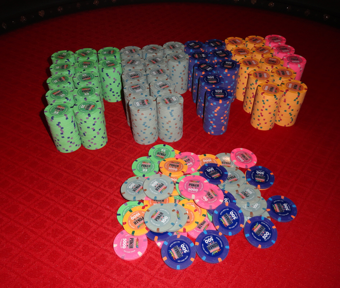
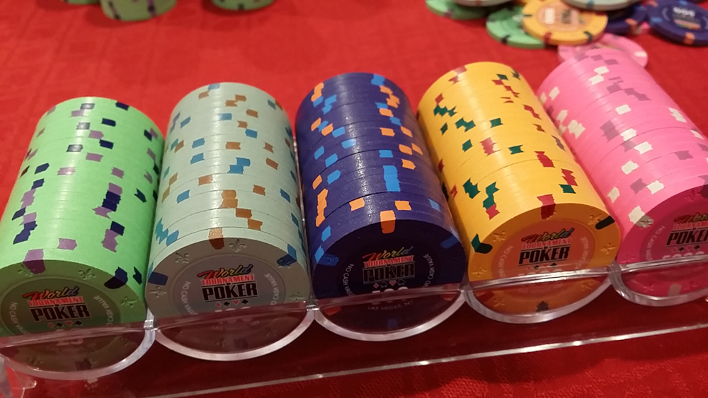
So I looked around and saw what @Seeking Alpha Social Club managed to put together (I will not pretend it wasn't a source of inspiration, the set is phenomenal ) and now I am convinced this should be (one of) my next project(s). I am using this picture, which I have found here on PCF somewhere, as a reference -it is my favourite version.

Going for 39mm, on the A-mold (cheaper, and will be "Aces" chips) and 4DSA18 because it is close enough and it allows me to keep budget under control.
Trying to be true to the originals with a twist here and there. Now the only thing I am hesitating with is the edge spots combinations for the T100 and T1000. Small differences, but can't decide. So what do you think? Please vote!
(what's changing from one picture to the other are the edge spots on T100 and T1000)
1. T100: Gray/Light Blue/Light Chocolate, T1000: Dayglo Arc Yellow/Dayglo Green/Mandarin Red

2. T100: Gray/Light Blue/Butterscotch, T1000: Dayglo Arc Yellow/Dayglo Green/Mandarin Red

3. T100: Gray/Light Blue/Butterscotch, T1000: Dayglo Arc Yellow/Light Green/Mandarin Red

4. T100: Gray/Light Blue/Light Chocolate, T1000: Dayglo Arc Yellow/Light Green/Mandarin Red

And two final questions: Light Blue on Gray and Dayglo Peaach on Pink - is there enough contrast? Thoughts on using Maroon with the lavender edge spot on the T25?
Disclaimer: I do not own a CPC color sample set
So I looked around and saw what @Seeking Alpha Social Club managed to put together (I will not pretend it wasn't a source of inspiration, the set is phenomenal
) and now I am convinced this should be (one of) my next project(s). I am using this picture, which I have found here on PCF somewhere, as a reference -it is my favourite version.Going for 39mm, on the A-mold (cheaper, and will be "Aces" chips) and 4DSA18 because it is close enough and it allows me to keep budget under control.
Trying to be true to the originals with a twist here and there. Now the only thing I am hesitating with is the edge spots combinations for the T100 and T1000. Small differences, but can't decide. So what do you think? Please vote!
(what's changing from one picture to the other are the edge spots on T100 and T1000)
1. T100: Gray/Light Blue/Light Chocolate, T1000: Dayglo Arc Yellow/Dayglo Green/Mandarin Red
2. T100: Gray/Light Blue/Butterscotch, T1000: Dayglo Arc Yellow/Dayglo Green/Mandarin Red
3. T100: Gray/Light Blue/Butterscotch, T1000: Dayglo Arc Yellow/Light Green/Mandarin Red
4. T100: Gray/Light Blue/Light Chocolate, T1000: Dayglo Arc Yellow/Light Green/Mandarin Red
And two final questions: Light Blue on Gray and Dayglo Peaach on Pink - is there enough contrast? Thoughts on using Maroon with the lavender edge spot on the T25?
Disclaimer: I do not own a CPC color sample set
Last edited:

 Level 9 I think.