CPC color and inlay ideas (1 Viewer)

Tripwired

High Hand
Joined
Aug 11, 2018
Messages
69
Reaction score
129
Location
staind7359
So, here's where I'm at as of now. It's going to take some time to raise the funds for this set unless I sell off some assets(i.e. my Taylor guitar and Glock). So, unless I go that route I've got time to work out the details of the colors and inlay design. I wanted to run this basic idea by the community to see what y'all thought .I don't have the tech knowledge to truly mock up the inlay, but I'll try to explain it as best I can.
Black inlay
I like the Aria style A in the background right in the center, so imagine that
Atlantis(arching at top)
Resort and Casino(smaller and just below Atlantis)
Denominations (25c, $1, $5, & $20) at the lower portion of the A that's in the background
I'll either go with a saying like "Sink or Swim" at the bottom below the denom, or spell out the denom around the edges in three places. Not sure yet.

I hope that's not confusing as heck. If so then I apologize. The chip design I have so far is:
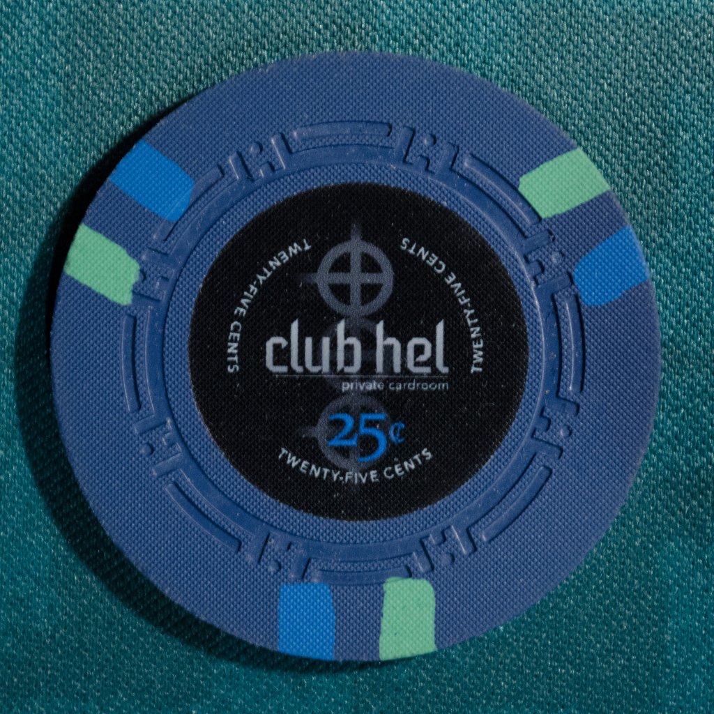
25c
25c.png

I would imagine the island of Atlantis to resemble something similar to Hawaii in many ways. So, this is a floral color design . I've waffled on whether to go with the dayglo yellow or the dayglo arc yellow for the base color. Here's an example of one with the arc yellow:
arc yellow.png


$1
$1.png

I chose this for the varying shades of blue water/waterfalls. I added the green because I just like the color combo.
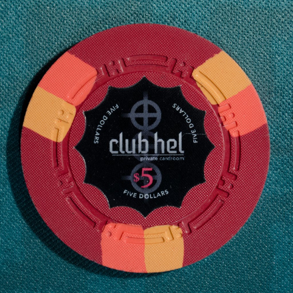
$5
$5.png

I picked this one because I imagine the island having an active volcano. I see these colors representing the different shades of lava.
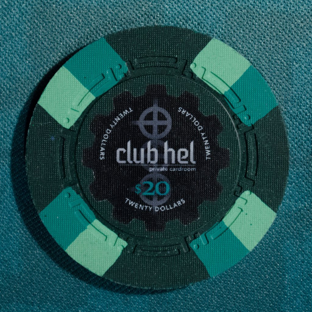
$20
$20.png

I chose this combination because when my wife and I honeymooned in Hawaii I couldn't get over all the lush green beauty the island revealed. Everything was green and vibrant. It may be too much green, but I really like this one.

So, that's what I've got so far. Please feel free to critique and assist, but just keep in mind this is my first work-up of my first attempt at a custom set.
 
For your 20, try switching out the base green for the dayglo yellow you have at the top. Keep your frac with arc yellow, or maybe a light pink to represent coral or shells.

To avoid having too much text on your inlay or a fight for space between text and graphics/denoms, you can always have a different inlay on each side.
 
So, this
$20Yellow.png

Interesting. I kinda like it. I have been mixing things up with the chip tool for about a month now. I don't recall trying the yellow with this one, though. I'll have to let it marinate for a while to see if it's a real keeper. Thanks for the advice. I appreciate it.
As far as the different inlays goes I think I prefer to have one matching inlay to both sides. If I have to I'll just cut out some of the text if it's too busy.
 
I bet that's why I felt like I'd seen the green one before. Did you post these on the forum? I don't remember the blue or red, but I feel like the green looked familiar. I originally had the $1 as a white base with three to four wider edge spots, but I opted to change it several times. I need to go with something around the level 3 price range & the 3DSA316 looks different from the rest, but still looks good. I thought the red looked like fire and lava. I rotated between all the reds, oranges, and yellows, and I'm not fully settled yet. I do like the current color combo though. I feel like it captures the theme. Themes seem to be very important to the designs around here and I felt like I should put in the effort to come up with a design that matches the inlay and the colors together. I struggled with this for weeks. My colors would show one thing, but the inlay said another. I hope I'm closer now, but I know it's never going to be perfect. I initially had much lighter colors to give that island/tropical theme, but that's just not what I like.
 
Hey, Nex, is the base color I your $5 red? Or is it the Mandarin red or retro? It seems a slight bit lighter than what the red on the chip tool shows.
 
I also like this for the $1
$1 6A14.png


Which should I go with on the $1's? I wonder if this blue is too dark?
 
Last edited:
I bet that's why I felt like I'd seen the green one before. Did you post these on the forum? I don't remember the blue or red, but I feel like the green looked familiar. I originally had the $1 as a white base with three to four wider edge spots, but I opted to change it several times. I need to go with something around the level 3 price range & the 3DSA316 looks different from the rest, but still looks good. I thought the red looked like fire and lava. I rotated between all the reds, oranges, and yellows, and I'm not fully settled yet. I do like the current color combo though. I feel like it captures the theme. Themes seem to be very important to the designs around here and I felt like I should put in the effort to come up with a design that matches the inlay and the colors together. I struggled with this for weeks. My colors would show one thing, but the inlay said another. I hope I'm closer now, but I know it's never going to be perfect. I initially had much lighter colors to give that island/tropical theme, but that's just not what I like.

Yup, I have them since February and got pics up here :)

Hey, Nex, is the base color I your $5 red? Or is it the Mandarin red or retro? It seems a slight bit lighter than what the red on the chip tool shows.

Yes, it's the standard red. Itappears brighter on the photo than it really is due to color adjustments I've done across the lineup photos. There are other pics of the $5 though that are closer to what it looks in person.

I also like this for the $1
View attachment 197289

Which should I go with on the $1's? I wonder if this blue is too dark?

Dark Blue is... really dark. I would say subjectively, it's even darker than Dark Green in comparison. In the first mockups for my set, I had the 25c chip with Dark Blue base too - until I got my color samples.
 
So, this
View attachment 197277
Interesting. I kinda like it. I have been mixing things up with the chip tool for about a month now. I don't recall trying the yellow with this one, though. I'll have to let it marinate for a while to see if it's a real keeper. Thanks for the advice. I appreciate it.
As far as the different inlays goes I think I prefer to have one matching inlay to both sides. If I have to I'll just cut out some of the text if it's too busy.

Well, I was really thinking of changing the BASE chip colour to yellow, and keep your green spots. Yellow is somewhat traditional for a Vegas $20 since you were using traditional colours. But green works if you like it, because of your Atlantis theme.
 
Well, I was really thinking of changing the BASE chip colour to yellow, and keep your green spots. Yellow is somewhat traditional for a Vegas $20 since you were using traditional colours. But green works if you like it, because of your Atlantis theme.

I tried the yellow base but I think I like the green better overall. I'll keep working with it to see if it grows on me, though. I already had a few times where I adjusted something and didn't like it much initially, but a couple of days later preferred it to the original. We'll see. Thanks
 

Create an account or login to comment

You must be a member in order to leave a comment

Create account

Create an account and join our community. It's easy!

Log in

Already have an account? Log in here.

Back
Top Bottom