Chess Themed Poker Set (1 Viewer)

Pinesol13

Flush
Joined
Feb 21, 2019
Messages
1,496
Reaction score
4,108
Location
Upstate, NY
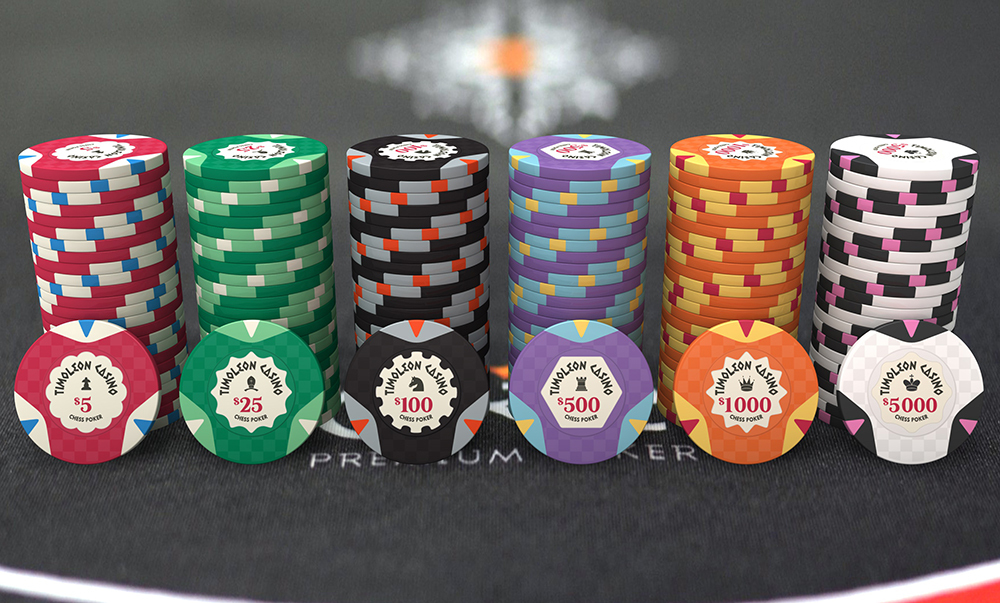
Kicking around some ideas on a chess inspired set, interested in any feedback.

thanks

Artboard 1.png
Artboard 2.png
Artboard 5.png
Artboard 3.png
Artboard 4.png
Artboard 6.png
 
Love the theme. I am partial to the bad bishop design. You could have different pieces as the "mold" for each of the denoms. Also, you could rearrange the center piece of the inlay to match (i.e., the 1s could have a pawn in the middle, slightly emphasized/larger than the other pieces, with the other pieces arrayed around it. The center piece could be color-matched to the chip denom; the 5s could have a bishop or knight emphasized in the center, the 25s could have whatever you didn't choose for the 5s; the 100s could have a rook, etc.)
 
perhaps for a tournament
pawn---rook---knight--bishop-queen---king
5 --------25-----100------500---1000----5000

would be tough to play all the denoms normally unless it was a multi-table.
 
Love the theme. I am partial to the bad bishop design. You could have different pieces as the "mold" for each of the denoms. Also, you could rearrange the center piece of the inlay to match (i.e., the 1s could have a pawn in the middle, slightly emphasized/larger than the other pieces, with the other pieces arrayed around it. The center piece could be color-matched to the chip denom; the 5s could have a bishop or knight emphasized in the center, the 25s could have whatever you didn't choose for the 5s; the 100s could have a rook, etc.)
love the idea of editing the multi-color piece logo to progress with the denominations!

perhaps for a tournament
pawn---rook---knight--bishop-queen---king
5 --------25-----100------500---1000----5000

would be tough to play all the denoms normally unless it was a multi-table.

Yep, that was my idea. The chips designed currently progress from T25 - T25K, and start with pawn - King. I just put different labels on some as I was working through the label designs.

So far I think I like Bad Bishop the best, but also really like the Fianchettos, but agree I should change it to a bishop piece.

Two follow up questions for anyone interested

1) is the chipface design (not the inlay) too simple? Should I add some type of edgespots, or other design element to the face? I worry they look a little too much like the cheap suited plastic poker chips.

2) what do I do with the edge itself? Solid? I thought about adding the chess piece icon, but worried it won't show up well on the printed edge.
 
perhaps for a tournament
pawn---rook---knight--bishop-queen---king
5 --------25-----100------500---1000----5000

would be tough to play all the denoms normally unless it was a multi-table.
King - Bounty Chip

…maybe shown as toppled over. And instead of the normal ‘Bounty’ text, it would say ‘Checkmate’
 
Someone did a set on this theme here.
This was the latest version of his design he shared :
sbs3.jpg

He said he'll post a pr0n as I think he now received the chips.

Very nice!

It's interesting that he put the bishop as the $25, and the knight as the $100. I have the opposite.
 
Someone did a set on this theme here.
This was the latest version of his d
love the idea of editing the multi-color piece logo to progress with the denominations!


Yep, that was my idea. The chips designed currently progress from T25 - T25K, and start with pawn - King. I just put different labels on some as I was working through the label designs.

So far I think I like Bad Bishop the best, but also really like the Fianchettos, but agree I should change it to a bishop piece.

Two follow up questions for anyone interested

1) is the chipface design (not the inlay) too simple? Should I add some type of edgespots, or other design element to the face? I worry they look a little too much like the cheap suited plastic poker chips.

2) what do I do with the edge itself? Solid? I thought about adding the chess piece icon, but worried it won't show up well on the printed edge.

I'm assuming you are planning to make these as ceramics - if so, I like the random polygon effect you've got going on with the chess pieces themselves in the Bad Bishop set - maybe consider something similar for the background of the chip face to give it some texture. You could work the chessboard motif onto the rolling edge, similar to the Timolean set. That would free you from having to worry about edge spot alignment.
 
Hey just joined this site as I have been spending a few nights perusing the threads and wanted to give an idea.

I really like the Bad Bishop name and agree with the above about the polygon effect on the pieces. My thought and I'm not sure of the rules but I'd like to see the bishop the same colour as the chip and the other peices in grey scale and as the denomination increases a piece gets removed from the first 5 say the pawn then rook, queen, king, 'till just the bishops left on the highest denomination, would that work??

Great theme and I like the piece symbols round the edge even though like you said it does give the look of the cheap chips that have the suit symbols around the edge.
 

Create an account or login to comment

You must be a member in order to leave a comment

Create account

Create an account and join our community. It's easy!

Log in

Already have an account? Log in here.

Back
Top Bottom