Cash set label poll - Injection Molded Chips GB - 2021 (1 Viewer)

What label version do you like better?

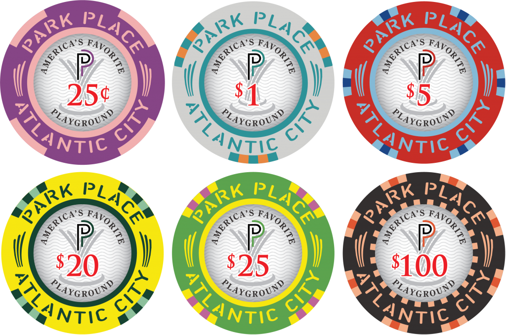
  • CHOICE A - Logo & Denom

    Votes: 44 35.8%
  • CHOICE B - Logo, Denom, and AFP text

    Votes: 47 38.2%
  • CHOICE C - Logo, Denom, and Denom text (style 1)

    Votes: 23 18.7%
  • CHOICE D - Logo, Denom, and Denom text (style 2)

    Votes: 9 7.3%

  • Total voters
    123
  • Poll closed .
Status
Not open for further replies.

Tommy

Royal Flush
Admin
Moderator
Supporter
Joined
Mar 23, 2013
Messages
17,599
Reaction score
38,130
Location
Delaware
CHOICE A - Logo & Denom Only
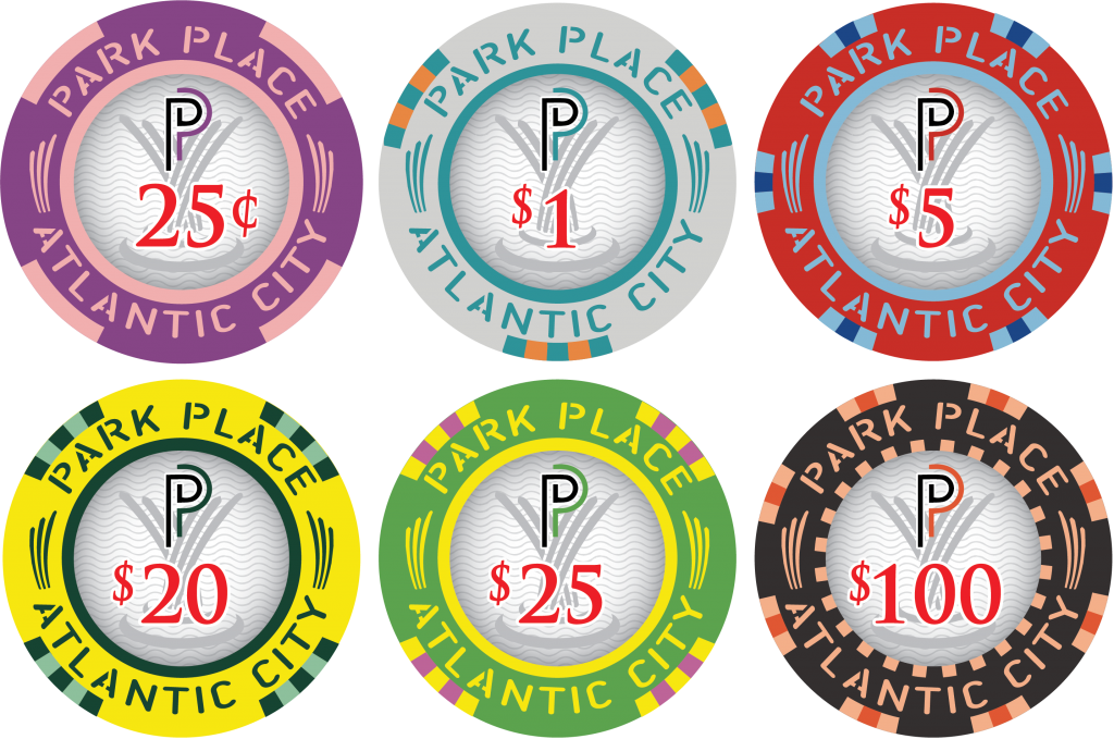
cash-1h.png


CHOICE B - Logo, Denom, and AFP text (color-matched or all black)

cash-1g.png


cash-AFP-2.png


CHOICE C - Logo, Denom, and Denom text (style 1)

cash-1.png


CHOICE D - Logo, Denom, and Denom text (style 2)

cash-AFP-4.png
 
Last edited:
The phrase "America's favorite playground" sounds really cheesy to me. I like the simplicity of A. It gives you a clear denomination, a nice logo, and the cool wave texture in the back. And then the inner ring gives you the location and full name. Too much text ruins that balance, IMO.

Edit to add: If you're doing color matching, it would probably be better to make it all based on the inner ring, because it removes the inconsistency that exists with using a mix, and in this case, the inner ring for all of the chips is fairly unique and not grayscale. And for the record, I think color matching is a good idea for this inlay. Especially if it ends up being A or C.
Yeah, it is a little cheesy. I changed my vote to my initial reaction....C
 
I'd never heard of that phrase before. My gut instinct when I read it was ewwwww.

Spelling out what the denom says, always feels redundant to me. So I voted A.

The design looks great though, good job design team.
 
Just a thought, A & C are both a vote against “America’s Favorite Playground”.

Does that make C the Ross Perot of the group buy???
 
Interesting... I was also going to say that B was cheesy and was going to select C, but if that is in fact based on a scene from Rounders, then the coolness factor of B just went back up. Now there’s a story behind it when someone asks.
Enjoy! @ 0:40

 
Yup, there it is... 54 minute 29 second mark, right after one of the best scenes of the movie...
 
That 2 seconds it’s in a movie isn’t a reason to put on a chip. But, that’s just my opinion. It’s in the lead at the moment, so what do I know.
 
That 2 seconds it’s in a movie isn’t a reason to put on a chip. But, that’s just my opinion. It’s in the lead at the moment, so what do I know.

Being in the movie wasn't the reason why we put it on a mockup. AC is known as AFP. And playgrounds are located at parks. Chips are Park Place. It all kind of ties together. I'm OK with any of them, but I thought it would be fun to put it to a vote.
 
Being in the movie wasn't the reason why we put it on a mockup. AC is known as AFP. And playgrounds are located at parks. Chips are Park Place. It all kind of ties together. I'm OK with any of them, but I thought it would be fun to put it to a vote.
Park Place seems like a classy name to me, and the inlay shares that very simplistic look, so Playground doesn't seem very fitting. And it is a bit repetitive to give a casino the same slogan as the city it's in. If the inlay was a fun cartoon or some bright image I think that slogan could work, but as it stands it seems like it just detracts from the theme, IMHO.
 
FP updated. Add the following in bold.

CHOICE A - Logo & Denom Only
CHOICE B - Logo, Denom, and AFP text (color-matched or all black)
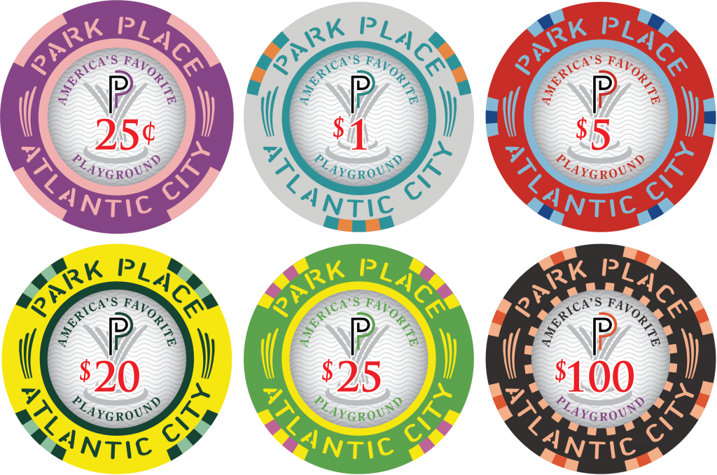
CHOICE C - Logo, Denom, and Denom text (style 1)
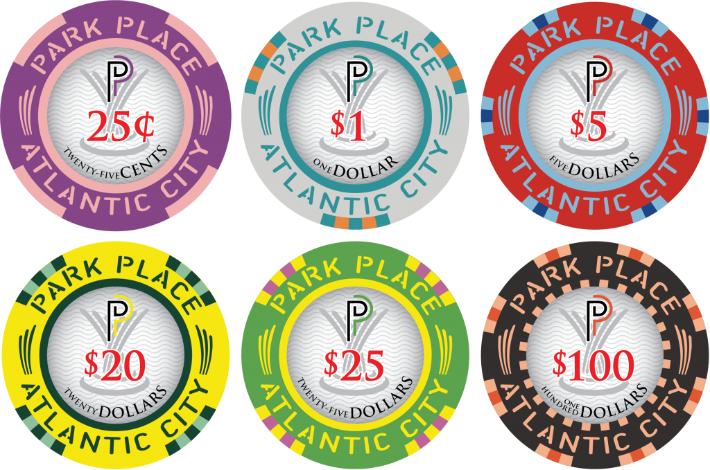
CHOICE D - Logo, Denom, and Denom text (style 2)
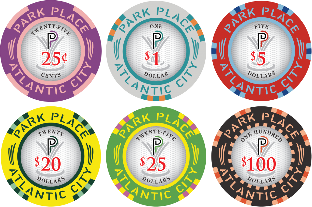
 
@Tommy if those that initially voted without the latest style changes don’t come back to potentially change their vote you may get a false read on the new styles...
 
The more I look at these, the more I think the extra words "America's Greatest Playground" take away from the custom inner ring, which is the star of the show here. I think it makes everything "too busy". I think option A is too sparse. So my preference is for C by process of elimination (not a fan of D).

I hope we don't decide to drown out the awesomeness of the super star inner ring.
Mel, I’m mostly with you, but I think D looks a bit more balanced than C... Either way, these chips are fantastic...
 
  • Like
Reactions: DMZ
Status
Not open for further replies.
Back
Top Bottom