Best Tina Colors to Use? (1 Viewer)

JFG

Pair
Joined
Feb 20, 2022
Messages
216
Reaction score
470
Location
Riverside, CA
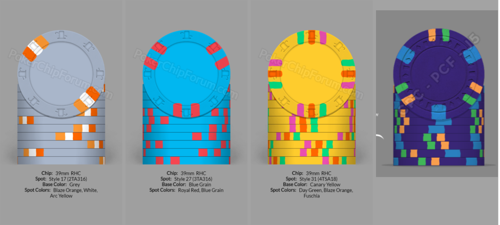
I've noticed that the color quality on some chips can vary – some are strikingly vibrant and opaque, while others seem faded. To ensure the best results for my design, I have two questions about the Pantomime colors used:

From your experience, which Pantone colors have you found to be the most vibrant and opaque when printed on the chips?

Are there any specific Pantone colors or tones that tend to fade or don't translate well onto the chips?
chips.png
 
Last edited:
I was always curious in the beginning of the cards mold craze that it was recommended to pick colors from the Pantone (PMS) system, especially since dye-sub doesn’t use Pantone ink. It’s either CMYK or a 6-color print used in the transfer. Even though there are CMYK values for PMS colors, many of the greens and especially bright blues simply do not translate.
A better way is to use CMYK while designing. It isn’t perfect, as some colors that traditionally print one way on paper tend to go completely out the window on Tina’s end. Sometimes I have no idea why some colors just come out completely different. For example, it’s tough to get a decent purple…if it has too much red, it goes completely red…and a bluish purple goes blue.
Generally, choosing CMYK values that are saturated and bright are replicated best in the final chip. Muted, less-saturated colors look a bit washed out.
Lately I’ve jus been taking colors from sample chips that I have in hand in which I know the CMYK values. It’s not the way it should be done, but there’s a good amount of trial-and error in the whole process.
Thank you. I probably need to rethink my Blurple chip.
 
Thank you. I probably need to rethink my Blurple chip.
It’s definitely possible to get the final result you’re looking for…but sometimes the color you want in the final just looks wrong onscreen. That’s why it’s so hard to choose…you almost need “happy accidents” once in a while to find certain colors.
It’s a truly inexact science.
 
These are the colors I'm using. Do you think I'll have problems with them? Also, do you think Tina will have issues with edge alignment and the semi-symmetrical design?

Screen Shot 2024-01-26 at 6.58.00 PM.png
 
These are the colors I'm using. Do you think I'll have problems with them? Also, do you think Tina will have issues with edge alignment and the semi-symmetrical design?

View attachment 1262317
The red edge spots in your second chip may get darker, if that's ok. Also, the bluish purple of the 4th chip may be fine, but may go dark blue. I recommend setting the file up in CMYK format if posible.
Regarding the rolling edge, you'll need to provide art for the edge, and the spots will need to be aligned so that as it wraps, the spots hit in the right alignment. It can be tricky, because the spots and the spaces are a bit larger than the face because it's on a curve. I highly recommend using a template that has both chip faces and edges. A great one can be found here:
https://www.pokerchipforum.com/thre...phics-useful-for-tina-anita-cards-mold.81302/
 
  • Like
Reactions: JFG
I have Anitas card mold chips. The Red and Black chips have colour distortions/fading of the ink at the seam edge of the rolling edge....other colour chips are not as affected, however the black and red are affected most. It appears almost as the printer was running out of ink.
 
  • Like
Reactions: JFG
The red edge spots in your second chip may get darker, if that's ok. Also, the bluish purple of the 4th chip may be fine, but may go dark blue. I recommend setting the file up in CMYK format if posible.
Regarding the rolling edge, you'll need to provide art for the edge, and the spots will need to be aligned so that as it wraps, the spots hit in the right alignment. It can be tricky, because the spots and the spaces are a bit larger than the face because it's on a curve. I highly recommend using a template that has both chip faces and edges. A great one can be found here:
https://www.pokerchipforum.com/thre...phics-useful-for-tina-anita-cards-mold.81302/
From what point do you measure? 12 o’clock or 6? And I’m assuming you measure clockwise, right?
 
From what point do you measure? 12 o’clock or 6? And I’m assuming you measure clockwise, right?
For a 39mm chip, the circumference is 122.5mm. So you'll need a box approx 3.3mm by 122.5mm.
Ive always laid the spots over the circle then used Illustrator to cut the circle into pieces where they intersect, then measure the length of the pieces to confirm. If all the pieces add up to 122.5, it's accurate. But I only do this on spot patterns that are not in the template file I referenced in my post above. In that file, all the chip face and edge art has already been figured out. You'll just need to make the spots wavy if you desire.
 
  • Like
Reactions: JFG
For a 39mm chip, the circumference is 122.5mm. So you'll need a box approx 3.3mm by 122.5mm.
Ive always laid the spots over the circle then used Illustrator to cut the circle into pieces where they intersect, then measure the length of the pieces to confirm. If all the pieces add up to 122.5, it's accurate. But I only do this on spot patterns that are not in the template file I referenced in my post above. In that file, all the chip face and edge art has already been figured out. You'll just need to make the spots wavy if you desire.
Thank you
 

Create an account or login to comment

You must be a member in order to leave a comment

Create account

Create an account and join our community. It's easy!

Log in

Already have an account? Log in here.

Back
Top Bottom