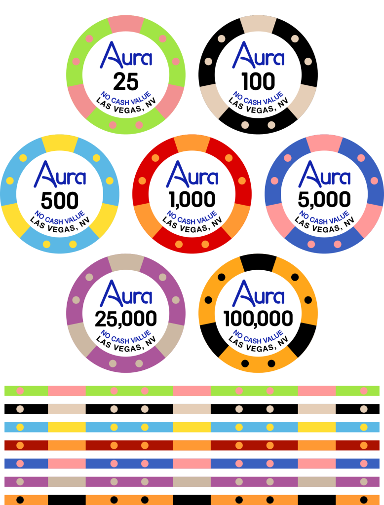
Update: I have changed the "tag" on this post to "Taking Orders". Editing this OP to reflect the most recent info, though I quoted the original post text to retain the info but in a collapsible form. This is the final artwork for the the Aria tournament tribute chips known as "Aura"...

If you are interested in buying these, chips must be bought in increments of 25. The cost for the 39mm chips, including shipping from Sun-Fly, artist fees, estimated wire transfer costs, is ~$0.98/chip. This is based on a hypothetical 2,500-chip GB order; chips will cost more if we order a lower quantity. (This does not include reshipping from me to you.)
I'd like to round up to an even $1/chip at this point, since we are only at 1,600 chips total and so we won't qualify for the discounted rate for a 2,500-chip order. I'd rather quote a higher price now than have to tell people it costs more later.
If we hit higher quantities and qualify for discounts, I will adjust the price down accordingly.
At least one person has reached out about 43mm chips, which would be ~$1.10/chip, based on a hypothetical 2,000-chip GB order, but will be more expensive at lower quantities. We'd need a minimum of 100 chips for a denom in order for it to be produced. We've met the requirements for 39mm, but we'll have to see if we get enough 43mm orders to make that option viable.
Please post your order in the following format:
39mm:
T25 -
T100 -
T500 -
T1K -
T5K -
T25K -
T100K -
43mm:
T25 -
T100 -
T500 -
T1K -
T5K -
T25K -
T100K -
Reshipping including insurance will be as follows for U.S. addresses: $12 for up to 300 chips, $22 for up to 600 chips, $32 for up to 1200 chips. International reshipping will be calculated on a case-by-case basis (but I can provide estimates).
To avoid potential issues with the previous "commemorative" design being too close to the real thing, I have redesigned the Aria tribute and am rebooting the group buy for them to be made on Sun-Fly PolyInno (hybrid) chips. (I will be creating a separate thread for the Rio/WSOP tribute, which I am also redesigning/rebooting.)
For the rebranding, I wanted to avoid "Aria's" which I did mock up initially, but it's been done before. So I wanted to see if we can find a name that could capture the same spirit as Aria, preferably starting (and ending) with "A" and be four letters like Aria. I've narrowed the redesign to "Aura" and "Aida" for the tribute "casino" name. Thank you to @Szczesnk for proposing the first option.
"Aria" means "air" in Italian, which is intangible, not directly observable except through other objects (leaves rustling, dust swirling, etc.), and "Aura" is similarly intangible and not generally visible, unless you're a psychic or get ocular migraines...
"Aria" is also the term a solo piece in an opera, and "Aida" is the name of a famous opera by Verdi, so there's a natural connection there...
I really want to avoid design-by-committee because, unlike replicating an existing design directly where there's little debate for how it should look, a new concept could open up the floodgates for potential name ideas, fonts, design tweaks, etc. So that is why I am making only these two options available in the poll. I have my own preference, but I won't say what it is until people have a chance to vote.
The core of the original Aria design (colors, spots, denoms, etc.) remains as-is. With the original Bud Jones chip being contained to certain color/spot combinations, and Sun-Fly's approved colors also being limited, the restrictions should mean both that we won't be able to exactly replicate the Aria colors/edges, but even if we could it would be relatively safe to copy, as we're not using the Aria logo, which is a registered trademark.
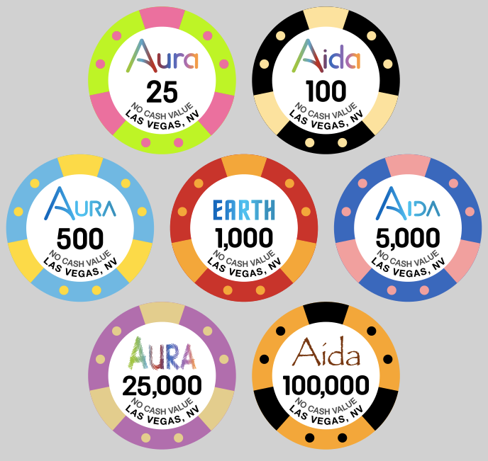
I've started playing around with how the two names would each look on the chips, here's what I have:

I decided against a handwritten script as to not try to mimic the original style too much (though I did create an "A" inspired by the original Aria logo). I know that means part of the look and feel of the "Aria" logo won't be in this one, but if we can't have the real thing, I'd rather not try make one tries to look too similar.
The first row shows both "Aura" and "Aida" in a font I found that I then heavily modified, with the letters following the "A" in lower case. The color gradient across the name uses each base color (except for the black T100).
The second row has all letters in upper case, though the leading "A" is larger. I stuck with the gradient but used a blue similar to the Aria blue. (The name on the T1000 is a hint for what the Rio WSOP tribute design theme will be. You get internet brownie points, worth the paper they're printed on, if you can guess the theme...)
The third row had the "fun" ideas, with "Aura" in this trippy swirly line font, and "Aida" in the infamous Papyrus font, since Aida the opera takes place in Egypt, and the font fits in with that setting.
I didn't make a poll for the different logo styles, but if you have opinions on which style you like better, please comment below!
I am not taking orders yet, until the design is finalized, but the old threads (which are now locked) still exist so I can see what peoples potential orders were before. I am tagging people who had expressed interest from @Szczesnk and my threads here for visibility, in no particular order: @jabsolstice @shorticus @LeLe @Pippa @JoeBGo @MichaelBubly @paulkersey @ceramicmike @FrostyMugs32 @STL_POKERGUY @CapNcrunchPoker @HebbNH @LowerBama1714 @TheSalt @GrindstonePoker @Taxi500 @CarlosStorm @JMC9389 @Matt G @rcamp014 @AcesUp907 @Chipnut @sgago84 @DuffCal @almondjoyce @PinDoc (Apologies if I've missed anyone.)
Constructive feedback welcome as I work to finalize the design, but like I said, I'd prefer this not devolve into design-by-committee. (The reboot of the Rio / WSOP tribute has been posted.)
Last edited:
