Lack of Interest REBOOT: Rio WSOP Tournament Tribute on Sun-Fly PolyInno Hybrid Chips (1 Viewer)

Which Rio WSOP tribute design would you buy for a tournament set on Sun-Fly hybrids?


  • Total voters
    18
  • Poll closed .
Status
Not open for further replies.

TheOffalo

Full House
Tourney Director
Joined
Sep 26, 2021
Messages
4,335
Reaction score
7,516
Location
Los Angeles, CA
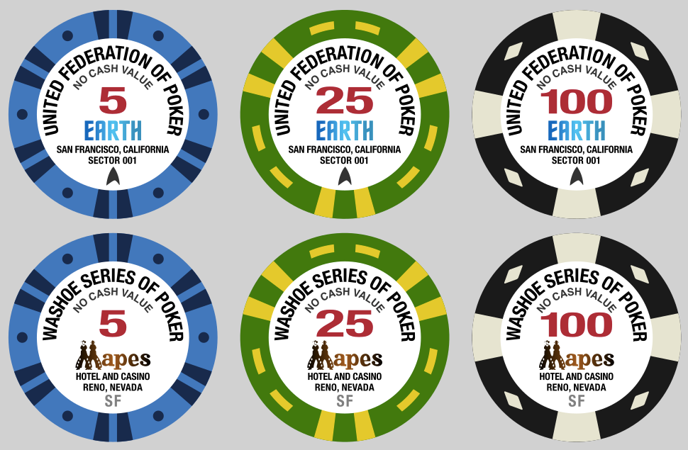
To avoid potential issues with the previous "commemorative" design being too close to the real thing, I have redesigned the Rio WSOP tribute and am rebooting the group buy for them to be made on Sun-Fly PolyInno (hybrid) chips. (Here's the separate thread for the Aria tribute design reboot.)

I've come up with a tribute design that should warm the hearts of many nerds. I also have a second tribute design that is more generic, in case the theme of the first tribute is too specific with not enough mass appeal. Anyway, without further ado:
1676347492880.png


I know we have some Trekkers/Trekkies here on PCF. I wanted to stick mostly with the original WSOP design and not hit people over the head with this new theme, but I'm hoping that other Star Trek fans will enjoy the first tribute design.

(I did a cursory search on the forums and am tagging some folks who might be into this, in no particular order: @AlbinoDragon @Poker Zombie @redeagle @bentax1978 @upNdown @megabit @CraigT78 @Machine @Indyscammer. Hope you don't mind and feel free to tag any fellow fans I've missed.)

For those who aren't as into Star Trek, I decided to also do a tribute design that stuck closer to the original themes--poker, casinos, gambling, etc.--but that didn't just substitute synonyms for the words in "World Series of Poker" and/or change the order of the words around. Also, Las Vegas gets all the glory, but what about Reno?

I originally had "Nevada Series of Poker" but liked the specificity of "Washoe" (the county that Reno is in), and it starts with "W" like "World" (also then "Nevada" is not repeated on the label). Went with Mapes for a very recognizable Reno casino logo in place of the Rio logo.

I'll be finalizing the design soon and posting all the denoms, but I'd be curious to find out how many people would be interested in each set. Please vote in the poll above! Also, constructive feedback welcome!

The old threads (which are now locked) still exist so I can see what peoples potential orders were before. I am also tagging people who had expressed interest from @Szczesnk and my threads here for visibility, in no particular order: @jabsolstice @shorticus @LeLe @Pippa @JoeBGo @MichaelBubly @paulkersey @ceramicmike @FrostyMugs32 @STL_POKERGUY @CapNcrunchPoker @HebbNH @LowerBama1714 @TheSalt @GrindstonePoker @Taxi500 @CarlosStorm @JMC9389 @Matt G @rcamp014 @AcesUp907 @Chipnut @sgago84 @DuffCal @almondjoyce @PinDoc (Apologies if I've missed anyone.)
 
Last edited:
Both designs are great, very well done, just not my cup of tea. But, I’ll hold off on a final decision until after the full lineup and samples are revealed.
 
My two cents is probably worth pennies on the dollar, but, I was going to get in on one of these SF buys, but, after the redesign I'm out. I get it and understand completely, but, for me it took a complete U turn south with the design changes. I'd have rather have seen a completely different style of design/labeling than to have something that blatantly "looks like" the original, yet, has a "mad magazine" spoof of a name.
 
Here's the entire series of each of the two designs I proposed. Sorry it took so long.

ufp_riowsop.png

washoe_riowsop.png
 
My two cents is probably worth pennies on the dollar, but, I was going to get in on one of these SF buys, but, after the redesign I'm out. I get it and understand completely, but, for me it took a complete U turn south with the design changes. I'd have rather have seen a completely different style of design/labeling than to have something that blatantly "looks like" the original, yet, has a "mad magazine" spoof of a name.
I understand that. It's just we've been warned off an exact copy. If that doesn't work for you, then I don't think any tribute name would work. Others have done World Poker Series, Global Series of Poker, World Poker Championship, Vegas Series of Poker, etc. I wanted at least to have a distinct theme even if I'm mimicking the WSOP Bud Jones designs (which, with fixed options does mean that they can be similar to other chips, like the T10K being the same pattern as some Aria tournament chips).

Anyway, I'm still hearing requests for a more generic design, so I've taken the last couple days to think on that. I did do one more "Mad Magazine" (as you call it) tribute:

degenseries.png


And then I got series and tried to come up with something "generic" but also different than what's been done before and came up with two other options.

First, taking inspiration from the Los Angeles Poker Classic tournament series at the Commerce, I was surprised to find there's not a "Las Vegas Poker Classic" so I decided to take the name. I chose a casino name that definitely evokes WSOP but was also generic enough not to run into any issues using a live casino's name:

lvpokerclassic.png


Second, I looked into the history of the WSOP and found that the idea for the tournament came from the "Texas Gamblers Reunion" tournament ran at Tom Moore's Holiday Casino in Reno. So I used that name and recreated the logo for the hotel:

texasgamblersreunion.png


I'm hoping that the combination of these less gimmicky names will be more palatable to more people. Let me know what you think...
 
First, let me start by apologizing for my previous comments, I realized as the day went on that they may seem harsh. I did not write them in a mean spirit, but realized how they could be taken that way. I appreciate all the efforts of those here that offer up their designs. Even those that aren't for sharing serve to further my imagination in my quest to build the "perfect" chip.

Now, without further ado, envelope please...and the winner is...

lvpokerclassic.png


This is it! I believe I'm in for a set of these!
Excellent work, young man, or whichever pronoun you roll with.
 
That’s a little bit of an lol. One of the NAGB sets was such a good copy of WSOP chips that the Rio pulled a set from usage.
Not really. It was a unique inlay that did not reference or infringe on the Rio or WSOP copyrights or trademarks in any fashion whatsoever.
 
Not really. It was a unique inlay that did not reference or infringe on the Rio or WSOP copyrights or trademarks in any fashion whatsoever.
That's true. And I'm surprised you didn't mention that it was a different mold. Also true. But the fact is that the set was pulled, presumably because the spot patterns and colors were such a close match. So it seems worth mentioning.
 
That's true. And I'm surprised you didn't mention that it was a different mold. Also true. But the fact is that the set was pulled, presumably because the spot patterns and colors were such a close match. So it seems worth mentioning.
Although Sun-Fly theoretically won't duplicate casino spot patterns/colors (if aware), it's actually not illegal to do so. The topic at hand is modifying the artwork to avoid legal issues.
 
First, let me start by apologizing for my previous comments, I realized as the day went on that they may seem harsh. I did not write them in a mean spirit, but realized how they could be taken that way. I appreciate all the efforts of those here that offer up their designs. Even those that aren't for sharing serve to further my imagination in my quest to build the "perfect" chip.

Now, without further ado, envelope please...and the winner is...

View attachment 1086809

This is it! I believe I'm in for a set of these!
Excellent work, young man, or whichever pronoun you roll with.
Definitely the best one!
 
Regarding this generic "Horseshoe" casino that the fictional "Las Vegas Poker Classic" takes place at, do you guys like just "Hotel and Casino" and "Las Vegas, Nevada" for the two lines underneath the "Horseshoe"?

I was experimenting with different combinations, "Gambling Hall" for the first line (like the current Binion's). And "Paradise, Nevada" (as to not use "Las Vegas" twice on the chip, even though the real Binions is not in Paradise) or "Downtown Las Vegas" (no "NV" or "Nevada") for the second line.
 
What about simply removing Las Vegas from the title and shortening it to just "Poker Classic", leaving the Las Vegas bit at the bottom.
 
What about simply removing Las Vegas from the title and shortening it to just "Poker Classic", leaving the Las Vegas bit at the bottom.
^ or "Desert Poker Classic"

"Poker Classic" would be too short when trying to mimic the original design. It doesn't wrap around the edge of the label unless you increase the font size or spacing, which then throws off the proportions. "Desert Poker Classic" is just long enough to have the curvature, but I prefer "Las Vegas Poker Classic" still.

1677613227724.png


Also, if people are interested in actually buying these (and hopefully get some economies of scale by combining with the "Aura" GB) I need to lock in on a design and start collecting numbers to see if there's enough interest before I ask Sun-Fly to produce test runs. I don't think they'll do those for free in advance without placing an order.

FYI - @Szczesnk received his sample set for the Aura design and they look great!
 
Agreed, I too prefer the LVPC and am cool with the two mentions of LV. They look great! :tup:
I had a couple mockups using "Paradise, NV" for the location previously, and normally I'd not want to repeat "Las Vegas" either, but I think they're far enough apart on the label that it's okay.
 
You will undoubtedly increase interest by many times switching to this. I have 2 tournament sets that I hardly use and may even jump on this just because, now.
 
I'm also willing to collect interest in sample sets, but the increments-of-25 requirement and the 100-chip per denom minimums, combined with the fact that this set has 14 denominations, might mean we may not be able to get enough interest to offer all 14 chips in a sample set, but feel free to post interest.
 
Status
Not open for further replies.
Back
Top Bottom