Anatomy of a Chipset Design (1 Viewer)

Taghkanic

4 of a Kind
Supporter
Joined
Jul 11, 2017
Messages
7,139
Reaction score
10,040
Location
Hudson Valley, NY
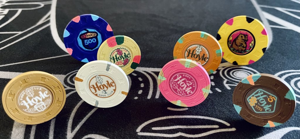
I recently completed a 1,400-chip custom set, whose progress I’ve been posting about in various places. Now that the set is done and actually in use, I wanted to put down some thoughts about its design.

The overall look and concept has brought in a fair number of compliments. I’m sure there are others who *don’t* like it, but have politely kept silent... The ideas behind the design are not likely to be universal—to each his own. But below are some attempts to explain some of the more general concepts I tried to put into play, and I’m interested to hear contrary opinions.
IMG_0127.jpeg
 
Last edited:
1 The design arose out of necessity. I wanted to upgrade my cash set to spotted THCs, preferably in very good to minty condition. But these proved very hard to find in quantity, without breaking the bank. This scarcity ended up becoming a foundation of the set design.

Since these would be used in 1/3 and 2/5 games, I knew my first order of business was to find enough spotted THCs for the $5 “workhorse” chip. My initial hunt focused on red chips, since $5s typically are here on the east coast.

But locating multiple racks of spotted red THCs in excellent condition proved essentially impossible during the pandemic. So when after much frustration, I saw a listing for 300 brown Aurora Star $2s, I jumped at them. All inlays were going to be replaced, so the denom was not important to me. (Note: Technically, the Paulson name for this color is Coffee.) Eventually, I was able to find 500 of these total.


harvest 5 blank.jpeg
 
2 Developing a color theme. Once I’d accepted the idea of an unconventionally brown $5, the question then became how to make that choice look intentional, rather than like the result of desperation.

Next up after the $5s had to be the $1s and $25s. I liked the white Jack Cincy 1s, which has minimal #### spots in gray and butterscotch. The butterscotch spot seemed to relate to the coffee-brown 5s, and the muted gray didn’t clash. In the wake of the Chip Room Cincy sale, these were relatively easy to find in the quantity I wanted, 200. (It did take some time to find enough in excellent, rather than worn, condition.)

The 25s proved more of a challenge. Normally I would look for a green chip for that denom. But again, finding these in quantity proved tough. The task became even tougher when my eye landed on a Mustard-base chip with green and pink spots, which was used on various well-known yet hard-to-get chips such as the CDI ’98 and FLV 1Ks, Gardena 10s, CDM 5s, and Appleton $1s.

Once I’d assembled samples of each, I found to my consternation that there were slight but noticeable variations in the spot colors of these apparently identical chips. Some had dark green spots, some more kelly green; and some had more hot pink/magenta spots, others a duller pink. These variations did not seem consistent even within inlay types, so I went through a lot of begging and trial-and-error to secure what I needed. It wasn’t until I already had the labels in hand from @Gear that I finally got to my goal of 300 matching chips.

So now I had 1s, 5s and 25s all with various earth-tones, either in the base or the spots. That’s where my fall “Harvest” theme came together.
 
3 Raiding the Cabinet. With the $1s, $5s and $25s decided upon, I started to think about how to fill out the set. Though my group never plays lower than 1/2, and only sometimes plays limit games, I wanted to have an NCV which could serve as either a 25¢ or 50¢ piece (say, if I had nieces/nephews over who wanted to play for fun) or a $20 denom (for a limit game). I also needed a $100 chip to expand the total bank of my set, and in case we someday bump up to 5/10.

In my chip cabinet, I found some never-used racks of minty THC hotstamps in what Paulson calls Gold (but looks like more of a tan to my eye). I had intended to sell them, but realized these would work perfectly in the growing earth-toned “harvest” theme.

I also found a rack of mint HSI secondary 1Ks that I’d bought on a whim in another @TheChipRoom sale. These have a Butterscotch base, same as one of the spots on the Jack Cincy 1s. I liked the idea of higher-denom chips in the set being larger than 39mm, so this was an easy decision, though originally I was going to go with a more conventional black 39mm.

1698590093403.png
 
Last edited:
4 Extras. Though I had enough 1s (200) for either a 1/3 or 2/5 game, I wanted to try to get some contrasting or “highlight” color into the set. Originally, I was going to go with the Aurora Star hotstamped tourney 1K, yellow with gray and white spots. But I eventually sold the minty rack I’d found, because I felt the yellow was too close to the mustard of the 25.

That’s when another chip from the Jack Cincy lineup caught my eye, the pink $2. This has a good intensity to it—I think of it as a fall berry—with a Metallic Gold spot that tied it back into the warm harvest colors. I only needed one rack here.

Very late in the process, I added two 48mm chips for a $500 and another NCV, just for fun. These don’t much relate to the rest of the color theme, though blurple could represent a blueberry-rhubarb pie filling on Thanksgiving. (OK, I’m stretching it.) I added acorn and woodchuck drawings to the inlays to tie them more to the overall concept, but more on the inlays later.

1698590574597.png
 
Last edited:
5 What’s in a name? I live on a dead-end dirt road named Hoyle, and for some years have been collecting various editions of Hoyle’s Rules of the Game to keep in the house. When I began hosting games in 2016, I set up a social media group to invite people, and on a whim called it the Hoyle Book Club—a kind of triple pun. Hoyle referencing the road, and also the rules; Book as a pun on the famous book and the phrase “keeping a book” (though I of course never lend any credit to players). And Book Club as a way of masking the true intent of the private social media group from anyone who might stumble upon it.

My initial label designs had the full “Hoyle Road” phrase on them (see below), but this took up too much space, and lessened the ambiguity between the location and the rulebook. I kept the Book Club idea in there in small caps, since most casino chip designs have some kind of subtitle below the main name.

1698590334958.png
 
Last edited:
6 What the font? As a print and web designer, I have always had a taste for combining vintage and modern typefaces. For this chip, I wanted something fairly bold with some flair for the main name (Hoyle), and something cleaner for any smaller text. I turned to the free Google Font library, and eventually landed on Berkshire Swash for the nameplate—a small irony, since I grew up in Berkshire County.

The numerals in that typeface weren’t to my liking, so I settled on Klinic Slab for the denoms, as it had a similar feel to Berkshire but with a cleaner, more contemporary feel. (Note: The Klinic family is now a paid font.) Lastly, I used a bold, sans-serif font called Righteous for the Book Club subtitle, to make it less intrusive.

I did some tracking on the Hoyle nameplate to bring the letters closer together, and made some very slight modifications on some of the shapes to customize it.

1698687472292.png

1698590194853.png

1698687570174.png
 
Last edited:
7 Outlines. Many classic chips have a circular ring around the edge of the inlay. While I wanted the design of my set to take some liberties with chip conventions, I also wanted to tip my hat to them. In thinking about an outline to contain the other components, I had the idea of these relating to the denomination of the chip.

The $1 chip has a single circular line. The $2 has a double line. The $5 a pentagon. The $25 has a circle with 25 points, and the $100 has 100 spikes. The flexible gold NCV intended as a frac or $20 chip has a broken line… Aaaand I confess I gave up on the idea for the $500 and fantasy “woodchuck” NCV, in part because these are not likely to actually get into play.

1698590540211.png
 
Last edited:
8 Graphic elements. Once the main type components were assembled, I felt the chips needed some kind of drawn graphic to both complement and “punch up” the type design. But given the limited space on the inlays, I knew that it couldn’t be anything too ornate or complicated.

I also wanted this added graphic touch to have some relation to both the place where I live, and to the Harvest theme. Fairly quickly, I settled on a simplified oak leaf, oaks being one of the more common but important trees in the Hudson Valley. After looking at various types of oak leaves, and also at various stock art for leaves, I settled on a reductive, geometric and symmetrical drawing which I tailored to the overall design.

The oak leaf needed to be a constant element of all of the workhorse chips, but I wanted some slight variation from denom-to-denom. I settled upon the idea of having either one or two leaves on each chip, but never in the exact same position. Some are upright, some sideways, some slanted. The position of the leaves also helped determine the location of the denomination, based on what would fit best.

1698590423400.png
 
9 All your base colors belong to the inlay. Originally, I hosted tournaments instead of a cash game. My original tourney set was THC hotstamped solids. I think this influenced my taste for inlay background colors being the same as the base color of the chips.

This is true for the base colors for all of the denoms except the $2. I knew from experience with some earlier over labels that bright pink is a particularly hard hue and intensity to match in label printing. So rather than try and fail to duplicate the base color, I opted for a complimentary darker shade of magenta.

For the type, graphic and outline colors, I aimed to pick up the spot colors on each chip. (For example, these elements on the white $1 chip are the same gray and butterscotch tones as the edgespots.) Again, there are places where exact color matching is difficult when trying to make ink look like dyes in clay, but overall I think it came out pretty well.

The bigger picture with the color scheme is the way the chips interact. Like everyone else, I wanted to avoid as much as possible the potential for “dirty stacks”—chips with too much color overlap, making it easy for different denoms to get confused in a pot or stack.

I settled on colors which related to each other. There are essentially three main families of colors at play here: (a) the warm coffee/gold/mustard/butterscotch clan, which set the fall scheme; (b) a suite of various light and dark greens plus aquas; and (c) some pink, magenta and peach elements to punch things up.

Where colors are close or even, I think the important thing is to think about how much of the “real estate” of the rolling edges and faces are taken up on each. For example, the pinks which show up in two places are a base color on one chip, and a small edge-spot on another. Such size differences help prevent them from confusing things when they wind up in the same pile or barrel.

5A699483-3259-4879-AF46-A3968BAEF5CE.jpeg
 
10 Simplify, simplify, simplify. Once all these elements were combined, I knew I would need to dial things back a bit. As alluded to above, it is very different looking at a full inlay design measuring a foot across on a giant monitor, and seeing it printed on a 7/8” inlay.

My initial mockups were way too busy. I had included various drop shadows, gradients and things had gotten too crammed together too much. Eliminating some of those fussier elements and flattening the colors gave everything more breathing space. It also (I hope) helped make the design more in keeping with older, classic casino inlays—which often used simple graphics and type against a more splashy, even kitschy nameplate.

When it came to the two oversized (48mm) chips, I allowed myself a little more freedom to play, both because there is a little more space to work with, and also because these chips as noted already are more fantasies meant to round out the set—as opposed to chips which will be shuffled and raked and stacked constantly. (I only have a barrel of each of these.) I drew an acorn icon for the $500, acorns being the precursor to oaks. Then I played with MidJourney to develop some concepts involving a woodchuck holding a pair of aces for the yellow NCV. Due to the vagaries of A.I., I had to modify its output a fair amount, but was please overall with the result.
 
11 Final (?) thoughts. What would I do differently, if I had to do it over? It may take some time for any major flaws or regrets to emerge; maybe some will be apparent after a few more months of use. But overall, I’m pretty pleased.

If anything, I might have dialed back the complexity of the design even more. Though I like the puns and jokes embedded in “Hoyle Book Club,” probably I could have made do with just “Hoyle,” and eliminated that extra text. But then again, it is typical for classic and even contemporary chips to have some subtitles or other text beyond the name, so maybe that is OK.

I suppose I also could have been more patient in trying to wait for a large lot of spotted, red THCs to materialize in the classifieds. Still, it already took more than a year to assemble the main chips, plus another half-year for milling, inlay removal, and label production. Had I found (say) some red $5s instead as my initial purchase, I would have wound up with a totally different supporting cast of other chips. So many of my purchase and design choices were determined by that initial score of coffee AS 2s.

But I think as in so many other design processes, having some limitations and challenges to work around can sometimes spur a designer to be more creative than if anything developed easily and conventionally. I hope that more unexpected outcome is what happened here.

IMG_0147.jpeg
 
Last edited:
An incredible process and incredible outcome. Very very well done @Taghkanic!

I love that you made this set work so well around the non traditional base colors.

The variations on the inlay design are *chef’s kiss*
 
Beautiful. Your approach and thought process to design is extremely similar to mine. After reading all of that I’d say you absolutely knocked your goals out of the park.

I love the chip choices and all the inlay variations and details. My one and only critique is the oversized chips feel like outsiders to the group, but it sounds like you agree and just wanted to have some fun there which fat hats are perfect for.

Time to have some more fun and get this theme on some cpc next :)
 
One concern I had was that the $25 and $100 chips shared too many colors. (Originally, the $100 was going to be a black 39mm.)

In person, I think this concern is unfounded. The size of the $100 makes it unmistakeable. And it’s butterscotch base is much darker and more saturated than the mustard $25.

However, I’ll have to see how they play in a number of games to be sure. The 100s are just one rack, so I could sell them with inlays removed, and replace them with some other 43mm.

9CD612B7-635A-443B-918C-16F389246801.jpeg
 
I’ll stop cooing over my new baby soon, I promise… But I did want to post a better, color-corrected pic of the set.

This shows the texture of the Gear labels pretty well, though in lower/warmer light the texture becomes much less obvious:

harvest-overview.jpg


Also, FWIW, just to further state the obvious, here’s a crude diagram of the color schemes underlying the concept:

harvest-color-families.jpg


(Apparently I can’t spell “coffee” much better than your average former President…)
 
Last edited:
P.S. I recently did an accounting of the cost of assembling this set, and thought I’d go full disclosure for the sake of anyone contemplating such a project.

All in, counting both the cost of acquiring chips plus the milling, inlay removal and label printing, this came out to an average of a little under $6 per chip ($5.91/ea. to be exact). The labor/printing part comprised about $1.40 of that. (I did roughly 10% of the inlay removals myself.)

Without the larger high-denoms, which were pricier, the average cost would have been more like $5.50 per chip.

If I hadn’t been as picky about condition and getting just the colors/spots I wanted, it could have come in less. But not all that much less, unless I was willing to go with much more worn chips, which seemed pointless when going to all the trouble of murdering so many chips and designing original labels.

Six years ago when I started chipping with a set of vintage THC monogrammed solids (cost: less than $1/each) I would have been horrified by that pricetag. Now, considering everything I’ve learned, the prices I see others paying, the ever-rising cost of quality chips, and since I expect these to last a lifetime, I think it’s actually a solid investment. More importantly, it’s something I’ll really enjoy using.
 
Last edited:
I was looking at some vintage chip inlays on Etsy, and this one caught my eye:

https://www.etsy.com/listing/1640790712/rare-1967-antique-bonanza-sy-geller

What intrigues me here, design-wise, is the printing flaw of the three colors/layers having been inexactly printed. I think this misregistration is part of what makes vintage casino chips look the way they do...

1709908144338.png


Look how the red, black and yellows fail to “hit” properly. That’s part of what makes the inlay feel so oldschool... But I’ve never seen anyone design a new inlay that wasn’t perfectly aligned, since 21st century is so precise.

Maybe there are some examples of new sets out there that I’ve missed, which have this “flaw” baked in. If I ever design another set, I might go that route.
 
Last edited:

Create an account or login to comment

You must be a member in order to leave a comment

Create account

Create an account and join our community. It's easy!

Log in

Already have an account? Log in here.

Back
Top Bottom