Advice Needed on a CPC Spotted H/S Cash Set (2 Viewers)

Goobus

Sitting Out
Joined
Nov 22, 2017
Messages
48
Reaction score
38
Location
Hong Kong
So I'm Thisthinking of creating my own hotstamped cash set, and playing around with the chip editor I came up with these two designs...
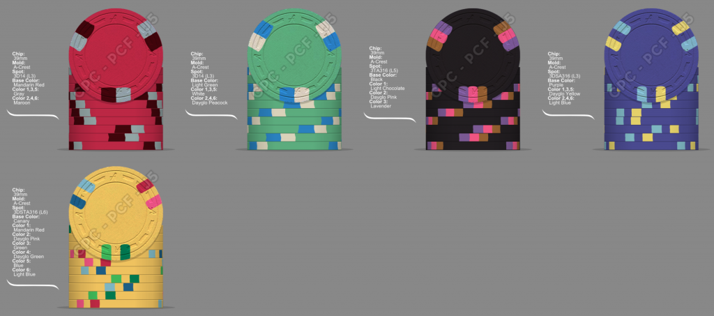
  • Would either of these sets work hotstamped (gold foil)? Or should I try inlays instead?
  • Those of you with access to color samples (I haven't gotten mine yet), please let me know you know for a fact that some of the color combos wouldn't work at all.

set2.png

This was the first set I came up with with a "3" spot theme, but I something seems off with it because it's not "coherent" - there are too many colors at play, the whole spot progression seems confused.
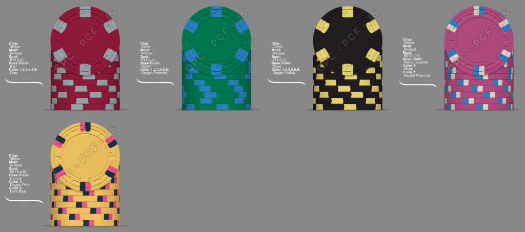
set1.png

This is my second design, and it seems much more coherent. Let me know your thoughts on color combinations and whether the reds/greens might be too bland.

Thanks!
 
You are close to one of my favorite color combinations I have been toying with on that green chip.

upload_2017-12-1_8-12-39.png
 
I like the top set better, but I would swap the black and the yellow from the 2nd set.

Also, I am nutty enough that if I were paying for custom chips, I would get an inlay as the HS will wear off.
 
  • Like
Reactions: Nex
I think they would both work for a hot stamp set. It's really what you would prefer. You could always go with the 3d14 edge spots for the whole set.
 
The yellow one might not work too well with gold foil hotstamping.
It'll still be readable if you look closely, but likely not very easy to see at a glance.

Pick the top set but the yellow chip from the bottom one (top set yellow is way too colorful, think circus/confetti), and completely redo the black chip - it just looks boring in both mockups.
 
Thanks guys. I redid a few of the chips, keeping 3D14 spots for all, and it does seem to look better as a set. I also redid the black chip with entirely new colors to make it pop.

Is 3D14 good enough? Maybe 4D14 looks a little more orthodox, but its a whole level higher which would mean less chips or compromising on the hotstamp/inlay department.

Please give me your honest opinions if you think it's a nice set or if some of the color choices need more work!

Also, any hotstamp ideas? I still have no idea what my theme is going to be. I love the GCR/Atlantic Club look, so I'd probably go for some text and a denomination. Also welcome any inlay ideas. As you can tell I'm not the most creative person.

4D14.png
3D14.png
 
I love the 3D14 spot. I think I’d rather have a whole set of that spot than 4D14. You get to see a lot more of the base color that way.
 
  • Would either of these sets work hotstamped (gold foil)? Or should I try inlays instead?

Thanks!

You need to decide whether you prefer hotstamp or inlay. Don't settle on hotstamp just because it's a little less expensive IF you really would prefer an inlaid set.

Do you have inlay design ideas? If so, maybe mock them up alongside your hotstamp design.
 
I personally prefer the 4D14 spots over the 3D14, and also the new ones over the two first mockups. Best in set is the yellow chip now. The other ones could probably use some slight color changes.

Same type of spot on every chip gives it just the necessary uniformness hotstamped chips need imo.
 
I personally prefer the 4D14 spots over the 3D14, and also the new ones over the two first mockups. Best in set is the yellow chip now. The other ones could probably use some slight color changes.

Same type of spot on every chip gives it just the necessary uniformness hotstamped chips need imo.

Thanks for the feedback! I also like the yellow chip most, the colors just mesh well. I mocked up a new version, how do you guys like this one compared to the one from before? I tried to make each spot a little more distinct, and changed dg tiger on the black to dg peach. Also changed the green chip completely. Also going to keep 3D14 for cost reasons, I also like 4D14 slightly better but it isn’t worth an extra $140+ to me.

9DAE7C58-C603-4631-AACF-376E890BAD23.png


This is what I see when I look at that black & orange chip.

View attachment 137452

:D do you prefer this new black chip or the one with dg tiger? I thought maybe dg tiger + dg green was a bit overkill.
 
Prefer the black with tiger personally. Also preferred the green and purple chips in your previous mock-up.

Also agree that 3d14 is the way to go. Akchips set looks great with those spots.
 
Thanks. I'm struggling with the purple chip at the moment, it seems difficult to balance the colors and contrast when using purple/lavender as a base.

You need to decide whether you prefer hotstamp or inlay. Don't settle on hotstamp just because it's a little less expensive IF you really would prefer an inlaid set.

Do you have inlay design ideas? If so, maybe mock them up alongside your hotstamp design.

I don't really have any inlay design ideas, but the reason I picked hotstamp to begin with was because I actually really the classic look of hotstamps. The cost for this run would be similar vs inlays after factoring in die costs (5 dies for 5 denominations).

What do you guys think of this set as opposed to the ones above? I improved the purple chip based on the Paulson classic colors, and to avoid repeat spot colors I changed the black chip (dg tiger + dg green are too similar to dg green + dg pink). Should the purple chip be purple or lavender? I also changed the red chip as the old color combo would have been to similar to the new black chip.

5773B4BE-F149-43FF-AABB-7B2AD96BF7BB.png
 
Last edited:

Create an account or login to comment

You must be a member in order to leave a comment

Create account

Create an account and join our community. It's easy!

Log in

Already have an account? Log in here.

Back
Top Bottom