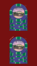
CPC Mockup - First timer (4 Viewers)

I was just about to say you shouldn't repeat spot patterns but now I see they are different. Here's an example of those two spot patterns:

View attachment 613125

You've also used DG peacock 3 times and there's a lot of orange also. You could use a green instead on your pink chip to bring that out in the inlay. A brown/butterscotch tone could be used on your 1st chip.
Thanks, that spot on the right looks wayyy better in real life, and what a gourgeous chip!
I was looking today and I think I might try canary with orange edge spot for the 1st chip. I’m very 50/50 on it but it works well with the inlay.

I tried a few greens on the link chip but couldn’t find something I was happy with. Plus I absolutely love the pink chip as it is right now. As long as there’s no risk of dirty stack I’m not too worried about reused spots. Having seen that 181418 I’m gonna take another looks at the 5
 
I’m new here - how does that work?

the plan for the last chip is a city scape based on a photo from London a few years back. I plan to have bits and pieces of landmarks that I have a connection with e.g. the Tyne bridge on account of my home city, something American for where I live, blah blah. That’s the plan. If not I’ll probably do some rolling hills to suggest the blue ridge mountains which give me a sunset every day or the sunsets I used to see when I was gliding in Northumbria.
I like the idea of the jungle though, I need to save space for a $100 chip if my game ever gets close to needing it, which I think will be green. Jungle or forest might work nicely for that ;).
Go with that !
 
I’m new here - how does that work?

Start a new thread offering sample sets for people who are interested in getting one. Total amount would be price per chip + S&H (if you want to include that in the total. Make sure to get all the requests and payment in and add the additional requests to your order.
Additionally, you can add extras to your set (this is a must, in case of Murphy's Law) and sell off sample sets that way.
 
Ok Folks,

Had quite a bit going on recently so the last inlay took a while to finish... Taking on board more feedback; I've made the spot colour on the 10c butterscotch to avoid repeat use of arc yellow, and leveraged how nice the 3TA16 edgspot is with someharmony colours. Finally on the $25 i brought in green to complement the bridge

I'm thinking this is it... kind of ready to put the order in... any last thoughts?

The Sunset Chipset final (2).png
 
I’ll take a ample if offered!

I’m no chip expert, and am fairly new to the community but will these have denomination on one side? And the number for some reason is throwing me off a little bit. Size? To light? Location on inlay? Not really sure. I look at them and love the inlay but something about the number is throwing for a loop. Just my new chipper opinion.
 
ll take a ample if offered!

I’m no chip expert, and am fairly new to the community but will these have denomination on one side? And the number for some reason is throwing me off a little bit. Size? To light? Location on i
I’ll take a ample if offered!

I’m no chip expert, and am fairly new to the community but will these have denomination on one side? And the number for some reason is throwing me off a little bit. Size? To light? Location on inlay? Not really sure. I look at them and love the inlay but something about the number is throwing for a loop. Just my new chipper opinion.
Yeah I was thinking just to have the denomination on one side so the artwork stands out. Would you prefer to see the number Centered in the chip? Smaller?
 
Yeah I was thinking just to have the denomination on one side so the artwork stands out. Would you prefer to see the number Centered in the chip? Smaller?
I’m not sure, maybe expert chip minds can help out. Like I said I don’t know what it is. I love the inlay but the denim is throwing me off. I noticed @detroitdad ’s set the number is in a different spot on the inlay in each chip. Maybe where it will bring out the artwork the most? Again.... font, size, location, color? I almost feel so much of you went into this chip, then at the end just kinda went I’ll throw a number on there. I could be wrong, and I’ve never designed chips before. And I’m pretty new to this chip sickness.
 
Each of my inlays were different. I needed the denoms to be in different locations to maximize the view of the sunset.

If you look at my ceramics, the Parks and Rec chips. I only have denoms on one side of the chip. If it was on both sides it would have fucked up the artwork.
 
then at the end just kinda went I’ll throw a number on there.
It’s a Shame that’s the impression - the font is actually heavily customised - taking an existing font and after spending quite a few hours, modifying the nodes to achieve the actual font I wanted. The cent and dollar symbols were made from scratch too.

my original artwork had the font in different locations per chip, wasn’t sure how legit that was so in the end I looked to place it in the same location.

I’m keen to get this right, so willing to do whatever to fix it. I might even go back to the old font which did have some nice style
 
That was just my impression, not nocking it. And if you like it keep it! That’s what it’s all about man. They look great. I keep looking at them and I think they look great. I’m just nit picking right now. Maybe just a tad lower on the chip, away from center might draw more attention to art
 
I like your change to the 10c chip - someone just posted a set with a canary/arc yellow chip, and it came out kind of funky looking. I like the rest of your chips, but going from 3 edge spot colors on your $5 to 2 that are both green seems like it is too simple for the highest value chip. I don't have any particular suggestions for other colors, maybe go with the 4 edge spot version of this pattern? For the denomination, I feel like if you are going to only have it on one side of the inlay, it should be very noticeable and bold. The size and such are fine as they are, but I feel like the transparency takes away too much weight. Maybe try non-transparent with a stroke on them to make them stand out more?
 
That was just my impression, not nocking it. And if you like it keep it! That’s what it’s all about man. They look great. I keep looking at them and I think they look great. I’m just nit picking right now. Maybe just a tad lower on the chip, away from center might draw more attention to art
No for sure, feedback is a gift - thanks for it. I can try dropping it for sure. I might also work a bit on the zeros. I’d like something more elegant.
 
I like your change to the 10c chip - someone just posted a set with a canary/arc yellow chip, and it came out kind of funky looking. I like the rest of your chips, but going from 3 edge spot colors on your $5 to 2 that are both green seems like it is too simple for the highest value chip. I don't have any particular suggestions for other colors, maybe go with the 4 edge spot version of this pattern? For the denomination, I feel like if you are going to only have it on one side of the inlay, it should be very noticeable and bold. The size and such are fine as they are, but I feel like the transparency takes away too much weight. Maybe try non-transparent with a stroke on them to make them stand out more?
Thanks, I’ll take a look at the 4 spot. I think I had that very originally but tried to keep everything tri spot but indo need somewhere to go if I want to ever build a $100 chip into the set
I did originally have the denomination with a stronger white text and it just didn’t look right to be honest. It maybe the watermark on the image here is distorting it (also the image quality is not great) it might look less clear. They do have strokes on the text too, probably really hard to see with the image above. I’ll add a pic of just the inlay to see what I mean
 
Last edited:
Your artwork and denominations should be complimenting each other but they are instead competing with each other. The placement of your denoms looks like an afterthought... your text should be placed in areas where it's not blocking the image.
 
Ok, thanks guys, ive had a bit more of a fiddle... is this better? worse? View attachment 630108
I almost feel on first look the denom on all but the $25 need to be up and to the left a couple pixels. And $25 up in that dark area. I’m talking very VERY slight adjustments. Looks a lot better on my eye though!
 
I almost feel on first look the denom on all but the $25 need to be up and to the left a couple pixels. And $25 up in that dark area. I’m talking very VERY slight adjustments. Looks a lot better on my eye though!
I can have a fiddle. I didn’t want to put too much to it in case people hated even the idea of the latest one

being honest, I don’t like the 10c. Something. doesn’t look right. Lower left doesn’t work, too cluttered
 
I can have a fiddle. I didn’t want to put too much to it in case people hated even the idea of the latest one

being honest, I don’t like the 10c. Something. doesn’t look right. Lower left doesn’t work, too cluttered
Maybe fade that dark brown instead of the really dark almost black color, and that word sunset won’t be broken up and maybe pop and look less cluttered
 
depending on feedback above, here's the line up with suggestions tweaked:
10c chip.png
25c chip.png
$1 chip.png
$5 chip.png

$25 chip.png
 

Attachments

  • $25 chip.png
    $25 chip.png
    490.1 KB · Views: 78
Last edited:
Ugh the $25 hasn’t saved right. Stand by your beds...

Edit: All good now!
 
Last edited:
My suggestion would be to not use photos as your inlays.
 
Sorry, full color graphics rather. I find them to be distracting and cluttered looking. But that doesn't make me right. Just a preference. I think cleaner, simpler design elements look best.
Day late and a dollar short for that kind of feedback my friend...
 
I like the artwork. The less textured the chips’ inlay area is, the better the details will come through. I think the A-mold has a smooth center version, but better ask about that from CPC... I do recommend getting a full mold sample set to see and feel them in person before deciding which one to use. Some are also better suited for certain inlay sizes than others. And which ever inlay size you end up getting, remember to include a bleed area for your artwork.

Because the inlay art has a lot going on, I think it would be better to not have two versions of each... Because the sunsets are in the artwork, you don’t need state that text necessarily. I would try to use the versions with the denoms, but make those denoms stand out a little more (bolder text and/or thicker black outline), and on the bottom maybe have the location in curved text instead of The Sunset? You could still use your customized work of The Sunset on maybe a dealer button or some other accessory.

As for the colors and insert selection, that’s a lot of ”3 spots” for my taste. I would play around with other inserts as well, but if those are what you love then go for it. I would also think about switching the base colors of the quarter and $1 so the progression is a little more traditional, but again totally up to your preference. Overall the color combos look nice, but keep working and you may find a few additional tweaks.

Good luck with your project! :tup:
 
Day late and a dollar short for that kind of feedback my friend...
Just trying to help make them look more like poker chips and less like souvenirs from the gift shop. But to each their own. Good luck with the set. As long as you're happy with them, that's all that matters.
 
I like the artwork. The less textured the chips’ inlay area is, the better the details will come through. I think the A-mold has a smooth center version, but better ask about that from CPC... I do recommend getting a full mold sample set to see and feel them in person before deciding which one to use. Some are also better suited for certain inlay sizes than others. And which ever inlay size you end up getting, remember to include a bleed area for your artwork.

Because the inlay art has a lot going on, I think it would be better to not have two versions of each... Because the sunsets are in the artwork, you don’t need state that text necessarily. I would try to use the versions with the denoms, but make those denoms stand out a little more (bolder text and/or thicker black outline), and on the bottom maybe have the location in curved text instead of The Sunset? You could still use your customized work of The Sunset on maybe a dealer button or some other accessory.

As for the colors and insert selection, that’s a lot of ”3 spots” for my taste. I would play around with other inserts as well, but if those are what you love then go for it. I would also think about switching the base colors of the quarter and $1 so the progression is a little more traditional, but again totally up to your preference. Overall the color combos look nice, but keep working and you may find a few additional tweaks.

Good luck with your project! :tup:
That’s a nice idea about the location on the bottom, curved. I did think of that but thought against it. Probably agree with you that it doesn’t need ‘the sunset’ on both sides but I will have it on there on at least one side.
When you mentioned texture, do you mean there’s a special request for non textured inlay? The a molds I have are quite rough. And since my colour samples aren’t mostly A molds, I’m very happy with them!

not sure about making the denominations any more bold vs. Current, if you read earlier you’ll see I’ve already made touches to that and I think we’re at the limit where and more bold and they’ll be distracting.
 

Create an account or login to comment

You must be a member in order to leave a comment

Create account

Create an account and join our community. It's easy!

Log in

Already have an account? Log in here.

Back
Top Bottom