Working on Cards Mold & eventually CPC customs. Design feedback please (1 Viewer)

I like the middle one.

But the C on the bottom is better.

As noted, the $ sign may be better if it's tighter to the numbers.

Might look better without the Lake Michigan text on the top.

Also prefer the prominence of the lighthouse on the top one.
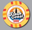
Thank you! Not sure I will remove the Lake names though. 5 Great Lakes - 5 Chips. smallest lake T5 thru largest lake T5000
 
Few more I worked on. Denom ring on cards mold, how accurate would that be? I'm not going to use it but wondered how that would come out.
 

Attachments

  • Denom_ring_bla.JPG
    Denom_ring_bla.JPG
    105.2 KB · Views: 86
  • FullgraphicFreshCoast.JPG
    FullgraphicFreshCoast.JPG
    85.2 KB · Views: 84
  • Ring_No_Denom.JPG
    Ring_No_Denom.JPG
    93.9 KB · Views: 87
  • SunColor_MainFont.JPG
    SunColor_MainFont.JPG
    86.6 KB · Views: 83
What feel are you aiming for?

White outer makes it pop and looks look fresh & clean.

Designs without it (main chip color combo as well) look like something I might find under a seat cushion in a yet to be renovated 1980s cabin in the UP.

I gravitate towards the white, no denom version.
 
Last edited:

Create an account or login to comment

You must be a member in order to leave a comment

Create account

Create an account and join our community. It's easy!

Log in

Already have an account? Log in here.

Back
Top Bottom