WIP: Harrah’s Cherokee-Inspired Tina Hybrid Set — Color & Spot Pattern Feedback (1 Viewer)

QueensFool

Sitting Out
Joined
May 25, 2026
Messages
39
Reaction score
30
Rewards
348
Location
Hickory, North Carolina
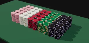
Hey everyone, I’m looking for some feedback on a custom set I’ve been working on. I’ve been playing around with the colors and spot patterns in ChipMatic and would love to get some opinions before moving forward.

I attached the chip mockups with blank inlays since the artwork is still being finalized. Right now I’m mainly looking for feedback on the spot patterns and how the set flows together as a whole.

The inspiration for this set comes from the look of Harrah’s Cherokee chips. I really like the clean casino feel of their chips and wanted to create something with a similar aesthetic while still making it my own.

For reference, the breakdown is:

Pink = $0.25
White = $1
Red = $5
Green = $25
Black = $100

A few things I’d love opinions on:

Do the spot patterns feel balanced across the set?
Does the progression from the lower to higher denominations feel natural?
Are there any spots that you think work well (or don’t work)?
Is there anything you would tweak before production?

Would love to hear what you guys think!
 

Attachments

  • chip_gallery (3).webp
    chip_gallery (3).webp
    44.2 KB · Views: 64
  • Screenshot 2026-07-16 144715.webp
    Screenshot 2026-07-16 144715.webp
    64.8 KB · Views: 61
I really like the $1 and the $25 -- I think those pastel colors for the edge spots look nice.

To me, the pink -> white -> red base color progression of the first three denoms feels a little too monotone. I personally would prefer more color variety in there. Maybe make the 25c or $1 chip blue or yellow?
 
I really like the $1 and the $25 -- I think those pastel colors for the edge spots look nice.

To me, the pink -> white -> red base color progression of the first three denoms feels a little too monotone. I personally would prefer more color variety in there. Maybe make the 25c or $1 chip blue or yellow?
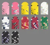
Thanks for the feedback! I took your suggestion about adding more color variety to the lower denominations and put together a few mock-ups.

I've added several alternate versions of the 25¢, $1, and $5 chips with different base colors to see if breaking up the pink/white/red progression improves the flow of the set. I also mocked up a $100 chip while I was at it to get a better feel for how the higher denominations might fit into the lineup.

I'd love to hear what you think of these new options. Which versions do you feel work best as a cohesive set? Do the added colors improve the progression, or is there another direction you think would work better?

Also, do you think the $5 still needs to be brightened up? If so, what base color or spot pattern do you think would make it pop the best while still fitting with the rest of the set?
 

Attachments

  • chip_gallery (4).webp
    chip_gallery (4).webp
    105.1 KB · Views: 16
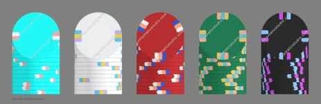
After what can only be described as an unhealthy number of hours messing around in ChipMatic, I think I might finally be getting somewhere...

I took your feedback and went back to the drawing board, playing with the base colors, spot colors, and spot patterns to come up with this revised lineup. I think this version flows a little better, but after staring at these chips for so long, I'm not sure I can trust my own eyes anymore.

What do you think? Better, worse, or have I just reached the point where every combination looks good to me?
 

Attachments

  • chip_gallery (3).webp
    chip_gallery (3).webp
    50.3 KB · Views: 22
I think they are looking good! A few nit-picky thoughts (but do whatever you like best, of course):
$0.25 -- That color of blue is a little bright, I would go for something a little less neon
$25 -- I liked the 1/8 - 1/4 - 1/8 spot pattern you had in the original design better (I generally like thicker spots), but colors still look good to me
$100 -- This is a big upgrade! I like your new colors on this chip a lot better.
 
Thanks again for all the feedback, @QuietMaple!

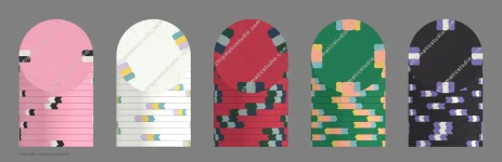
I ended up going back and tweaking a few things based on your suggestions. The neon blue on the quarter was bothering me too, so I moved away from that and tried a different purple frac. I also made some adjustments to the $100 spot colors and pattern to give it a little more contrast and make it feel like it fits better with the rest of the set.

I think the latest version is starting to feel more cohesive, but after going through so many iterations it’s getting harder to tell which changes are improving the set and which ones are just different.

I attached the newest mockup. I’d love your thoughts on whether this version is moving in the right direction, or if you think I’ve gone too far with any of the changes and should pull any of the chips back toward an earlier designs. Sometimes I think the original designs had a little more simplicity, but then other times I think the revisions add more pop.

My other concern is how these will translate from the screen to the actual chips. The ChipMatic soft proofing feature helps, but I know there can still be differences between the renderings and the final printed product. It's part of the reason I have gone with more saturated colors. Do you have any insight into this? I’d be interested to hear if anything looks like it might not translate well in person.

Thanks again for taking the time to look these over — I really appreciate the feedback!

1784596916265.webp
 
Alright, I'm getting into this, haha. This is personally what I would do (feel free to use these designs or tweak them however you like):
https://chipmaticstudio.com/share/1KRK9bBihH-Gt641IdeQ4
Here is the json export of the set if you want to import it on your computer.

chip_gallery(48).webp


Here's my thinking:
  • I used my favorite versions of the $1, $5, and $25 designs you had shared previously, pretty much unchanged. I might have skewed a couple of the hues slightly.
  • I separated the tan spot from the yellow spot on the $5 chip because I think the yellow and tan colors are too close so they sort of get lost in each other, but maybe that's something you like. Up to you, of course.
  • The $100 is based on the $100 in your third post, but I added a yellow edge spot because the 1, 5, and 25 all had some yellow in them already, so I think that adding it to the $100 makes it feel more cohesive. I also increased the edge spot group to have 3 spots per group instead of 2 because the 1,5, and 25 also all have three spots per group (again, I think this adds cohesion to the set). I also toned down the brightness in the purple edge spot
  • The 25¢ chip was less directly related to any of your previous designs. I used blue as the base color because that just looks the most "balanced" to me and it goes will with the other strong primary colors in the set (red green and blue are the primary colors of the additive color model)
  • I did 3x 1/8 spots because they are "simple" (appropriate for a frac) and keep with the pattern of basing the edge spots around 3s.
  • I picked existing colors from our color palette that I thought contrasted well.

A couple other thoughts generally:

  • It's true that Tina's printers (and all printers) can struggle to reproduce very saturated and bright colors, but that doesn't mean that all colors will be under-saturated across the board. Instead, it means that those colors on the extreme will be "clipped" to be within in the printable-color space. I think it's generally to choose the colors directly you want to appear on the chips and that are likely printable rather than to try to overcompensate by shifting in one direction or another. You'll get more consistent results this way.
  • I don't actually know what the Harrah’s Cherokee chips look like off the top of my head, and I've avoided looking at them to prevent the image from dampening creativity -- but it means that it's possible the designs I'm suggesting don't evoke that set at all. So if that's important to you, you might of course want to go in a different direction.
  • I think I might have two different yellows in use across the set. You probably want to choose just one specific yellow and use it on all chips -- that will create a more cohesive look.
 
Thanks again for taking the time to put together such detailed feedback, @QuietMaple. I really appreciate how much thought you put into the set and how you looked at it from a casino chip design perspective rather than just commenting on individual colors.

I went back through the designs and made some additional revisions based on your suggestions. The biggest things I took away were the importance of creating more consistency between denominations, making sure the spot colors have enough separation, and carrying some recurring accent colors throughout the set so it feels like one cohesive lineup.

I attached the latest version. A few of the changes were directly influenced by your feedback:

- I revisited the quarter and decided to keep the blue direction, but adjusted the colors slightly

- I made some tweaks to the $5 spots to improve separation between the lighter colors.

- I continued refining the $100 so it feels more connected to the overall set rather than standing on its own

Since you’ve seen the evolution of the set, I’d really appreciate your opinion on whether any of these revisions are improvements or if there are any areas where you think I should pull things back toward your version or an earlier version of mine.

One thing I’m still thinking about is how these will translate from the screen to the actual chips. Do any of my adjusted colors or combinations stand out to you as something that might not translate well once printed on the Tina Hybrid? My goal is to have these POP on my charcoal outer/grey inner playing surface.

Another specific area I would appreciate your thoughts on is the $1 chip. I’m intentionally trying to achieve more of a pastel look with the spot colors, similar to the Harrah’s Cherokee $1 chip. That chip has always been one of my favorites visually, and it is one of the few places where I have really drawn direct inspiration from the Harrah’s Cherokee lineup (the other being the $25 chip).

Do you have any recommendations for adjusting the $1 spot colors so they maintain that soft pastel appearance once produced? I really like the direction on screen, but I’m not sure how those lighter colors will translate through the printing process. I’d rather make any necessary adjustments now than end up with something that looks too saturated or washed out in person.

Thanks again for all the detailed feedback. It has been extremely helpful having someone with a good eye for chip design look these over before I commit to production.

View attachment 1705118
 
Looking really really good! I'll write more later today. In the meantime, can you send me/post here the Chipmatic share link so that I can see the exact color values that you're using?
 
I think this set is looking really excellent. All these colors should print well I think. Given your goal of making the chips really "pop" on your charcoal/grey playing surface, I think the changes you made to the base colors to be slightly brighter was the right call.

I would just make one small change to the $1 chip to make it more pastel. The purple color you're using there seems a little too bright to me. Try #A477B7 instead (but really they are quite close. I'm kinda splitting hairs here). If you tweak the purple here, you may also want to tweak it on the $100 for consistency (although I like the brighter purple better on the $100, so you could probably go either way)

Hope this helps!
 
Thanks again! I really appreciate you taking the time to look these over and provide such thoughtful feedback throughout the process.

I’m glad to hear you think the colors should translate well. The printability question has definitely been one of my biggest concerns, especially with some of the brighter colors, so that gives me a lot more confidence moving forward.

I’ll definitely test the #A477B7 purple on the $1. I agree they are very close, but I can see how slightly muting that color could help achieve the softer pastel look. I’ll compare it against the current version and may keep the brighter purple on the $100 since I like how it pops against the black base.

Thanks again for all the help — your feedback has been extremely valuable in getting this set dialed in!
 

Create an account or login to comment

You must be a member in order to leave a comment

Create account

Create an account and join our community. It's easy!

Log in

Already have an account? Log in here.

Back
Top Bottom