WIP: Harrah’s Cherokee-Inspired Tina Hybrid Set — Color & Spot Pattern Feedback (20 Viewers)

QueensFool

Sitting Out
Joined
May 25, 2026
Messages
30
Reaction score
27
Rewards
314
Location
Hickory, North Carolina
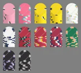
Hey everyone, I’m looking for some feedback on a custom set I’ve been working on. I’ve been playing around with the colors and spot patterns in ChipMatic and would love to get some opinions before moving forward.

I attached the chip mockups with blank inlays since the artwork is still being finalized. Right now I’m mainly looking for feedback on the spot patterns and how the set flows together as a whole.

The inspiration for this set comes from the look of Harrah’s Cherokee chips. I really like the clean casino feel of their chips and wanted to create something with a similar aesthetic while still making it my own.

For reference, the breakdown is:

Pink = $0.25
White = $1
Red = $5
Green = $25
Black = $100

A few things I’d love opinions on:

Do the spot patterns feel balanced across the set?
Does the progression from the lower to higher denominations feel natural?
Are there any spots that you think work well (or don’t work)?
Is there anything you would tweak before production?

Would love to hear what you guys think!
 

Attachments

  • chip_gallery (3).webp
    chip_gallery (3).webp
    44.2 KB · Views: 37
  • Screenshot 2026-07-16 144715.webp
    Screenshot 2026-07-16 144715.webp
    64.8 KB · Views: 35
I really like the $1 and the $25 -- I think those pastel colors for the edge spots look nice.

To me, the pink -> white -> red base color progression of the first three denoms feels a little too monotone. I personally would prefer more color variety in there. Maybe make the 25c or $1 chip blue or yellow?
 
I really like the $1 and the $25 -- I think those pastel colors for the edge spots look nice.

To me, the pink -> white -> red base color progression of the first three denoms feels a little too monotone. I personally would prefer more color variety in there. Maybe make the 25c or $1 chip blue or yellow?
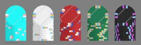
Thanks for the feedback! I took your suggestion about adding more color variety to the lower denominations and put together a few mock-ups.

I've added several alternate versions of the 25¢, $1, and $5 chips with different base colors to see if breaking up the pink/white/red progression improves the flow of the set. I also mocked up a $100 chip while I was at it to get a better feel for how the higher denominations might fit into the lineup.

I'd love to hear what you think of these new options. Which versions do you feel work best as a cohesive set? Do the added colors improve the progression, or is there another direction you think would work better?

Also, do you think the $5 still needs to be brightened up? If so, what base color or spot pattern do you think would make it pop the best while still fitting with the rest of the set?
 

Attachments

  • chip_gallery (4).webp
    chip_gallery (4).webp
    105.1 KB · Views: 7
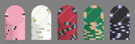
After what can only be described as an unhealthy number of hours messing around in ChipMatic, I think I might finally be getting somewhere...

I took your feedback and went back to the drawing board, playing with the base colors, spot colors, and spot patterns to come up with this revised lineup. I think this version flows a little better, but after staring at these chips for so long, I'm not sure I can trust my own eyes anymore.

What do you think? Better, worse, or have I just reached the point where every combination looks good to me?
 

Attachments

  • chip_gallery (3).webp
    chip_gallery (3).webp
    50.3 KB · Views: 5

Create an account or login to comment

You must be a member in order to leave a comment

Create account

Create an account and join our community. It's easy!

Log in

Already have an account? Log in here.

Back
Top Bottom