Which T25 do you like better (1 Viewer)

Which chip do you prefer

  • A

  • B

  • Either one works


Results are only viewable after voting.

krafticus

Straight Flush
Supporter
Joined
Apr 2, 2013
Messages
8,627
Reaction score
22,158
Location
Ellicott City, MD
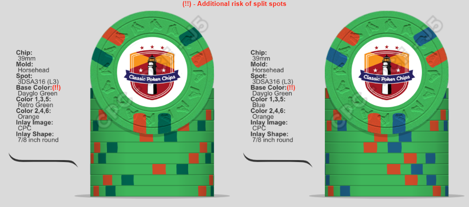
In a bubble, which T25 do you like best? Left side image would be (A) while right side image would be (B).

This will be for a new Tournament set. Same spot pattern across all chips (except the bounty chip). Neither Retro Green (or any other green) or a darker blue is used on any other chips. Blurple will be on a chip that will be used in conjunction with the T25 though, but as a spot only.
t25.png
 
A for sure. I've been playing with the idea of including a shade of purple on my Canoe Club $25 but I can't mock anything up that I really like. I find it's easier to find something that works with the Paulson or ceramic pallete though is very difficult with CPC's pallette.

Feel free to drop me a PM with a mockup with the rest of the set if you'd like if you're not ready to share it all in the open.
Thanks. all of the other chips are set, for the most part. This is the only one I keep teetering on. Green is one of my favorite colors, but one of the hardest ones to work with and get right. I always tend to use oranges and/or yellows with green, as I think they work well together. Maybe I will try something way off... ??
 
Thanks. all of the other chips are set, for the most part. This is the only one I keep teetering on. Green is one of my favorite colors, but one of the hardest ones to work with and get right. I always tend to use oranges and/or yellows with green, as I think they work well together. Maybe I will try something way off... ??
The problem with using a dark spot color like a brown, purple, red, etc is that it further darkens the green base in relation to other base colors. The green CPC palate is already on the darker side of the spectrum in relation to the yellows, oranges, etc. YMMV but I feel in the absence of a lighter spot, purple on green will come out too dark looking.
 
How many other chips have a monochrome spot? Basically my main question for a tourney set with the same insert pattern. If none, I’m going B.
 
I'm usually a fan of retro/dayglo green combos (including this one), but I think the brighter blue spot works better with the orange in this particular case.
 
Here is where my current mockup stands. (inlay design request has been submitted ... that will stay on the hush)

finsridgemock.png


and yes, I realize there is a good bit of pink... it's on purpose.
and yes, I know the bounty chip has all repeated colors ... it's also on purpose.

and the brown 100 .. that's not changing either.
 
DG Pink chip needs more pop, imo -- try retro red/black spots.

Also, maybe non-dg pink on the grey chip, and replace black with charcoal on the white chip?
 
Just realized that my mock up has retro blue, and my 2 options up top don't. You get the point though
 
In a bubble, which T25 do you like best? Left side image would be (A) while right side image would be (B).

This will be for a new Tournament set. Same spot pattern across all chips (except the bounty chip). Neither Retro Green (or any other green) or a darker blue is used on any other chips. Blurple will be on a chip that will be used in conjunction with the T25 though, but as a spot only.

View attachment 1246217
A in my opinion
 
I'll be the opposition... I like the 2 tone green... the blue looks out of place and forced to me. Plus the 2 tone is pretty close to one of my favorite chips ever
20220802_170600.jpg

(I know not exact... but I love 414!) if it was mine I would brighten up the red to orange or peach (but that is not the question and I am bias because of the above chip! Lol)

It's gonna be awesome Mark!!
 
I initially was thinking B. But then I saw the lineup and am thinking A works a lot better. I really like it with the charcoal spots on the 500, not the purple. I don't care for having two chips with retro blue spots (25 & 1000). But what if the purple replaces the retro blue on the 1000?
 
I’m with @Ben8257 on this one. The blue is rubbing me the wrong way and feels out of place based on how far you’re stretching the palate on each individual chip.

After seeing that dark green mock up, @buffalojim might be onto something though. The general dark to light gradient as you move up in denomination really hits when you use the dark green
 

Create an account or login to comment

You must be a member in order to leave a comment

Create account

Create an account and join our community. It's easy!

Log in

Already have an account? Log in here.

Back
Top Bottom