-
PCF is an eBay Partner. If you make a purchase through one of our links, we may earn a commission at no extra cost to you. Thank you for your support!
You are using an out of date browser. It may not display this or other websites correctly.
You should upgrade or use an alternative browser.
You should upgrade or use an alternative browser.
What do you think of these chips ? Art is not set yet - getting a quote from classic chips (1 Viewer)
- Thread starter taco_dlr
- Start date
Welcome!
I think its 2024, and if you figured out how to load an image (the bull) you should have been able to use copy and paste rather than uploading a photo from your phone!!!!

Those are high level inserts, which will be on the expensive side.
The hourglass mold is nice, but we as a community would suggest you purchase a mold sample from CPC to make sure you like that mold and / or do not prefer a different mold. While you're at it you might also purchase a color sample.
While I don't like the standard Vegas colors, that's not a bad lineup. I'm not fond of the $25 colors
There are a few links in my signature that might help you out (landscape on mobile)
Happy Chipping!
Quicksilver-75
4 of a Kind
The Hourglass mold may appeal to people for its aesthetics but be warned: it is totally unlike any feeling chip you've experienced at any home games or casinos. It is VERY "nubby". 100% support getting a mold/color sample from either somebody here or direct from Classic. The cost pales in comparison to your order. Especially if there's even a hint of disappointment.
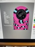
I like the inlay. My biggest problem with your spots and colors is you only use red/pink, white, green, and black. Get some yellow, blue, purple, and/or orange variants in there.
A set from CPC is a huge investment. Don't rush it. Get some mold samples, play with the designer tool a lot, get lots of advice, and make sure you get this right.
A set from CPC is a huge investment. Don't rush it. Get some mold samples, play with the designer tool a lot, get lots of advice, and make sure you get this right.
Last edited:
As others have said, take your time and get samples. I'd recommend getting stacks of 10 of the molds you are considering so you can feel how they shuffle.
Your denominations don't stand out well enough for my liking. Bigger, bolder, different color and/or a different font can help with that.
The size of your font should be legible at arm's length - SJC may be too small.
My subjective opinion on your color choices...too much Christmas going on ;(
Your denominations don't stand out well enough for my liking. Bigger, bolder, different color and/or a different font can help with that.
The size of your font should be legible at arm's length - SJC may be too small.
My subjective opinion on your color choices...too much Christmas going on ;(
- Joined
- Dec 29, 2017
- Messages
- 25,940
- Reaction score
- 35,092
- Rewards
- 0
- Location
- Burnaby (Greater Vancouver), BC
This would be perfect for the new Greek Key mold hybrid ceramics. Just sayin'.
I like the inlay design. Though I would shrink the bull a bit and put the ”Siempre Adelante” in an arc, like these for instance:
https://www.pokerchipforum.com/poker-chip-database/bridge-city-poker.238/
I would also increase the size of the denomination and possibly make it red.
I would reconsider the use of the hourglass mold and get a mold sample set. Also, I would get at least 10 chips of each of the molds you like the look of to get a proper feel for them.
I would play around a lot more with the base and spot colors and get more variation. Some of the current combos have a high risk of resulting in dirty stack issues.
Most importantly, I would let this take time (months) and keep tweaking, letting it sit, revisit, keep tweaking.
Good luck! Lots of potential pit falls to manuever but very rewarding once you get it right, not to mention when having the finished set in hand.
. . .
I would also increase the size of the denomination and possibly make it red.
. . .
My first thought was this, the denomination is small and hard to read
MeridianFC
Flush
Every suggestion above is correct. Re-read them. Meditate on them.
Every suggestion above is correct. Re-read them. Meditate on them.
this
There are a ton of colors to choose from. You have a lot of shared colors throughout most of the chips. For my experience in custom CPC's, the journey is almost as much fun as actually getting the chips. Don't rush it, listen to advice, but ultimately it is your money and your chips. If you haven't done at least 500 mock ups, then you shouldn't be close to finalizing the colors/edge spots/edge spot colors/and edge spot flow
Dirty stack problems between the $5 and $25 for sure!
Super-lightweight (too much missing clay from the debossed images), and feels very plastic-y and just plain cheap. Visually, it is very busy, but that's more subjective. My least favorite clay mold, by a large margin.
Last edited:
taco_dlr
Sitting Out

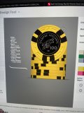
I do think you’ve made a big step from your first mockup. Also please try out the export button on the CPC designer, it’ll give us a picture of all your chip designs in one photo.
Is this a tournament set? I know some people here like their tourney sets to have the same edge spots. This has the same vibe, even if the edge spots are slightly different for each denomination. I’m not personally a fan of the different variations, I think it might be a bit better if you stick with the 316 pattern for all denominations if you like that look.
Is this a tournament set? I know some people here like their tourney sets to have the same edge spots. This has the same vibe, even if the edge spots are slightly different for each denomination. I’m not personally a fan of the different variations, I think it might be a bit better if you stick with the 316 pattern for all denominations if you like that look.
Great job on the label! I still think the denomination needs to be bigger/clearer but this is a step in the right direction. I’m not feeling the off center denomination but that’s more a question of taste and obv my taste matters a whole lot less than yours in this case.
****IMPORTANT MESSAGE!!!!!****
When you have a chip done, click on the chip, then click "Save as New" (or save as #...). That will put it down below in a set. you can rearrange the chips down below in the correct order by clicking on them.
When you have all chips ready, click "Save Set" from the menu on the left. You can recall saved sets with "Load Set".
Click "Save as PNG" to export all the chips together so we can see the whole set.
Now that I have that out of the way, I'll get back to the design. You're making progress. Keep playing around and save a bunch of different ideas. You'll start to get a feel for what works. I go back and look at sets I designed at first, and wonder what I was thinking.
You're using 3 different edge spot styles, but they're all practically the same. I would suggest you use very different edge spots, or identical ones.
BTW, that 25 is fantastic! Green chip best chip!
You're using 3 different edge spot styles, but they're all practically the same. I would suggest you use very different edge spots, or identical ones.
BTW, that 25 is fantastic! Green chip best chip!
ekricket
Royal Flush
ekricket
Royal Flush
ekricket
Royal Flush
Oh man, getting tech shamed by the retired crew. Not looking too savvy here, OP ")
taco_dlr
Sitting Out
Will do thanks****IMPORTANT MESSAGE!!!!!****
When you have a chip done, click on the chip, then click "Save as New" (or save as #...). That will put it down below in a set. you can rearrange the chips down below in the correct order by clicking on them.
When you have all chips ready, click "Save Set" from the menu on the left. You can recall saved sets with "Load Set".
Click "Save as PNG" to export all the chips together so we can see the whole set.
Some acknowledgment of the source of inspiration for chip colors and edge spots would also be nice ")
Similar threads
- Replies
- 5
- Views
- 204
- Replies
- 13
- Views
- 2K
- Replies
- 4
- Views
- 372