Varkaus Huone Custom Ceramics (2 Viewers)

Okku

Full House
Joined
Jun 6, 2020
Messages
3,707
Reaction score
12,879
Location
Las Vegas
This is a project that I've been working on slowly but surely over the past year or so. I got the original idea looking at different type of CPCs, mocking up Small Crown and Large Crown ideas that would possibly be stamped, The original idea that I had in mind would've been some sort of vintage, OG look and "feel" to what would've possibly been ordered in the 60s or somewhere around that area.

My family is from Finland and that's where everyone resides. I have some family in Dallas, but everyone else is in Finland which makes it hard to see them at times. We are mainly the ones traveling there so when we have time and save up which is every couple of years we take a few weeks during summer and go visit, take it easy and do what we can. My grandparents are no longer with us anymore, but luckily we still have lots of things/items that we can remember them by. Memories being the top thing. They owned (we still own) a cabin/land that's about a half hour away from my parents hometown and we go there at times to check up on things, step back in time essentially and take it easy. When I saw you are stepping back in time, you quite literally are. There were newspapers from the 60s/70s at the top of the barn last time I went up there, the stove is an all metal stove/oven built into the wall, you heat things up with wood and fire underneath the "stove" and make things that way. There isn't a TV in there from what I remember and it's just so nice. Nothing to worry about there, it's relaxing and somewhere I wouldn't mind spending a few days out of the year.

This "Varkaus Huone" (literal translation being Varkaus Room or the Varkaus Room) set is what I'd think of an ideal set that would be played with in there.

I'd want something to start with and that's why I was thinking about moving forward with ceramics before I jump into a CPC set in a few years which would be custom stamped to get that actual older feel etc.

Any input, criticism and so on would be greatly appreciated to bring this set to life.

I've got two different versions of $25s because I'm not very set on what I'd like. These will be made on the new SmCrown hybrid, so keep that in mind.
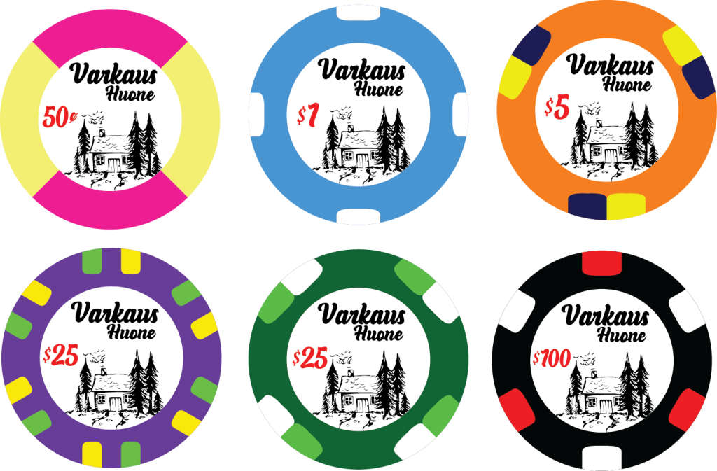
Varkaus Houne Proof-1 v2(2).png
 
Perkele, lusmu!

:p

I like the idea of going vintage. Have you thought about a sepia toned background, rather than the bright white? I also like the sketch style graphic, but I don't think that the font choice works well with it. I'd rather see something with more of a hand drawn style if possible.

Just some random ideas. (And that 50c is a classic combo for TRK chips)
Haven't thought about that, but I'll get back into Illustrator and mess around with that!
 
Love your description of the cabin in the woods, a vivid picture leaps into my mind when I read.

Not sure how attached you are to the SCrown ceramic. I can't help but feel these would feel out of place up at the cabin, a little too modern. I think the closest feel on a budget would be relabeled china clays.

That said, let's look at the design as intended.

- The illustration is beautiful.
- There's a lot of white here. I'd either add more and make it a dominant theme, or use only in one chip, two at most.
- Reusing the same yellow color across chips would help make the set more cohesive. Don't see much of a risk of dirty stacks.
- I prefer the 4D14 $25, makes sense for spot progression. If you love the 6DS18, I would consider this progression: 4PIE/414/3D14/614/6DS18.
 
That name doesn’t quite work in my mouth, would it be a fun idea to involve some relatives back here to come up with the name together?

I think a bit of color could really bring the illustration to life, take a look at this lottery ad from the 80’s:


Maybe do the currency in marks (mk) and pennies (p)? Could take a look at old Finnish currency / ads from that period for some ideas on the font style.

I also think the 4D14 pattern is the way to go. :tup:
 
I love the idea! Like the purple $25 best with the line-up but would make the hundo white
 
This is a project that I've been working on slowly but surely over the past year or so. I got the original idea looking at different type of CPCs, mocking up Small Crown and Large Crown ideas that would possibly be stamped, The original idea that I had in mind would've been some sort of vintage, OG look and "feel" to what would've possibly been ordered in the 60s or somewhere around that area.

My family is from Finland and that's where everyone resides. I have some family in Dallas, but everyone else is in Finland which makes it hard to see them at times. We are mainly the ones traveling there so when we have time and save up which is every couple of years we take a few weeks during summer and go visit, take it easy and do what we can. My grandparents are no longer with us anymore, but luckily we still have lots of things/items that we can remember them by. Memories being the top thing. They owned (we still own) a cabin/land that's about a half hour away from my parents hometown and we go there at times to check up on things, step back in time essentially and take it easy. When I saw you are stepping back in time, you quite literally are. There were newspapers from the 60s/70s at the top of the barn last time I went up there, the stove is an all metal stove/oven built into the wall, you heat things up with wood and fire underneath the "stove" and make things that way. There isn't a TV in there from what I remember and it's just so nice. Nothing to worry about there, it's relaxing and somewhere I wouldn't mind spending a few days out of the year.

This "Varkaus Huone" (literal translation being Varkaus Room or the Varkaus Room) set is what I'd think of an ideal set that would be played with in there.

I'd want something to start with and that's why I was thinking about moving forward with ceramics before I jump into a CPC set in a few years which would be custom stamped to get that actual older feel etc.

Any input, criticism and so on would be greatly appreciated to bring this set to life.

I've got two different versions of $25s because I'm not very set on what I'd like. These will be made on the new SmCrown hybrid, so keep that in mind.


View attachment 1191177

Cool project!

If I may… If the goal is to go for a vintage look, I would perhaps try to tone down or desaturate the colours a bit.

The illustration is great. You could perhaps try to distress it a bit more, add a bit of texture to give a it a more "real" drawing look. Really nitpicking here, but I can't help to think the first tree is a bit too dark and take the focus/weight a little too much at first glance. Or maybe add another tiny one to the left to counterbalance?

My main criticism is the font, as @Racer96 said. It is too "fake-retro" imho. I would either go with a classic nordic mid-century modernist feel, or something with more hand-lettering feel. You mentioned the wood stove, you could look at matchboxes from this era, etc.

And just a thought considering the layout: I would try to move the house a bit up, to make it more the center of attention, put the denom at the bottom in front of the path, and perhaps put the name in an arc at the top. Or not. Just the itch to see it.

Good luck :D

edit:
Nothing to worry about there, it's relaxing and somewhere I wouldn't mind spending a few days out of the year.
A few days? I would go live there all year round, lol. (or at least all summer… :wtf: )
 

Create an account or login to comment

You must be a member in order to leave a comment

Create account

Create an account and join our community. It's easy!

Log in

Already have an account? Log in here.

Back
Top Bottom