You are using an out of date browser. It may not display this or other websites correctly.
You should upgrade or use an alternative browser.
You should upgrade or use an alternative browser.
Thinking of a CPC tournament set (1 Viewer)
- Thread starter MrCatPants
- Start date
- Joined
- Jul 12, 2020
- Messages
- 9,999
- Reaction score
- 14,660
Looks great! Hands up a sample!
Kid_Eastwood
Full House
I like both the lineup and the inlay.
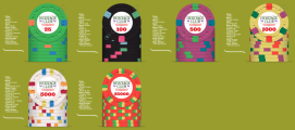
I think the green background really skews the viewer's eye. Try gray or another neutral hue for less background color clutter.
Also might consider the cost of a bright-white base and move it to the 25k slot, where much fewer chips are needed.
Also might consider the cost of a bright-white base and move it to the 25k slot, where much fewer chips are needed.
OP
OP
MrCatPants
Full House
Changed image to a neutral background.I think the green background really skews the viewer's eye. Try gray or another neutral hue for less background color clutter.
Also might consider the cost of a bright-white base and move it to the 25k slot, where much fewer chips are needed.
What kind of base colors would you look at if the bright white was moved to 25k?
Eloe2000
Straight Flush
Changed image to a neutral background.
What kind of base colors would you look at if the bright white was moved to 25k?
Peacock blue
This is the complete opposite of stupid thinking. CPC customs are awesome!
Looks sweet! I would seriously consider four different edgespot colours on the 500 - shouldn't be that much more expensive since you don't need many. Especially since the 100 has three different colours.
The only other thing that jumps out is potential dirty stack issues with the 1k and 25k given they have such similar colours.

The only other thing that jumps out is potential dirty stack issues with the 1k and 25k given they have such similar colours.
Chippy McChiperson
4 of a Kind
I really dig all the chips, except for the 1k. I just don’t think those colors go well together, but all the others look fantastic.

Last edited:
OP
OP
MrCatPants
Full House
The
25k in general I've really struggled with. Open to all sorts on that one for sure - definitely not married to it.Looks sweet! I would seriously consider four different edgespot colours on the 500 - shouldn't be that much more expensive since you don't need many. Especially since the 100 has three different colours.
The only other thing that jumps out is potential dirty stack issues with the 1k and 25k given they have such similar colours.
View attachment 721205
Personally, I'd go with tiger 1000, peacock 5000, and white 25k. That has CPC's best colors on the felt at the tournament's end.Changed image to a neutral background.
What kind of base colors would you look at if the bright white was moved to 25k?
Spot progression looks great as-is (2,3,4,6,8,8d), but agree with @Darson that the T500 should have 4-color spots. Also his reasoning on why ditching the yellow for peacock.
OP
OP
MrCatPants
Full House
Thoughts? Tried the Peacock as the 5k and white as 25k, but had a hard time with spot progression and think I want to keep the white chip design as is.

") love the T100!
love the T100!
OP
OP
MrCatPants
Full House
Ok. Did some tweaking to the 500, 1k, and did a bunch of iterations of the 25k...but not sure I'm happy with any of them. Thoughts?

philhut
Flush
bottom left for obvious reasons.......It is very similar to a chip that I have been sitting on and could see daylight as a cards mold or CPC add on one day.Ok. Did some tweaking to the 500, 1k, and did a bunch of iterations of the 25k...but not sure I'm happy with any of them. Thoughts?
View attachment 722419
AlbinoDragon
Flush
I like where you are going with this set. The DG Peacock 25k with the white 5k is a nice "pairing" as sequential denominations.
Personally, I'd drop the "tournament" on the inlay design. It's sort of unnecessary for a tournament specific set, clutters the otherwise simple and on-point design a bit, and takes up space in what is otherwise limited real-estate in a chip inlay.
Do you have a CPC color sample set? I only worry that some of the colors in the 1k might look a bit muddy/indistinct in real life.
To the input that you can (and probably should... take with a giant grain of salt as it's now down to 100% personal preference), but you are putting your prettiest and most intricate spots on chips that will see the felt the least amount of time on the table. After 15 years and four (soon five) ASM/CPC sets that I did a traditional spot progression with the most complicated spots on the highest denomination chips, I placed an order late last year where I specifically put the "best" spots on the chips that I knew would see the felt the most. It's absolutely your set, and where you are going already looks really good, but maybe... just maybe, consider putting the "best" spots in the middle of the pack where you are your players will get to enjoy them the most.
Curious and interested to see where this goes. You already have a very good start. It doesn't need a whole lot of effort to make this a HOF-worthy set!
^^ That's also a compelling reason to build a T100-base tourney set using 100-500-2000-10000 denominations. Three of the four chips will see nearly equal use, with the T500 and T2000 being used extensively from start to finish, while the T100s stay in play longer (than T25s) and more T10k chips are used (and more often) than corresponding T25k chips.
You end up with fewer denominations, each of which will see more play, and each can all be 'all-star' chips in their own right.
You end up with fewer denominations, each of which will see more play, and each can all be 'all-star' chips in their own right.
CrazyEddie
Full House
... because here at PCF we know what really matters when planning a tournament structure: HOW GOOD THE CHIPS LOOK ON THE TABLE
OP
OP
MrCatPants
Full House
So on the t1k the colors aren't as close as the chip designer makes them appear. Do tiger is much more bright orangey irl. Going to for a wthc/noir 5 "feel" to it. Let me know thoughts.
Also - thoughts on the 25k?
And I feel good about the complex spots getting less play time. To me they often look too busy and I actually like the simplicity of the earlier chips.
Here's a pic of the true base color sequence as well.


Also - thoughts on the 25k?
And I feel good about the complex spots getting less play time. To me they often look too busy and I actually like the simplicity of the earlier chips.
Here's a pic of the true base color sequence as well.
- Joined
- Nov 7, 2014
- Messages
- 2,136
- Reaction score
- 2,342
- Location
- Northern NJ and NY/Long Island Areas
Another thought...
If the spot pattern you really like the most, or feel looks the best, happens to be on the largest chip, there is no problem with using it on , say the workhorse chips that will see the most use/seen by the most players instead, such as the $100 or $500 ....
I've seen Casinos that have "really nice" edgespot $25's, as compared to their $500 cash chips.... there's no rule that edge spots absolutely have to do a "1, 2, 3, 4, 5 " type progression ...
Eloe2000
Straight Flush
Thoughts? Tried the Peacock as the 5k and white as 25k, but had a hard time with spot progression and think I want to keep the white chip design as is.
View attachment 721272
So on the t1k the colors aren't as close as the chip designer makes them appear. Do tiger is much more bright orangey irl. Going to for a wthc/noir 5 "feel" to it. Let me know thoughts.
Also - thoughts on the 25k?
And I feel good about the complex spots getting less play time. To me they often look too busy and I actually like the simplicity of the earlier chips.
Here's a pic of the true base color sequence as well.
View attachment 722556
I just ordered a CPC cash set and my $5 is the most important chip and all shades of orange/yellow/red. I built a mock-up tool since the CPC tool doesn’t accurately reflect some colors as precisely enough to pull this off. IMO Peach is incredibly close to either Arc or Tiger that they can get lost to each other.
Here are some photo mockups using the color sample chips.
butterscotch:
Peach:
Retro Red
Bright White
Eloe2000
Straight Flush
OP
OP
MrCatPants
Full House
Agree on the peach/tiger/arc yellow blending. Latest mock up I've got dg yellow/arc yellow/(regular) yellow. Looks like it will have an appropriate contrast?
Last edited:
1st and 4th look best to me.
OP
OP
MrCatPants
Full House
Ok, done a little narrowing down/tweaking on the 25k. Thoughts on these 3?
Also, anyone know who on here is still in the inlay design game these days?

Also, anyone know who on here is still in the inlay design game these days?
Eloe2000
Straight Flush
8D18 because of the pattern of more but smaller spots with the progression.
Last edited:
philhut
Flush
After mocking up several, go back and look through all of them....the ones that grab your eye two or three times immediately toss or select them based on what grabs you...if anything bugs you remove it from the list.....if one seems good and your just playing with designs stop, you have already achieved the perfection that draws your attention. See the choice is easy now....lol.
I would agree this of the last three is the one that catches my eye as first choice. I still prefer your lvl 11 chip from the previous design that I compared to a similar prospect above that I had saved. I'd go with the one you designed of the 6QADS188D18 because of the pattern of more but smaller spots with the progression.
OP
OP
MrCatPants
Full House
So, 'last' item for now. Between small crown and H-mold. Like the idea and look of a small crown set with the simple/clean look I'm going for. H Mold I like as well, and goes with 'H'eritage Club to increase the custom feel of set.
And what should be unrelated but still is part of the decisioning process - wait for H-mold will probably be later this year. Small Crown would be the next run, likely 12+ months.
Thoughts on the look with the set, or feel of these molds?


And what should be unrelated but still is part of the decisioning process - wait for H-mold will probably be later this year. Small Crown would be the next run, likely 12+ months.
Thoughts on the look with the set, or feel of these molds?
philhut
Flush
I agree with the decision of the H mold as it directly relates to the logo.So, 'last' item for now. Between small crown and H-mold. Like the idea and look of a small crown set with the simple/clean look I'm going for. H Mold I like as well, and goes with 'H'eritage Club to increase the custom feel of set.
And what should be unrelated but still is part of the decisioning process - wait for H-mold will probably be later this year. Small Crown would be the next run, likely 12+ months.
Thoughts on the look with the set, or feel of these molds?
View attachment 725235View attachment 725236
I'm a huge fan of scrown but H-mold is a no brainer for this set. I also think that 7/8" inlays on scrown doesn't look as good as the 1". I'll bring a shuffle stack of scrown CPCs on Thursday for you to check out.
Similar threads
- Replies
- 17
- Views
- 759
- Replies
- 1
- Views
- 260
- Replies
- 0
- Views
- 117
- Replies
- 15
- Views
- 883