I really enjoy reading how folks developed their custom set, so I figured I'd go into some detail as to how I picked all my chips and designed the inlay theme. I provided a sneak preview of this set in my basement renovation thread, but I figured with the HHRs now being pressed and hopefully just a few weeks away from being finished, it was time to post all the details. And for those of you who don't care about the details, the final J5 proofs are at the bottom of the page. 
This set has been in the works for a long time. I've been running NLHE tourneys for about 13 years, and shortly after getting my game up and running, I developed the itch for a custom set. Initial mock-ups started back in the ASM days, but at the time I just couldn't finalize a chip lineup. The set has always revolved around a whiskey/bourbon theme, and in particular Jack Daniels. I've been a big Jack Daniels drinker since my college days. In our poker group's early years, I always started out the night with a Jack and coke, which typically progressed to Jack on the rocks by the end of the evening. And while my tastes have expanded (I currently have ~30 different bourbons/whiskeys/scotches stocked in the bar), there's always at least a fifth of Jack in the house, and usually a handle (or two).
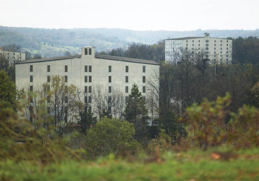
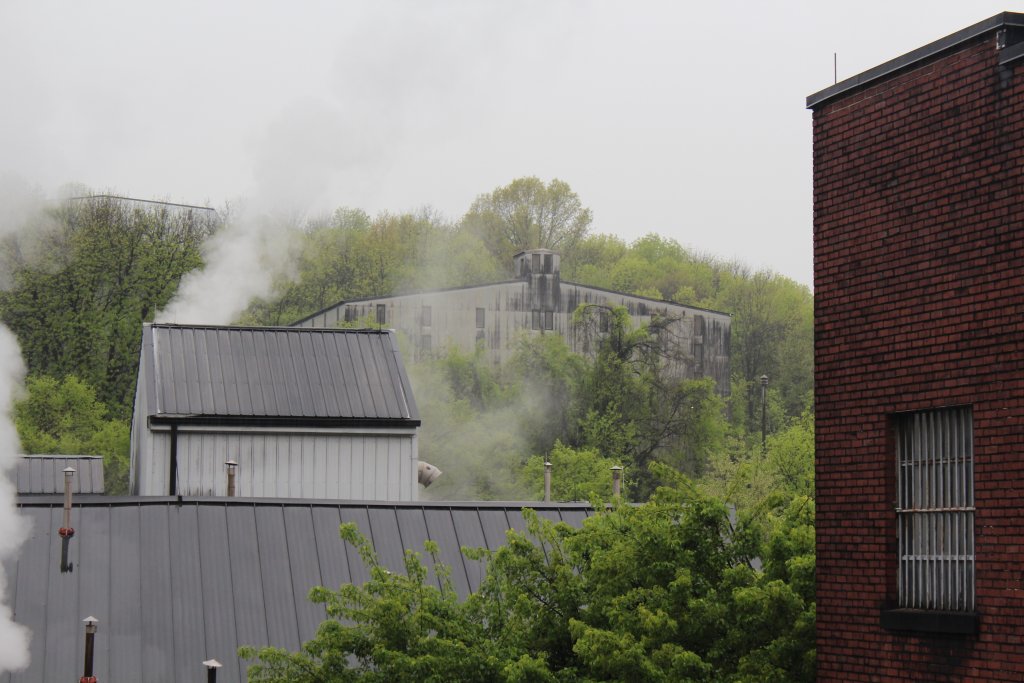
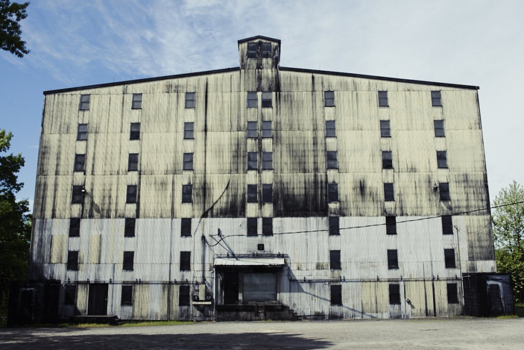
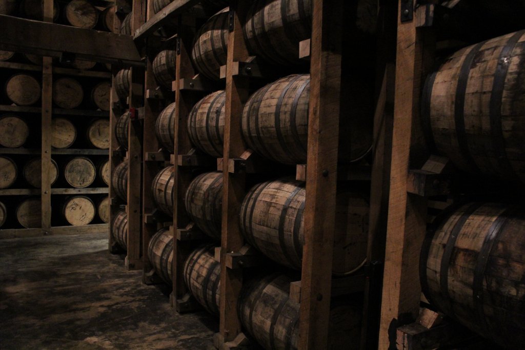
Last year my father & I made the trip to Lynchburg Tennessee to visit the Jack Daniels distillery. The distillery has dozens of barrel houses on site, and I found them to be really neat buildings - very rustic and almost dingy (especially the outside), but with an interesting, down to earth character that I felt matched the vibe I was trying to re-create in my upcoming basement poker room renovation. The trip fully solidified my desire to go with the barrel house theme for the set.
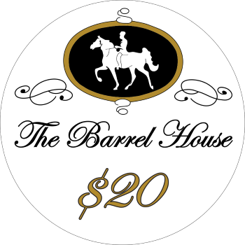
For the inlay design, I wanted to go with a relatively simple design with a white or off-white background, similar to a few of my favorites like Chateau De Noix, Copperhead Road, and Pier Five. The primary inlay design I did mostly myself, incorporating the logo of a whiskey related social club I belong to along with "The Barrel House" in a script-ish font and the denomination:
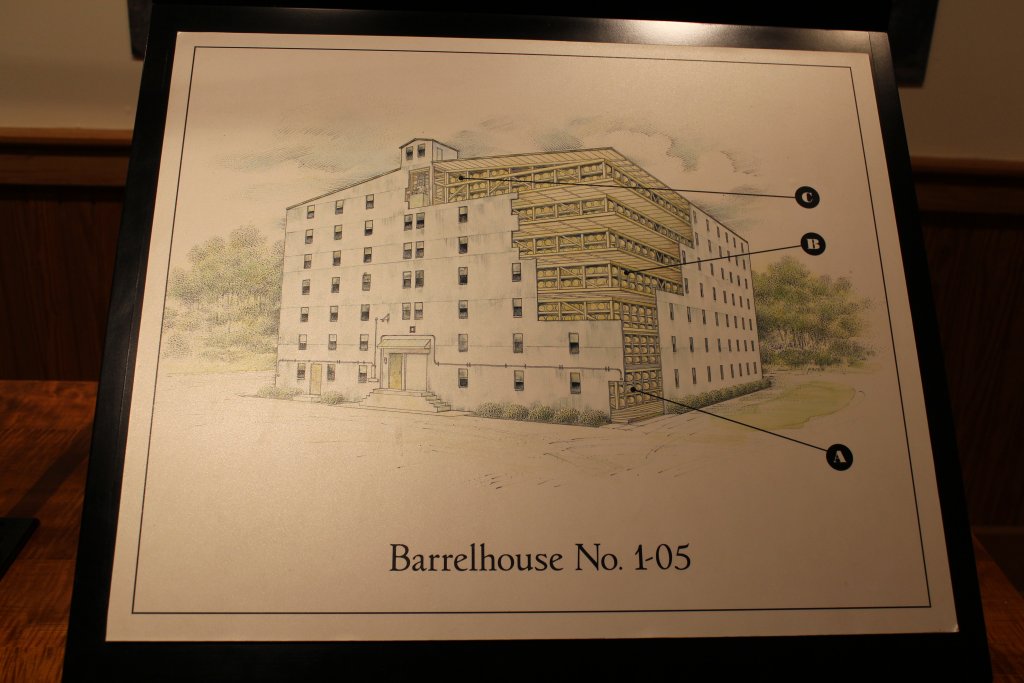
I was 95% happy with this, but really wanted to create a complimenting back inlay with a design that included some aspect of the distillery process. So I reached out to @Johnny5 to help with the inlay design for the other side, and we discussed a bunch of options, most of which just didn't seem to work or jive with the primary inlay design. Then a thought came to me - during my trip to the Jack Daniels distillery, I had snapped a photo of a barrel house sketch that's on display in their visitor center:
I sent this, my original side A sketch, and a ridiculous concept sketch....
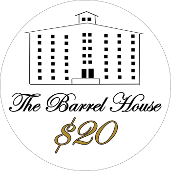
....over to John, to work his magic.
For chip colors, I started with a few basic preferences/guidelines:
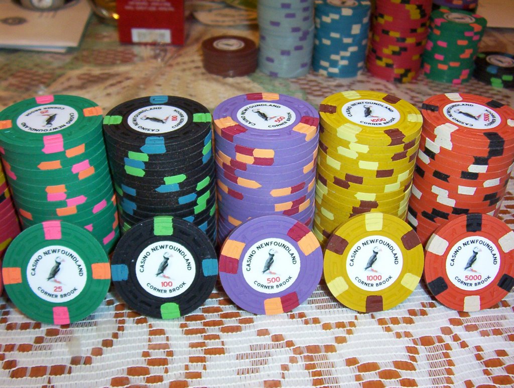
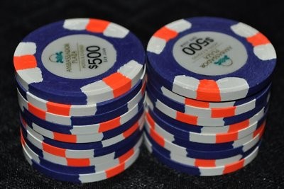
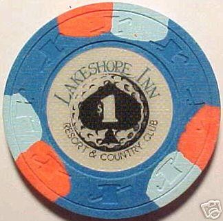
The only tweak I made to the chip was swapping out imperial blue for DG peacock when that color was introduced to help the blue pop even more. I figured the 100s would be one of the most used chips on the table, and considering how much I liked this combo, I started here and built the set around it. The other two chips that had a big color influence on the set were the Ambassador Plaza $500 (I love the deep purple base and contrasting white and orange spots) and Lakeshore Inn $1 (one of my favorite overall chips) - I made it a priority to get both incorporated in some fashion.
So here were the first 3 chips to get more or less locked down, my T100, T500 and T5k:

Once you get those 2 or 3 favorite chips more or less locked down, I find the the toughest part about putting a set together is filling in the rest of the set with chips that you both really like and that complement those favorites. The toughest ones for me were the green and orange chips. I prefer CPC's regular green for a base, but I couldn't find spot colors I liked that matched the rest of the set, so I settled on the one pictured below. I didn't realize it looks just like the WSOP main event T25 until someone else mentioned it, lol. The orange chip was last, and I had about 40 different iterations. I knew the general spot pattern I wanted (either 6A14 or 314318), but I couldn't decide on a color combo to save my life. Here are a few...
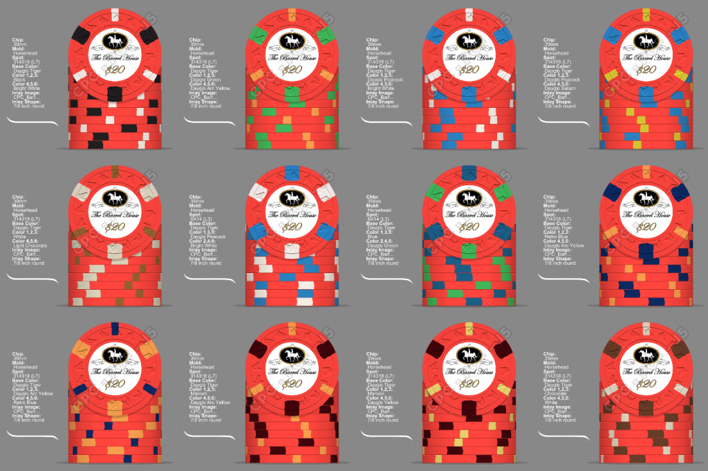
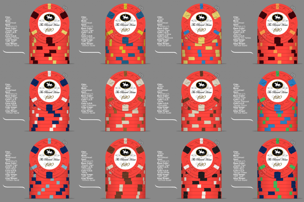
Honestly, there are probably one or two color combos here that I liked a hair better as a stand alone chip, but I felt the one I picked meshed better with the set. And it's very similar to the PCA 500 The final chip would be either a T20k or T25k. Again, more indecision on which would work better for my tourneys. I couldn't decide, so I ended up getting both a white T20k and a yellow T25k
  Both of these designs surprisingly came pretty easy.
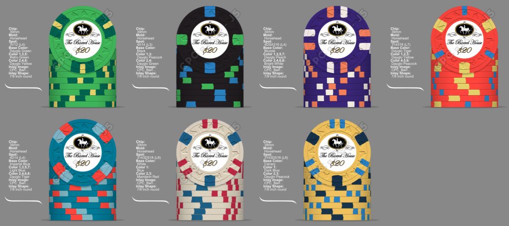
I posted the various chip mock-ups I went through over the years here as well. But here's the final color arrangement - T25, T100, T500, T1k, T20k, T25k:
Given the set is pretty heavy in blue/darker base colors and peach/orange tones, I attempted to mock up some dirty stack potentials (Chip Design Tool + Powerpoint + a lot of patience):
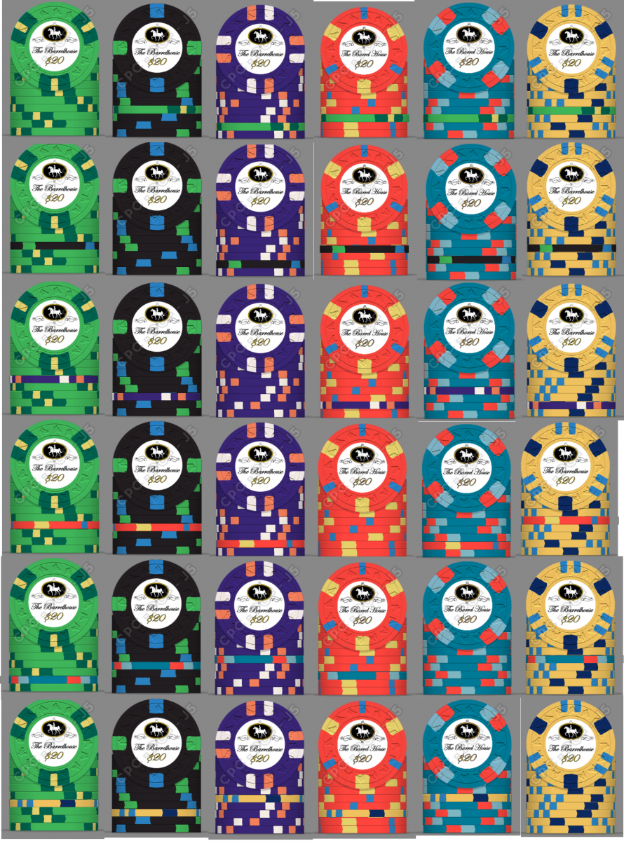
There may be some minor issues with 100s in stacks of 500s, but after seeing these mock ups I was good with pulling the trigger. Once they come in I'm going to do some real life photo comparisons to see if this exercise was worth the time...
The mold choice was a pretty easy one. My 3 favorite molds in terms of look and feel are HHR, Scroll and DIASQR. I didn't feel like the DIASQR fit with the look of the set, and it would have required a good deal more cash to fund the set on this mold. I very much entertained using the scroll mold, especially with the possibility of using the oversized 44m chips for some of the high denoms. At the end of the day though, once I went through the process of laying out all the colors and spots, I didn't think the spots available for the 44mm chips meshed well with the workhorse others. I also already have a set on the scroll mold (KGB Rounders). I felt the HHR worked the best with the set (and ended up tying into the inlay design a bit), so that's the mold I went with.
I'd like to take the time to thank John @Johnny5 again for the inlay design help and @theewpice for providing feedback during the design process!
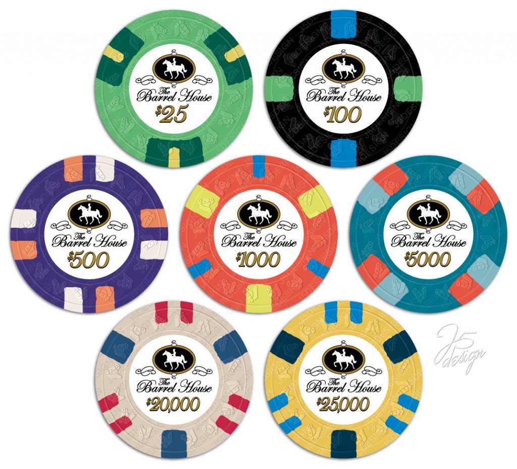
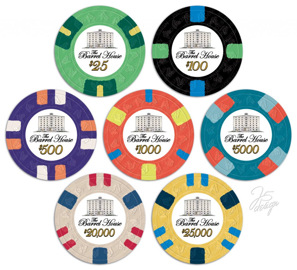
So for those of you still reading (or those who went TLDR and fast-forwarded to the goods) - I present The Barrel House!
This set has been in the works for a long time. I've been running NLHE tourneys for about 13 years, and shortly after getting my game up and running, I developed the itch for a custom set. Initial mock-ups started back in the ASM days, but at the time I just couldn't finalize a chip lineup. The set has always revolved around a whiskey/bourbon theme, and in particular Jack Daniels. I've been a big Jack Daniels drinker since my college days. In our poker group's early years, I always started out the night with a Jack and coke, which typically progressed to Jack on the rocks by the end of the evening. And while my tastes have expanded (I currently have ~30 different bourbons/whiskeys/scotches stocked in the bar), there's always at least a fifth of Jack in the house, and usually a handle (or two).
Last year my father & I made the trip to Lynchburg Tennessee to visit the Jack Daniels distillery. The distillery has dozens of barrel houses on site, and I found them to be really neat buildings - very rustic and almost dingy (especially the outside), but with an interesting, down to earth character that I felt matched the vibe I was trying to re-create in my upcoming basement poker room renovation. The trip fully solidified my desire to go with the barrel house theme for the set.
For the inlay design, I wanted to go with a relatively simple design with a white or off-white background, similar to a few of my favorites like Chateau De Noix, Copperhead Road, and Pier Five. The primary inlay design I did mostly myself, incorporating the logo of a whiskey related social club I belong to along with "The Barrel House" in a script-ish font and the denomination:
I was 95% happy with this, but really wanted to create a complimenting back inlay with a design that included some aspect of the distillery process. So I reached out to @Johnny5 to help with the inlay design for the other side, and we discussed a bunch of options, most of which just didn't seem to work or jive with the primary inlay design. Then a thought came to me - during my trip to the Jack Daniels distillery, I had snapped a photo of a barrel house sketch that's on display in their visitor center:
I sent this, my original side A sketch, and a ridiculous concept sketch....
....over to John, to work his magic.
For chip colors, I started with a few basic preferences/guidelines:
- Standard tourney base colors - green/black/purple where possible. My group has been playing with these colors for years, I didn't want to change it up too much.
- Utilize a lot of CPC blues. I personally find all the blue clay colors to be CPC's strength, especially imperial blue, retro blue and DG peacock
- Use spot patterns that allow the base color to take precedence and define the chip. While some of the more complicated spot patterns and half/quarter pies are pretty cool, I feel they often detract from the "identity" of the chip. When I see a chip or stack of chips, I prefer it be obvious that you're looking at a black chip, or a green chip, or a purple chip. So I went with spots that provided at least ~70% base color around the circumference of the chip. The only exception to this rule was the 4D14 for my 5k (~60%)
- Base/spot contrast - bright contrasting spot colors with dark, rich base colors - or bright base colors with darker spots.
- Different spot patterns on each chip and make an attempt at some kind of spot progression
The only tweak I made to the chip was swapping out imperial blue for DG peacock when that color was introduced to help the blue pop even more. I figured the 100s would be one of the most used chips on the table, and considering how much I liked this combo, I started here and built the set around it. The other two chips that had a big color influence on the set were the Ambassador Plaza $500 (I love the deep purple base and contrasting white and orange spots) and Lakeshore Inn $1 (one of my favorite overall chips) - I made it a priority to get both incorporated in some fashion.
So here were the first 3 chips to get more or less locked down, my T100, T500 and T5k:
Once you get those 2 or 3 favorite chips more or less locked down, I find the the toughest part about putting a set together is filling in the rest of the set with chips that you both really like and that complement those favorites. The toughest ones for me were the green and orange chips. I prefer CPC's regular green for a base, but I couldn't find spot colors I liked that matched the rest of the set, so I settled on the one pictured below. I didn't realize it looks just like the WSOP main event T25 until someone else mentioned it, lol. The orange chip was last, and I had about 40 different iterations. I knew the general spot pattern I wanted (either 6A14 or 314318), but I couldn't decide on a color combo to save my life. Here are a few...
Honestly, there are probably one or two color combos here that I liked a hair better as a stand alone chip, but I felt the one I picked meshed better with the set. And it's very similar to the PCA 500
I posted the various chip mock-ups I went through over the years here as well. But here's the final color arrangement - T25, T100, T500, T1k, T20k, T25k:
Given the set is pretty heavy in blue/darker base colors and peach/orange tones, I attempted to mock up some dirty stack potentials (Chip Design Tool + Powerpoint + a lot of patience):
There may be some minor issues with 100s in stacks of 500s, but after seeing these mock ups I was good with pulling the trigger. Once they come in I'm going to do some real life photo comparisons to see if this exercise was worth the time...
The mold choice was a pretty easy one. My 3 favorite molds in terms of look and feel are HHR, Scroll and DIASQR. I didn't feel like the DIASQR fit with the look of the set, and it would have required a good deal more cash to fund the set on this mold. I very much entertained using the scroll mold, especially with the possibility of using the oversized 44m chips for some of the high denoms. At the end of the day though, once I went through the process of laying out all the colors and spots, I didn't think the spots available for the 44mm chips meshed well with the workhorse others. I also already have a set on the scroll mold (KGB Rounders). I felt the HHR worked the best with the set (and ended up tying into the inlay design a bit), so that's the mold I went with.
I'd like to take the time to thank John @Johnny5 again for the inlay design help and @theewpice for providing feedback during the design process!
So for those of you still reading (or those who went TLDR and fast-forwarded to the goods) - I present The Barrel House!
Last edited:

