That's interesting. I always thought plaques originated in European casinos. Probably got that idea from James Bond movies and others.Cruelly ironically, plaques are considered domestic crap around here, and all the admiration goes to American round "clay" discs
-
PCF is an Amazon Associate and an eBay Partner. If you make a purchase through one of our links, we may earn a commission at no extra cost to you. Thank you for your support!
You are using an out of date browser. It may not display this or other websites correctly.
You should upgrade or use an alternative browser.
You should upgrade or use an alternative browser.
Texas Flood Poker Club - Attempting my first chip & label design (2 Viewers)
- Thread starter TX_Golf_N_Poker
- Start date
It's always greener at the other side of the fenceThat's interesting. I always thought plaques originated in European casinos. Probably got that idea from James Bond movies and others.
CrazyEddie
Full House
Once you go plaque
You don't go back
You don't go back
CrazyEddie
Full House
They did! Our dear friend @Coyote lives in Greece, which I think is still considered part of Europe? I don't keep up, honestly...That's interesting. I always thought plaques originated in European casinos. Probably got that idea from James Bond movies and others.
I wrote a little bit about the parallel evolution of jetons (and plaques) in Europe vs. chips in America here: https://www.pokerchipforum.com/thre...etons-and-french-roulette.69814/#post-1413592
Greece is the cradle of Europe, just for information.
Yes, I think I just misunderstood his comment. I'm used to using the word domestic to describe the US. But of course when he used it, he was describing Europe, Thus that Europeans are more interested in American clay chips than in locally used plaques.They did! Our dear friend @Coyote lives in Greece, which I think is still considered part of Europe? I don't keep up, honestly...
I wrote a little bit about the parallel evolution of jetons (and plaques) in Europe vs. chips in America here: https://www.pokerchipforum.com/thre...etons-and-french-roulette.69814/#post-1413592
CrazyEddie
Full House
I know it's hard to grasp, but there are places in the world that aren't Texas. 
I've heard that, but I've never found a reason to see if it was true.I know it's hard to grasp, but there are places in the world that aren't Texas.
I 've played Texas Hold'em with Texans in Texas. .25/.25, and lost $25.
The morale of the story is:


The morale of the story is:
Greece is the cradle of Europe, just for information.
Does that mean everyone there is...a baby?
Possibly. Basically, Christian Mountain Savages, back in 1821.Does that mean everyone there is...a baby?
Some progress, ever since .
I recently had a new idea for a chip label. I'm working on a set of Paulson THC 312 chips. These will all be milled and relabeled - probably with high quality Gear labels. So thinking of giving these a different look. Keeping the Texas Flood name but switching up the art theme from brewing to..... Stevie Ray!
So, any thoughts? Is this going to look like anything more than mush on a 7/8ths label??? I expect to lose most of the details in the background colors, but that's OK as long as I can see Stevie and his guitar.
This is very rough - only about an hour or so of messing around in the Avery Labels designer tool. Same/similar fonts as my other Texas Flood ceramic chips and China clay DIY labels. I really like the background colors on this piece of art. And of course it will need some touch up work to extend the background all the way to the top and bottom of the label. But I'm thinking this has some real promise.
CrazyEddie
Full House
Looks amazing! ... on a poster. Or even a postcard. I have my doubts about the results on a 7/8 decal. At the very least, it'll need a really good printer.
Have you done a test print? How's it look?
Have you done a test print? How's it look?
I'm assuming Gear uses a "really good" printer. And I will definitely have print files created in hi def by one of our designers.Looks amazing! ... on a poster. Or even a postcard. I have my doubts about the results on a 7/8 decal. At the very least, it'll need a really good printer.
Have you done a test print? How's it look?
Is it any busier or more detailed than my original TF design? Here it is shrunk down smaller and next to the original.
CrazyEddie
Full House
Let me just say I have my doubts and concerns. To my eyes (which aren't great, admittedly) there's a lot of details that are getting lost, and the result is not all that flattering to the design. It's still cool, but not... striking.
I mean, it might work great! It's really hard to judge from the screen rather than seeing it in print, at actual size, in person.
I mean, it might work great! It's really hard to judge from the screen rather than seeing it in print, at actual size, in person.
The background behind SRV will be lost for sure. Try something simpler. The font is on the thin side too so background pattern choice will be crucial.
I'm not concerned with the details in the background. I just like the color. The font will be adjusted to look like the one on the right which is thicker.The background behind SRV will be lost for sure. Try something simpler. The font is on the thin side too so background pattern choice will be crucial.
A little busy IMO.
It is. I agree. It's just that I have looked at hundreds of photos, drawings, caricatures and icons of Stevie, and most are way more busy or detailed than this one. Or they are so simplistic that it is even less clear who they are. Or the artwork runs up and down rather than side to side, which won't work with my text. I chose this one for this first draft due to the muted colors in the background, which I know will mute together even more on a tiny label. And because the image of Stevie is mainly white and reasonably simple. Which I'm hoping will stand out from the colored background. Even as small as it is, I think his trademark hat and face profile will still be identifiable. I know the guitar is going to be tiny, and ALL the detail is going to be lost. I'm OK with that as long as it's at least recognizable as his guitar. I plan to keep the denominations left of center so as not to cover much if any part of the fretboard and headstock.A little busy IMO.
It will be tiny. It will be busy and it won't be easy to see all the details. It's that way with my original design too. But I will know what it is, and that might just be enough for me. Just like it is with the original design. And there will be a poster size copy of this image hanging on the wall in my poker room!
Someone asked if I had done a test print. So I did a test print.

Given what I assume is less than pro level resolution of both my graphics and my printer, I don't think that looks too darn bad. Get a designer to expand the background to fill those white spaces, improve the resolution, Bold the text a bit, and then print it on Gears commercial quality printer, and I think it will work.
I guess it's time to see what a designer thinks...
dmoney
Full House
Looks great! I slightly prefer #2 - a little more contrast bt the chip and label, and the use of a subtle gradient and some white space appear a little cleaner to my eye.I received my first drafts from @Johnny5 this morning for my label art. All I can say is WOW! Dude knocked it out of the park. I'm leaning towards the first one with all the background color, but may still change my mind and will do a few tweaks before I'm 100% decided.
View attachment 890622
I suspect most people will prefer #2. I still haven't decided for sure, but I just really like all the colors in the background and I like the white outlines around the text on #1. It makes a very bold statement, and I like that about it. I tend to be a contrarian who likes to go against what the majority prefers.Looks great! I slightly prefer #2 - a little more contrast bt the chip and label, and the use of a subtle gradient and some white space appear a little cleaner to my eye.
CrazyEddie
Full House
He is the MAN !
CrazyEddie
Full House
I think last time I said I preferred #2 but tonight I've changed my mind. The colors in #1 make it all work out.
chutracheese
Straight
My 2 cents...I like #1.
I think his face needs just a little bit of color though.
I think his face needs just a little bit of color though.
doakwolf
Straight
Ohh this is cool!
I love the Texas Flood set and the new design concepts for the SRV set too!
I began design of a SRV tribute set "Rude Mood Saloon" quite a few years ago (https://www.pokerchipforum.com/threads/srv-tribute-set-rude-mood-saloon.8370) but then life got in the way. I picked it up again 5-6 months ago and am on track to finally make it happen. We'll have to share samples when we're done!
For sure. I need to get this back on track. I'm still trying to make final decisions about which chips to use. I've added a few different ones lately, but I still have a problem in that I don't have enough of the chips I want to use as my $5s.Ohh this is cool!
I love the Texas Flood set and the new design concepts for the SRV set too!
I began design of a SRV tribute set "Rude Mood Saloon" quite a few years ago (https://www.pokerchipforum.com/threads/srv-tribute-set-rude-mood-saloon.8370) but then life got in the way. I picked it up again 5-6 months ago and am on track to finally make it happen. We'll have to share samples when we're done!
Texas Flood has sat dormant for way too long. It's time to bring this project back to life. In the 9 months since I last posted an update to the label design I have been trying to procure all the chips I will need for this set. But I ran into a few roadblocks along the way. It's damn hard to put together a cohesive set of casino used chips. All the chips I have seem to be of different barrel heights and that has me on tilt. As much as I love some of the chips I bought, I just don't think this set is going to come together. At least not now.
So what do you do when you come to a roadblock? You find a detour! And in my case, I think that detour is that Texas Flood with the SRV inlay is going to go on a custom CPC set instead of leaded used THC chips!!!
The other big news for this set is that this week I believe my wife and I have located our new forever home. Fingers crossed or say a prayer for us, but we will submit an offer tomorrow and if we are able to purchase this home, then Texas Flood Poker Club will finally have a real home. This property has a huge detached building that will be perfect for hosting games, something I do not have in my current home.
Next step is to get back with John and finish up the INLAY!!! (not label) design. And then I need to figure out how many chips I will need. Updates on the property will be provided once we have a deal.
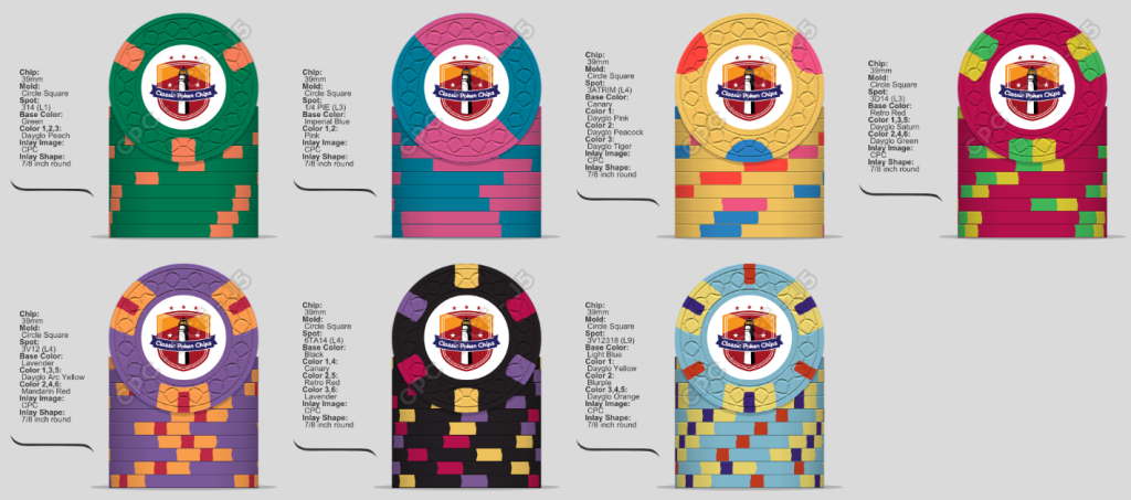
In the last 48 hours I've been feverishly working with the CPC chip design tool, and I think I have a pretty solid lineup drawn up. Some of you may have seen this in another thread. I do need to see what these will look like with John's artwork on them, and I will think on them a bit to be sure it's what I want, but for the moment I'm pretty darned happy with these. So without further ado, here they are!
Top row - nickel, quarter, dollar, and $5
Bottom row - $20, $100, and $500 (why not even though I'll probably never use it)
Similar threads
- Replies
- 16
- Views
- 569
- Replies
- 93
- Views
- 4K
Reshipping (ordering closed)
Faro Dunes 60mm Ceramic Dealer Buttons
- Replies
- 33
- Views
- 1K
