How do you know if your custom label design will print well? (1 Viewer)

valleychips

Sitting Out
Joined
Mar 9, 2025
Messages
40
Reaction score
32
Location
SoCal
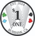
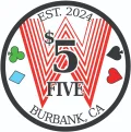
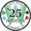
Hey all! I'm about to pay for my custom Tinas. I just want to ask... how do you know for sure that your label designs will print well? I test printed mine on my home printer (which is only black and white) at actual size (.88 inch approx). They looked pretty good, but of course, my home printer can't print finely enough, so you can see the dots and striations if you look closely. I assume the printers over at the Tina factory can use my full color design and do an excellent job with it. And the few Tina samples I've seen have good labels.

But... is there a way I can be sure my label designs would print well? If anyone's done it, I'd love to hear from you.. Please and thanks!

EDIT: Here are a few .png files of the labels. When I upload them here, the images are a little bleached compared to on my own system/on email etc. So I'm not worried about that part.
 

Attachments

  • ChipLabels_1.webp
    ChipLabels_1.webp
    55.7 KB · Views: 35
  • ChipLabels_2.webp
    ChipLabels_2.webp
    87 KB · Views: 31
  • ChipLabels_3.webp
    ChipLabels_3.webp
    79 KB · Views: 30
Last edited:
To reiterate, I'm just wondering how people can tell/know if their design will print well before submitting to the Tina factory. I'm pretty set on the design itself unless I need to adjust it for printing considerations. Thank you everyone.
 
I think this is a good question. I’m wondering about this for CPC label designs.

I saw some tips from gear for their printing in their FAQ. That might help with some considerations . https://www.pokerchipforum.com/thre...-kind-of-files-do-you-need-for-artwork.36665/

Just looking at 300dpi printing, from some googling it looks like that’s equivalent to 0.25pt line thickness in a vector format. But I feel like how it comes out depends on how the printer handles the info in graphic that’s given.

I’ve done test prints for some of my designs on a laser printer where really close lines look a particular way on screen but have come out as blobs. I’m assuming it’ll be similar for the actual production print but that’s just a guess. Assuming it’s the same consideration with the fine lines in your Ws

I’m sure there’s some proper graphic design science around this but I can’t seem to find anything. It probably will be a matter of getting test printed samples and adjusting appropriately.

Would be interested in hearing anything general you find out
 
What some very informed folks told me is that if it prints fairly well on a home inkjet printer, it should print very very well on Tina's printers. (My printer is laserjet which is part of why my sample print looks the way it does.) I also heard that the Tina factory will inform you if the print is coming out strangely/poorly if they have a good relationship with the person putting in the group buy. That, plus some of the advice up here, made me feel okay with moving forward. Thanks all.
 
I’ve had a number of designs printed by Tina on hybrids, and can say that the fidelity of the printing is quite high. High enough to be comparable to standard printing presses on high quality stock.
That said, your designs should print fine regarding detail, and I wouldn’t be concerned at all.
The variable is in the colors…Tina hybrids tend to become more saturated and a bit darker than the original art. Expect the gray W behind the $1 to get a shade darker, and maybe the red and green W as well. It’s always hard to say how much, but if you’re a bit flexible in your expectations, it should all be great.
Also keep in mind that a border outline near the edge is troublesome, as they will likely make it thicker to add bleed, so the border doesn’t get too close to the cut line.
Good luck!
 
I struggled with this too. My set's inlay was colour matched to each chip's clay by a pro (J5). But he wasn't available to do the same for an add on order for different chip colours. I tried colour matching myself and found (as expected) three printers had different colour results. In the end it was a case of make the best decision possible... and pray to the chip god.

Perhaps you could pay a slight premium for a sample order and see how they look?
 
I would probably make the Ws brighter and/or the white outline on the texts thicker, to make them stand out more. And I'd probably remove the suits or make them single color.
And a tad larger margins.
 
^^^

More often in an inlay design, less is more.

Remember, these will exist on a chip and be printed one-inch across (give or take). It's easy to design on a screen that's the size of a dinner plate, but in reality and on a table in front of you, all those little details will be lost.


Print it on your home printer... or office (my printer of choice) or even take it to Kinko's or the FedEx store and print it on the best printer you can find, but print it at the actual size it will be. Take it home and put on the table you will use, or at a minimum, look at it at arms length at least. Several feet away (table distance) is better, and see how it looks.

I have used this for all of my custom designs and with every single one (five designs at this point) I wound up removing elements and design concepts as it made the final version much too busy for a poker chip.
 

Create an account or login to comment

You must be a member in order to leave a comment

Create account

Create an account and join our community. It's easy!

Log in

Already have an account? Log in here.

Back
Top Bottom
Cart