Texas Flood Poker Club - Attempting my first chip & label design (1 Viewer)

TX_Golf_N_Poker

Royal Flush
Tourney Director
Supporter
Joined
Apr 29, 2020
Messages
11,144
Reaction score
17,408
Location
Kingwood, TX
Spending WAAAAY too many hours on pokerchipdesigntool.com and Avery.com. Thought I would share what I'm finally comfortable enough to call my first finished DRAFT design for a chip label and some color combos.

So what's Texas Flood you ask? Well, among many dozens of different hobbies and pastimes are my love for music, and for brewing beer. I am thinking about possibly opening a small micro brewery after I retire from my accounting career in about 4 years. I'd love to get out of Houston and get 5-10 acres in either the Texas Hill Country, or in Colorado. We'll see. Anyway, for several years now I've called my home brewery Texas Flood Brewing, incorporating my love for music, especially Texas Blues and Stevie Ray Vaughan, with my love for craft beer. There's a good chance that will become my brewery name. So hey, I think a good brewery should have a good poker club, don't you?

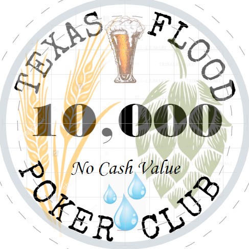
There's only so much room on a poker chip label, so I decided to stick to just brewing in my design. As you may know, there are three main ingredients needed to make beer; barley, hops and water. Yeah, you need yeast too, but there weren't too many cool clip art designs for a colony of yeast online. :D The inspiration for the style of the label was the Paulson Casino De Isthmus labels. The branches with leaves look a lot like stalks of barley, the shield looks a bit like a hop cone, I added water in place of the stars and a foamy glass of beer replaces the eagle.

So here's my tournament set! Let me know what you think and feel free to offer up suggestions for improvement.
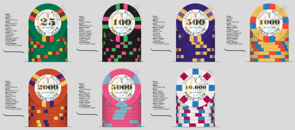
Tournament Set v01.png


Here's a better look at the label:

Texas Flood labels - T10,000 ncv.jpg
 
The first CD I ever owned was "Couldn't Stand the Weather".

I put it into my high end stereo and waited in anticipation for the digital sound to start. I didn't hear any hiss or background noise at all, so I kept turning it up until the first track started (Scuttle Buttin') and I actually jumped into the air it was so loud. This was my introduction to digital signal to noise ratio. I'll never forget it.

You seem to be designing an inlay/label that requires at least a 1" diameter. Make sure the chips you are planning to use will be able to accommodate this.

And since you are in 'Murica, I believe the primary ingredient in beer is rice. :bag:
 
Not what I was expecting to see. . . . . this is almost exactly the five year anniversary of the 2015 Memorial Day flood in the Texas Hill country. I thought what an interesting idea.

There is always room for another great micro pub in the hill country. Not only that, but there is a fair amount of poker around here as well. Best of luck for any and all of your dreams.

DrStrange.

PS my gang were the last ones over the bridge that night. Jerry "the Cougar" Mooney had water to his hub caps. Five minutes later and he would have been the 13th fatality of the flood. We never, ever thought the river could over wash that bridge.
Yeah, I try to stick with the good memories and let the bad ones go. My son was camping with friends on the Frio river that weekend. Luckily, the only major loss was a well insured, and fairly old, beat up Kia Forte.
 
Texas Flood makes me think of Galveston Texas,,,


Wasn't it a mIghty Storm .. !!
 
I love the premise and the idea.

I see that initially you were alternating spot patterns from 3 to 4 spots until the T5000 chip. I'd do a bit fancier with that edge spot if you can afford it. Maybe make the T5000 and T10000 chips six spotted? Traditionally you wouldn't have both on the table at the same time.
 
I think for a first try at designing a chip you have done an incredible job!!!

Some thoughts:
  • The water drops don't fit with the other artwork to my eye. Try bringing the saturation and luminosity down on just those.

  • The spacing between "no cash value" and the denomination looks pretty good on the 25. I'd try moving it up on the other denoms and see how that looks, ie. consistent spacing between the denoms and no cash value vs. consistent position of no cash value.

  • The two different typefaces on the no cash value and the Texas Flood look okay, but I think it may look better if the no cash value is in either the same typeface or a sans serif like gotham or helvetica.

  • I think it may look cleaner if the transparency is removed from the denominations.
 
I love the premise and the idea.

I see that initially you were alternating spot patterns from 3 to 4 spots until the T5000 chip. I'd do a bit fancier with that edge spot if you can afford it. Maybe make the T5000 and T10000 chips six spotted? Traditionally you wouldn't have both on the table at the same time.
Yes, I agree. If I were actually having these chips made, I would do 4 half moons on the T5000 instead of 3. But for some reason, that option isn't available within the tool. As far as cost, this isn't going to be a CPC order, at least not any time soon. If I do have a set like this made this year, they're going to be inexpensive Chinese ceramics, probably using the "cards" mold. Similar to the chips that @SeanGecko uses. So once I send my ideas to a designer, tweaks will be made, especially regarding edge spots.

As far as the chips getting fancier as the denominations rise, I have the exact opposite feeling. There are so few high denomination chips in the game, and they're seldom used early in the game, so I want my "coolest" looking chips to be the lower denomination chips, the ones I have lots of and use from the very beginning. The coolest thing about a T5K or T10K chip is the number printed in the middle!
 
I think for a first try at designing a chip you have done an incredible job!!!

Some thoughts:
  • The water drops don't fit with the other artwork to my eye. Try bringing the saturation and luminosity down on just those.

  • The spacing between "no cash value" and the denomination looks pretty good on the 25. I'd try moving it up on the other denoms and see how that looks, ie. consistent spacing between the denoms and no cash value vs. consistent position of no cash value.

  • The two different typefaces on the no cash value and the Texas Flood look okay, but I think it may look better if the no cash value is in either the same typeface or a sans serif like gotham or helvetica.

  • I think it may look cleaner if the transparency is removed from the denominations.
Thanks! I appreciate some really great suggestions. Addressing your points:

Yeah, those water drops do jump out on the blown up label. But they're tiny on an actual printed 1 inch label. I've dialed them up, then back down several times already. I'll definitely keep that in mind before this design is finalized.

I did think about the location of the "no cash value." I consciously decided to keep it in exactly the same spot on all chips. So it's more part of the label that never changes, rather than rising or sinking depending on the font size of the denomination. I'll definitely give your suggestion some more thought before this becomes final.

Regarding fonts, originally the denomination numbers and No Cash Value were the same font. I liked it on NCV, but the italics didn't work for the denoms. I'm sure you're right that 3 different fonts is probably too many. So thanks! I'll give this some more thought.

Trust me, I have no intention of the denoms being at all transparent. Just haven't been able to figure out how to do that in Avery. It's set to 0% transparent, and yet, here we are...

Thanks again. Extremely helpful post.
 
Last edited:
This is another possibility for the T5000. Same colors in a 1/4 pie with two edge spots. Kinda different I think.

5000_Pink alternate.png
 
By the way, this is the label for one of the beers I brew. My personal favorite recipe of all the beers I've brewed over the years. You may notice that the font used on my brewing label is the same one I picked for the poker chip label. I had tried a few other fonts when developing the poker label that I didn't just love. Earlier today I happened upon this one, and decided it "looked" right. About 15 minutes ago it hit me! I pulled up this label design, and BAM! That's why it looked right! It's the same font I've been using for the name of my brewery on my beer labels for about 3 years!

Texas Flood Brewing label.jpg
 
Just realized that I didn't ever come back and update this thread. Many of you probably already know that Texas Flood has come to fruition in the form of a set of custom ceramic Cards mold chips.

Here is the final design workup done by @timinater

v5-Texas Flood Poker Club PRINT_Lineup.jpg


And here are the completed chips:

TX Flood Lineup.jpg


I love the way the edge spots tuned out!

20201102_095512.jpg


This past weekend I finally got my hands on some of the chips. Unfortunately, it looks like one box from the first shipment to @SeanGecko is lost in transit, and it contains the rest of my chips. Hopefully it will show up soon and I can post a splash shot of all the chips.
 
I'm glad Timinator was able to incorporate an actual image of the state into the design. Wouldn't be Texas without, you know, Texas!
 
In addition to the custom Cards mold Tournament set, I also had Tim create a matching label design for my PGI 8V China Clay cash chips. And of course, what set would be complete without a matching Dealer Button!

Here's a $20 buy-in stack for my low stakes cash game:

20201102_113610.jpg


And if I ever go high roller, I've got some bigger chips ready to deploy:

20201102_114723.jpg


There's also a cut card in the works. Hoping to get those into production soon. Won't be long I'll have everything I need and you guys will never see me around here anymore... :rolleyes:;);)

I really appreciate all the support and great ideas I've gotten from many of you guys. And a special shout out to @chipsncoffee who thought of and designed the awesome Texas icon used on all the chips. He called it "Texas Waves" and it's a focal point to the logo design, as it represents the state of Texas, and water. Both the water from a flood that can be so damaging, and the precious water that is so integral to the brewing of beer. Thank you so much Jay!
 
Awesome
Now do cash set...
I actually did the cash set first. Post #22 on PGI 8Vs. I've only put the tournament set in play once. A two table family game at Christmas. But the Cash chips have been put in play many times in the past year and a half.
 

Create an account or login to comment

You must be a member in order to leave a comment

Create account

Create an account and join our community. It's easy!

Log in

Already have an account? Log in here.

Back
Top Bottom