I'm a huge sriracha fan, I buy it by the case. All my friends know this about me so I thought that it's a good theme for my first set of custom ceramics. I've been playing around a little and came up with this. My initial thoughts are that it's a bit simple - please let me know your feedback.

-
PCF is an eBay Partner. If you make a purchase through one of our links, we may earn a commission at no extra cost to you. Thank you for your support!
You are using an out of date browser. It may not display this or other websites correctly.
You should upgrade or use an alternative browser.
You should upgrade or use an alternative browser.
Sriracha poker chips (1 Viewer)
- Thread starter Darson
- Start date
WhiteMamba1646
4 of a Kind
lol i love that! i would play in that game haha
WhiteMamba1646
4 of a Kind
i love the simplicity. It's not obnoxious and doesn't distract from the game. I like the color of the 20 too.
Rhodeman77
Straight Flush
Like the rooster, denomination is a little small. Maybe move the rooster over to the right slightly to make more room.
Also the value text is pretty hard to read.
Also the value text is pretty hard to read.
DrStrange
4 of a Kind
- Joined
- Nov 9, 2014
- Messages
- 6,205
- Reaction score
- 13,708
- Rewards
- 231
- Location
- Outlet Mall in San Marcos
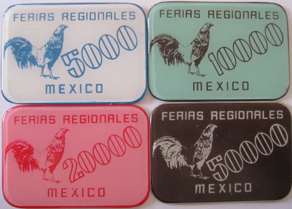
Some barely related images from plaques made for the Ferias Regionales state fair in Mexico decades ago. I saw this mock up and these came to mind. Actual size is a bit bigger than a playing card.
DrStrange
DrStrange
Nathanman123
High Hand
I love these, one my favs I've seen in my short time here.
Kain8
Flush
Will these chips stick together really well so that when I go to shake them apart I bet more than I intended to?
Poker Zombie
Royal Flush
I agree, the denom is far too small.
As for denoms on the rolling edge, I've done that on my ceramic set, but it's too small for anything but the sharpest eyes to read. Not pro or con against the rolling edge denom, but helping you be aware.
I like the chip with the white circle better than the one without. It looks more finished.
As for denoms on the rolling edge, I've done that on my ceramic set, but it's too small for anything but the sharpest eyes to read. Not pro or con against the rolling edge denom, but helping you be aware.
I like the chip with the white circle better than the one without. It looks more finished.
Rhodeman77
Straight Flush
Agree about the white ring. Looks so much better.
What about flames on the rolling edge?
What about flames on the rolling edge?
Nathanman123
High Hand
Flames sound good. Denoms bigger and maybe more legible too... What color would the other chips be? Also I feel the green should be darker to match the cap
OP
OP
These will be 43mm ceramics, probably by Gene@ABC. I was thinking blue for the $1, black for the $100 and maybe a white with red print for the frac - colours are not fixed other than red $5.
Not sure about the denom in a circle overlapping the large circle - it looks fine but it's a bit "Paymaster" and don't want to seem derivative.

Not sure about the denom in a circle overlapping the large circle - it looks fine but it's a bit "Paymaster" and don't want to seem derivative.
Nathanman123
High Hand
I like the other sriracha side print over the heart one. Like the updated denom placement. These in white with red/green designs would be great too. Oh man I want
OP
OP
Before I get my hopes up, I have an email out to Huy Fong Foods to ask for permission to use the rooster logo. The name "Sriracha" is not trademarked but the rooster is.
Poker Zombie
Royal Flush
I wouldn't be concerned with reusing the logo. Unless you intend to resell them (and in bulk) the first step would be to send you a "cease and desist" letter. Once the chips are produced you would be easily within compliance of the letter.
If you sat on this project for a year, then yes, they may catch wind and order a halt (alla the Boardwalk chips). But this isn't a group buy. A single person should never punt around an idea that long. If they do, they deserve to have their hopes and dreams smashed.
As for the circle in a circle... It's been done, and not just by the Paymasters.

This was one of my early mock-ups, circa 2008 or 09. I stole the concept from a commemorative (Caesars?) chip I once saw.
Good ideas are good ideas, and will reimagine themselves from time to time.
If you sat on this project for a year, then yes, they may catch wind and order a halt (alla the Boardwalk chips). But this isn't a group buy. A single person should never punt around an idea that long. If they do, they deserve to have their hopes and dreams smashed.
As for the circle in a circle... It's been done, and not just by the Paymasters.
This was one of my early mock-ups, circa 2008 or 09. I stole the concept from a commemorative (Caesars?) chip I once saw.
Good ideas are good ideas, and will reimagine themselves from time to time.
OP
OP
True, and I don't think Huy Fong will bother - I have seen an interview with the owner who repeatedly said that anything promoting his product is free publicity and he doesn't care.I wouldn't be concerned with reusing the logo. Unless you intend to resell them (and in bulk) the first step would be to send you a "cease and desist" letter. Once the chips are produced you would be easily within compliance of the letter.
However, I want to get permission so that I can have these made locally and I would expect that the serious vendors will not violate trademarks.
OP
OP
Frac, alternate blue $1 and $100

kaida
Pair
Before I get my hopes up, I have an email out to Huy Fong Foods to ask for permission to use the rooster logo. The name "Sriracha" is not trademarked but the rooster is.
Fun fact: "The name "Sriracha" is considered a generic term since the creator of the Huy Fong Foods sauce, David Tran, did not trademark it."
Taken from https://en.wikipedia.org/wiki/Sriracha_sauce
And an interesting article regarding his views on trademark. http://www.latimes.com/business/la-fi-sriracha-trademark-20150211-story.html#page=1
I remember seeing a documentary on him and his success story. A very humble guy.
Last edited:
- Joined
- Dec 29, 2017
- Messages
- 25,940
- Reaction score
- 35,090
- Rewards
- 0
- Location
- Burnaby (Greater Vancouver), BC
Move the denom over to the other side
Rooster on one side, denom in text
Big denom on the other side
I'd use "quarter dollar" instead of just "quarter"
Rooster on one side, denom in text
Big denom on the other side
I'd use "quarter dollar" instead of just "quarter"
OP
OP
Rolling edge ideas...

Nathanman123
High Hand
Wow these are amazing!!! How did you design them?
Rhodeman77
Straight Flush
Top one by a mile. The rest will be so small it will be too to hard to see any detail
OP
OP
Like this?Move the denom over to the other side
Rooster on one side, denom in text
Big denom on the other side
I'd use "quarter dollar" instead of just "quarter"
Poker Zombie
Royal Flush
Remember to print them out at the size of a chip. Ceramics are notorious for being grainy. I really think you need to see just how small and unreadable the text turns out.
I also think it was better with the rooster facing the denom. It's a rule in publishing: Faces face toward the center of the publication/poster. Shifting the denom to the back moves the centerpoint of the piece to the rooster's butt.
OK if you want the denom to be egg shaped though (though roosters don't lay eggs, so there's that little biological quandary).
OP
OP
Remember to print them out at the size of a chip. Ceramics are notorious for being grainy. I really think you need to see just how small and unreadable the text turns out.
I also think it was better with the rooster facing the denom. It's a rule in publishing: Faces face toward the center of the publication/poster. Shifting the denom to the back moves the centerpoint of the piece to the rooster's butt.
OK if you want the denom to be egg shaped though (though roosters don't lay eggs, so there's that little biological quandary).
I have a 43mm sample from ABC and the printing is very good - there is tiny text that can be read so I'm no so worried about that.
I get your point, it is better with the rooster facing the denom. Perhaps this will help me avoid any trademark issues:
OP
OP
Actually, Hook & Pixel offer this for a t-shirt. I think the rooster is more appropriate for a poker chip!

TheOctagon
Two Pair
What if you just did the “cool” rooster on your frac or the chip you have the least of as an Easter egg? I’m a big fan of this design. So simple and elegant.
- Joined
- Dec 29, 2017
- Messages
- 25,940
- Reaction score
- 35,090
- Rewards
- 0
- Location
- Burnaby (Greater Vancouver), BC
Almost yes. Keep these for Side 1 (except for the little circle with the denomination).
On Side 2, replace the fowl with the denomination, in BIG text, and replace the bottom text with your home town and state.
Similar threads
- Replies
- 39
- Views
- 2K
- Replies
- 4
- Views
- 297
- Replies
- 18
- Views
- 640
- Replies
- 11
- Views
- 468
- Replies
- 1
- Views
- 460