Needs more Vancouver Maroons.
-
PCF is an eBay Partner. If you make a purchase through one of our links, we may earn a commission at no extra cost to you. Thank you for your support!
You are using an out of date browser. It may not display this or other websites correctly.
You should upgrade or use an alternative browser.
You should upgrade or use an alternative browser.
Sports team chipsets (4 Viewers)
- Thread starter Taghkanic
- Start date
LinkyBabe
Flush
I was sticking to teams that were around during my lifetime.Needs more Vancouver Maroons.
- Joined
- Dec 29, 2017
- Messages
- 25,940
- Reaction score
- 35,090
- Rewards
- 0
- Location
- Burnaby (Greater Vancouver), BC
Ooo, Grizzlies (shudder). I remember watching a game between the Grizzlies and the Bulls when they were at their peak. It was a slaughter.
dmalhi1
Flush
- Joined
- Oct 12, 2018
- Messages
- 1,317
- Reaction score
- 1,397
- Rewards
- 0
- Location
- North Delta (Vancouver), BC, Canada
Ooo, Grizzlies (shudder). I remember watching a game between the Grizzlies and the Bulls when they were at their peak. It was a slaughter.
lol.. and the voodoo... i hear they are bringing (or already have brought back) roller hockey.
LinkyBabe
Flush
This time with the Vancouver Canadians (PCL)...

Trying to come up with colors for “my” teams, but the palette comes up pretty limited—the first five teams on my list all have dark blue with either gold (Predators, UTC) or light blue (Titans, Chattanooga FC, Chattanooga Rollergirls). Adding in Vanderbilt at least adds black, and the Chattanooga Lookouts probably red, but that’s it...
Poker Zombie
Royal Flush
Tennessee Walking Horse is a thing. TN themed chips demand HHR mold. (y) :thumbsup:Thinking about that further, I can see a way to squeeze out four California colors:
1 Titans etc.
5 Preds/UTC
20 Vandy
100 Lookouts
View attachment 228885
The Chattanooga Red Wolves SC will be starting up this year. There's a red for you.Trying to come up with colors for “my” teams, but the palette comes up pretty limited—the first five teams on my list all have dark blue with either gold (Predators, UTC) or light blue (Titans, Chattanooga FC, Chattanooga Rollergirls). Adding in Vanderbilt at least adds black, and the Chattanooga Lookouts probably red, but that’s it...
The Chattanooga Red Wolves SC will be starting up this year. There's a red for you.
Them’s fightin’ words for ChattFC fans.
Really, though, with the Lookouts going back to Cincinnati as parent, red is covered there. The big obstacle to classic colors is lack of a green. Maybe the local high schools are the way to go...
KrisPringle
Sitting Out
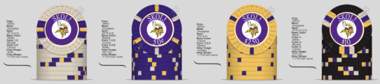
Designed this set for fun today on the CPC tool. Not sure if I can afford CPCs tho  . I too am curious about being able to use an official team logo.
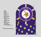
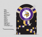
Edit: upgraded the purple chip's edge spots to L9 and added text/denominations. Might need to go bigger with the font?
Edit 2: Still fiddling. Liked the idea of yellow snappers. Thinking whites can serve as a non-denominated filler chip. Could easily be a dime or a dollar.
. I too am curious about being able to use an official team logo.Edit: upgraded the purple chip's edge spots to L9 and added text/denominations. Might need to go bigger with the font?
Edit 2: Still fiddling. Liked the idea of yellow snappers. Thinking whites can serve as a non-denominated filler chip. Could easily be a dime or a dollar.
Attachments
Last edited:
Poker Zombie
Royal Flush
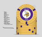
There are occasionally discussions about using copyrighted logos.Designed this set for fun today on the CPC tool. Not sure if I can afford CPCs tho
You can search the threads, but from my recollection, you may do a set for yourself without fear of reprisal. You may not use them for commercial purposes. CPC may refuse to make them as well, because they are technically making them for commercial purposes, especially if they have been asked to make a lot of team logos recently.
In the end, it's a fine line that only lawyers dare to walk.
...but I do love those chip colors.
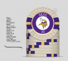
I've got two team-themed CPC sets, one for my college and one for my NBA team, and have some advice if you're interested. A challenge with sports team themed sets is the desire to use the team's colors on all the chips and edge spots. Because it's fun, as a fan, to use those colors at the design stage. But there are two problems. One, unless you're extraordinarily lucky, the CPC colors aren't going to be an exact match for your team colors. So you may be a bit disappointed that the chips don't scream "Vikings", and the chips and spots aren't likely to match your inlays exactly.Designed this set for fun today on the CPC tool. Not sure if I can afford CPCs tho
Edit: upgraded the purple chip's edge spots to L9 and added text/denominations. Might need to go bigger with the font?
Edit 2: Still fiddling. Liked the idea of yellow snappers. Thinking whites can serve as a non-denominated filler chip. Could easily be a dime or a dollar.
The second issue, which I always sort of thought was an overblown concern until I had my own CPC sets, is the "dirty stack" problem. You've only used a total of 4 colors combined, across all your chips and all your spots. They're easy enough to differentiate when you look at each chip individually, but when they're piled into a pot together you'd be surprised how easily your eyes mix them up. Especially when you throw in the fact that these all have essentially the same inlay.
I still like incorporating team colors on a team-themed set. I just wouldn't elevate that above all other considerations. My recommendation is to incorporate your team logo and colors as much as you want in your inlay design, and maybe use those colors in your "workhorse" chip. But in your other chips just try to use colors and spots that you like independently, regardless of whether the chip colors meet the "theme."
buzzmonkey
Flush
You could do old school Pittsburgh colors.
Steelers - Black and Gold
Pirates - Onyx and Yellow
Penguins - Ebony and Saffron
Steelers - Black and Gold
Pirates - Onyx and Yellow
Penguins - Ebony and Saffron
KrisPringle
Sitting Out
Some quality advice here. I mocked up another set in a different thread and got the same "dirty stack" comment and had no idea what it meant. I did order some cpc color samples so I'll have a good idea. Not sold on doing a team set, but I'll try throwing in some other colors. Would be a shame to do a custom set of CPCs and not use any of the dayglow colors I thinkI've got two team-themed CPC sets, one for my college and one for my NBA team, and have some advice if you're interested. A challenge with sports team themed sets is the desire to use the team's colors on all the chips and edge spots. Because it's fun, as a fan, to use those colors at the design stage. But there are two problems. One, unless you're extraordinarily lucky, the CPC colors aren't going to be an exact match for your team colors. So you may be a bit disappointed that the chips don't scream "Vikings", and the chips and spots aren't likely to match your inlays exactly.
The second issue, which I always sort of thought was an overblown concern until I had my own CPC sets, is the "dirty stack" problem. You've only used a total of 4 colors combined, across all your chips and all your spots. They're easy enough to differentiate when you look at each chip individually, but when they're piled into a pot together you'd be surprised how easily your eyes mix them up. Especially when you throw in the fact that these all have essentially the same inlay.
I still like incorporating team colors on a team-themed set. I just wouldn't elevate that above all other considerations. My recommendation is to incorporate your team logo and colors as much as you want in your inlay design, and maybe use those colors in your "workhorse" chip. But in your other chips just try to use colors and spots that you like independently, regardless of whether the chip colors meet the "theme."
Edit: did a quick paint experiment. I see what you mean
Last edited:
KrisPringle
Sitting Out
Trying to prevent a potential dirty stack problem. Thoughts?

Poker Zombie
Royal Flush
I dont understand... How do you play a game where everybody loses?
Seems like an improvement, although your 0.50 and 2.50 are still pretty similar. I wouldn't commit too firmly to anything until you get your color samples if you don't have them yet. You might like the brightness of some of the unweighted colors and want to incorporate them. I'd consider using Bright White for those spots on your $0.50, it pops more than White. And for 1/8" spots I think you'd be fine not paying the premium for "clean" white, so it wouldn't cost you any more.Trying to prevent a potential dirty stack problem. Thoughts?View attachment 710886
As an aside, what stakes are you usually playing that made you choose these denominations? $0.25/0.50? $0.50/1.00? Are you playing fixed-limit or no-limit? I don't play much cash other than $1/2 so I'm not an expert, but you may want to try to find some guidance on the forums for the best denominations for lower-stakes games. At least for no-limit games, for $0.25/0.50 or $0.50/1.00 my inclination would be to make $1s and quarters, along with something bigger ($5s or $10s). Except for the blinds, I would think in those games people are mostly betting in $1s and up. But you may have an established game already that uses these denominations, so the lineup you have planned could be the best choice for you.
Whatever your stakes, figure out what your "workhorse" chip is, the one you'll have to order in the largest quantity, and if you're trying to keep the costs manageable you may want a lower-level spot design. Level 9 is a very expensive chip (over $4 per chip in that mold). A level 3 chip in the same mold is less than half the price. Don't get me wrong, I'm not saying to skimp. It's an expensive investment regardless, so don't get something you're not happy with. But if you're budgeting, one way to manage the budget is to use simpler spot patterns on your larger-quantity chips and splurge a little more on the chips you only need a few barrels of.
KrisPringle
Sitting Out
Thanks for the feedback. My samples should be here Saturday, so I'll have a better idea on colors then. I originally had the purple with more basic edge spots, then bumped it up to L9. Now I have it back down at L3 and I tried to make it more different from the snapper. I have put a lot of thought into the denominations. Mostly play .10 / .20 breakdown. I have read through some recommended break downs and already have a cash set with quarters, 1s and 5s. I like the yellow snappers and I thought it would be more unique. The white non-denominated chip can be a dime, $1, $5 or $10 depending on stakes. The blue chip will also be non- denominated with the intention of serving as $10 or $50. I want it to be a small and simple set that I can maybe keep at our lake house in Minnesota. Thinking a set of 100 each of the whites, purples, and yellows with 20 blues. I'd buy an extra barrel of each color to get my 400 chip requirement and just keep those separate as spares. With this breakdown the bank could range from $500 to $2300 pretty easily.
KrisPringle
Sitting Out
Ugh. Now there are 5 of them! My color samples came in and I really like all these combos: I even found a use for DG Saturn! I can see this hobby getting out of hand quickly. I really don't think I need to be buying 500+ custom CPC chips. I may have to seek help  . The color progressions in this set are screaming tourney set, but I really think I want to keep it small stakes cash. All edge spots are now L4 or less and there is more difference between yellow and purple chips per advice from @fieldsy. I'm going to try to get my hands on some inlayed shuffle stacks in a few different molds I'm considering. Meanwhile I will keep thinking about inlay design.

. The color progressions in this set are screaming tourney set, but I really think I want to keep it small stakes cash. All edge spots are now L4 or less and there is more difference between yellow and purple chips per advice from @fieldsy. I'm going to try to get my hands on some inlayed shuffle stacks in a few different molds I'm considering. Meanwhile I will keep thinking about inlay design. University of Iowa - Tigerhawk Card Room

Those Hawkeye chips don't look half bad!Thanks for the tag... Iowa, Iowa State and Nebraska on Majestics with Gear labels.
View attachment 225866
View attachment 225867
GO HAWKS! Those chips are fire!
Yes. My chipset was built based on the historical colors of the Chicago White Sox.View attachment 225535
I was playing around with CPCs chip design tool, working on a standard white-red-green-black cash set scheme... When it hit me: Those correspond to the Boston/New England teams: Patriots, Red Sox, Celtics, Bruins. I was subliminally making chips that looked like my teams’ uniforms.
This surely isn’t a new idea. Does anyone have chipsets with colors chosen for their sports rooting interests? I’ve seen tables with team logos, for sure.
chipinla
Straight Flush
- Joined
- Apr 12, 2018
- Messages
- 9,683
- Reaction score
- 26,217
- Rewards
- 475
Rock chalk! My Alma MaterI got written permission for a one-off table felt from a university. Most vendors won’t print without it.
View attachment 225846
This was my first design from start to finish and was part of the MEGA Cards Mold group buy! Really happy with the way they came out.
Note: I'm not Brad, I made this for a buddy of mine.


Note: I'm not Brad, I made this for a buddy of mine.
chipinla
Straight Flush
- Joined
- Apr 12, 2018
- Messages
- 9,683
- Reaction score
- 26,217
- Rewards
- 475
Kansas City Tournament relabel set.
Chiefs, Royals, and Sporting.


Chiefs, Royals, and Sporting.
R0ACH_XCVII
High Hand
These are dope AF !!!Kansas City Tournament relabel set.
Chiefs, Royals, and Sporting.
View attachment 903842View attachment 903845View attachment 903846View attachment 903849View attachment 903850View attachment 903851View attachment 903853
View attachment 903855
SoundsFan
New Member
Love the SKC chips.
Similar threads
- Replies
- 6
- Views
- 1K
- Replies
- 18
- Views
- 4K
- Replies
- 169
- Views
- 32K