-
PCF is an eBay Partner. If you make a purchase through one of our links, we may earn a commission at no extra cost to you. Thank you for your support!
You are using an out of date browser. It may not display this or other websites correctly.
You should upgrade or use an alternative browser.
You should upgrade or use an alternative browser.
Seek Comments and Suggestions, especially on inlay design, and green chip design (1 Viewer)
- Thread starter Francisho
- Start date
OP
OP
Francisho
High Hand
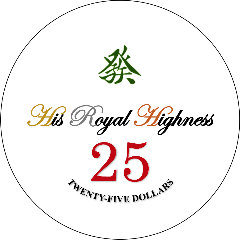
Hi PCF, I recently designed a set of custom chips for myself, which borrowed a lot of ideas from PCA set apparently.
However, I have trouble designing the $25 chip, namely the green chip. Please leave a comment if you have any suggestions, much appreciated.
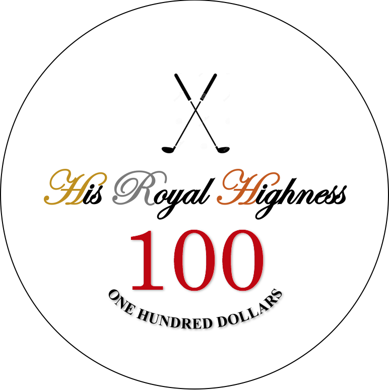
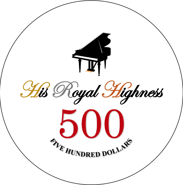
Besides, I also really appreciate comments and suggestions on inlay designs. The logos I put on the chips represent the hobbies I have. And the Chinese character on $25 chip stands for Mahjong, a Chinese board game.
However, I have trouble designing the $25 chip, namely the green chip. Please leave a comment if you have any suggestions, much appreciated.
Besides, I also really appreciate comments and suggestions on inlay designs. The logos I put on the chips represent the hobbies I have. And the Chinese character on $25 chip stands for Mahjong, a Chinese board game.
If you want PCA $25s, here you go.
")
OP
OP
Francisho
High Hand
lol thank you. But I’m afraid that would make set too similar to PCA, so I want to make some breakthroughs on $25 chip
Winnie chian
New Member
Beautiful set! Best self-design poker chip I have ever seen. Loved the $25 chip with a mahjong symbol!
Psypher1000
Straight Flush
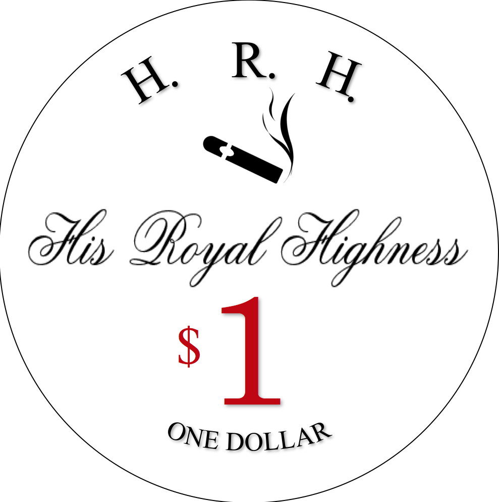
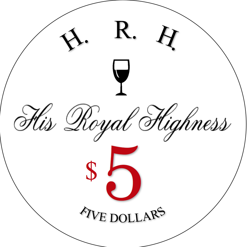
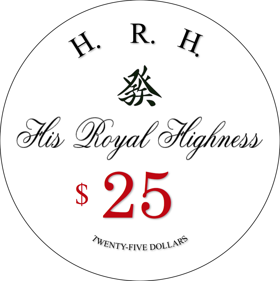
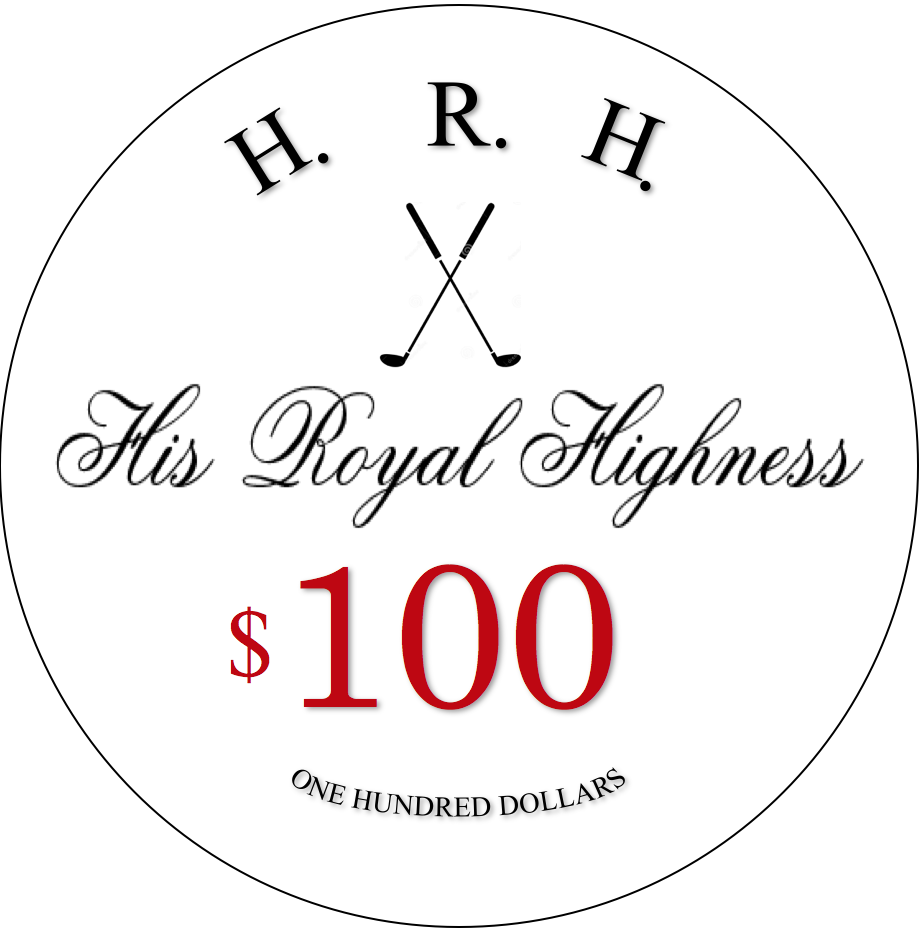
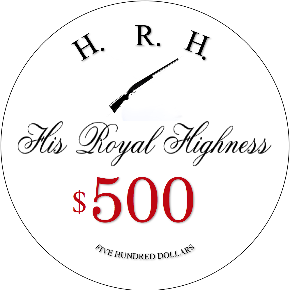
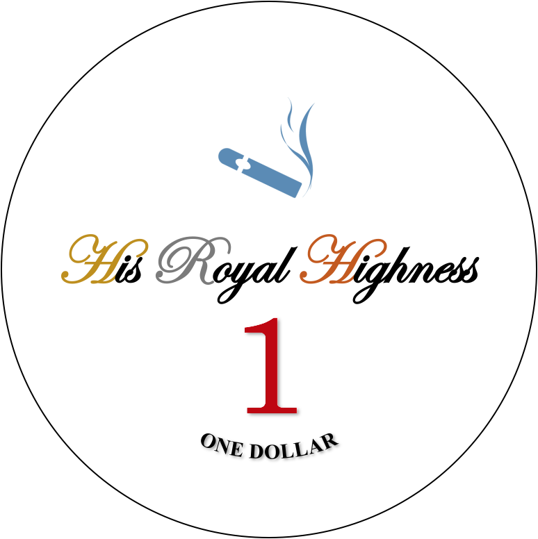
It's unlikely that the inlays as depicted in the mocks will past muster at CPC - there should be no text, printing, or graphics that spill into the cogs/hubs/spikes of the shaped inlays. What this means is that there's actually less design space to work with on shaped inlays than round. Also, the small written denominations at the bottom may be too small to read at scale other than the One Dollar and Five Dollars. You may need to boost the size of the rest. Additionally, at scale, His Royal Highness is fairly difficult to read because of the shape/fanciness of the font.
As it stands now, you have a yellow spot on four of the five chips. Additionally, you have an exterior white spot against a light blue base and a lighter yellow interior spot for the $1 which makes the spots start to blend in with one another. I've also changed that blue to a peacock blue to make it a closer approximation to the Flamgino $1 (which I think you're trying to replicate). I've made a few tweaks to the lineup as a whole, including a complete rework of the $25 to be closer to the PCA secondary. Take the suggestions or leave them as you like.

As it stands now, you have a yellow spot on four of the five chips. Additionally, you have an exterior white spot against a light blue base and a lighter yellow interior spot for the $1 which makes the spots start to blend in with one another. I've also changed that blue to a peacock blue to make it a closer approximation to the Flamgino $1 (which I think you're trying to replicate). I've made a few tweaks to the lineup as a whole, including a complete rework of the $25 to be closer to the PCA secondary. Take the suggestions or leave them as you like.
OP
OP
Francisho
High Hand
Thank you very much! Very helpful comments!It's unlikely that the inlays as depicted in the mocks will past muster at CPC - there should be no text, printing, or graphics that spill into the cogs/hubs/spikes of the shaped inlays. What this means is that there's actually less design space to work with on shaped inlays than round. Also, the small written denominations at the bottom may be too small to read at scale other than the One Dollar and Five Dollars. You may need to boost the size of the rest. Additionally, at scale, His Royal Highness is fairly difficult to read because of the shape/fanciness of the font.
As it stands now, you have a yellow spot on four of the five chips. Additionally, you have an exterior white spot against a light blue base and a lighter yellow interior spot for the $1 which makes the spots start to blend in with one another. I've also changed that blue to a peacock blue to make it a closer approximation to the Flamgino $1 (which I think you're trying to replicate). I've made a few tweaks to the lineup as a whole, including a complete rework of the $25 to be closer to the PCA secondary. Take the suggestions or leave them as you like.
View attachment 157344
lol thank you. But I’m afraid that would make set too similar to PCA, so I want to make some breakthroughs on $25 chip
Well, considering your
$1 - Flamingo
$5 - PCA
$25 - ???
$100 - PCA
$500 - Native Lights
You might as well continue on and find a $25 to
How about ( just a few off the top of my head )
1. Grand Vic
2. Tonkawana
3. Native Lights
4. Paulson Fantasy ( and others )
5. Horseshoe
If not, this thread will probably give you some ideas as well:
https://www.pokerchipforum.com/threads/best-green-chips-of-all-time.18034/
good luck.
OP
OP
Francisho
High Hand
It's unlikely that the inlays as depicted in the mocks will past muster at CPC - there should be no text, printing, or graphics that spill into the cogs/hubs/spikes of the shaped inlays. What this means is that there's actually less design space to work with on shaped inlays than round. Also, the small written denominations at the bottom may be too small to read at scale other than the One Dollar and Five Dollars. You may need to boost the size of the rest. Additionally, at scale, His Royal Highness is fairly difficult to read because of the shape/fanciness of the font.
As it stands now, you have a yellow spot on four of the five chips. Additionally, you have an exterior white spot against a light blue base and a lighter yellow interior spot for the $1 which makes the spots start to blend in with one another. I've also changed that blue to a peacock blue to make it a closer approximation to the Flamgino $1 (which I think you're trying to replicate). I've made a few tweaks to the lineup as a whole, including a complete rework of the $25 to be closer to the PCA secondary. Take the suggestions or leave them as you like.
View attachment 157344
May I ask you a question. I’m wondering that if I switch to all-round inlays, can my design pass CPC’s muster? Thank you!It's unlikely that the inlays as depicted in the mocks will past muster at CPC - there should be no text, printing, or graphics that spill into the cogs/hubs/spikes of the shaped inlays. What this means is that there's actually less design space to work with on shaped inlays than round. Also, the small written denominations at the bottom may be too small to read at scale other than the One Dollar and Five Dollars. You may need to boost the size of the rest. Additionally, at scale, His Royal Highness is fairly difficult to read because of the shape/fanciness of the font.
As it stands now, you have a yellow spot on four of the five chips. Additionally, you have an exterior white spot against a light blue base and a lighter yellow interior spot for the $1 which makes the spots start to blend in with one another. I've also changed that blue to a peacock blue to make it a closer approximation to the Flamgino $1 (which I think you're trying to replicate). I've made a few tweaks to the lineup as a whole, including a complete rework of the $25 to be closer to the PCA secondary. Take the suggestions or leave them as you like.
View attachment 157344
OP
OP
Francisho
High Hand
Wow I! Awesome! Thanks a lot!Well, considering your
$1 - Flamingo
$5 - PCA
$25 - ???
$100 - PCA
$500 - Native Lights
You might as well continue on and find a $25 tocopygrab inspiration from.
How about ( just a few off the top of my head )
View attachment 157346
1. Grand Vic
2. Tonkawana
3. Native Lights
4. Paulson Fantasy ( and others )
5. Horseshoe
If not, this thread will probably give you some ideas as well:
https://www.pokerchipforum.com/threads/best-green-chips-of-all-time.18034/
good luck.
Psypher1000
Straight Flush
Probably. Some of the text may need to be brought just slightly in from the edges, but it looks pretty close as it is.I’m wondering that if I switch to all-round inlays, can my design pass CPC’s muster?
That said, the small denomination text at the bottom still needs to be increased in size no matter what shape inlay you use, and the font for His Royal Majesty is still going to be difficult to read in that font at full scale.
OP
OP
Francisho
High Hand
Great! I’ll adjust the font and size tonight. Thank you very much!Probably. Some of the text may need to be brought just slightly in from the edges, but it looks pretty close as it is.
That said, the small denomination text at the bottom still needs to be increased in size no matter what shape inlay you use, and the font for His Royal Majesty is still going to be difficult to read in that font at full scale.
Wow I! Awesome! Thanks a lot!
No problem. And I really like what @Psypher1000 did, except I like a green base, instead of a light green base.
timinater
Flush
Looks like these inlays could use some cleanup before they get printed. If you'd like some assistance getting the kerning, spacing and the radiuses on the text proportional to the inlay please send me a PM and I'd be happy to help.
LinkyBabe
Flush
In addition to @Psypher1000's comments, directly below the Chip Design Tool are artwork and guideline links that give you the specifics of what you need to know when designing your inlays. Start with that and then order color and mold sample sets from CPC as the colours represented on your monitor do not resemble the actual chip colours. Once you're ready to order, be sure to order extras that you can sell as sample sets to the community... more specifically for sample lovers hoarders (damn autocorrect) @Jeff, @Psypher1000 et al... 
Last edited:
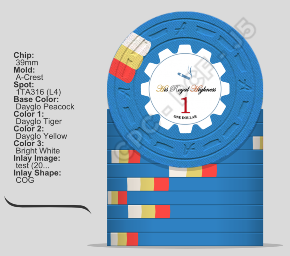
I’m loving the 3TA316. I hope you have a color sample set because those spot colors are sweeeeeeet and you should always check them with color samples to make sure they look as good in person as they do on the computer screen.
- Joined
- Dec 29, 2017
- Messages
- 25,940
- Reaction score
- 35,091
- Rewards
- 0
- Location
- Burnaby (Greater Vancouver), BC
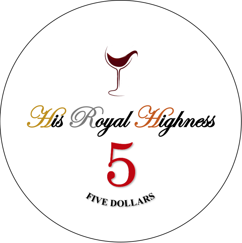
My suggestions for your inlays:
1) No need to have the numerical value and the text value on the same side, i.e. "$1" and "ONE DOLLAR", since it's redundant. I'd move one to the other side.
2) I'd move "H.R.H" to the other side, too. You probably have room to put a crown symbol around, above, or under these initials, too.
3) Keep the script font, but enlarge the letters so that "His Royal" and "Highness" are on two lines. The numerical denomination can also be bigger if you want.
4) Enlarge the graphic (cigar, wine glass, pictogram, golf clubs, and shotgun) to fill the majority of the inlay, but reduce the opacity (i.e. turn it grey) to use as a background behind the text and the denomination. On the other side, use a slightly smaller (but still large) size graphic, but keep it black.
Remember, you are dealing with an inlay barely 1" in diameter. You want to be able to see the graphic and read the text at a reasonable distance. Not necessarily splashed in the pot from 2 to 3 feet away, but at least holding in your hand from about 9" from your eyes.
OP
OP
Francisho
High Hand
My suggestions for your inlays:
1) No need to have the numerical value and the text value on the same side, i.e. "$1" and "ONE DOLLAR", since it's redundant. I'd move one to the other side.
2) I'd move "H.R.H" to the other side, too. You probably have room to put a crown symbol around, above, or under these initials, too.
3) Keep the script font, but enlarge the letters so that "His Royal" and "Highness" are on two lines. The numerical denomination can also be bigger if you want.
4) Enlarge the graphic (cigar, wine glass, pictogram, golf clubs, and shotgun) to fill the majority of the inlay, but reduce the opacity (i.e. turn it grey) to use as a background behind the text and the denomination. On the other side, use a slightly smaller (but still large) size graphic, but keep it black.
Remember, you are dealing with an inlay barely 1" in diameter. You want to be able to see the graphic and read the text at a reasonable distance. Not necessarily splashed in the pot from 2 to 3 feet away, but at least holding in your hand from about 9" from your eyes.
Thank you! It didn't occur to me that I could design two sides differently. I will put more thought into it.
OP
OP
Francisho
High Hand
It's unlikely that the inlays as depicted in the mocks will past muster at CPC - there should be no text, printing, or graphics that spill into the cogs/hubs/spikes of the shaped inlays. What this means is that there's actually less design space to work with on shaped inlays than round. Also, the small written denominations at the bottom may be too small to read at scale other than the One Dollar and Five Dollars. You may need to boost the size of the rest. Additionally, at scale, His Royal Highness is fairly difficult to read because of the shape/fanciness of the font.
As it stands now, you have a yellow spot on four of the five chips. Additionally, you have an exterior white spot against a light blue base and a lighter yellow interior spot for the $1 which makes the spots start to blend in with one another. I've also changed that blue to a peacock blue to make it a closer approximation to the Flamgino $1 (which I think you're trying to replicate). I've made a few tweaks to the lineup as a whole, including a complete rework of the $25 to be closer to the PCA secondary. Take the suggestions or leave them as you like.
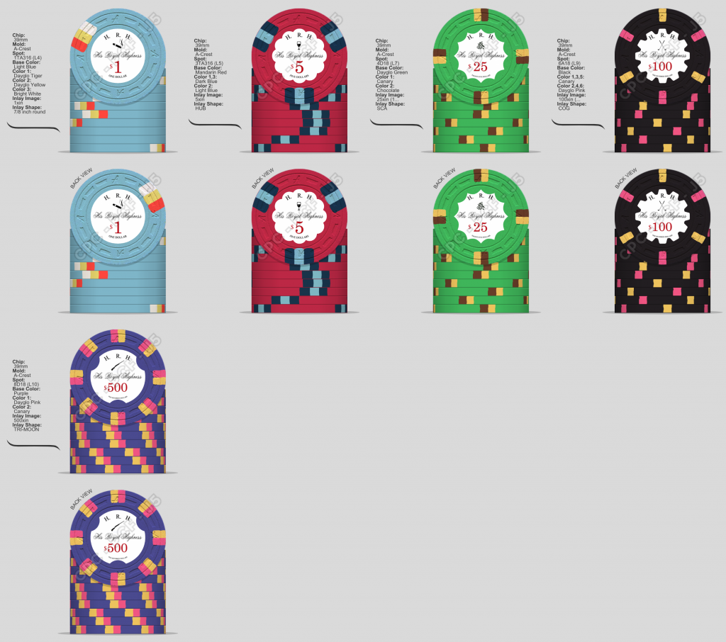
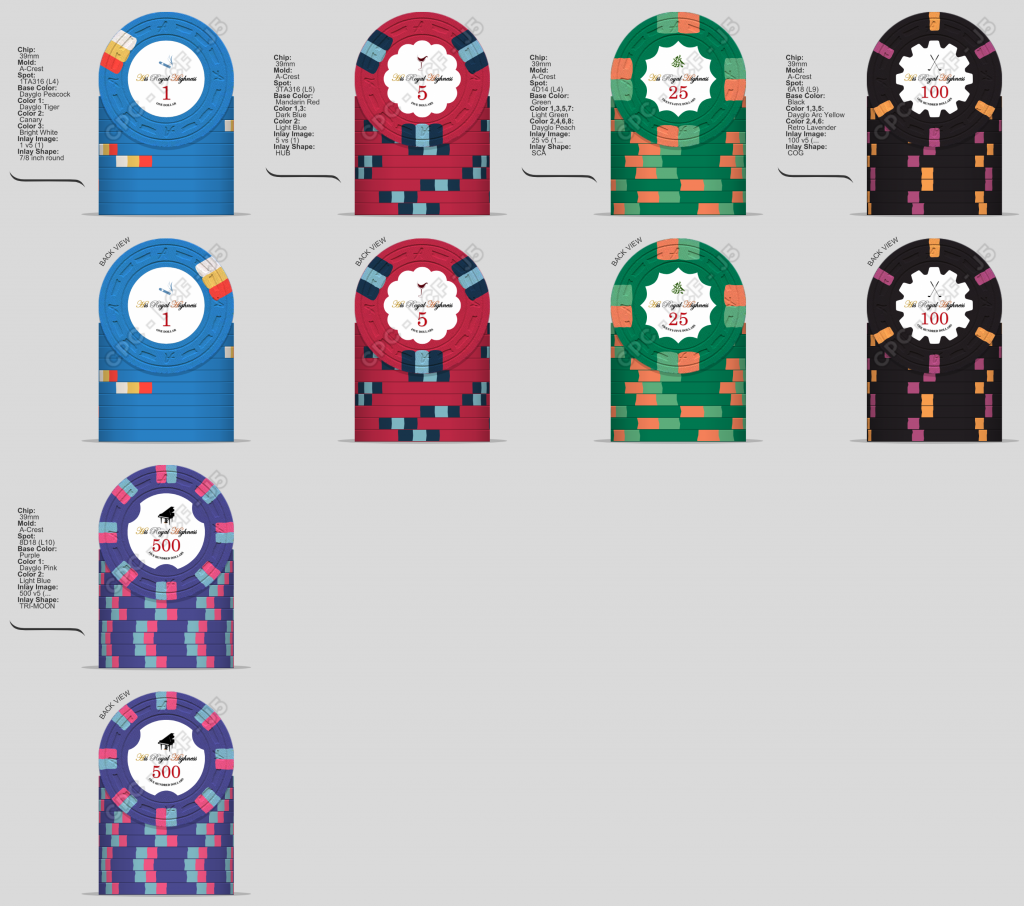
Hi Psypher1000, thanks to your advice and arch3r's, I have adjusted my design. As you probably have noticed, I have done the following changes:
1. Redesigned the color of $1, $25, and $500 as you and arch3r suggested, to avoid overuse of "yellow", and changed $1's base color to peacock blue.
2. Compressed the space of inlay to avoid encroachment by "cog" outlay. As you can see on the 6th picture, I drew a circle that clarified the boundary of the actual usable space, and limited my design for inlay into that circle.
3. Increased the size of the textual denominations as you suggested, and adjusted "His Royal Highness" to be less fancy. I still kept it to be a little bit fancy since I wanted it to act as more like an icon, rather than just text.
Would you and other PCF chippers help take a look at this version of design please? Thank you!. Moreover, personally speaking I'm still not very satisfied with the design of $500 chip. I really like Psypher1000 your design, but purple base looks better on my laptop than lavender base. So may I know that based on your experience, which base looks better in real CPC chip, purple or lavender? Thank you!
You need to print the chip out to correct size and look at it an arms length away. I believe your graphics are too small and won’t be readily visible. You need to make the cigar/piano/wine, etc bigger and perhaps behind the other elements.
I always wanted to do a Mans Four Vices (wine, women, horses and cards) themed set, which would probably feel like this set.
OP
OP
Francisho
High Hand
Thank you! I’ll do that tonight
You need to print the chip out to correct size and look at it an arms length away. I believe your graphics are too small and won’t be readily visible. You need to make the cigar/piano/wine, etc bigger and perhaps behind the other elements.
Nex
Flush
- Joined
- Jan 25, 2017
- Messages
- 2,191
- Reaction score
- 3,411
- Rewards
- 106
- Location
- Club Hel, Downtown Megacity
Latest iteration of the inlays definitely still needs work.
Way too much white space, the inlay as a whole looks fairly empty. Maybe find some nice simple ornament you can use to fill the space to the left and right of the respective hobby icon. Maybe also consider putting "His" on a separate line so you can increase the font size for "Royal Highness". Will likely result in a better balanced design and also be easier to read.
Looking at the OP, best in set definitely is the $100. Would not stray away from having both edge spots dayglo. The later posted variant with Retro Lavender is a step backwards in my eyes.
$500 will need very different colors though or it will be hard to tell apart from the $100 just looking at the edge.
$5 looks solid but nothing I'd praise for good design; I just don't like all-dark chips. Maybe experiment with one DG color for the spots, or grab a different chip to draw "inspiration" from... Aurora Star, Horseshoe Cleveland, Horseshoe Cincinnati are my faves (the latter can be approached with a 2D14 DG Arc Yellow / Gray, dropping the brown).
For the $25 I'm in the Horseshoe camp. Need to add though that DG Arc Yellow and DG Green are much better color picks for the spots than DG Peach and Light Green imo.
Last edited:
OP
OP
Francisho
High Hand
Thank you! Would you mind giving me some specific suggestions for $500 color combination, much appreciated.Latest iteration of the inlays definitely still needs work.
Way too much white space, the inlay as a whole looks fairly empty. Maybe find some nice simple ornament you can use to fill the space to the left and right of the respective hobby icon. Maybe also consider putting "His" on a separate line so you can increase the font size for "Royal Highness". Will likely result in a better balanced design and also be easier to read.
Looking at the OP, best in set definitely is the $100. Would not stray away from having both edge spots dayglo. The later posted variant with Retro Lavender is a step backwards in my eyes.
$500 will need very different colors though or it will be hard to tell apart from the $100 just looking at the edge.
$5 looks solid but nothing I'd praise for good design; I just don't like all-dark chips. Maybe experiment with one DG color for the spots, or grab a different chip to draw "inspiration" from... Aurora Star, Horseshoe Cleveland, Horseshoe Cincinnati are my faves (the latter can be approached with a 2D14 DG Arc Yellow / Gray, dropping the brown).
For the $25 I'm in the Horseshoe camp. Need to add though that DG Arc Yellow and DG Green are much better color picks for the spots than DG Peach and Light Green imo.
I agree with @Nex, the inlay still needs some work - too much white space. Although, instead of some ornament to fill the space, how about doubling up the chip name. His Royal on line one with Highness below it and move that to the top of the chip. Now you can even increase the font size and weight, making it easier to read and you can fill up more of the inlay. Then you can take the hobby icons and double them up, putting one on each side, again sizing them to fill more of the inlay's white space. I think something like that would balance the design and the inlay better.
As for the chip designs, I like them well enough. Each one is a tribute to a know beautiful chip. But, if you were to tweak them, might I suggest changing the $100 to spot 6A14. Just increases the spot sizes and adds a bit more color to the chip and to the set. Now not a copy, but inspired by. Plus its a level 3 ($1.67/chip), as opposed to the level 9 ($3.49/chip) you have now. Quite a savings (~$200/rack), if that is an issue. And I again agree with @Nex, the $5 is dark. I too like the Aurora Star $5. Same basic design, but with brighter spots. Unfortunately, the spots may then clash with the $1.
Anyway, just the ramblings of a fellow chipper.
Nex
Flush
- Joined
- Jan 25, 2017
- Messages
- 2,191
- Reaction score
- 3,411
- Rewards
- 106
- Location
- Club Hel, Downtown Megacity
Thank you! Would you mind giving me some specific suggestions for $500 color combination, much appreciated.
I had nothing specific in mind where I'd say it could have good cohesion with the overall style and colors of your set - it was just obvious to me that there will be issues telling the chips apart in not-so-stellar lighting conditions due to the identical spot colors and both with very dark base colors. You will need to decide for the one or the other, but taking both unchanged will be problematic.
By the way, for the $100 I actually missed that the yellow you used is just Canary. Consider DG Yellow to have all spots on it dayglo. Switching from 1/8" to 1/4" spots would degrade the overall color balance in my eyes though. DG Pink is extremely bright, so is DG Yellow. Sparingly applied I think it looks great, but put too much of it on a chip and it looks crappy. I don't think cost considerations should be an argument for a $100 chip anyway, given you'll likely only order very few of them relative to the total size of your set.
Psypher1000
Straight Flush
This statement/question concerns me, as it communicates that you don't have CPC color sample chips in front of you to work with.purple base looks better on my laptop than lavender base. So may I know that based on your experience, which base looks better in real CPC chip, purple or lavender?
I cannot state this strongly enough: do not finalize an order with CPC until you have color sample chips in front of you to look at.
How I think colors look or how they appear on your screen or my screen is ultimately irrelevant. What matters is how you think the actual colors look when in front of your own eyes.
Similar threads
- Replies
- 1
- Views
- 316
- Replies
- 10
- Views
- 735
- Replies
- 23
- Views
- 2K