Possible mock-up switch-up (1 Viewer)

PsyLens

Sitting Out
Joined
Nov 9, 2014
Messages
21
Reaction score
3
Location
Georgia, USA
After struggling for so long to fit my lower denoms into my cash game set with a color scheme that's bright and contrasts, I'm tempted to just say ... ehh these high denoms look too good to only see the felt once a year when they get made.

So I've been seriously debating dropping the 5c, 25c, 1$ denoms and just make this set a tourney set starting with the 5$ chips.

Of course none of this is set in stone yet. Ideas? Comments? Hate it? Love it? Stick with cash? Def go to tourney? Inquiring chippers wanna know. :D

So here's a look at the last mock-up of my cash set
mockup260.jpg


And here's a look at my latest tourney idea with 500 and 2500 chips added
mockup tourney.jpg

Of course this would mean I get to go back to re-designing a new cash set idea :D

I mean, you already know. Chip degens gonna degen :o

Looks like I need pic help :( My pics seems grainy and too small to really read/
 
I normally don't bump my own stuff but I'm hoping these pics will be ... larger. IDK how to do the UPDATE thing so I'll just try this. Sorry Tommy, feel free to change this up if you want.

Cash, 5c, 25c, 1$, 5$, 25$ hundo
http://i.imgur.com/NJw3tf0.png

Tourney idea
5 - 2,500
http://i.imgur.com/BLVbMfz.png
I used Mauve for retro-lavender.
Of course if there was a T10,000 it would be a white base 6DS retro red/retro blue.
As a side note I'm thinking of making the T5 spot Canary Yellow and leaving the 500 yellow spot Saturn Yellow.
 
Don't switch it. Personally I feel like the $0.25, $1 and $5 are the stars of the cash set, as it should be. The $25 and $100 are nice enough without making me wish they were the workhorse denoms - but it appears that you feel differently.

Love the cash set (either version, though the top with 6a18 quarter is insanely baller.) As tourney set it's a little meh IMO.
 
so you plan to have T2500 chip? If thats the case, seems like overkill, should be no denom between T1000 and T5000, imo of course
 
so you plan to have T2500 chip? If thats the case, seems like overkill, should be no denom between T1000 and T5000, imo of course

he's using the T2500 in lieu of the T1000, so it goes 5-25-100-500-2500.
 
Don't switch it. Personally I feel like the $0.25, $1 and $5 are the stars of the cash set, as it should be. The $25 and $100 are nice enough without making me wish they were the workhorse denoms - but it appears that you feel differently.

Love the cash set (either version, though the top with 6a18 quarter is insanely baller.) As tourney set it's a little meh IMO.

Thanks Ben. I'm still really undecided about the 1$ chip; but after months of thought, I think you're right. so I've been working on fixing up my cash set. Soooooo close to finishing.

Thanks jbutler for clarifying what my denoms were for my (abandoned :oops: ... for now) tourney idea. So back to cash :D

I'm thinking of replacing the Saturn yellow base on the nickel with canary yellow. Other than that, this very well could be my cash set. I'm really just unsure of the 1$ chip.

Ideas?

chip set.png
 
I think the $1 is very clean and very appropriate for a $1. My *only* gripe about it is there's not really any contrast present. There doesn't necessarily need to be, though.

I think the Saturn Yellow nickle is solid. Wouldn't change it, personally.

As is, the set looks fantastic!
 
My opinion is, if torn between a weighted and unweighted color for a base color option, go with the weighted color.

The light blue with bright white and retro blue combo you had previously for the $1 was fantastic. Maybe not in that exact spot configuration - just a simple 3dsa316 or 4dsa316 would be great IMO. The bright white base with double blue spots is nice as well, but has lost a little something and will also cost you a bunch more money (for bright white base - which is also unweighted. ;))
 
I think the $1 is very clean and very appropriate for a $1. My *only* gripe about it is there's not really any contrast present. There doesn't necessarily need to be, though.

I think the Saturn Yellow nickle is solid. Wouldn't change it, personally.

As is, the set looks fantastic!

Thanx! I've been playing with this design for over 2 years (including the 6 months I took off from the ASM disaster of He-Who-Shall-Not-Be-Named). So I need as much encouragement as I can get to pull the trigger on a custom set. :)

My opinion is, if torn between a weighted and unweighted color for a base color option, go with the weighted color.

The light blue with bright white and retro blue combo you had previously for the $1 was fantastic. Maybe not in that exact spot configuration - just a simple 3dsa316 or 4dsa316 would be great IMO. The bright white base with double blue spots is nice as well, but has lost a little something and will also cost you a bunch more money (for bright white base - which is also unweighted. ;))

I haven't gotten a Saturn Yellow in my hands yet :oops: so idk if the weight is too light yet. After lovingly fondling my color sample Mandarin Red and Retro Red I decided the Retro Red wasn't too much of a weight difference tho. Gonna have to see about getting an add-on color sample.

As for the 1 comments hummmm ... maybe I should keep the colors and use the 1st post spot.:cool:
 
I think your $1 workhorse chip should be something special. Looking at the other chip colors, I'd exclude yellow, purple, red, green, and black (existing base colors) along with pink and blue (spot colors used twice already) as spot colors for your white chip. Here are a few orange and gray combos to consider:

psylens.png
 
I was going to say something along the same lines as BG.

All the other chips really pop but the $1 is lacking. I LOVE all the top row chips BG mocked up but that 6ds18 is stunning.
 
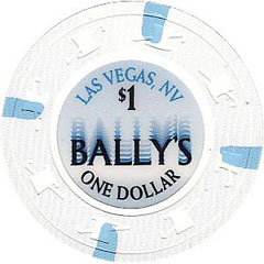
Personally, I really like the bright white $1 with the blue. It reminds me of the Las Vegas Bally's chip. Actual inlay will be a major determining factor though.
20319.jpg
 
Thanks everybody, especially BGinGA; you may have just designed my 1$ chip. I really appreciate you taking the time to mock-up your idea.

I'm going to have to take a day or 3 and think about these new designs. I started out with one idea and have made so many compromises that later turned out to be wonderful additions.

My only other passing thought is: If I use this much orange, maybe I should change the nickel ... but IDK, I'll give all of this some thought,
 
I will add this....

If you stick with a white/blue dollar, I'd swap the fracs and make it a yellow quarter and purple nickel. But the yellow nickel and purple quarter go fine with a white/orange dollar, imo. You could consider a different spot color for the yellow nickel perhaps (maybe gray, charcoal, retro blue, or maroon?) but I don't think it would be a required change.
 

Create an account or login to comment

You must be a member in order to leave a comment

Create account

Create an account and join our community. It's easy!

Log in

Already have an account? Log in here.

Back
Top Bottom