Poll for inlay (1 Viewer)

Which inlay?


  • Total voters
    87

Pinball

Full House
Joined
Dec 19, 2014
Messages
2,702
Reaction score
3,404
Location
Eggenwil / Switzerland
Which Inlay you like most?
F0C8DF96-567F-4065-8225-5528A24367CA.png
 
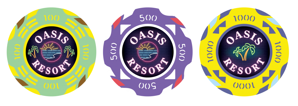
For precision purposes, only palm trees belong to an oasis, which is by defininition located in the middle of a desert, normally somewhat away from the sea.
The sun / sea design here is pretty cute though, and fits very well the center.
Probably, and for better detail, you could have the sun / sea on one side and the palm tree on the other.
or create an inlay that resembles an oasis using the neon design style?


1621848375298.png


1621848794192.png
 
Last edited:
The second (500) inlay looks too empty, I like the first inlay (100). If you are doing the mock ups, what about making the lettering smaller and adjusting the images on the first one?
 
For precision purposes, only palm trees belong to an oasis, which is by defininition located in the middle of a desert, normally somewhat away from the sea.
The sun / sea design here is pretty cute though, and fits very well the center.
Probably, and for better detail, you could have the sun / sea on one side and the palm tree on the other.

I voted for just the Palm, but I agree you could do the sun & sea on one side, and the palm on the other. That would be nice
 
A is more interesting, and prettier.

A chip face is a pretty limited canvas. Make the best use of it.
 
I’m a chipping noob but I much prefer the one on the right with just the palm. It’s simple, doesn’t compete with the edge, and let’s the coloring on the background of the inlay really shine. Seeing more of the blue background makes the graphic almost glow which looks great with the neon style and I think is lost with the busier options.
 
Inlay alone, I like the first one but the chip itself is so busy that I'd vote for the simpler palm tree design on these chips.
 
I dont mind the first (left) design with the trees and ocean/sun. Those trees on the side help fill up some open space of you went with the other two original designs. Don't think the first design is that busy.

The design in the latter design have the trees smaller, I feel the trees are a bit too small for some people to know what they are with initial viewing. But I understand why you did it to help not clutter it, but the tree design is too intricate and thin lined to make it too small.
 
Chips look AWESOME. I'm not a fan of the tiny palm trees on the revised design. They look like weeds :)
Far too small for the beautiful and proud trees that they are!!
 
Id suggest you try an inlay without any writing. Im a big fan of the neon lighting style logo, so much so that any writing takes away from it. Maybe revise to enlarge the logo to incorporate palm trees.

On a different note the chip is very busy and I personally would like to see a simpler design on your inlay instead. Potentially you can save this current design / theme for your next set of customs. The chip designs looks great also. It all just feels a bit too much as it stands.

Looking forward to seeing how this turns out.
 
Last edited:
Id suggest you try an inlay without any writing. Im a big fan of the neon lighting style logo, that any writing takes away from it. Maybe revise the enlarge the logo to incorporate palm trees.
One thing to try might be a two-sided design. One side predominantly artwork, the other side predominantly text.
 
The new ones are way too busy IMO but knowing PCF they’ll tell you to add clouds and birds and a few more squiggly lines to really ensure no space goes left untouched.

Remember, you won’t be using them on a computer screen, they’ll be printed on a <1” diameter circle. “Less is more” never loses … except in a vote.

Personally, I like the original Palms centered (C) with maybe slightly smaller font and larger image. I do like the idea of a different image on each side, though.

As an aside, if you keep the ocean as-is on the last designs, my eyes seem to think it’s just really small font and instinctively squint to see what it says at the expense of other elements. Weird, but figured I’d share in case anyone else notices.

Good luck, they’re all looking great!
 

Create an account or login to comment

You must be a member in order to leave a comment

Create account

Create an account and join our community. It's easy!

Log in

Already have an account? Log in here.

Back
Top Bottom