OfficerLovejoy
Full House
A little backstory to this first cg set that I am building.
I am a police officer in germany and have been doing this job for 10 years now. I know in light of the events in the USA from earlier this year that does not make me popular in the eyes of the public, but I can say with full confidence that I have never treated somebody unfairly for whatever reason, nor have I covered for another cop who missused his or her power during the job.
My current homegame started around 5 years ago when I started hosting once a month with friends from my station. The german animal nickname/insult for police officers is a little more flattering than the "pigs" from the USA. It's "Bullen" - meaning bulls. From time to time my colleagues and I use it in jest to adress each other.
Introducing the "Bullenrunde" or loosely translated "circle of bulls":
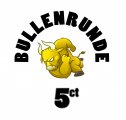
My first mockup for the lable:

The bull artwork is temporary stockfootage by sararoom that i could buy for $15 should I stick with that particular image.
The design overall is very minimalistic as of now and ofc subject to change. I still have to experiment on the fonts and I already think the denoms are not as easy to read as I'd like them to be.
I have bought bits and pieces from the classifieds and collected them at a friend of mine who lives in minnesota. She shipped the collected chips a few weeks ago and I expect, I can pick them up at german customs on monday.
I will update this thread as soon as the chips arrive with actual chip pr0n, but for now I can show the mockups of the actual THC I rebuild in the cpc design tool:
Not yet purchased / found on the classifieds:
100x yellow THC solids - 5ct

200x casablanca $5s - 25ct

100x scandia $1 - €1

80x empress $100 - €5

10x HS Cincinatty $25 - €25
I know, I know this one is RHC and I will replace it at some point.

Together they will look something like this:

I know I have yet to see / feel the actual chips in person. Things might change, but this is how far I've gotten as of now.
I am a police officer in germany and have been doing this job for 10 years now. I know in light of the events in the USA from earlier this year that does not make me popular in the eyes of the public, but I can say with full confidence that I have never treated somebody unfairly for whatever reason, nor have I covered for another cop who missused his or her power during the job.
My current homegame started around 5 years ago when I started hosting once a month with friends from my station. The german animal nickname/insult for police officers is a little more flattering than the "pigs" from the USA. It's "Bullen" - meaning bulls. From time to time my colleagues and I use it in jest to adress each other.
Introducing the "Bullenrunde" or loosely translated "circle of bulls":
My first mockup for the lable:
The bull artwork is temporary stockfootage by sararoom that i could buy for $15 should I stick with that particular image.
The design overall is very minimalistic as of now and ofc subject to change. I still have to experiment on the fonts and I already think the denoms are not as easy to read as I'd like them to be.
I have bought bits and pieces from the classifieds and collected them at a friend of mine who lives in minnesota. She shipped the collected chips a few weeks ago and I expect, I can pick them up at german customs on monday.
I will update this thread as soon as the chips arrive with actual chip pr0n, but for now I can show the mockups of the actual THC I rebuild in the cpc design tool:
Not yet purchased / found on the classifieds:
100x yellow THC solids - 5ct
200x casablanca $5s - 25ct
100x scandia $1 - €1
80x empress $100 - €5
10x HS Cincinatty $25 - €25
I know, I know this one is RHC and I will replace it at some point.
Together they will look something like this:
I know I have yet to see / feel the actual chips in person. Things might change, but this is how far I've gotten as of now.
Attachments
Last edited:

")

")