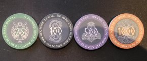
Have been working on a Nordic Mythology chip design for ceramic (BR Pro) tourney set. Still need to do the edges, but this is where we are so far (other than plan to change the denomination to either white or a very light grey on all chips. Debating 39mm or 43mm as well. Thinking these might look better on 43. Would be interested in thoughts, feedback.


You are using an out of date browser. It may not display this or other websites correctly.
You should upgrade or use an alternative browser.
You should upgrade or use an alternative browser.
Nordic Mythology Chip Design (1 Viewer)
- Thread starter IceViking
- Start date
http://pokerchipset.cricket/ceramic...t-chips-are-39mm-in-diameter-3-3mm-thick.html
I like your graphics better but colors need to be more distinctive
I like your graphics better but colors need to be more distinctive
Northman
High Hand
As a fellow viking I like the idea ")
Great design but I agree with surfik that the center color might be too dark.
Great design but I agree with surfik that the center color might be too dark.
Things are looking quite dark. I think you'd be better off reversing the contrast in the center graphic.
43mm would be good with this level of fine detail.
43mm would be good with this level of fine detail.
Silver_Fiend
Flush
Love the design, but the colors have to contrast more or its all just going to blend together even more than the pictures
CrazyEddie
Full House
Very cool! Concerned about usability - I'm not sure how easily distinguished the different chips will be, given the similarity of the colors.
That said, sometimes aesthetics trump usability. Just be careful when putting them into play, and be aware that people could accidentally put out a few of the wrong chips when they're making a bet and thus be dramatically over or dramatically short, which would have a big effect on the game.
That said, sometimes aesthetics trump usability. Just be careful when putting them into play, and be aware that people could accidentally put out a few of the wrong chips when they're making a bet and thus be dramatically over or dramatically short, which would have a big effect on the game.
Yup. Been a bit concerned about the darkness. Trying to strike a balance on rich colors vs. bright - but trying to keep them from getting to dark.
I like the idea of flipping the shading on the center, or maybe just make the entire emblem brighter. Also maybe brighten the "watermarks" on the back to lighten that up as well.
Another thought was to have the center be the chip color (or a lighter version of it), and adjust the ruins color to work with that.
Appreciate all the feedback!
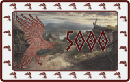
We were looking at Valkyrie for the 100, but struggled with the graphic, and ended up really liking the Loki, so we switched. Looking to do Plaques for the higher Denoms and working out what to put on those. Plus bounty chips and dealer buttons.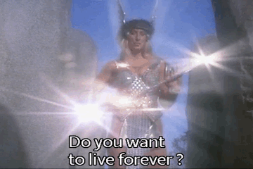
The 5k in Valkyrie inlay imo
We have it on the back of the 500 and as the symbol on the front ring. Trying to stick with faces on the front.So all chips have the same base color?
One of them needs to have Mjolnir on it
There are other versions I like most of them as well but doesn't have as much 'Nordic feel', I'd like to see it pop more, but that is a personal preference on priority of your images.
I'm currently working on a 'Loki' chip, as part of my set, can't wait to show it off, but it's not done yet
I'm currently working on a 'Loki' chip, as part of my set, can't wait to show it off, but it's not done yet
Valkyrie should be on the bounty chip. "The choosers of the slain."
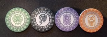
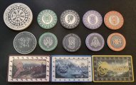
We made several changes to the first version I posted and then got samples. Learned from the samples and are now at this point. Still working on the color for the 500 and the color/fading/background brightness on the plaques. Have a dealer button that turned out great (just black on white) but don't have a pic of that at the moment. Thinking this will address the color differential issues. Have determined the round chips will be 43mm.
Any thoughts or feedback certainly appreciated.
Any thoughts or feedback certainly appreciated.
Attachments


Mr Winberg
Full House
Very cool!
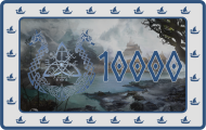
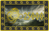
Are you sure you need all plaque denoms? With T5000 and T25000 there usually isn't a need for T10000. I know this thread is about the design, but make sure you make a post about your intended breakdown before ordering.
Are you sure you need all plaque denoms? With T5000 and T25000 there usually isn't a need for T10000. I know this thread is about the design, but make sure you make a post about your intended breakdown before ordering.
jake8907
Sitting Out
Awesome looking set!
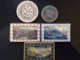
It's NOT a Dragon!Newer version is better! Dragon Plaque fits better than the other two, IMO. Maybe its the white borders...
I know it says Dragon, but its a snake
Also you have a lot of fine detail, I'm not sure it will come through depending on print, make sure to get samples first.
Last edited:
Correct. It's a snake (not sure why the file name is dragon, but it's a snake.It's NOT a Dragon!
I know it says Dragon, but its a snake
Also you have a lot of fine detail, I'm not sure it will come through depending on print, make sure to get samples first.
We did a first run of samples, and the details actually do come through, particularly on the 43mm chips, which I think I will go with for this set. That said, I'm getting a second run of samples to be certain before pulling any triggers.
thebigblind96
Sitting Out
I think they look amazing! Only minor comment would be to make the inner grey ring on the Fenrir and Thor chips a little lighter, cause the lettering doesn't really show too well.
As an aside, did you draw the gods yourself or was that commissioned? That's seriously impressive stuff either way.
As an aside, did you draw the gods yourself or was that commissioned? That's seriously impressive stuff either way.
Thanks for the comments. On the colors and background, we have adjusted them to make that lettering come out better (we also saw it was not coming through well). On the Gods, I would love to say we drew them, but we actually bought them. We are about to get a second sample run and hopefully all will look good and we can move forward. It's been a very long, but fun process. The colors/shading/contrast were definitely the hardest part of these (once we locked in on the design).I think they look amazing! Only minor comment would be to make the inner grey ring on the Fenrir and Thor chips a little lighter, cause the lettering doesn't really show too well.
As an aside, did you draw the gods yourself or was that commissioned? That's seriously impressive stuff either way.
Similar threads
- Replies
- 16
- Views
- 532
- Replies
- 15
- Views
- 515
- Replies
- 10
- Views
- 538